A Solari Report Interview with Rambus
of Rambus Chartology

My “go to” website for technical analysis of precious metals, the US dollar & the US stock market is Rambus Chartology, where Rambus (that’s his handle – he’s the founding technical analyst) leads a discussion with extensive charts of what the markets are saying.
Listen to an introduction to this interview...
- Why "Rambus?"
- How Rambus Chartology Got Started
- What Rambus Chartology Does
- About Technical Analysis
- Tracking the Markets
- What does the word "Chartology" mean?
- The US Dollar
- Precious Metals
- Equity Markets
Why Rambus?
CAF: Rambus, your industry handle has been Rambus ever since you started your remarkable website - Rambus Chartology. I love the story of how you got your handle and how you financed your home! Please do share it with our subscribers!
Rambus: Actually Rambus was a chip stock I traded back in the 1990’s tech bubble. There were a lot of new technology stocks that were being born back then such as Amazon, E Bay and Cisco just to name a few. Rambus was one of the most volatile stocks at that time and would go up and split only to go up and split again. They were in the semiconductor area that was really hot and supposedly had a patent on a particular chip that was going to make them a fortune.
The last time I traded Rambus was during the first part of 2000 when the tech bubble was peaking out. It was over $200 a share as were many tech stocks back then. The last time it split was a four for one stock split which meant I now had four times as many shares as before. It started trading in the low 50’s but what happened next was what every trader dreams of.
Within the next two months Rambus was already trading back up to about the 135 area when I called my broker telling him to put a sell/stop in at 123 just in case it was running out of gas. I was also watching a chart on the COMPQ that was suggesting that it was time for a pause at a minimum or maybe even a top of some kind may start forming. A couple of weeks later my sell/stop was hit at 123 and the rest they say is history.
That was a life changing trade for me that basically let me retire in my late forties. I still remember asking my wife if she was ready to build our dream house on our forty acres and she said, I’m paraphrasing here, “are you kidding me?” I said “nope.” Six months later we moved into our brand new house complete with all new furnishings. That is the reason I use Rambus as my handle as it was very good to me.
How Rambus Chartology Got Started
CAF: One of the things that you and I have in common is that we were both booted out of Goldbug USA. So tell us how you offended the Goldbugs and came to start Rambus Chartology. I would appreciate it if you would describe in detail what your charts were telling you at that time.
Rambus: After trading the greatest bull market in history it was hard finding new stocks to trade as most of the tech stocks crashed and burned during the ensuing bear market. I remember it was in the spring of 2002 when I stumbled upon the bull market in the precious metals complex. Up to that point I didn’t know a junior precious metals stock from a big cap precious metals stock as they were so far off my radar screen. One day I came across a long term weekly chart for gold which was showing a big and beautiful inverse H&S bottom forming which got my attention.
From that point on I started studying and reading everything I could on the precious metals complex. I learned there were many juniors that could have big moves when the time was right which was right up my alley. I had found a new bull market to trade.
Back in 2006 I found a free primary gold website where posters were expressing their ideas on gold, silver and the precious metals stocks. I followed their posts for a couple of months before I decided to post my first chart which I still remember was a very long term monthly chart for silver which was very bullish at the time.
I got a few comments and started posting fairly regularly. I met a poster there by the handle of Fullgoldcrown who was probably the biggest goldbug I had ever know up to that point. He would often compliment my charts because they were always very bullish on the precious metals sector so we formed an online friendship.
As that website was a gold only website you couldn’t post charts on the stock markets or anything else if it didn’t pertain to the precious metals complex. If you did post on something other than the PM complex you would find your post deleted.
About 25 or 30 members decided to go out on their own and start a free-gold website called Goldtent / Posters Paradise. This new free website was much more open to the stock markets and other techniques of trading. They asked me if I would like to join and I said yes because I was always open to new ideas of trading as there are many different methods to trade the markets.
Everything was good until I started noticing a potential H&S top that was forming on the HUI back in 2007. Keep in mind the bull market in the precious metals complex was going full throttle to the upside at that time. When I started posting the possibility of an H&S top forming I started getting a lot of negative feedback (to put it lightly).
Fullgoldcrown, who I considered my friend, could not believe I would post something negative about gold and silver. So at that point I decided to just back off and do just an occasional post because I knew most of the members were staunch goldbugs and they didn’t want to hear what the charts may be showing.
As it turned out, that H&S top did play out and the HUI dropped from 520 to 150 in a matter of about five months. The precious metals stocks crashed beyond anyone’s comprehension when it was all said and done. From that point I just kept to myself and pretty much just did my own thing.
A couple of times Fullgoldcrown would send me an email asking if I would be interested in starting a new website and I politely declined because I knew it would take 110% of my time and I was happy just the way things were.
Then in 2011 my father passed away unexpectedly and I missed our conversations and discussions we had on the stock markets and the economy. Even though we rarely agreed on the markets, I missed having someone to really talk about where the stock markets might go or what shape the economy was in.
So in July of 2011, I e-mailed Fullgoldcrown to see if his offer still stood on wanting to start a new website. He said “yes, let's do this.” He said he knew a computer wizard named Todd that could build the website from scratch but he needed a couple of months to work on the design. In October of 2011, Rambus Chartology was born. We had no expectations on what would happen when we opened the door but here its four years later and our door is still open.
What Rambus Chartology Does
CAF: Give us an overview of what a public reader will find at Rambus Chartology and the resources available to subscribers. You have built up quite a community. Perhaps you could say a few words about your partners and the subscribers who are contributors to the ongoing discussion.
Rambus: If you’re interested in charts, we have a ton of charts ranging from the stock markets to the precious metals complex, currencies or just about anything that can be charted—we have it. We also have a forum where you can post your ideas on any market or trading discipline that you use. Everyone is shown respect even if you’re a novice which many of our members are.
We also have many members that are very good at trading the markets and post their views at the forum. We have folks that are into cycles, Elliot Wave Gann theory and just about any trading discipline you can think of. There are members from all walks of life and from all over the world which I didn’t expect when we opened up our website at Rambus Chartology. The world wide web has really opened up the door for the little guy.
We have a five-day free trial period where you can come in and look around and decide for yourself if our website suits your needs.
Fullgoldcrown came up with a motto that reads, “give a man a chart and he may prosper for a day, but teach him to chart and he will prosper for a lifetime.”
Behind the scenes we have Fullgoldcrown who is our public relations guy that will help you get on the site if you’re having problems, set you up with a password or anything else if you need help.
Todd is our computer wizard that built our website from scratch writing his own code. He’s one of those guys that you don’t hear much about but you know he’s working behind the scenes taking care of business.
About Technical Analysis
CAF: Before we dive into what the charts are saying now, give us
some background on how you developed your gift with technical analysis and
why you think it is important. Any tips to beginners on how they can begin
to educate themselves?
Rambus: I first became interested in the stock market way
back in 1974 when I returned home from overseas. My father who grew up during
the great depression was always very conservative with his money and had
opened up a trading account with Merill Lynch. I was shocked to say the
least. While I was overseas there was the infamous oil embargo that I missed.
My father, using basically a fundamental approach to the stock market, bought American Motors because he thought everyone was going to buy smaller cars based on the price of oil. I remember he bought American Motors around 12 or 13 dollars a share. From the point at which he bought American Motors the stock just kept going down lower and lower until he lost over half of his investment. American Motors eventually went bankrupt I believe and the stock never got back up to where my father originally bought in. That was his one and only time he ever invested in the stock market.
By all rights, what happened to my father should have steered me away from the stock markets but it had just the opposite affect on me. I could see way back then the potential the markets could have on someone either good or bad.
I knew absolutely nothing about the markets so I began the education phase of learning as much as I could on how the stock markets worked. I bought my first book on the stock market and the author's trading system was based on watching the ticker tape looking for big blocks of shares that would show him if a stock was under accumulation or distribution. That’s the way most of the short-term traders did it back then: watching the ticker tape.
I didn’t really get much out of his trading system but his book had some charts in it that really fascinated me. I began to look for books with charts in them and I stumbled across a book by Edwards & McGee on Technical Analysis of Stock Trends. For me, personally, that book just made sense.
Back in those days charts were very hard to come by so I decided to start making my own charts. I was one of those guys with a sheet of graph paper, a pencil and a ruler. I would put five bars to a square which would equal one week's worth of price action. I charted 100 stocks a day using the quotes from the Wall Street Journal. It took me about an hour and a half a day to chart those 100 stocks. It was labor-intensive compared to what we have now.
When the 1990’s arrived so did alot of different technologies and especially charting services. Technology really opened up the door for the little guy. Prices were no longer delayed by 20 minutes. Real time quotes became a reality and they also stopped using fractions and went to decimals.
The very first charting service I subscribed to required a six-foot satellite dish to get real-time quotes and charts. My computer was running DOS back then which seems like an eternity ago.
With that satellite dish I could now get monthly, weekly, daily and minute charts with one click of a button. I thought I had died and gone to heaven. That was a real breakthrough in charting for me. I could start looking for all the different chart patterns, on different time-frames, that I had been studying for so many years in what seemed like slow motion compared to my new 1990’s high-tech satellite dish. From that point on, charting really took off for me and I couldn’t think of any other trading discipline I wanted to learn and understand more than looking for patterns on a chart.
Tracking the Markets
CAF: Let's first review the indicators you look at to track the markets and why you use them.
Rambus: First and foremost, I look for chart patterns. When I think I may have found something that looks promising I will look at just a handful of indicators such as the RSI, MACD and stochastics just to give me a feel if the stock may be overbought or oversold. Using too many different indicators can get a bit confusing and cloud one's thinking. Most technicians generally have their own set of favorite indicators they like to use based on how they interpret the markets. It’s really a personal thing and what you get comfortable with.
I also like to look at several different moving averages as they can tell you a lot about a trend. The 20-day ema and the 50-day ema are my two favorite moving averages to look at from a short to intermediate-term perspective. Many times when they cross they will give you a buy or sell signal.
On the weekly charts, the 30-week ema does a good job of showing you the intermediate to longer-term trend. Then there is the old standby, the 200-day moving average, which shows the very long-term trend for a bull or bear market. There is only one rule when it comes to the markets and that is: there are no rules. The sooner one learns this rule, the better off they’ll be.
Chartology ??
CAF: What does the word Chartology mean?
Rambus: Chartology is a new word coined by our computer guy, Todd. The word Chartology has two meanings. "Chart" means the study of chart patterns and "ology" is the study of the psychology of investors who make up these chart patterns. It’s the thousands of investors, all acting in concert, bulls and bears alike, that create the many different chart patterns we look for on a chart.
Human nature and the sum total of all trading activity tends to repeat over and over again throughout time. Once you learn to read a chart you will be able to see the battles that take place between the bulls and the bears on any given time-frame from minute charts to long-term monthly charts. This will give you an edge in deciding if you want to make a trade or not. So basically, we’re charting the psychology of thousands of investors interested in a particular stock or market.
The US Dollar
CAF: Let's turn to the US Dollar. This is the price to which I pay the closest attention. What do you use to track the US Dollar?
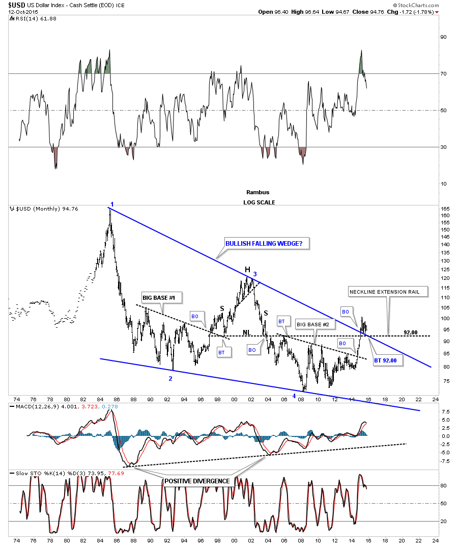
Rambus: Let's take an in-depth look at the US dollar starting with a very long-term monthly chart which goes back about 40 years or so. This chart shows how the US dollar made its all time highs way back in the mid 1980’s around the 160 area. The US dollar then made a lower high in 2000 which corresponded with the bottom in the precious metals complex. From the 2000 high, the dollar fell for eight years until it finally found a bottom in 2008 at 71.33 which was its all-time low. The two blue down-slopping trendlines capture the investor's psychology, bulls and bears, during each major swing within the blue falling wedge during the last thirty years.That is a massively large blue falling wedge which should give the US dollar plenty of energy to move much higher.
One last thing before we move on. Note the breakout above the top rail of the blue falling wedge that occurred last year. The top rail of that blue falling wedge held resistance for thirty years. That breakout last year is incredibly important. When a trendline gets broken, it will reverse its role. In this case it was resistance for 30 years--it should now act as support during any backtest. As you can see, the price action has found support on the top rail, consolidating its gains since the breakout. There was also an H&S top that formed in the late 1990’s and early 2000’s which led to the all time low. Many times you can extend the neckline out in time and look for support, in this case at the 92 level. So there are two main areas of support for the US dollar where the top rail of the blue falling wedge and the neckline intersect at 92 or so. Until 92 gets broken to the downside I have to remain bullish on the US dollar.
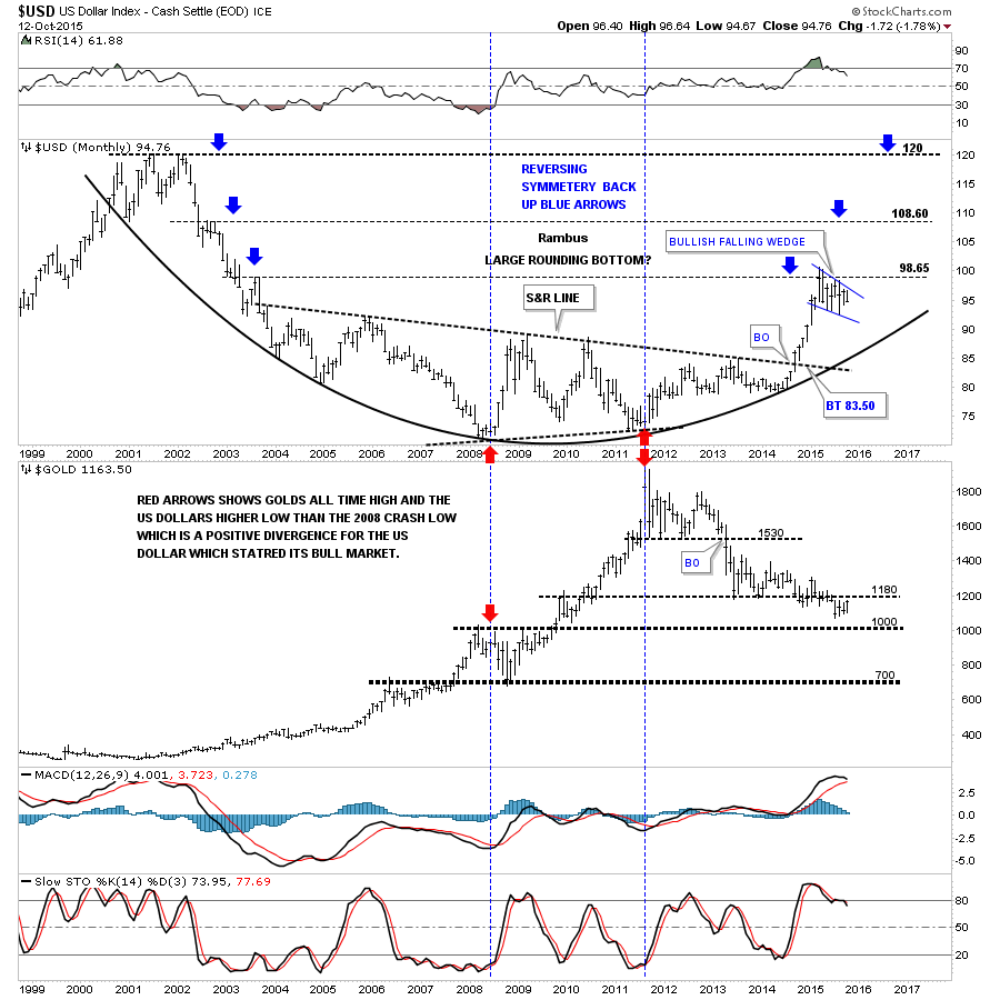
This next 15-year monthly chart for the US dollar shows a nice big rounding bottom or base which is needed to launch a big move in any stock or index. The blue arrows on each side of the chart show how the price action is reversing symmetry back up. Many times a stock will go up inversely to the way it came down. The pause at 98.65 was to be expected as that’s where a previous top in 2003 formed. Once this correction ends, I will be looking for a move up to the next area of resistance at the 109 area.
Also, notice that this is a combo chart which has gold below the US dollar. This combo chart gave me my first real clue that gold was topping out and that the US dollar was bottoming. Everything was pretty normal going into 2008 as gold was topping and the US dollar was bottoming (red arrows on the left side of the chart). What happened over the next three years was way out of character for this pair that usually ran opposite to each other, not always but in general. Note the red arrows on the right side of the chart showing the US dollar making a higher low vs the 2008 low while gold ran over a thousand points higher into its all-time high in September of 2011 at 1920. This was a massive positive divergence for the US dollar, which we can see now looking back in hindsight. From the low in 2011 for the US dollar and the high for gold they have been moving opposite to each other again for the most part, with gold not to far off of its low and the US dollar not too far off of its high.
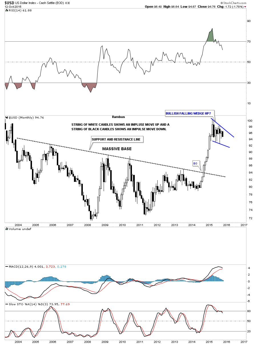
This next ten-year monthly candlestick chart for the US dollar shows the massive base which launched the first impulse move up. When you see a string of white candlesticks all in a row, you know you’re in a strong impulse move up. It’s just the opposite in a strong move down where you’ll see a string of black candlesticks all in a row. Note the ten year chopping action during the formation of the big base which basically went sideways. Compare that price action to the near vertical move the nine white candlesticks made once the breakout occurred. This is called an impulse move.
Once a stock has a big impulse move like this, it eventually needs to rest before it can move higher. This is what the dollar has been doing since it topped out. With the near vertical move out of the big base, many times a stock will consolidate that move forming a much smaller consolidation pattern which will show up as a halfway pattern. This means that when this particular consolidation pattern finishes building out, we should see an equally strong impulse move higher which will leave the blue falling wedge in the middle of two strong impulse moves. How much longer this blue consolidation pattern will last before it breaks out is unknown. What we do know is that when the dollar is ready to move, we will see a very strong rally according to this principle.
Let's work our way back to the beginning of the big impulse move up by looking at a daily chart for the US dollar. The US dollar's big rally started with a five-point blue rectangle reversal pattern at the bottom of the chart. In case you’re wondering, BO means breakout and BT means backtest. In a strong impulse move, it’s not uncommon to see up to three small (in this case red) consolidation patterns form the impulse leg. At the top of the chart you can see the blue falling wedge that has been building out since March of this year. This is where patience comes in while waiting for the dollar to finish consolidating the move from roughly 79 to 100. Usually during a correction -- such as the dollar has been experiencing since the top -- a stock can correct up to 38%, 50% or as much as 62% of that impulse move. These percentages are Fibonacci numbers. If you recall, I showed you where 92 should be strong support on the first monthly chart we looked at above. So far, the US dollar has corrected 38% of that big move at 92.47 (red arrow).

From a Chartology perspective, this is how I see the US dollar. Long-term it’s still bullish with the short-term trend being neutral consolidating the big rally. It now becomes a waiting game.
Precious Metals
CAF: You just finished a review of the precious metals complex. What did it indicate?
Rambus: As I mentioned earlier, I didn’t even become aware of the gold bull market until the spring of 2002. Up until that point I didn’t know a junior from a major. It was all new to me. I’m so glad I found the bull market in gold when I did because the bull market was a thing of beauty. From a Chartology perspective it just doesn’t get any prettier. I have told my members several times that they will study gold’s bull market in the future just like we study the 1929 stock market crash.
Most folks don’t know I was really bullish on gold and the whole precious metals complex up until the top in 2011 when the bull market ended. Since we got Rambus Chartology up and going there has been very little to be bullish about, so most think I’m a long-time bear. But that would be far from the truth.
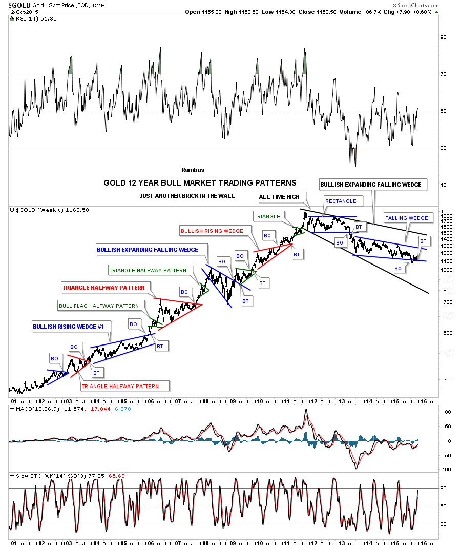
The long-term weekly chart below shows the most beautiful bull market I’ve ever had the pleasure to trade. This chart will give you an understanding of what Chartology is all about. I call this chart, "Just Another Brick in the Wall." You will notice that after each consolidation pattern there was an impulse move up, which led to the next consolidation pattern which led to the next impulse move up, so on and so forth all the way up to the bull market top in September of 2011. If you look closely you can see several small green triangles that formed as a halfway pattern between each impulse leg, similar to what I showed you with the US dollar’s blue falling wedge. It’s the same principal.
Note how the character of gold changed once the bull market topped out in 2011. Instead of making higher highs and higher lows gold has been making lower highs and lower lows which tells us gold is in a bear market.
The first consolidation pattern to form during this ongoing bear market was a six-point rectangle consolidation pattern that broke down in April of 2013. I can still remember all the gold bugs calling that impulse move down manipulation. From a Chartology perspective, that was exactly what I wanted to see. It makes me cringe to hear that word as you couldn’t have such beautiful chart patterns if gold was manipulated. All those chart patterns were formed by millions of investors each individually adding their own two cents worth to each chart pattern.
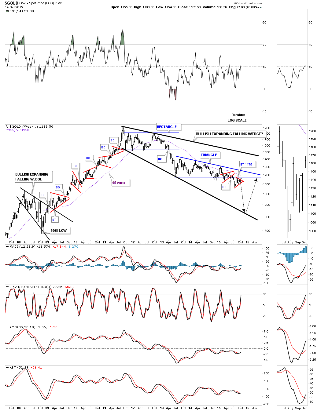
Since gold has been in a bear market since 2011, the latest chart pattern that has formed is the two-plus years blue falling wedge, which I consider to be a halfway pattern to the downside when all is said and done. Just look at the left side of the chart during the bull market years when each consolidation pattern broke out to the upside. Now look at how our current bear market is unfolding opposite to the bull market. This is how markets work.
On a bullish note, gold could be forming the last consolidation pattern within this bear market. If the blue falling wedge breaks out to the downside, which I expect it will, this next impulse move down may very well complete the bear market. As you can see, I’ve labeled this four-year bear market as a possible bullish expanding falling wedge. You can compare this possible bullish expanding falling wedge to the same pattern that formed the low for gold during the 2008 crash -- it's the same pattern, just on a longer time-frame. Even though I’m bearish for the short-to-intermediate term, I can still see the bull market continuing when the top black rail of the potential bullish falling wedge gets broken to the upside.
This next chart for gold is a weekly look that brings the potential bullish expanding falling wedge into focus. I did take some liberties with the bottom blue rail and instead of having it slope down as shown in the weekly chart above I’ve made it horizontal. I did that because of the two small red consolidation patterns. Sometimes (as in this case) you will get a bearish setup when you see a small consolidation pattern form just above, just below or one-on-top and one-below an important trendline. Here, you can see that we have one above and one that looks like it may be completing as we speak, just below the bottom trendline.
You can see how the bottom blue rail has held support for over two years. Once gold broke below that botttom blue trendline, everyone who bought gold since the bull market peak in 2011 is now underwater. This is the psychology part of Chartology. Everyone is now trapped from above the horizontal blue trendline and they will be looking for a place to break even or to take a loss just to end their pain. This is the essence of how support and resistance works. The black arrows shows how this bear market might end. It won’t be pretty, but important bottoms never are.
Let's take a quick look at the HUI (the most widely watched Precious Metals Stock Index which contains the largest miners) since its inception back in 1996 which shows many different chart patterns. The HUI built out a big inverse H&S bottom in 2000 which launched its bull market. It built out three blue triangle consolidation patterns during the main part of its bull market. That part of the bull market ended with the small H&S top that formed in 2007. It was a relatively small pattern and the bull was so powerful that I took a lot of flack for that call. After the low from the 2008 crash was in place, the HUI rallied back up to make a slightly higher high vs the 2007 H&S top. Note how symmetrical the H&S top was that ended the HUI’s bull market. That’s one of the prettiest H&S tops you’ll find anywhere, but few recognized it at the time. The whole bull market ended up being a massive 13 year bearish rising wedge. The neckline and the bottom rail of the bearish rising wedge broke down around the same time which really put the last nail in the coffin for the gold promoters.

Equity Markets
CAF: Let's turn to the equity markets. You have been charting the stock market for quite some time. Perhaps you can say a bit about your history tracking the S&P 500. You just finished looking at a 20-year monthly chart for the SPX – the S&P 500 Index. What did you see?
Rambus: As you know, the stock markets took a pretty decent hit back in August of this year which did some technical damage on the short-to-intermediate term scale. The big question on everyone’s mind is, is this the start of a brand new bear market? As always, let's start by looking at the long-term charts for the SPX and work our way back to the shorter-term charts so we can put this latest move in perspective.
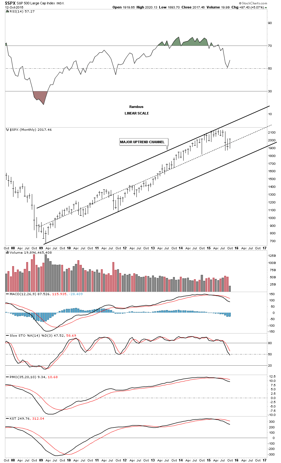
Let's start with just a very simple monthly chart for the SPX which shows the parallel uptrend channel that began forming in 2009. So far, there haven’t been any violations of the bottom trendline. The move down in August came close to breaking below the October low from last year, but support held. This chart shows you what a bull market looks like with higher highs and higher lows forming for over six years now.
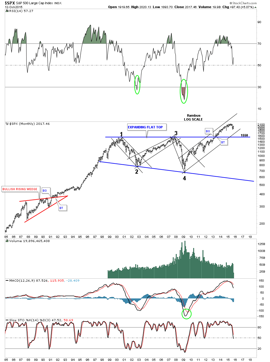
This next very long-term monthly chart for the SPX shows the 13 year flat top expanding triangle consolidation which the SPX broke out of in early 2013. This is a massively large consolidation pattern which strongly suggests our current bull market has much further to run. I know it’s hard to believe from a fundamental point of view, but the SPX has been climbing a wall of worry since the 2009 crash. Every time there is a small correction, the bears come out of hibernation. At some point, they may be correct if the top rail of the expanding flat top triangle at 1550 gets broken to the downside. But until then, the bull lives.
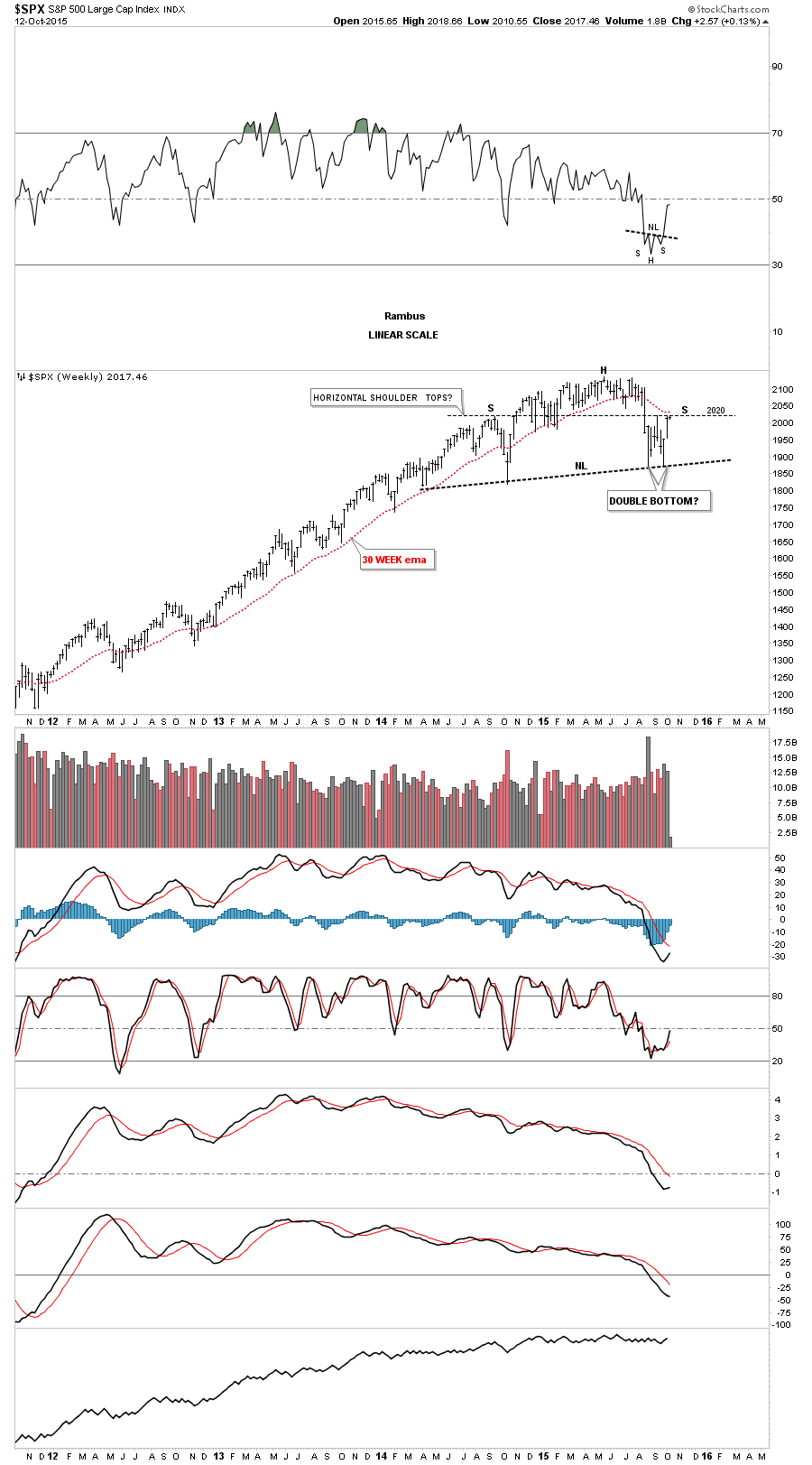
If I were bearish on the SPX, I would be looking at this weekly chart which shows the multi-year flat top expanding triangle. One could make the case for an H&S top with the neckline forming on the October low from last year and the August low from this year. If an H&S top were to play out, I would still be looking for major support to come in on top of the brown shaded support and resistance zone at 1550 to 1570 which would also be a 38% retrace of the entire bull market. The H&S top looks obvious. But when you look at a shorter-term chart, you can see a possible double-bottom forming.
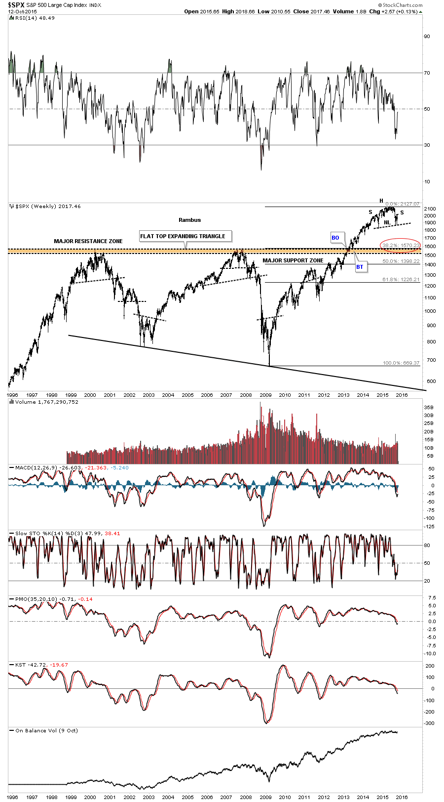
This next weekly chart shows the two possible scenarios with one being bearish and the other being bullish. Again, when you look at this chart the H&S top seems very obvious. On the other hand, I’ve labeled our recent lows as a possible double-bottom. As you can see, the SPX is right at a critical inflection point where the price action is either going to breakout above 2020 signaling the double bottom is in play or the 2020 area is going to hold resistance and the top for the right shoulder will be in place. We will now know in 20/20 hindsight.
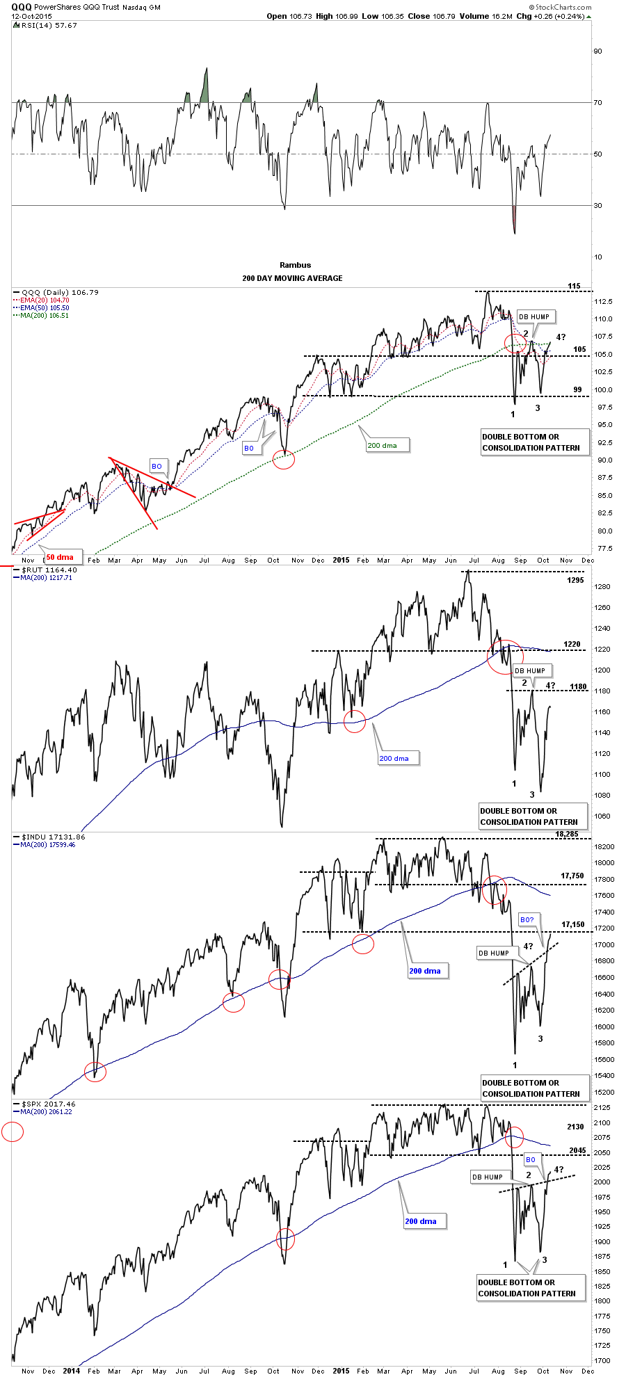
Next, I would like to change it up a bit and look at a daily line chart that has the QQQ, $RUT, $INDU and the $SPX on it which covers the big US stock markets. Looking at these charts from this perspective, you can see the potential double-bottoms that may be forming. The INDU and the SPX have already broken above their double-bottom hump with the QQQ testing its potential double-bottom hump and its 200-day moving average. To be sure, there is still a lot of work to be done before these charts really become bullish, as in trading above their respective 200-day moving averages. But, a bottom has to start forming somewhere if the bull market is going to continue.
The numbers on these charts represent the reversal points if we see a consolidation pattern form to the downside. There has to be a minimum of four reversal points in a consolidation pattern to be valid. At this point, they have all completed three reversal points. A break below their lows would complete a consolidation pattern and would be bearish.
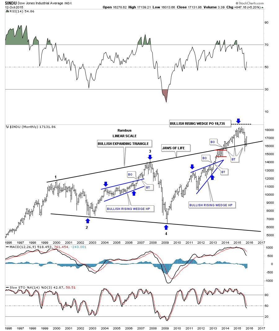
This long-term monthly chart for the DOW shows you the main reason I remain a long-term bull for the US stock markets. I’ve been showing this chart since the day it broke out above the top rail of the bullish expanding triangle. Many are calling this pattern the Jaws of Death. I, on the other hand, am calling it the Jaws of Life. For close to two years now, that all important top rail has held support even though it has been strongly backtested from above in August.
I realize that many folks don’t understand charting and are turned off by it for one reason or another. Investor psychology has been around since the beginning of time and the early investors experienced the same emotions as we do today, which creates these various chart patterns. Even with all the technical advancements over time, the same chart patterns still show up after a hundred years or so.
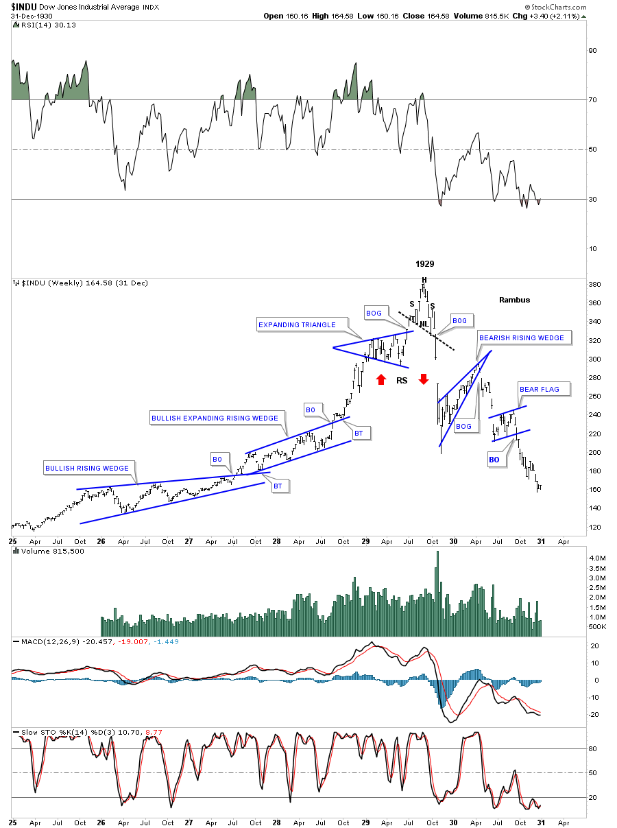
To show you what I mean, I have built a chart that shows the bull market in the INDU (Dow) which began in 1925 or so. I have shown my members many examples of bullish rising chart patterns, such as wedges, flags or expanding rising wedges, that tend to show up in strong moves. As you can see on this weekly chart for the INDU, it built out a bullish rising wedge which broke out to the topside followed by a backtest to the top rail in July of 1927. The INDU then began forming another very bullish pattern, a bullish expanding rising wedge. It had a breakout through the top rail and had a nice clean backtest before the impulse move began. As you can see, the trend is starting to go parabolic. That mania phase formed one last consolidation pattern before the top was put in and that was the blue expanding triangle. Expanding triangles tell you that investors are becoming confused and uncertain as each swing within the expanding triangle is getting bigger and bigger. This particular expanding triangle had six reversal points in it and broke to the upside with a breakout gap.
Few knew it at the time but the INDU’s days were numbered. Note the beautiful little H&S formation that formed the top in 1929 which reversed that parabolic bull run. The neckline was broken to the downside with a big breakout gap. When a parabolic move ends, it wastes little time in chopping around and usually the price action will go down faster than it went up which was the case back in 1929. After the INDU lost almost half of its value, it rallied back up closing the big gap and created a bearish rising wedge which is a very common pattern. The price action gapped out of the bearish rising wedge with a breakout gap and declined close to the October 1929 low where it created a beautiful little bear flag.
If one just knew a little basic Chartology back in 1929, they could have saved themselves from disaster. You don’t have to be a rocket scientist to be able to find many of the different chart patterns. You just have to develop your skill through trial and error. This is what we teach our members to do at Rambus Chartology.
It has been a very rewarding experience for me to watch many members at our forum learn and grow in their trading, to the point where they are making consistent gains in their portfolio using the principles we teach. We have a contest at the Forum and many members trading the contest have made 100% plus plus gains using 3X leveraged ETF's.
There are no absolutes when it comes to the stock markets. All you can do is get the odds in your favor.
CAF: Rambus, this has been fascinating. I am going to take some time to digest these charts and your analysis. I can’t thank you enough -- I know that this has been quite an effort on your part. I feel like I have an invaluable framework to help me navigate the financial markets in the 4th Quarter. I would encourage our subscribers to check out your site as a source of this kind of support on an ongoing basis:
Rambus Chartology: http://rambus1.com
Rambus: Thank you Catherine for having me on your show.
I have been a fan of your work for many years and it is a great experience
to connect with you and your community.
© Solari 2015