By Chuck Gibson
Many wonder why market technicians spend so much time analyzing the charts. The main reason is a skilled analyst can find opportunities, warnings and most importantly expectations of the future buried in price movement. Over the next couple of weeks blog posts I am going to not only go dust off some old charts I created a few years back (when I first started work on my CMT designation) and see how they are playing out but also introduce a few new ones.
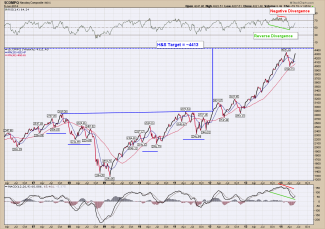
This week let’s start off with an old chart I created at the start of 2012 and have presented every year since then of the U.S Nasdaq market. At the start of 2012, based on the prevalent bullish pattern that developed after the 2011 (-20%) pullback, the price objective of that pattern pointed at 4413. At the time the Nasdaq was about 2900 as you can see. I didn’t want to believe it. After analyzing and reanalyzing because of my disbelief, I thought to myself there had to be something wrong with the chart. If not the chart, it had to be me. I had to be either drawing or interpreting it incorrectly. There was no way it was going to go up an additional 50% from there. Jump forward almost 3 years and we can see the high created earlier in March of this year topped out at 4336. That is less than 2% away from the pattern target. If you are like me, you are wondering if now that it hit its target is that the end of the run or do we need more time to see if it can push higher?

