
By Paul Ferguson
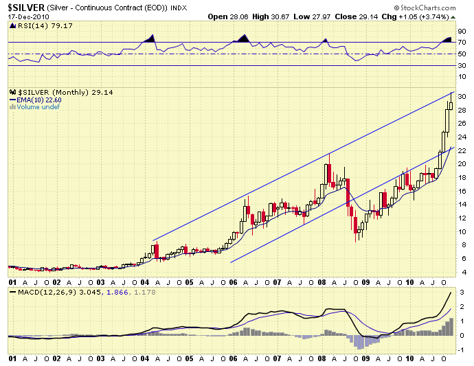
Going with the sailing analogy here. Silver has set a course to the northeast. When we look at it on a monthly chart—a timeframe that filters out short-term noise—we can see Silver moving along this course, tacking regularly but moving inexorably northeast.
In 2008, buffeted by the global financial storms, the good ship Silver got blown off course. After moving along the south side of the channel for two years, the spinnaker was hoisted, pulling Silver back into the channel at full speed and taking it quickly to the north side of the channel.
There are a couple of potential scenarios that come to mind. One scenario is that Silver tacks here and resumes a course within the channel. Another scenario is that Silver overshoots the top of the channel here just as it overshot the south side of the channel in 2008. While it is impossible to know the future in advance, tools such as charts are useful for providing a graphical view of where we are, how we got here and where we might go.
View larger chart by clicking ‘Continue reading . . .’

