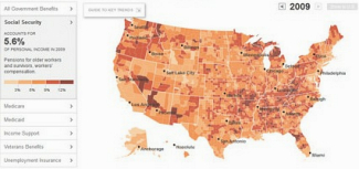
The share of Americans’ income that comes from government benefit programs, like Medicare, Medicaid and Social Security, more than doubled over the last four decades, rising from 8 percent in 1969 to 18 percent in 2009.
Related reading:
Geography of Government Benefit
Perspective (14 Feb 12)
Even Critics of Safety Net Increasingly Depend on It
The New york Times (11 Feb 12)
You may post questions or comments for Catherine at the bottom of this blog post (click on blog post title above, this will take you to the page to view the full blog post, scroll down to the bottom of that page and type in your comment

