
July 21, 2016
Rambus: Blockbuster Chartology - 2nd Quarter 2016
By Catherine Austin Fitts
My "go to" website for technical analysis of precious metals, the US dollar & the US stock market is Rambus Chartology, where Rambus (that's his handle - he's the founding technical analyst) leads a discussion with extensive charts of what the markets are saying.
Last October, the Solari Report did a written interview with Rambus including an introduction here and a discussion of Rambus, his background, technical analysis as well as the word "Chartology." You can find all this information at our first interview:
- Why "Rambus?"
- How Rambus Chartology Got Started
- What Rambus Chartology Does
- About Technical Analysis
- Tracking the Markets
- What does the word "Chartology" mean?
- Rambus: Blockbuster Chartology
In January 2016, Rambus launched his quarterly Solari Report with a Blockbuster Chartology across the four market sectors: Currencies, Commodities, Precious Metals and Stock Markets. You can find it here: Rambus: Are We in a Deflationary Spiral? Then with a challenging 1st Quarter behind us, Rambus returned with his Blockbuster Chartology across the four market sectors in April. Now with the 2nd Quarter behind us, Rambus returns with a Blockbuster Chartology that takes an in depth look at the bull markets in both equities and precious metals.
One of the reasons that Rambus is so good at his craft is that he focuses on "staying on the right side of the major trend." The challenge of doing so at this time is that it is tempting to look for bottoms or to assume that the trend upwards in the US dollar or stock market may be over. However, Rambus consistently brings us back to the discipline of the Chartology. What does price tell us? As he describes so aptly, we are dealing with psychological warfare.
Sitting back once each quarter to get this perspective offers invaluable insight. So, here we go for the 2nd Quarter Blockbuster Chartology!
Blockbuster Chartology
By Rambus
US and World Stock Markets...
With the slow summer months upon us I’ve been working on putting together some interesting charts for the US and world stock markets. Keep in mind it’s not my opinion but it’s my interpretation of what the charts are strongly suggesting. It can be very hard sometimes to keep an open mind to possibilities that few deem reasonable or downright wrong based on their one views. That’s fine because that’s what makes the markets work.
One of the hardest things to do when investing in the markets is to keep an open mind as we are bombarded everyday with so much information that it can be hard to stay objective. This is why Chartology for me keeps things in perspective and shows the unbiased truth of what is actually taking place. When you strip away all the reasons why a stock or stock market has to go up or down the price action is the final arbitrator that tells the truth.
Lets start by looking at a daily chart for the SPX which is good index to see how the big cap stocks are doing. If you recall back in January of this year the SPX had one of the worst starts in history for a new year. That usually isn’t a good sign for the rest of the year as the old stock market adage states, how January goes so goes the rest of the year. I really don’t pay much attention to those old expressions as I’m most interested in what the charts are showing.
Below is a ten month daily chart for the SPX which shows the bad start to 2016 which was the left low for a double bottom reversal pattern. The rally out of the double bottom led to the high in April, which ended up being the first reversal point in the expanding triangle consolidation pattern. Reversal point #4 was created during the BREXIT vote which ended up being the capitulation spike, the fake out before the breakout. The SPX wasted little time in reversing back to the upside breaking out above the top rail last week. The last piece of the puzzle I’m looking at now is a backtest to the top rail of the expanding triangle at the 2125 area for a low risk entry point.

This next chart for the SPX is a much longer term daily chart, which shows some pretty nice symmetry on the left and right side of the much bigger double bottom. The lower brown shaded support and resistance zone on the right hand side of the chart between 2040 and 2050 was doing a good job of holding support until the BREXIT vote, when we got that capitulation spike to the downside. I was looking at the pink shaded area as reverse symmetry, which was showing how the trading range on the right side of the double bottom was matching the symmetry on the left side of the chart in height. I’m showing the price action as a big H&S consolidation pattern, which is just a way to describe the price action below the upper brown shaded S&R zone. We could call the year and half trading range as a double bottom as well. What’s most important at this time is the breakout move above the upper brown shaded S&R zone. All those previous highs as shown by the blue arrows should now hold support on any backtest down to the 2110 area.
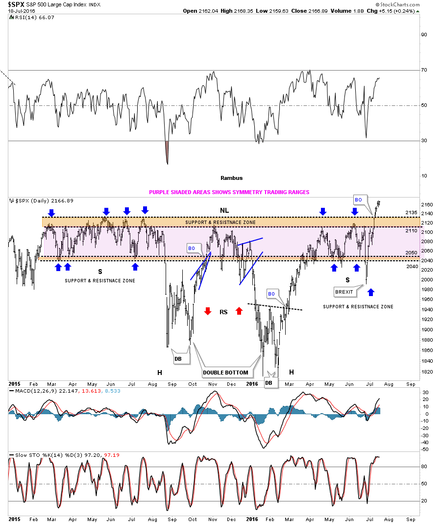
The six year weekly bar chart really puts the trading range in perspective. Most have been looking at this massive trading range as a big topping pattern. Its been a meat grinder for both the bulls and bears alike, but I have always thought this big trading range would end up being another consolidation pattern in the bull market that began in 2009. We now need to see the top rail hold support on any backtest to keep the consolidation pattern alive.

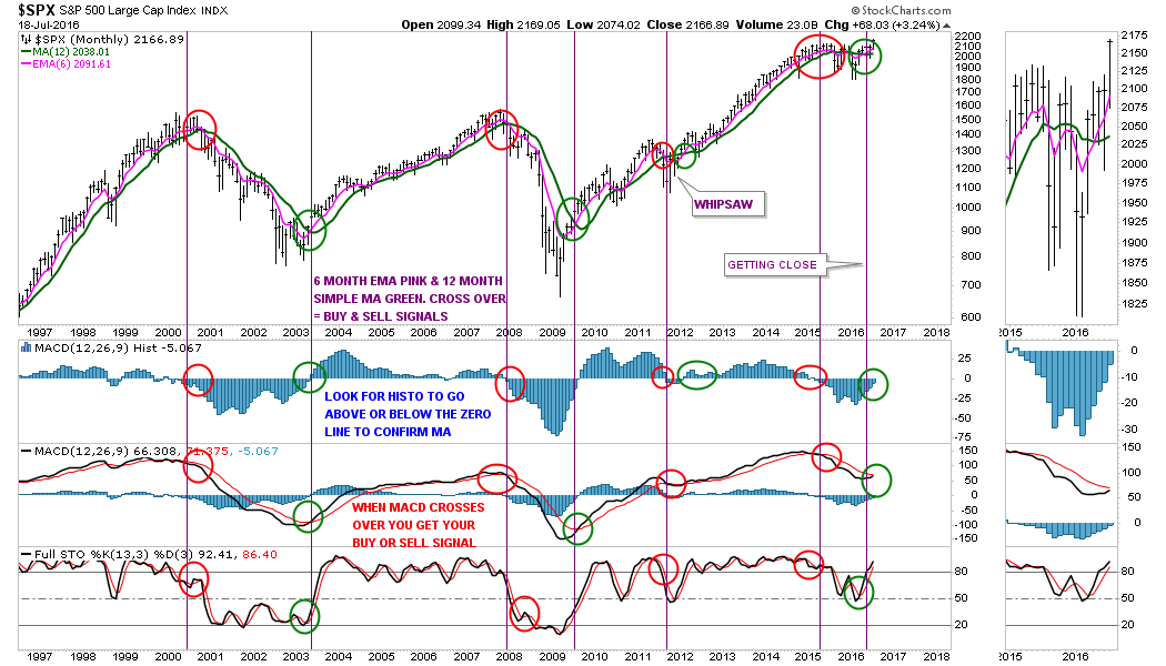
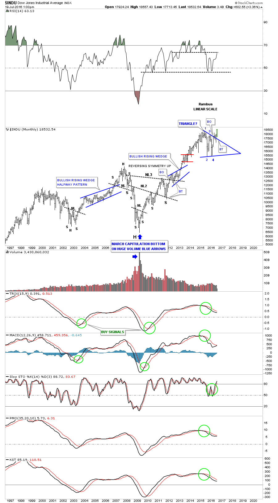
This next chart for the SPX is a 20 year monthly look which shows a simple buy and sell signal. First, lets look at the two moving averages which are the 6 month ema and the 12 month simple moving average. When they cross, that sets up the initial buy or sell signal as shown by the red and green circles. Then we look at the indicators at the bottom of the chart for confirmation of the moving averages crossovers. For a buy signal we need to see the blue histogram trade back above the zero line which it’s currently just below at 5.067. A move above the zero line will be another piece of confirmation for a buy signal. Next we want to see the black line cross above the red line on the MACD, which is getting close. The full stocs at the bottom has already crossed and turned up. As you can see buy and sell signals don’t show up very often but when they do one needs to pay attention.
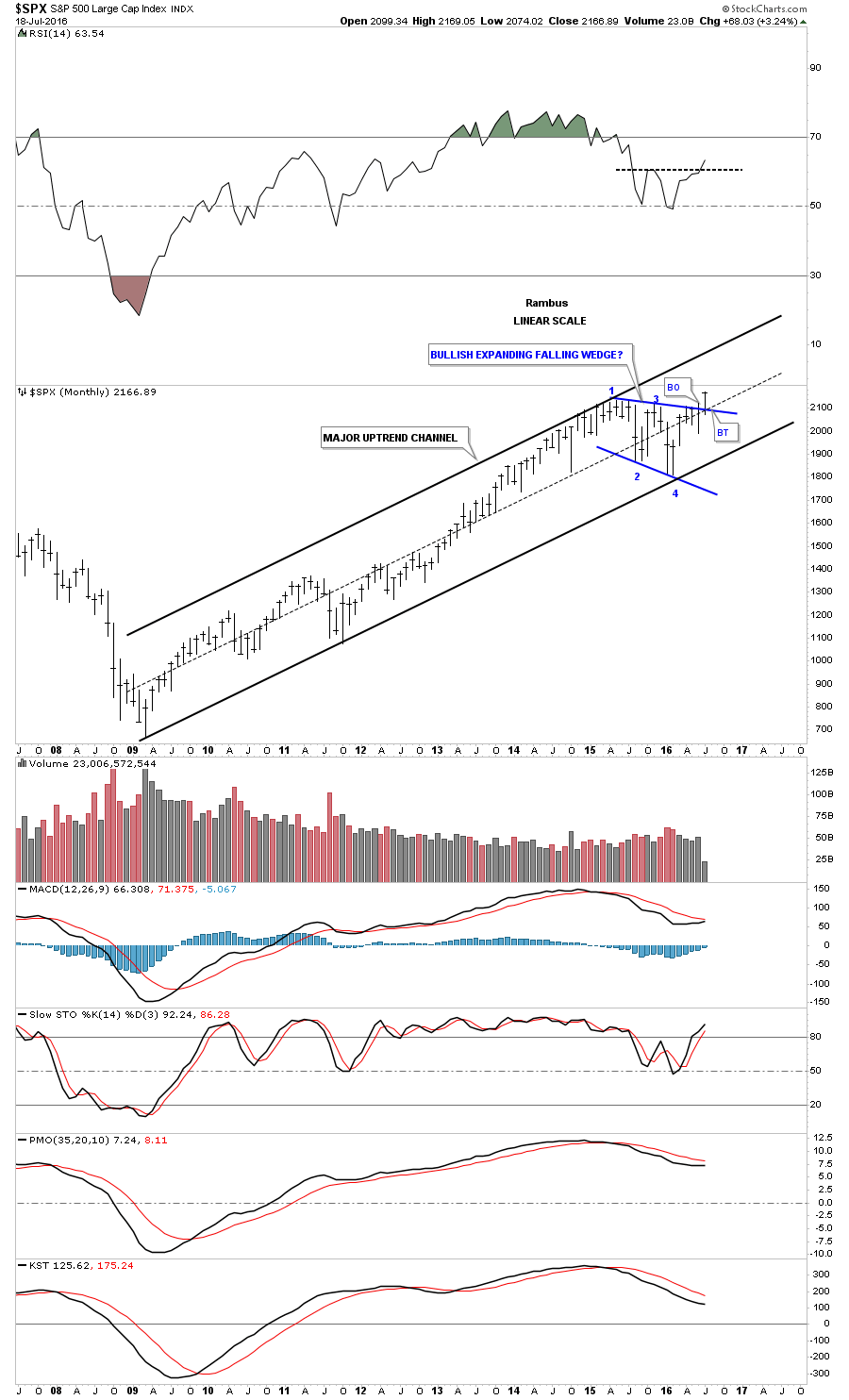
Lets look at one last chart for the SPX which shows its beautiful bull market uptrend channel that began to form at the 2009 devilish crash low at 666. With the blue consolidation pattern complete I would expect the SPX should rally up to the top rail of its bull market uptrend channel in this next impulse move higher.
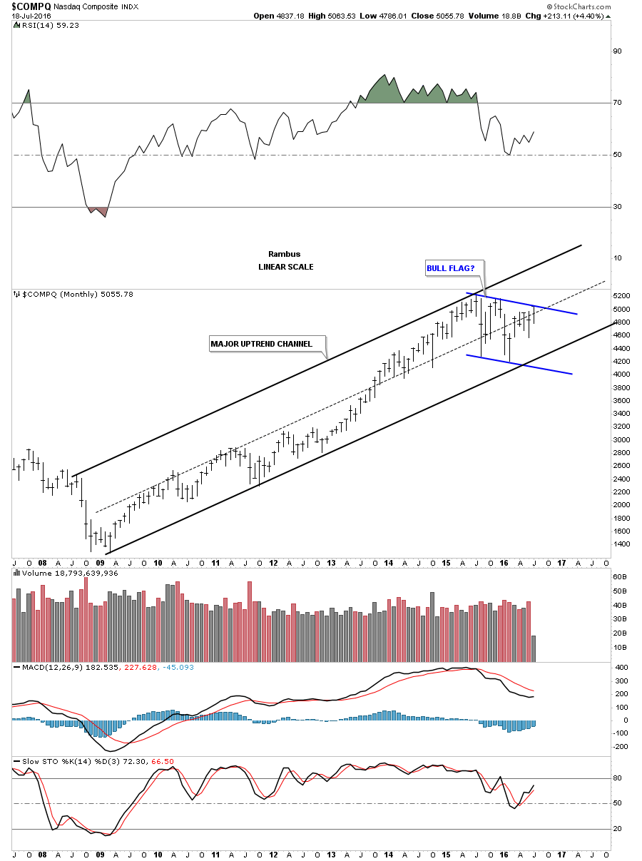
Knowing the main direction of a stock or market is very important to understand as it’s very hard to short a bull market and just as hard to buy in a bear market. It can be done but it’s like a salmon swimming upstream fighting its way to the spawning grounds, some make it and some don’t. Trading in the direction of the main trend is much easier to do as you have the wind at your back. As you’ll see on the following long term monthly charts, which shows the bull market that began in 2009, would have been much easier to trade on the long side vs the short side. It’s been a tough market for both the bulls and bears alike since the last high in 2015, but being on the long side would have given you an edge as the price action is trading closer to the top of the trading range vs the bottom. With that said lets look at some nine year monthly charts for some of the US stock markets.
The monthly chart for the $COMPQ shows its bull market uptrend channel and the potential blue bull flag in which the price action is currently testing the top rail. Notice how the uptrend channel has created all higher highs and higher lows for the most part, with the January 2016 low being just slightly lower than the previous low. In hindsight it’s always easy to see which way one should have traded.
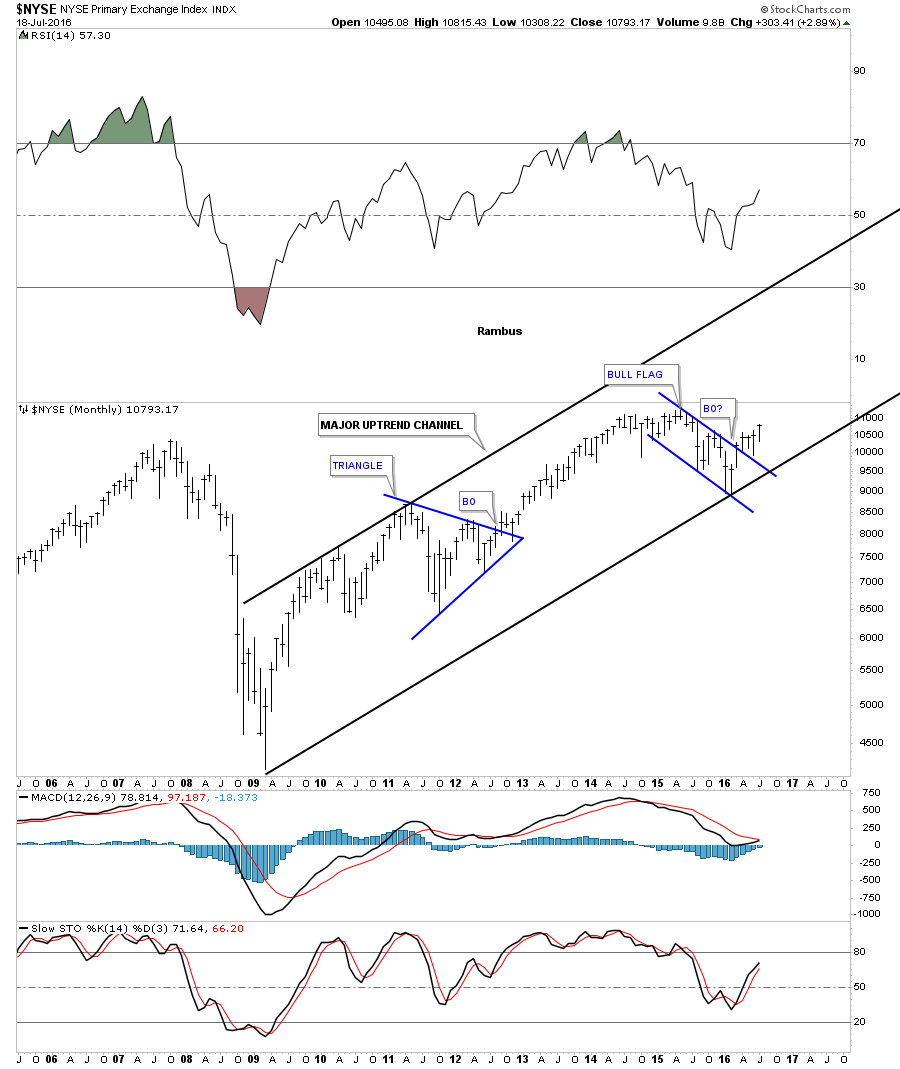
The $NYSE is a broad measure for stocks which shows its bull market uptrend channel, and the blue flag that it broke out of four months ago.
There are two ways the price action can trade between the upper and lower trendlines of a channel. The first way is for the price to fall hard to the downside in an uptrend. The second way and usually takes longer is for the price action to just trade sideways between the two trendlines. The OEX 100 shows it’s breaking out of a rectangle consolidation pattern that has formed between the upper and lower trendlines.

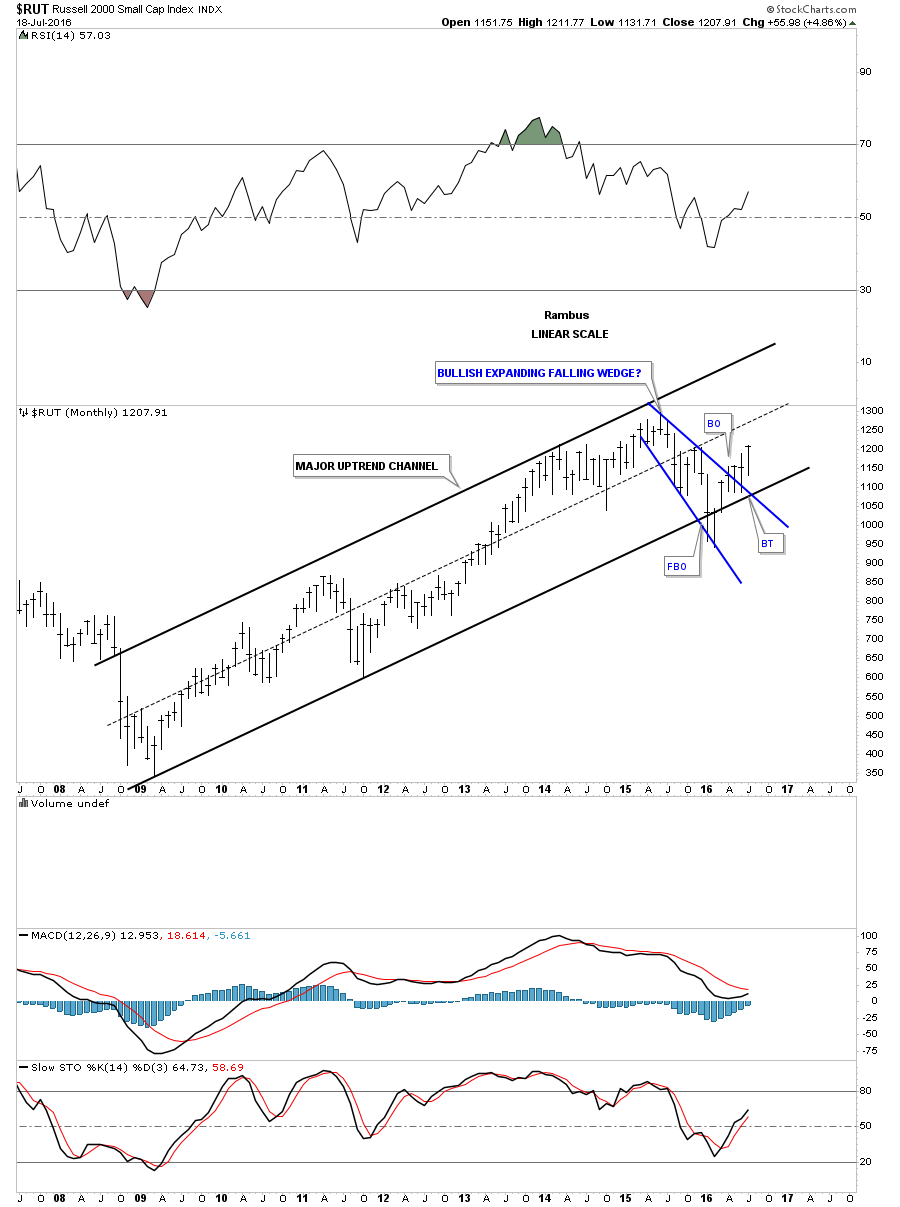
The monthly chart for the $RUT shows it had a false breakout below the bottom rail of its bull market uptrend channel during the weak part at the beginning of this year. It quickly reversed back up trading above the bottom rail, which negated the breakout below the bottom rail. It has since went on to breakout above the top rail of the blue expanding falling wedge.
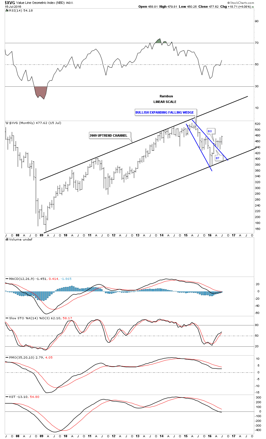
Another broad based US stock index is the $XVG which has broken above the top rail of its blue expanding falling wedge which formed between the top and bottom rails of its bull market uptrend channel.
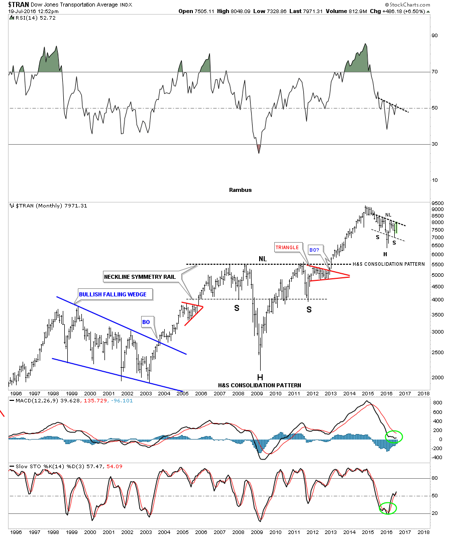
If this bull market is to continue then we need to see the Transportation Average showing some bullish signs and join the party. The daily chart below shows a one year H&S consolidation pattern maturing and getting ready to breakout above the neckline. After breaking out from the blue expanding falling wedge which formed the right shoulder, the price action hit the neckline and sold off for a few days which is what you would expect on the initial hit. We could even see a backtest to the top rail of the blue expanding falling wedge around the 7760 area before another attempt to breakout above the neckline. It’s really a very symmetrical looking H&S consolidation pattern.
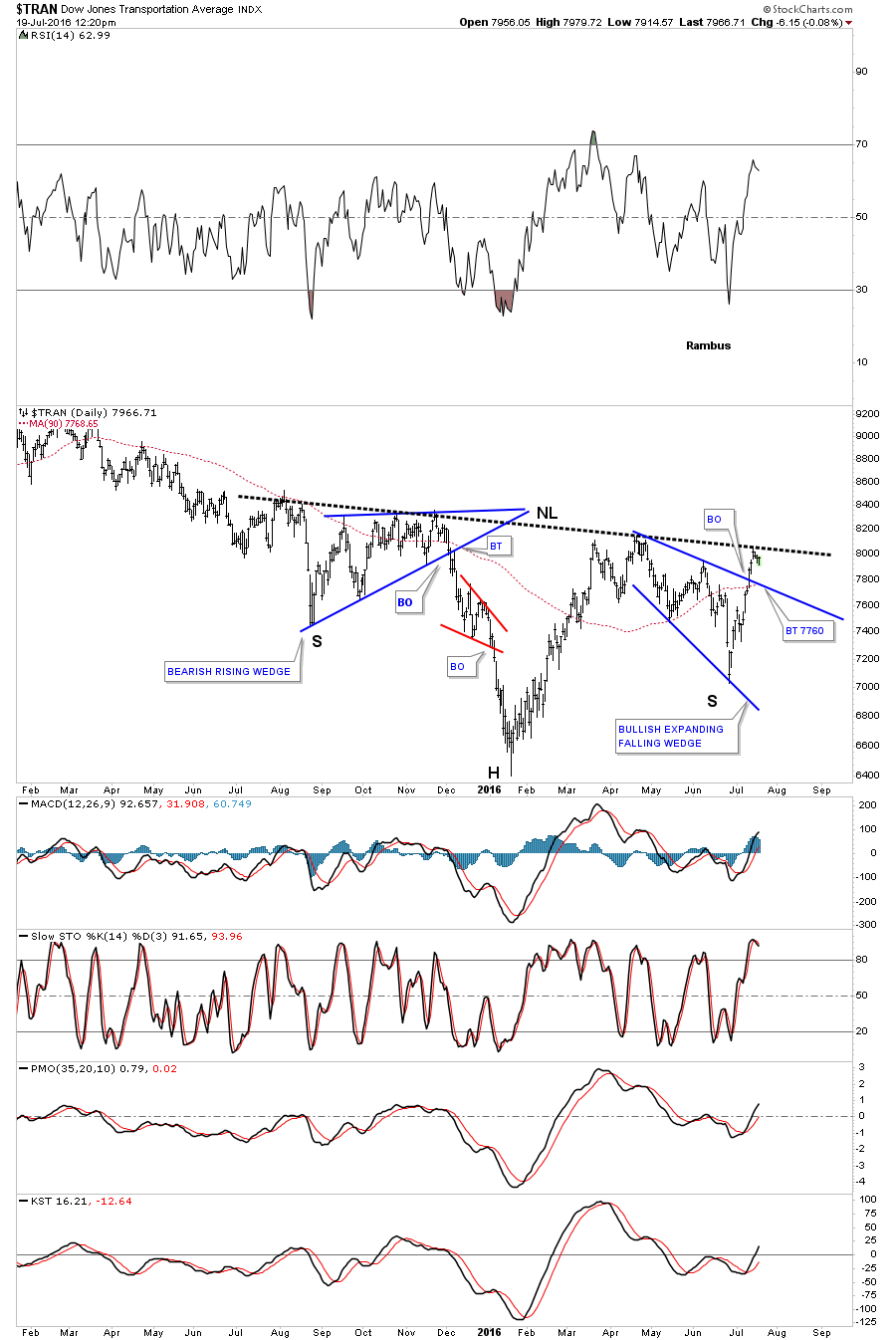
The twenty year monthly chart really puts our current H&S consolidation pattern in perspective. I’ve been showing the massive seven years H&S consolidation pattern ever since it broke out above the neckline. What our current H&S pattern on the daily chart above is showing us is it’s the first consolidation pattern to form since the breakout from the massive seven year H&S bottom.
One last note on the chart below shows the beautiful symmetry of the massive H&S bottom, and our current H&S consolidation pattern. The neckline symmetry rail is just the angle of the neckline brought down to the bottom of the left shoulder, which can give us a place to look for a low for the right shoulder if we see a H&S pattern forming. I put the neckline symmetry rail on our current H&S consolidation pattern which shows the low for its right shoulder as well. Nice symmetry.
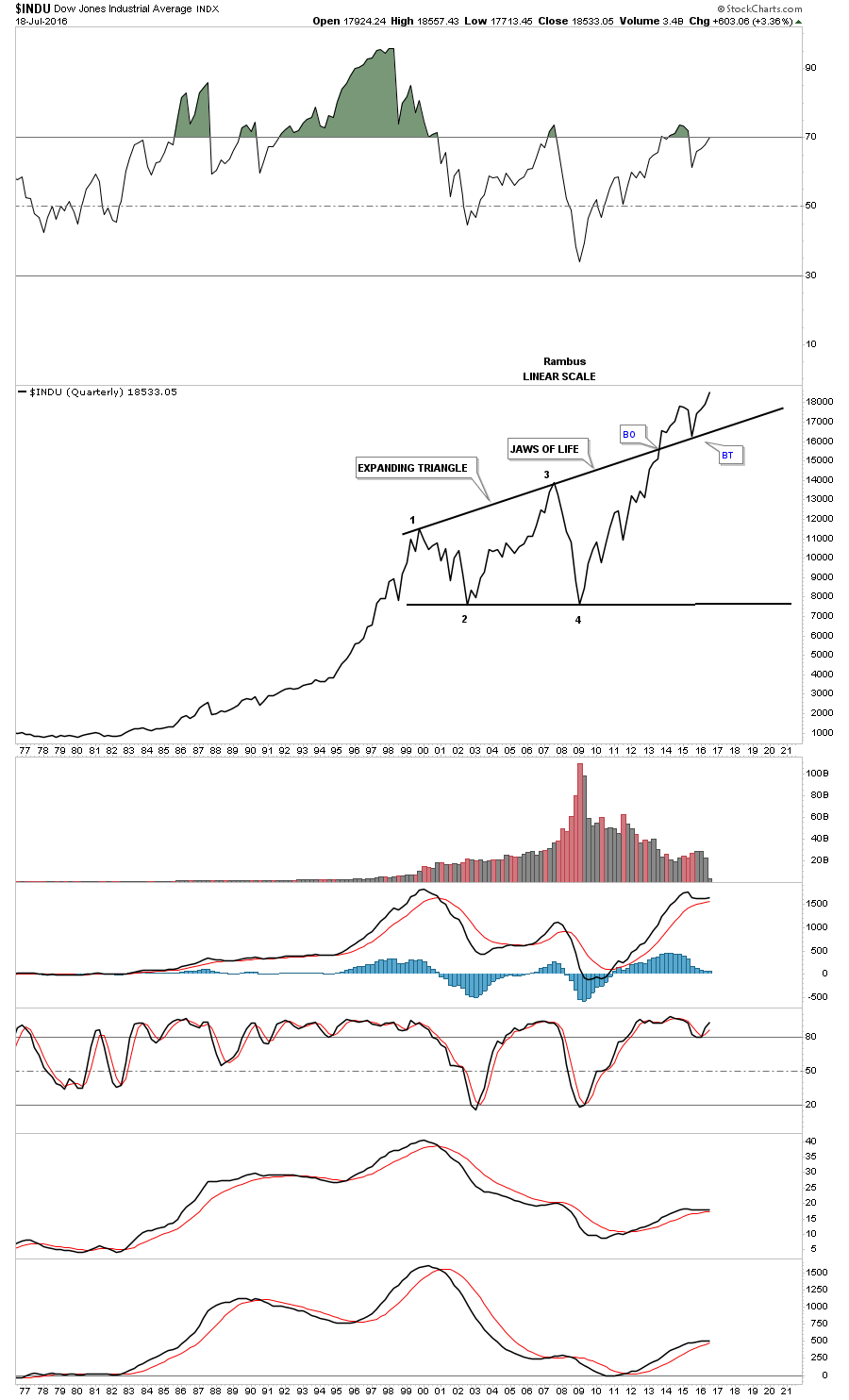
Of all the US stock market indexes, the $INDU had the most serious breach of the bottom rail of its bull market uptrend channel, but when it was able to trade back above the bottom rail that negated the false breakout. Now the $INDU is one of the stronger stock indexes as it has broken out above the top rail of the blue triangle consolidation pattern and has made a new all time high.
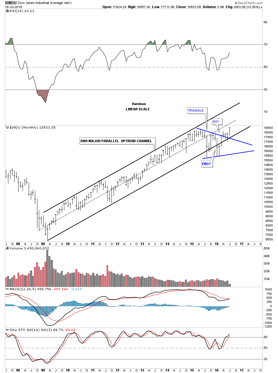
Below is a longer term twenty year chart for the $INDU whch shows you how one of the most hated bull markets of all time looks in reality. The crash that led to the bear market low in 2009 has scared many investors for a lifetime. There are many reasons why this seven year bull market can’t keep going up, but so far all those reasons means nothing when compared to the price action. The 2009 crash has built up a wall of worry that so many will never see what is really taking place in the present. A bull market climbs that wall of worry, or otherwise we couldn’t have a bull market as everyone would be invested all the time. The ending phase of a bull market is when it allows everyone and their brother a chance to get in but that will set up the final top and trap all those late comers to the party. It’s how markets work.
This next long term monthly chart for the $INDU puts the blue triangle, on the chart above in perspective, as it has formed on the top rail of a massively large expanding triangle which I have called the Jaws of Life. Many annalist have been calling this pattern the Jaws of Death, but it doesn’t seem to be working out to good for them. Everything in regards to a big pattern like this is large, and that goes for the breaking out and backtesting process that has been going on since the middle of 2013. Big patterns like this should also give us a big price objective.
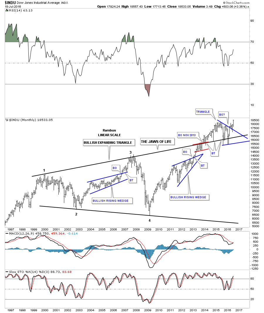
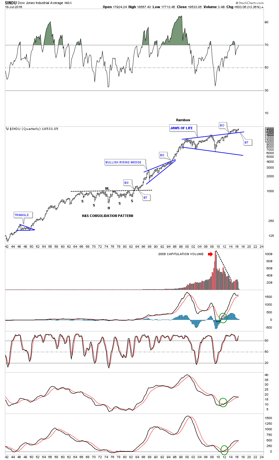
Line charts can take out a lot of the noise a bar chart can make sometimes, whch just shows the closing price. Below is a quarterly line chart for the $INDU which really puts the Jaws of Life consolidation pattern in perspective. First you can see the capitulation volume that signaled the 2009 crash low at reversal point #4. Note how clean the breakout and backtest look on this quarterly line chart. This is one massive consolidation pattern that few recognize the potential of what lies ahead. If you didn’t know the name of this stock or the time frame you would think this stock was in a very strong uptrend by the series of higher highs and higher lows. The breakout above the top rail with the backtest for good measure is the frosting on the cake. I call this pattern the Jaws of Life .
This last chart for the $INDU is a 75 year quarterly chart that really puts the Jaws of Life consolidation pattern in perspective. Some of you may remember the big H&S consolidation pattern that formed back in the 1970’s. I clearly remember the high inflation and high interest rates back then which were signalling the end of the world as we knew it. Stocks were despised and were never going to go up again.
You can see the clean breakout and backtest to the neckline, which launched one of the biggest bull markets in history in the face of economic disaster. Again, if you didn’t know what stock this was, or what time frame you were looking at, you would have to conclude this stock was breaking out of a very well defined trading range with the breakout and backtesting process done.
We’ll only know in hindsight how this plays out but I’ve been posting this Jaws of Life pattern ever since the breakout occurred. The only thing that I didn’t anticipate was the length of time the backtesting process would take. The breakout and backtest to the neckline during the 1970’s H&S consolidation pattern would have been a piece of cake compared to the breakout and backtest of our Jaws of Life. It has taken much longer to complete backtest, the key word being complete, than I originally thought. If we continue to see the $INDU make new highs there will be no doubt that the Jaws of Life is a massive consolidation pattern that will lead to much higher prices in the years to follow regardless of all the fundamental reasons why it can’t keep going up.
Lets switch gears and look at some of the many different sectors that make up the stock markets. If the stock markets are looking bullish then we should see some underlying strength in the sub sectors. To keep a bull market going there can be rotation taking place between the sub sectors, with some getting hot, while others are consolidating their recent gains. This will happen until the final top is made. Normally when a very important top is being made the strongest sectors will top out before the weaker sectors. As the stronger sectors begin to trade sideways, the weaker sectors pick up the slack and push the bull market higher without the generals. It can be a very long process before each sector finally tops out and a new bear market can begin. This is what happened during the tech bull market that ended in 2000. Each sector got its shot at the bull market before the final top was made.
The $BKX, Banking Index, is a very important sector when it comes to keeping the bull market alive. It has been bouncing off the bottom rail of its major bull market uptrend channel over the last year or so.

It doesn’t hurt to have the $RXL, retail sector, making new bull market highs in a parabolic uptrend channel.

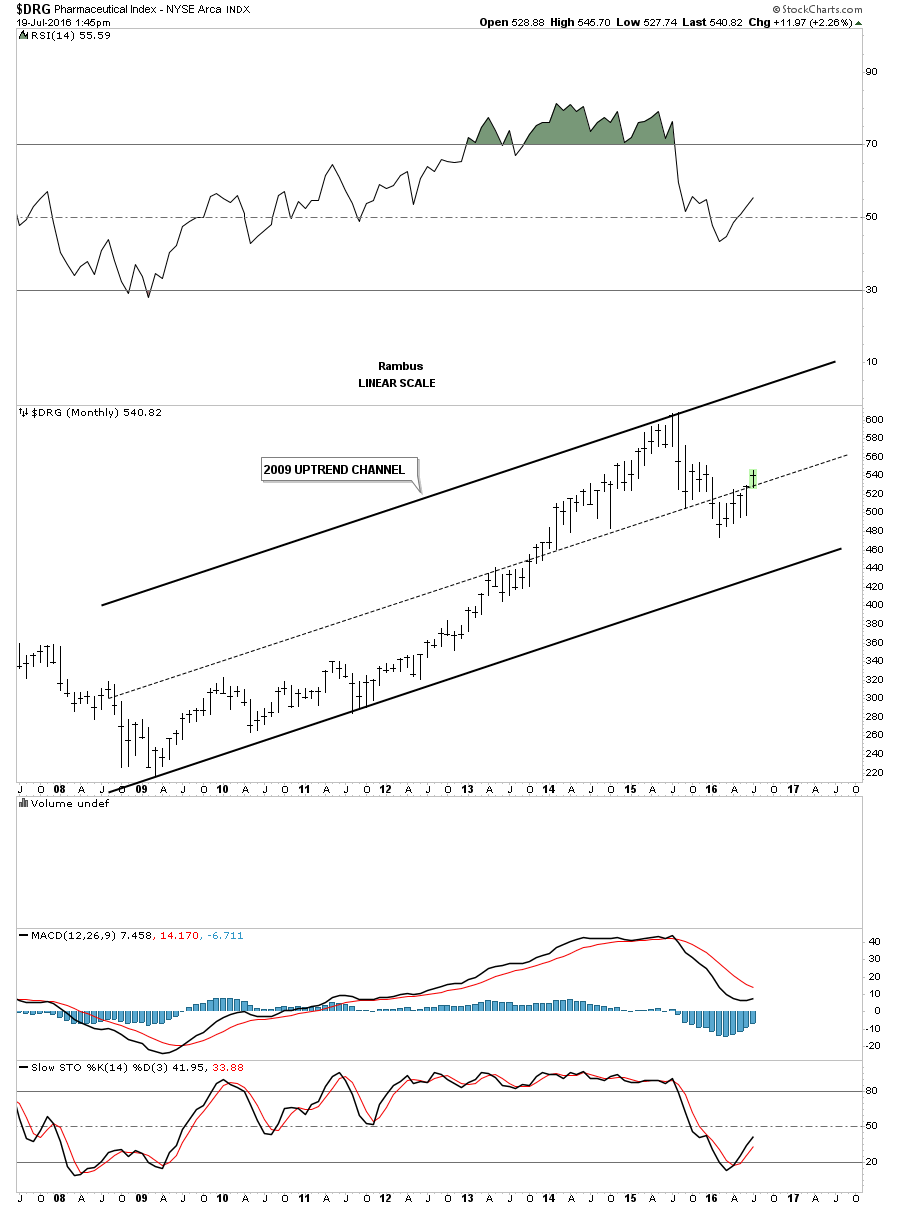
The $DRG, Pharmaceutical index, is trading right in the middle of its bull market uptrend channel with a lot of overhead room to move higher.
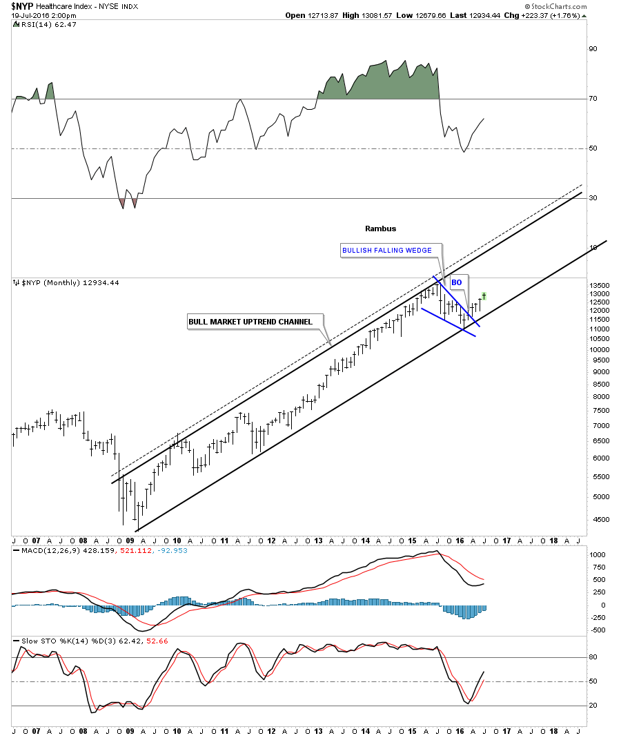
The $NYP, Healthcare index, has been one of the best places to be invested during the seven year bull market. It bounced off the bottom rail of its bull market uptrend channel at the beginning of this year, and has just recently broken out of the blue bullish falling wedge.
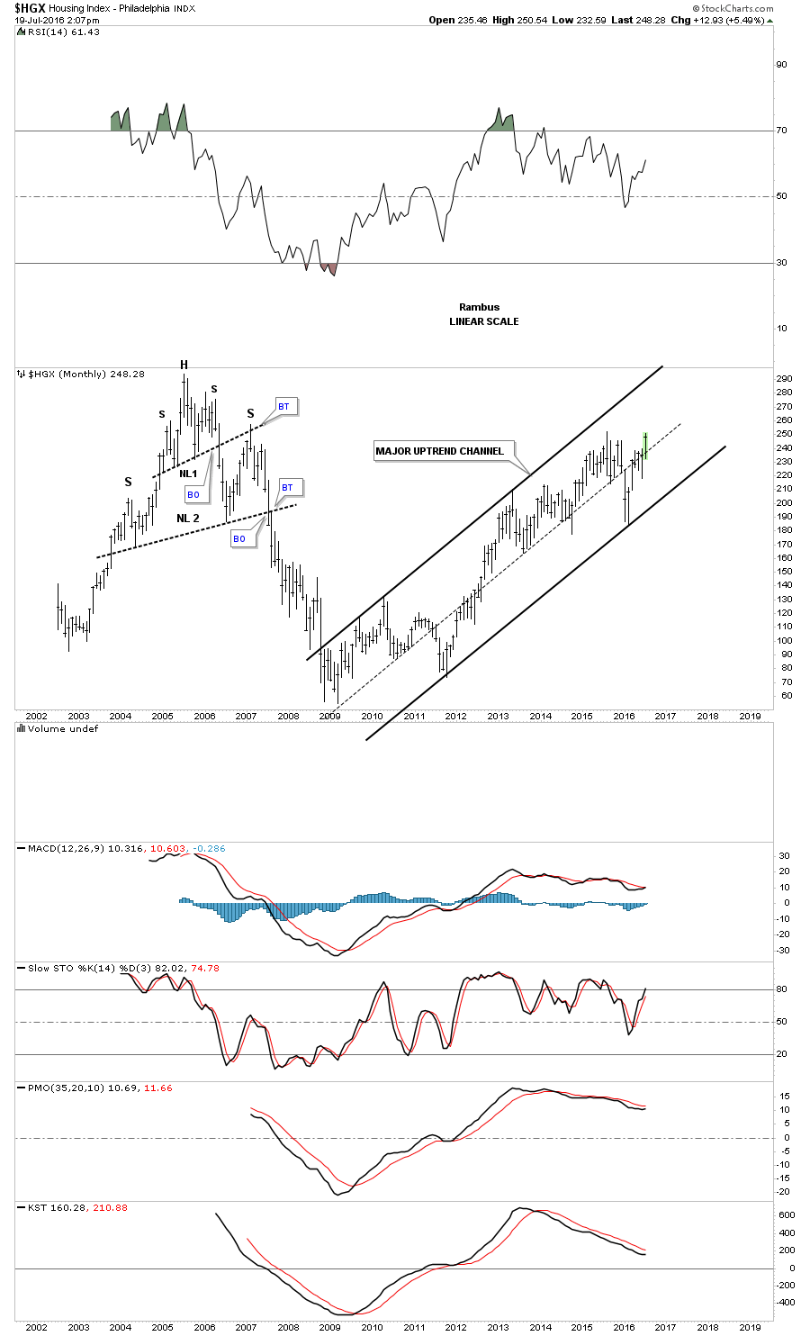
It’s always a good sign to see the $HGX, Housing index, moving up strongly in its bull market uptrend channel.
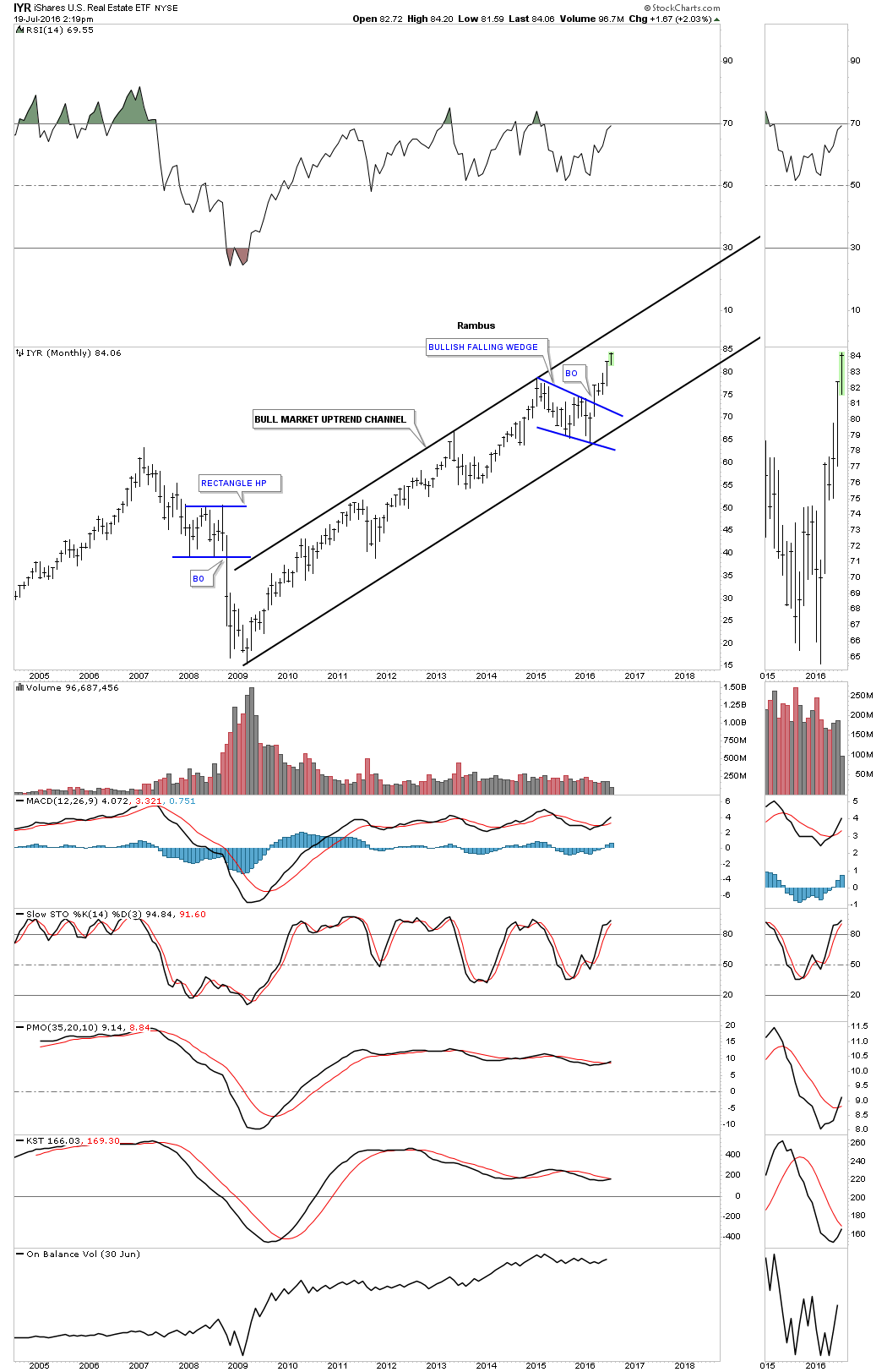
One of the strongest sectors in the markets right now is the IYR, Real Estate. The 2009 crash doesn’t look so ominous now as the IYR is making new all time highs.
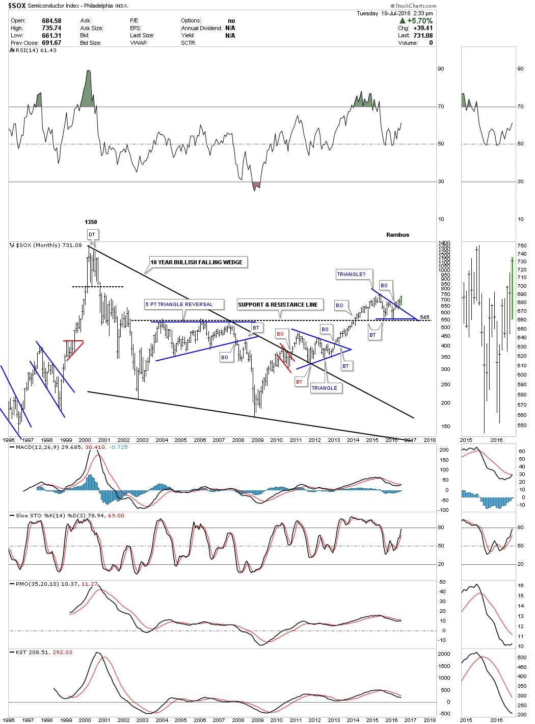
It’s always nice to see the tech sector doing well in a bull market. Below is the $SOX, Semiconductor index which is breaking out from the blue triangle consolidation pattern. The blue triangle has formed right on the black dashed support and resistance line, taken from the top rail of the big five point triangle reversal pattern that formed during the bear market years. Also notice the big ten year black bullish falling wedge, with the breakout and backrest forming the lower blue triangle. This sector looks like it may pick up the slack while other areas of the markets consolidate for awhile.
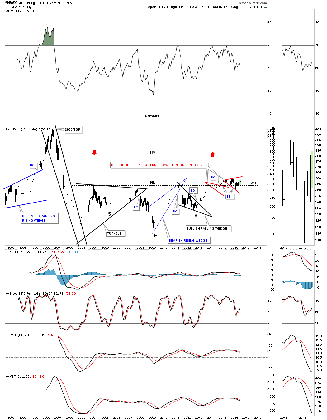
The $NWX, Networking sector, has been one of the weaker areas in the tech complex. I’ve been showing this chart for several years, which has been taking its time breaking out and backtesting the massive ten year H&S neckline. As you can see there is one small red consolidation pattern that formed below the neckline, and now there is another small red consolidation pattern forming above the neckline. This is usually a bullish setup and strongly suggests the H&S bottom will fulfill its measured move. Once this index finally gets ready to run we could see some reverse symmetry to the upside, as shown by the red arrows.
In the last part of this post I would like to show you some world stock markets that may shed some light on the bigger picture, which is most important to understand. I always look at the bigger picture first, and then work my way back to the smaller time frames to see where a stock has been relative to where it’s currently trading.
Lets start with the $FTSE 100 in Great Britain which gave the rest of the world a big scare when it voted to leave the Euro Union. For several days after the vote it felt like the world was going to implode into a black hole but the $FTSE had a different plan, which was completing the right shoulder of a one year H&S consolidation pattern.
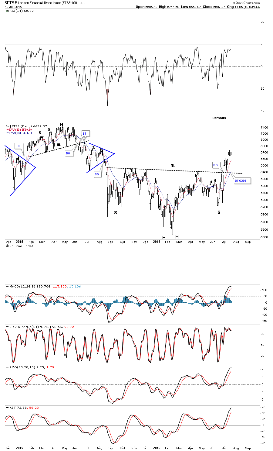
The weekly chart below shows a very symmetrical H&S bottom complete with a breakout and backtest to the neckline.
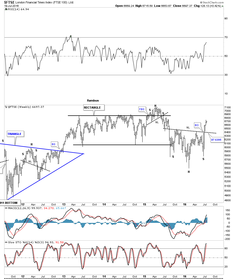
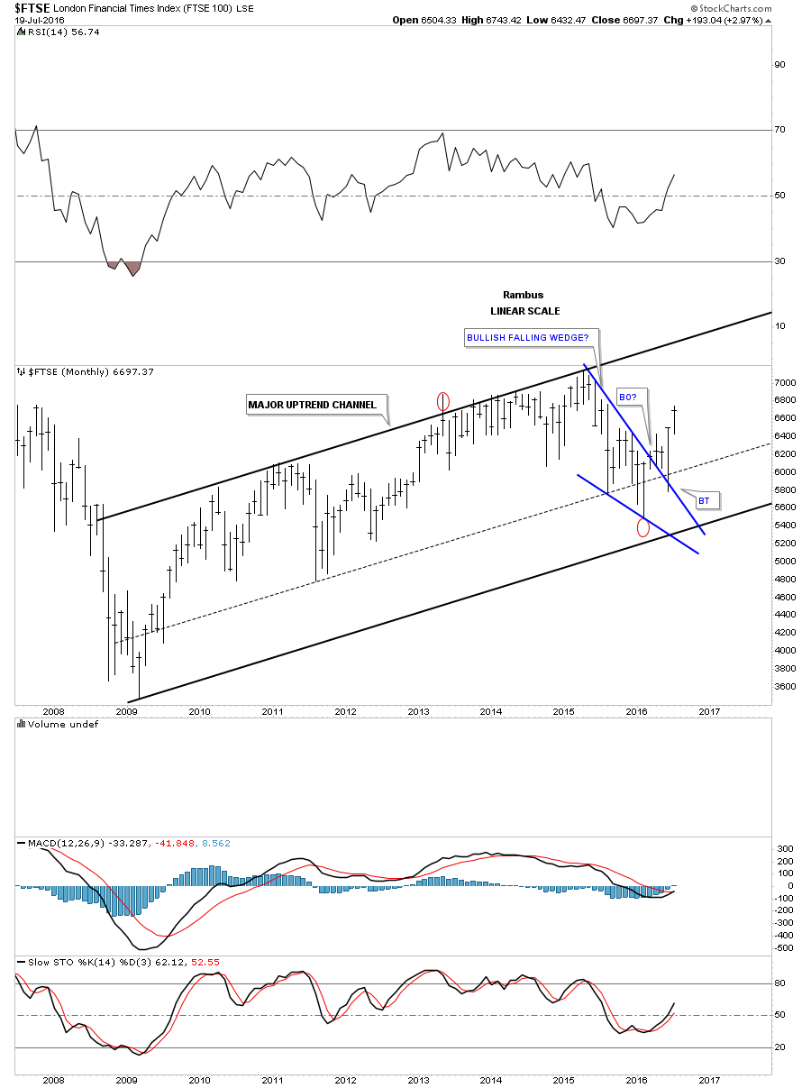
Like everything we looked at on the charts above, the $FTSE shows a nice bull market uptrend channel that began to from at its 2009 bear market low. The smaller consolidation pattern on this monthly chart shows the blue bullish falling wedge breakout, and the BREXIT vote which led to the backtest.
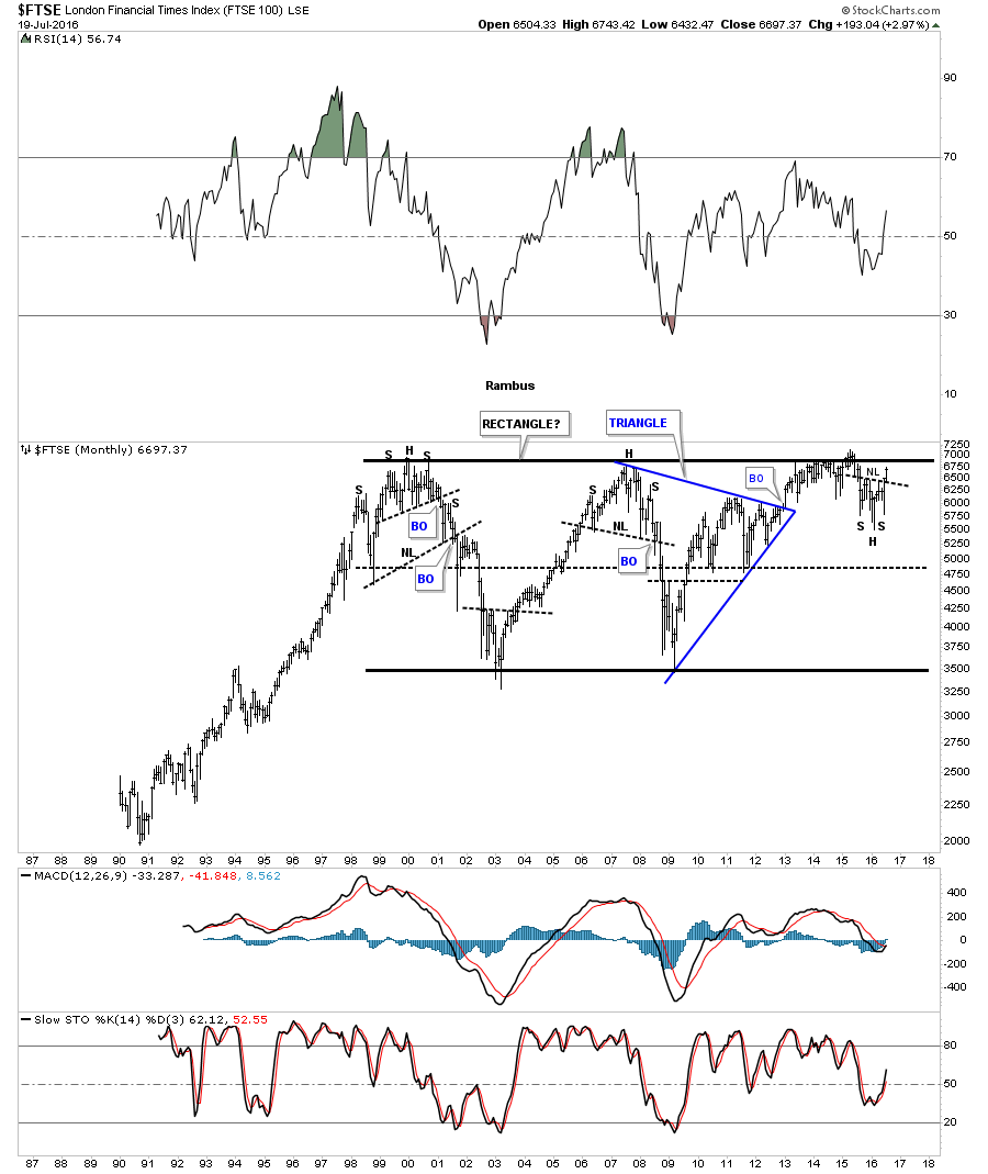
This last chart for the $FTSE goes back 26 years and shows its massive rectangle trading range starting in 2000. The bullish setup here is the H&S pattern we looked at on the daily chart above. Many times you’ll see a small consolidation pattern form just below a very important trendline, which will then give the stock the energy in needs to finally breakout above the resistance line.
Another important piece of the puzzle in regards to a rectangle formation is when the last reversal point in the rectangle fails to move lower than the center dashed mid line. In this case, it tells us the bears only had enough energy to take the $FTSE down to the center of the rectangle before the bulls took charge and moved prices higher. A solid breakout above the top rail of the 16 year consolidation pattern will be a very big deal and will be just another clue that the bull market that started in 2009 is alive and well.
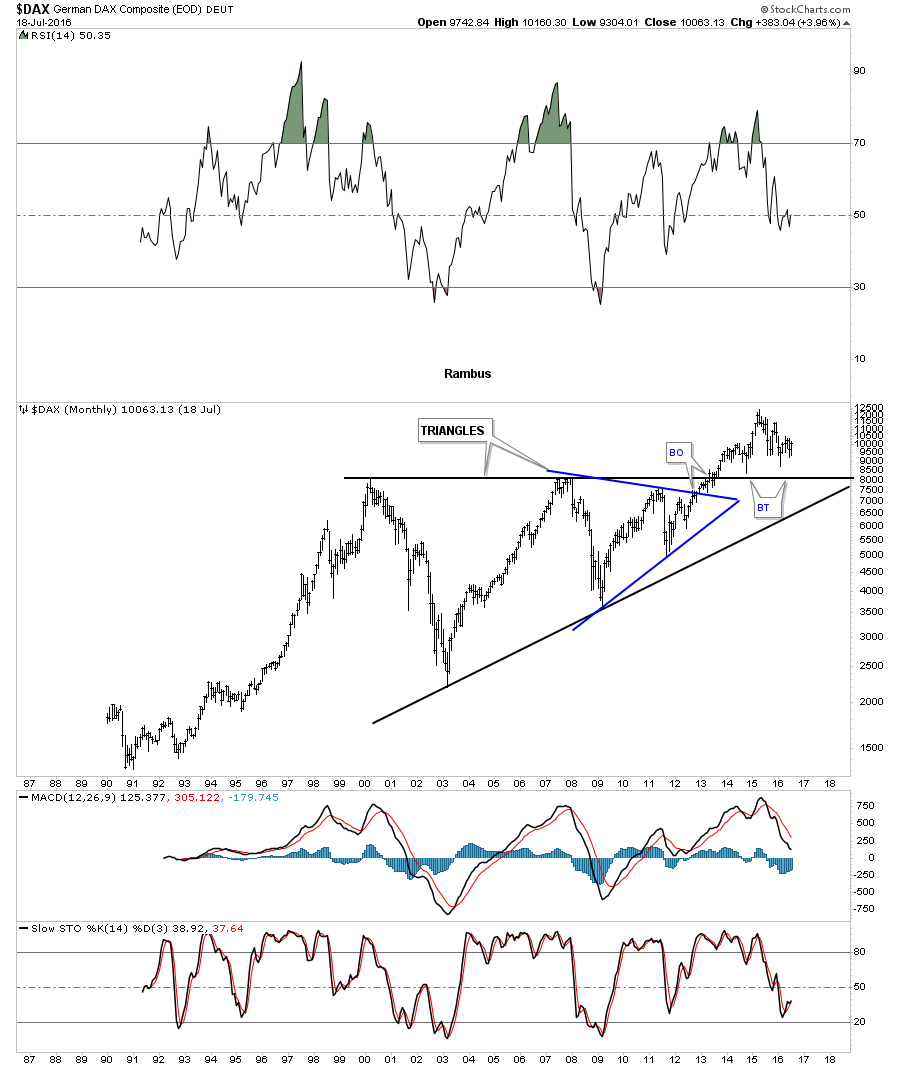
The $DAX, German stock market, is a very important stock market to keep a close eye on, which needs to have a bullish bias if the world stock market rally is going to extend out into the future. The monthly chart below shows its bull market uptrend channel that began in 2009 and is currently working on building out a potential bullish falling flag.

As is the case with most of the important world stock markets the $DAX has formed a very large triangle consolidation pattern going back to 2000. Just like the long term chart I showed you earlier for the $INDU, which had broken out from its big expanding triangle consolidation pattern, the $DAX has also formed a very large consolidation pattern. We have a very clean line in the sand between what is bullish and what is bearish. Above the top rail of the big black triangle is bullish and below is bearish.
Next lets look at the $BVSP, Brazilian stock market which has been getting a lot of bad press lately with the Olympic’s just around the corner. It has been building out a parallel downtrend channel going all the way back to 2010 or so. It’s currently testing the top rail which it has done four times so far. If it can breakout above that very important top rail that would be a very bullish sign for this stock and the world stock markets in general.

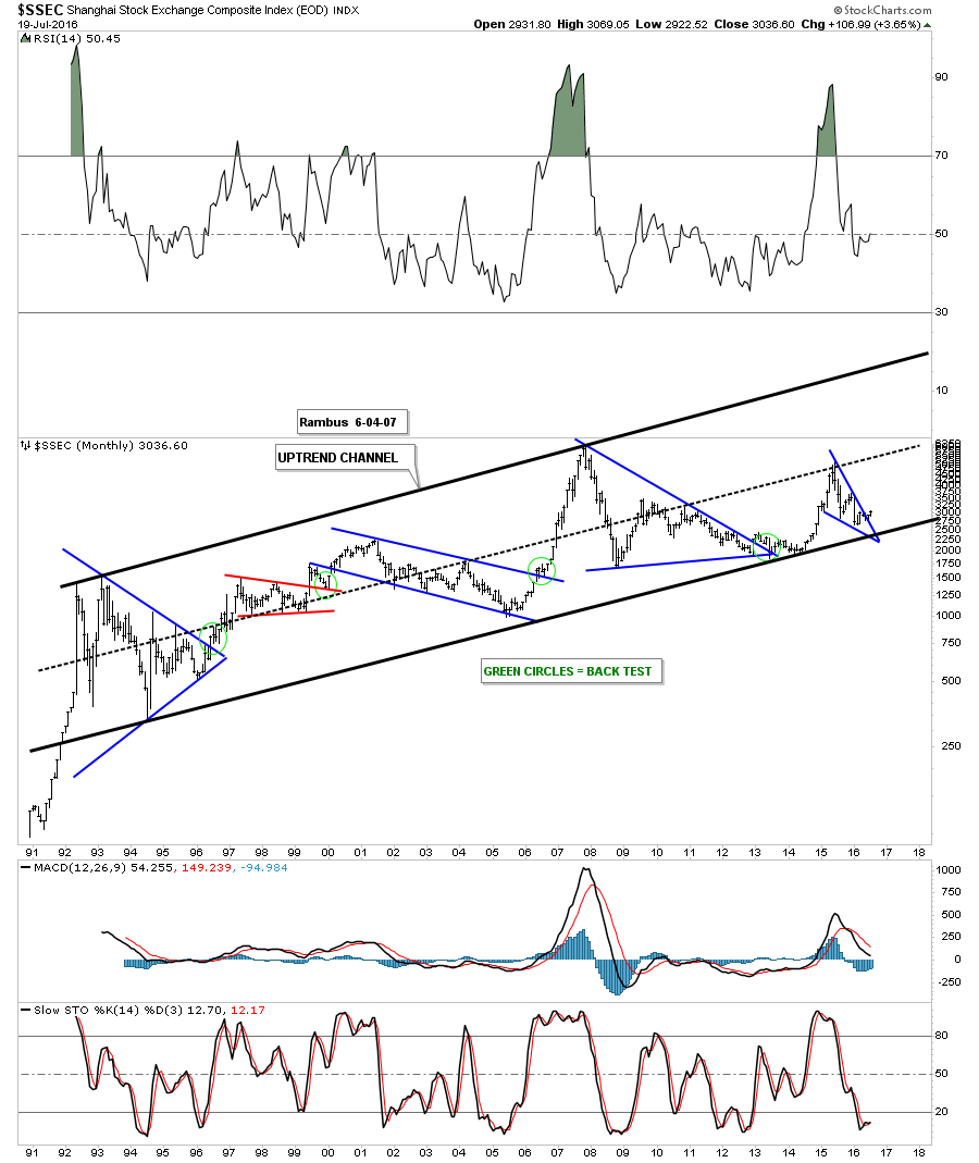
The $SSEC Shanghai stock market, has been in a 25 year uptrend channel going all the way back to the early 1990’s. The current price action has just broken out above the top rail of the blue falling wedge which formed just above the bottom rail of the 25 year uptrend channel. There has also been a lot of negative things written about the Chinese economy, which may be true, but at the bottom of a move that is when things are the most bearish. This is another important index to keep a close eye on.
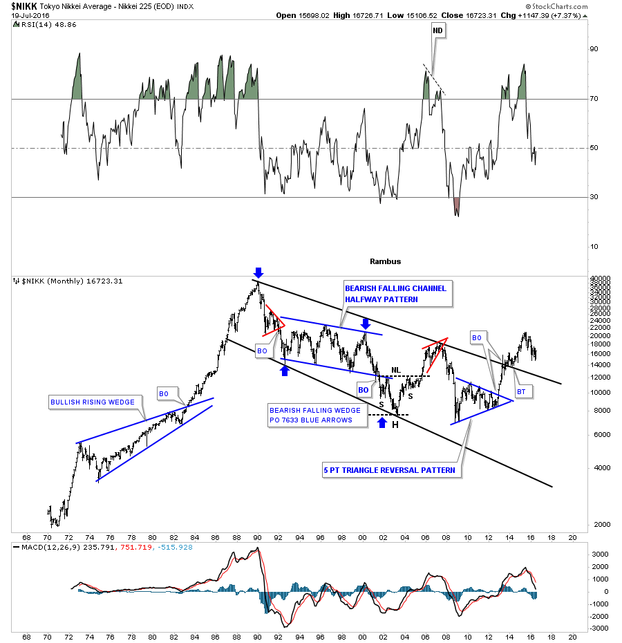
The very long term monthly chart for the $NIKK, Japanese stock market, goes all the way back to the 1970’s and shows its massive bull market run that ended in 1989. From that secular bull market high the $NIKK has been in a well defined downtrend channel for 25 years or so, but has recently broken out above the top rail with one backtest in place. If we see this stock market make a higher high, that would signal some positive price action.
Below is the ACWI, which is a good etf to track many of the world stock markets along with emerging markets, to get a feel for how the rest of the world is doing. This monthly long term chart shows its bull market uptrend channel that began to form back at the 2009 crash low. It has recently broken out and backtested the top rail of its bullish falling wedge.

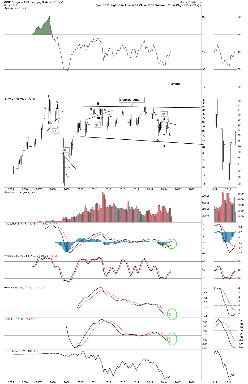
The last index we’ll look at is the VWO which is one of the more actively traded etf’s for the emerging markets. The VWO has been building out a very large trading range going back to the 2011 high which also coincides with the highs made in many commodities and precious metals stocks. As you can see it’s just now breaking out from a H&S bottom that has formed on the bottom rail of the sideways trading range. That H&S bottom should give the VWO the energy it needs to trade back up to the top of the trading range. If the price action can trade above the top rail of the trading range then it will most likely signal the trading range is a halfway pattern to the upside.
The bottom line is there are many reasons to be bullish on the overall health of the world’s stock markets right now, which flies in the face of all the fundamental reasons why the world should be collapsing into a black hole. Above everything else it’s the price action that tells us the truth. How one interprets the charts can be a different matter altogether, but from a Chartology perspective the world as we know it isn’t coming to an end anytime soon, which I know will disappoint a lot of folks. It is what it is until it isn’t. All the best…Rambus
Basic Materials Equities (Commodities)
A little over four months ago on March 6th I did a Weekend Report on the Basic Materials sector which was showing some potential bottoming and consolidation formations. There are some really large big cap stocks that help make up this sector, which was one of the reasons why I have remained bullish on the stock markets. If these big cap stocks are showing bullish price behavior that should bode well for the economy in general.
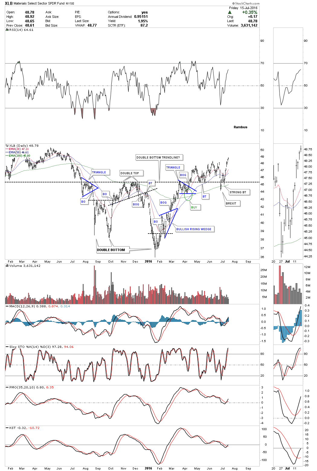
Lets start with a daily chart for the XLB, basic materials sector etf, which is showing a breakout from a large double bottom reversal pattern. The price action gapped above the double bottom trendline in April of this year and had been backtesting that important support and resistance line from above, until just recently. As with so many individual stocks and stock markets, the BREXIT vote gave us a false breakout below the double bottom trendline. The shakeout before the breakout. Last week the XLB made a new high since the BREXIT vote.
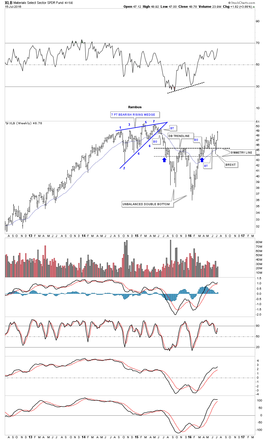
The weekly chart puts the double bottom in perspective, as it’s really pretty symmetrical from a Chartology perspective, as shown by the blue arrows. You can see the BREXIT spike just below the double bottom trendline that looks like the capitulation move. Also, that is a very large double bottom in place, which suggests much higher prices ahead which should also be good for the stock markets. The XLB is not that far below its all time highs which would make sense ff the INDU or other big cap stock market indices are beginning to breakout to new all time highs themselves.
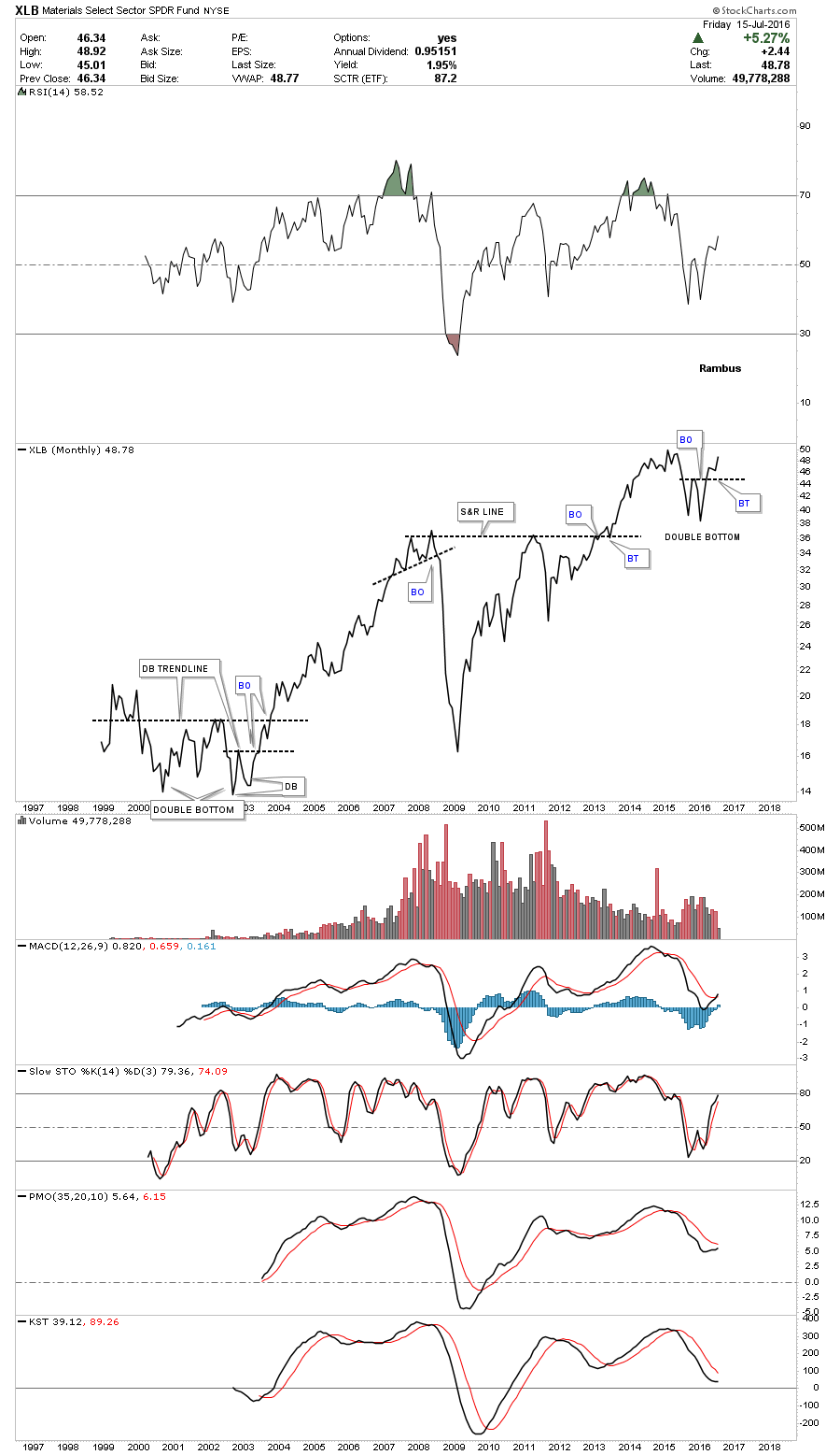
This last chart for the XLB is a monthly line chart which just shows the monthly closing prices. Our current double bottom sticks out like a sore thumb on this chart. Note the complex double bottom that formed back in 2000 to 2003, which shows the right low of the bigger double bottom looking a lot like our current double bottom. When we see this sector breaking out to new all time highs it will confirm the new all time highs in the stock markets.
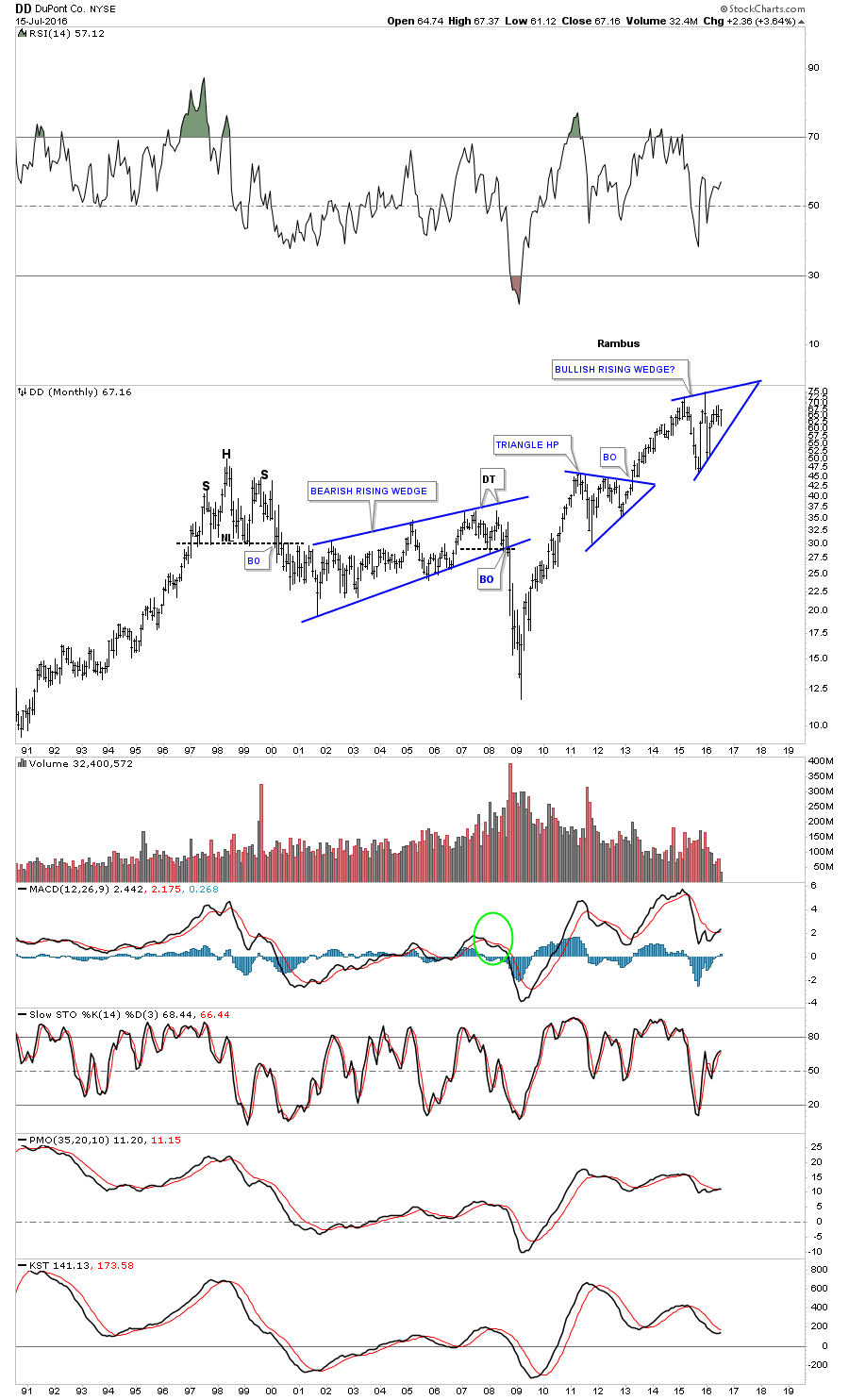
Lets now look at some of the individual components that help make up the XLB starting with the biggest weighting DD, DuPont. The daily chart shows it has been consolidating in an eight point expanding rising wedge since March of this year. DD recently formed another small double bottom on the BREXIT vote, to go with the other two that formed in late 2015 and early this year in February.
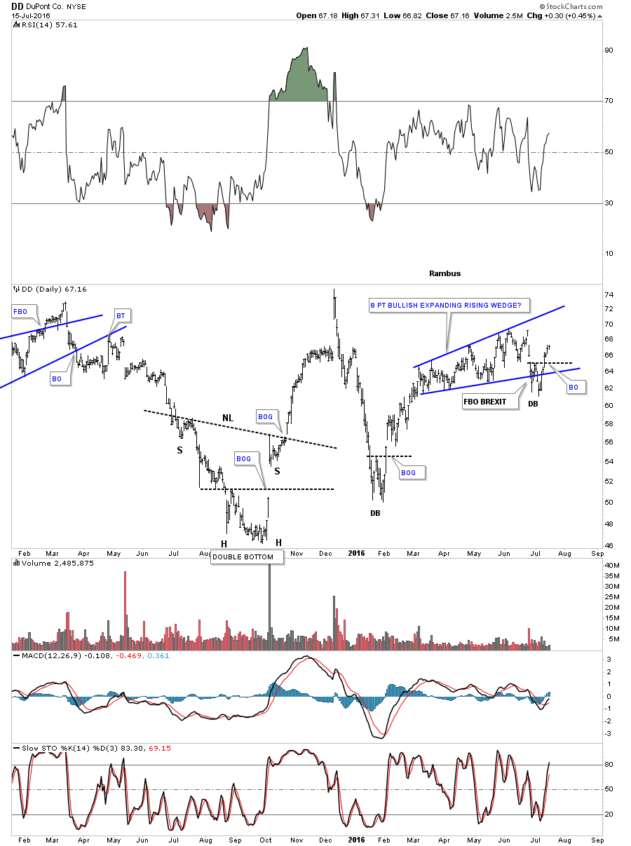
The weekly chart shows how the 8 point expanding rising wedge fits into a much bigger consolidation pattern which is a possible bullish rising wedge. The fourth reversal point won’t be complete until the top rail is hit.

The 26 year monthly chart shows how the potential bullish rising wedge fits into the bull market uprend that began at the 2009 crash low. The trend remains up until we see a reversal pattern.
The weekly chart for Dow Chemical shows it has been building out its second consolidation pattern since the bear market low in 2009, which is a two year expanding triangle. Note the beautiful inverse H&S bottom that formed during the bottoming process at the 2009 low. That inverse H&S bottom looks alot like some of the precious metals stocks we’ve been following since their bear market low in January of this year. This stock should give us a heads up on the continuation of the bull market in the equities markets, when it breaks out above the top rail of the expanding triangle.

The monthly chart for perspective.

The weekly chart for AA Alcoa, shows a very large inverse H&S bottom forming. A breakout above the neckline will add more confirmation that things aren’t as bad as a lot of folks think.

The weekly chart for ADP Air Products, shows it has broken out and backtested the top rail of a year and a half bullish expanding falling wedge.

The monthly chart for ADP shows its trading not too far below its all time highs.

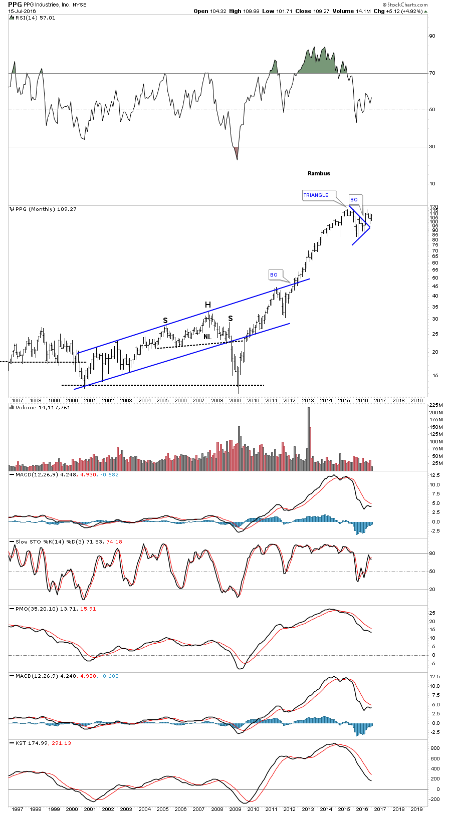
The monthly chart for PPG, shows it has broken out from the blue triangle consolidation pattern with new all time highs not far above the current price action.
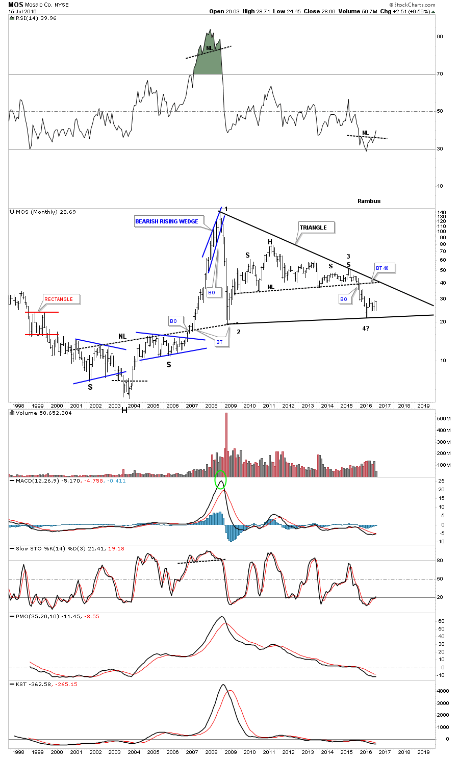
MOS has been one of the weaker sectors in the Basic Materials complex, but it’s trying to bottom out at a possible fourth reversal point in a massive triangle consolidation pattern.
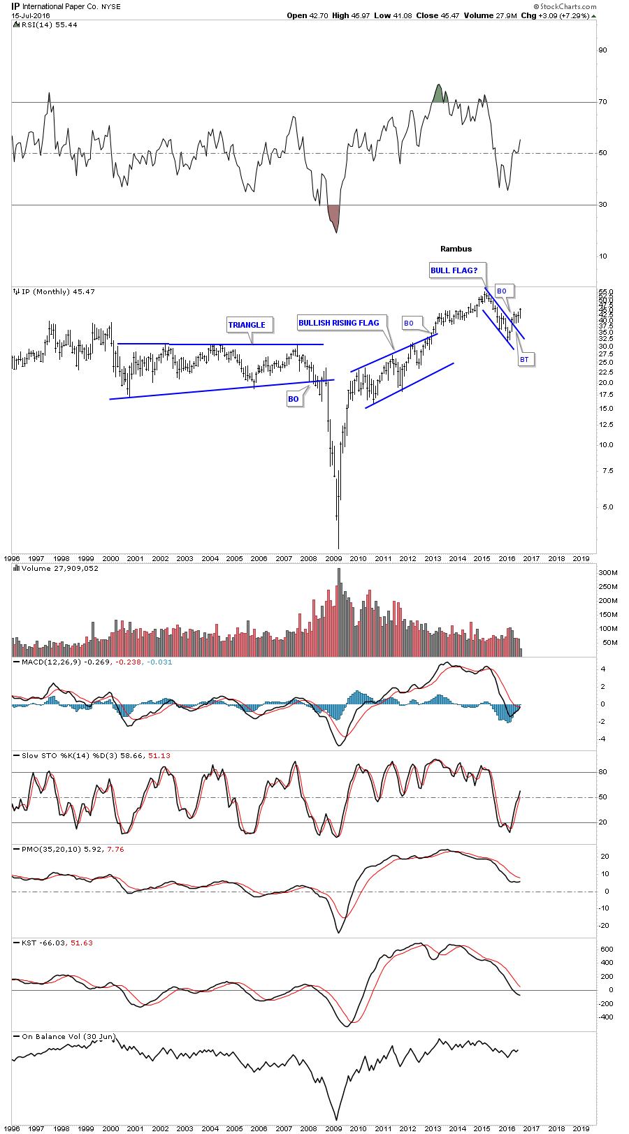
It looks like IP, International Paper, has broken out of a bull flag on the monthly chart.
The weekly chart for CNX shows some nice reverse symmetry taking place as its attempting to breakout from the third H&S neckline.

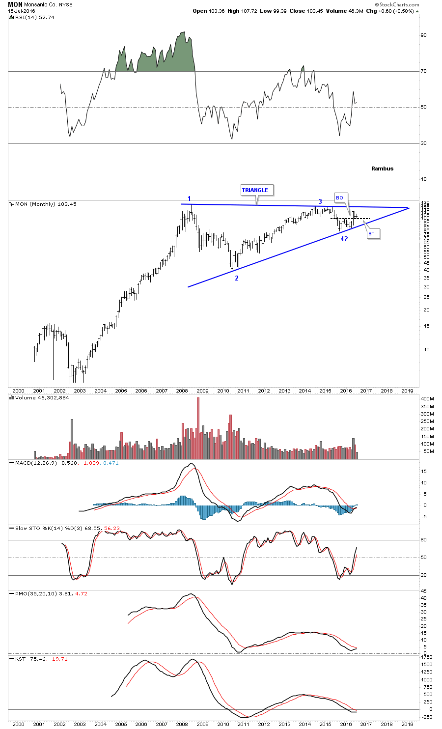
The monthly chart for MON, Monsonato, shows its working a possible fourth reversal point in a massive eight year triangle consolidation pattern. The potential fourth reversal point is showing a double bottom with a backtest to the double bottom trendline taking place right now.
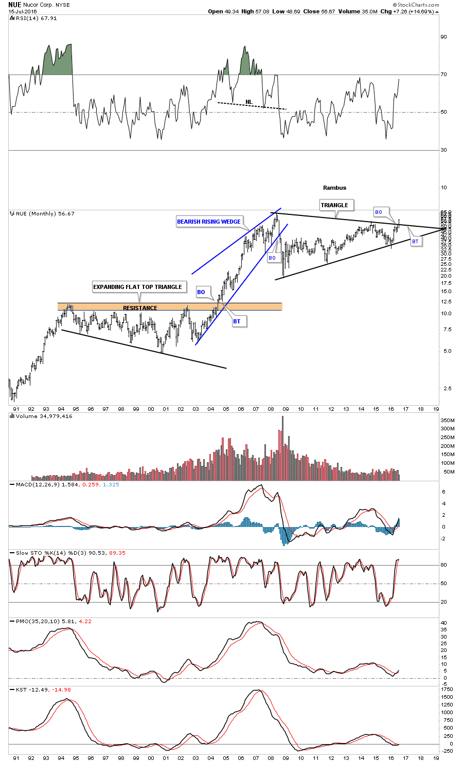
NUE is a steel company that is breaking out from a massive eight year triangle consolidation pattern. This isn’t the only steel company that is looking bullish right now.
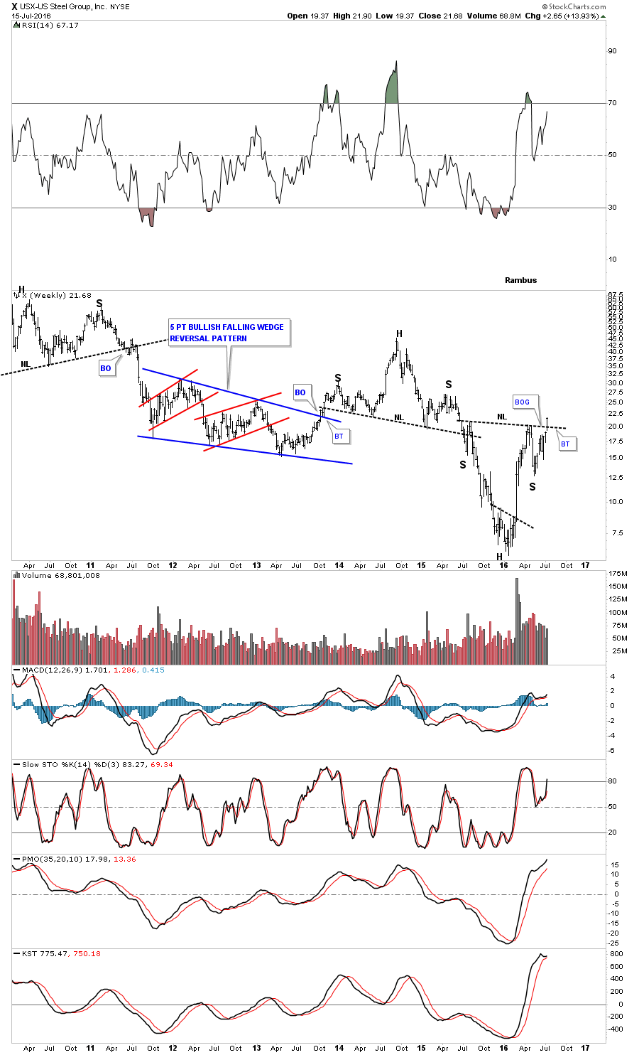
US Steel, X, gapped above the neckline last week of a pretty big inverse H&S bottom.
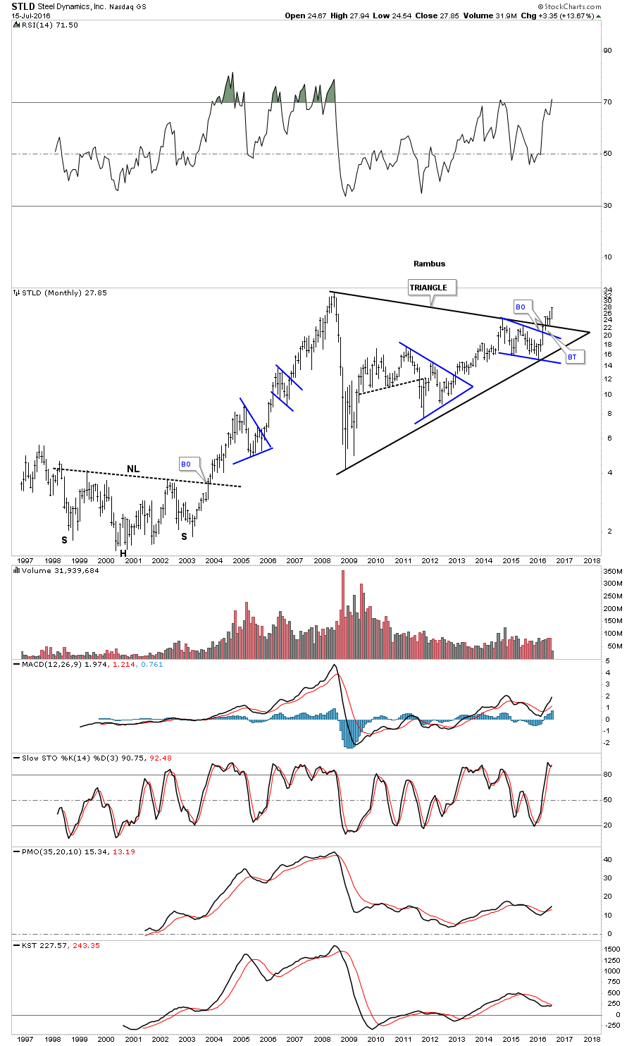
STLD is another steel company that has broken out of a very large eight year triangle consolidation pattern.
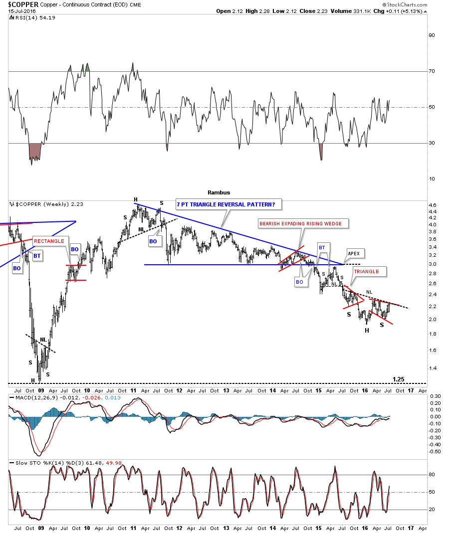
Lets look at some other commodity related stocks to see if they too are showing if this area of the market is attempting to at least show a bottoming or consolidation pattern forming. Copper is still the least loved commodity, but it’s trying to join the party as it has been working on an inverse H&S bottom. The left and right shoulders each formed small red consolidation patterns just below the neckline. As you can see, the price action is testing the neckline currently.
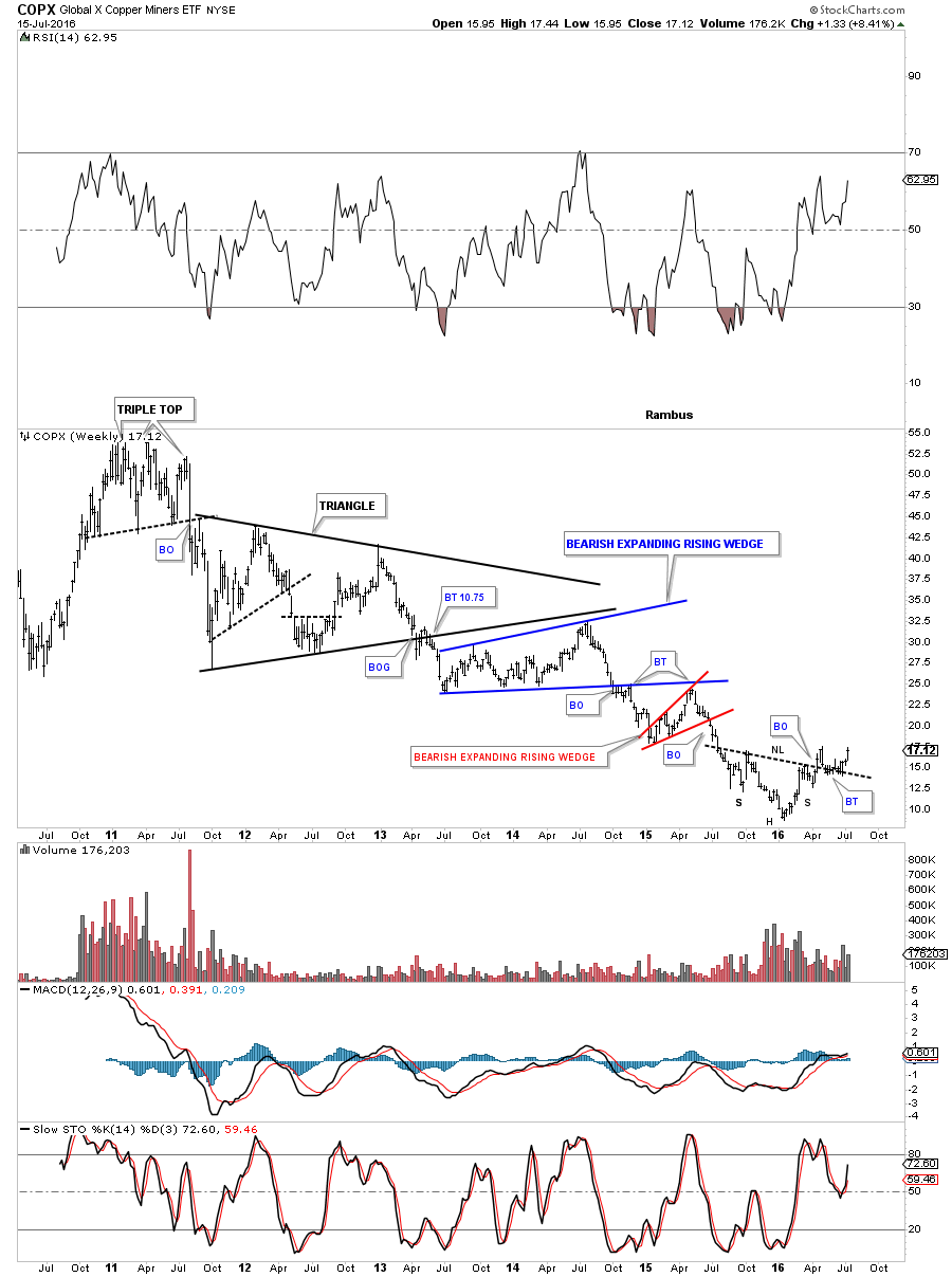
The weekly chart for the COPX copper miners etf, shows it has already broken out from an inverse H&S bottom complete with a backtest. After a massive bear market since the 2011 high, this is a perfect place to see an inverse H&S build out.
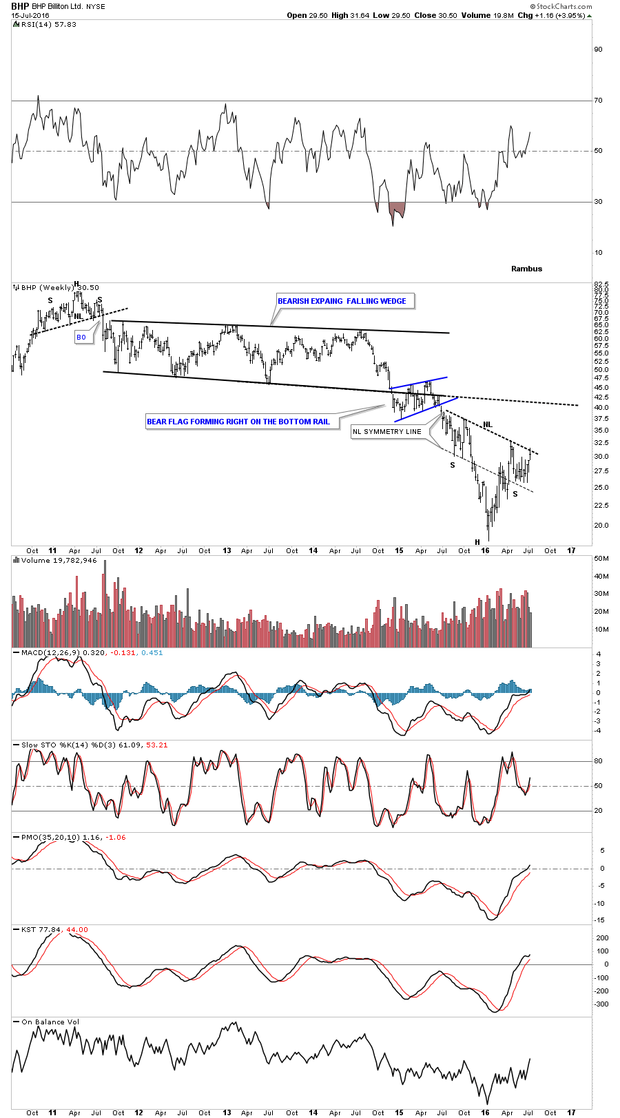
The weekly chart for BHP shows one of the biggest miners on the planet is building out a possible inverse H&S bottom, with the price action testing the neckline.
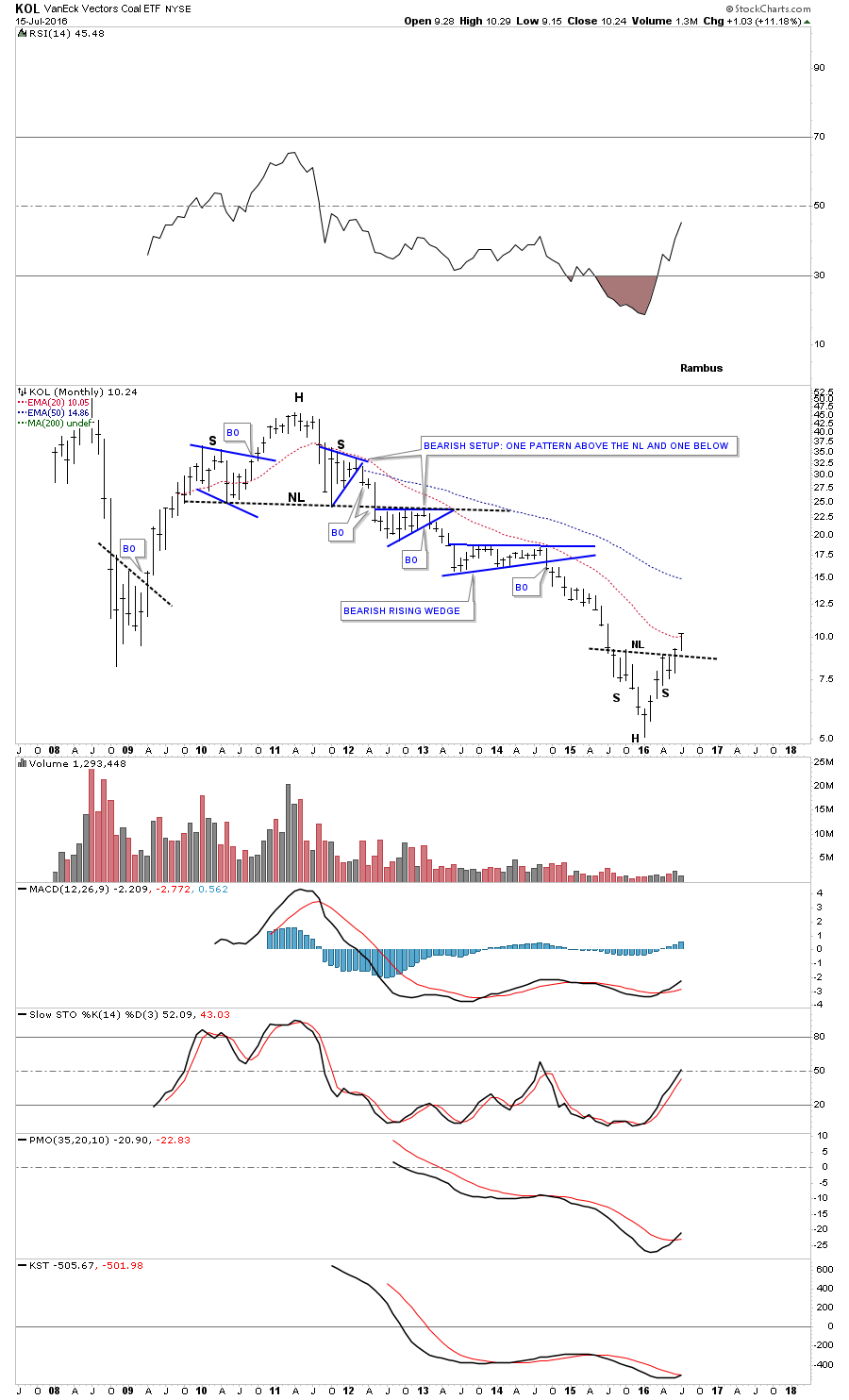
One of the most beaten down areas in the commodities sector were the coal stocks. Below is the KOL which is the coal etf that is showing it has broken out from an inverse H&S bottom five weeks ago.
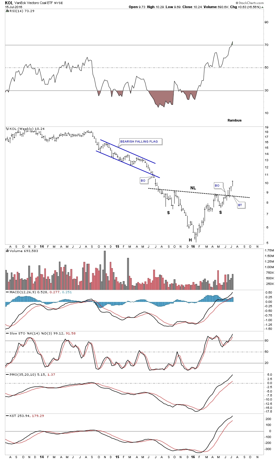
After building out a massive H&S top in 2011, KOL has now formed an inverse H&S bottom to end the bear market.
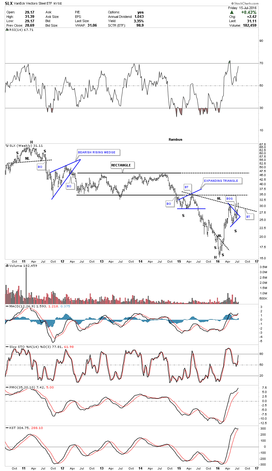
The SLX is a steel etf that had a breakout gap last week above its neckline.
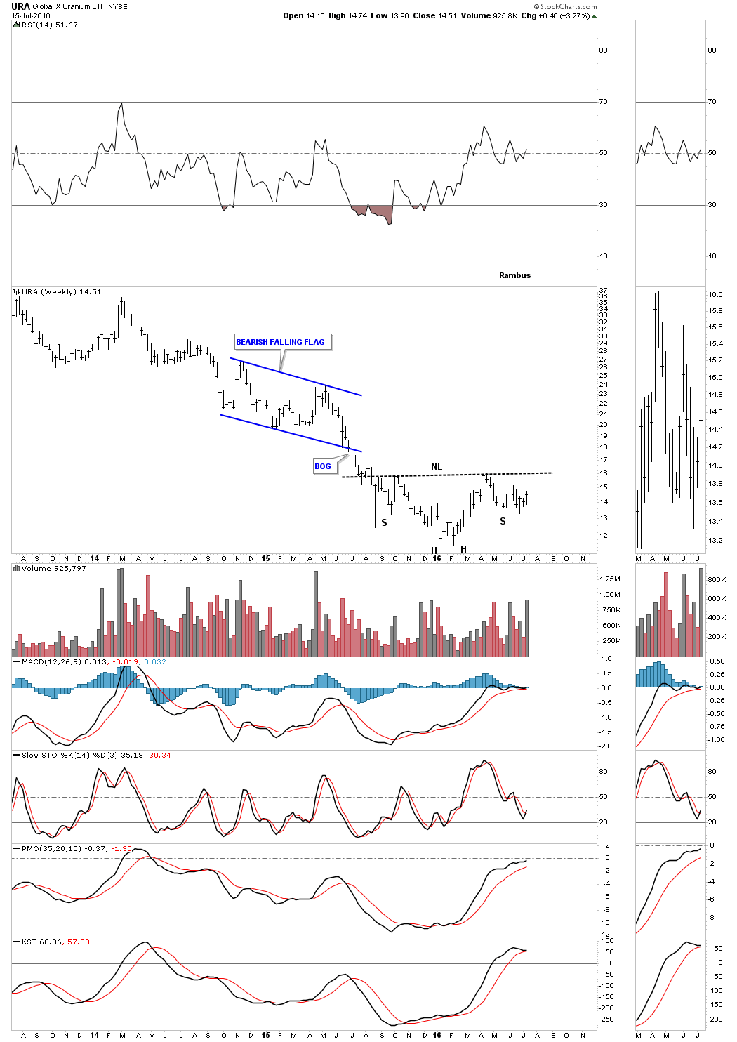
URA is a Uranium etf which shows it’s still working on an inverse H&S bottom.
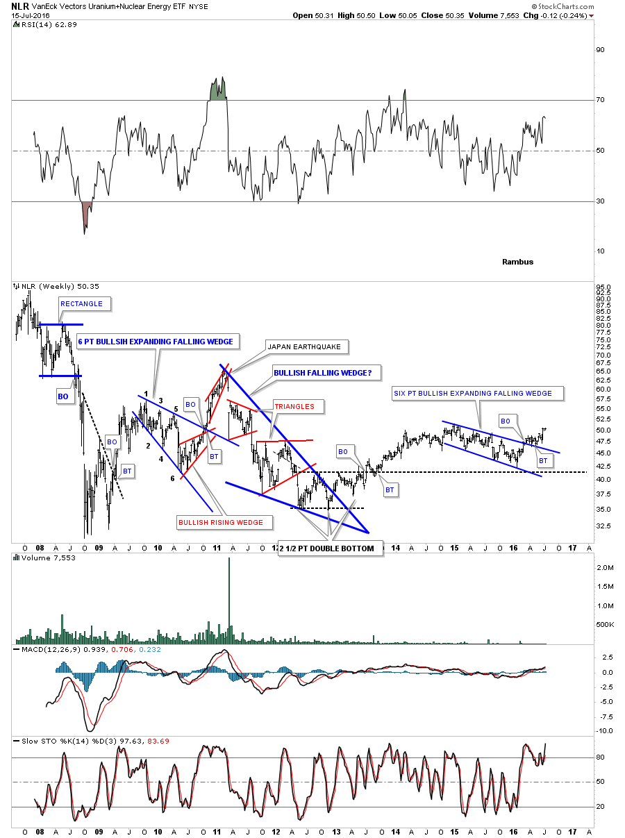
NLR is another Uranium etf which built out a six point bullish expanding falling wedge on top of the black S&R line. It has broken out and backtested the top rail and looks to be moving higher. Note where it was trading when the Japanese earthquake hit.
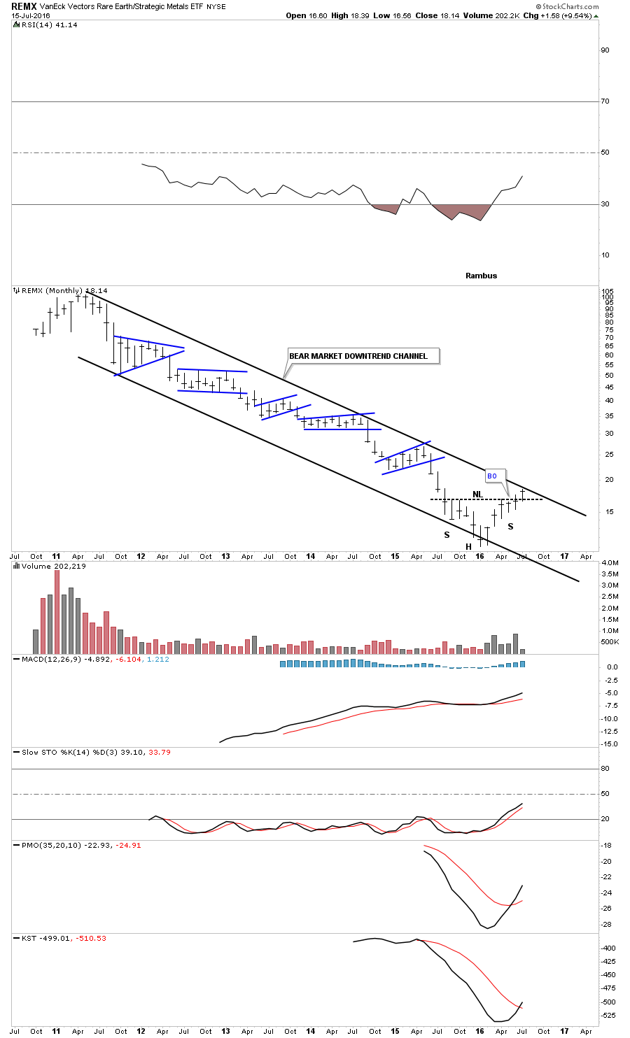
REMX is a rare earth etf which has joined the party after a very lengthy bear market by forming an inverse H&S bottom on the weekly chart.

The monthly chart for REMX shows its entire history as one big downtrend channel. The inverse H&S bottom should give this index the energy it needs to finally breakout above the top rail of the 5 year downtrend channel.
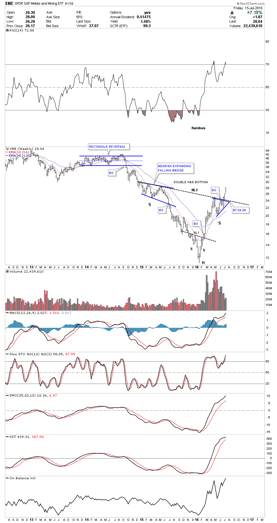
The last chart I would like to show you tonight is a weekly look at the XME, metals and mining etf. It has just recently broken out above the second H&S neckline. If we get a backtest to neckline #2 it should come in around the 24.25 area. This etf has been moving up nicely along with the PM complex.
This update from March 6th of this year shows the bottoming and consolidation process still in play, which should lead to a nice move up in the commodities sector. Are all the stocks and indexes we looked at above, signalling the end of the deflationary wave that has been in place in this sector, along with the precious metals complex, since they all topped out together in 2011? Regardless of how investors are perceiving the coming collapse of the world stock markets, commodities in general are showing a different picture. I’ll have more on the US and world stock markets in the coming days. All the best…Rambus
Precious Metals
Now is a good time to update some of the ratio combo charts that showed us where the bear market bottom was, and also gave us some good clues to expect a strong initial impulse move higher. It’s still uncanny how these different ratio combo charts came together at the same time, and from different perspectives, to show the bottom of the bear market.
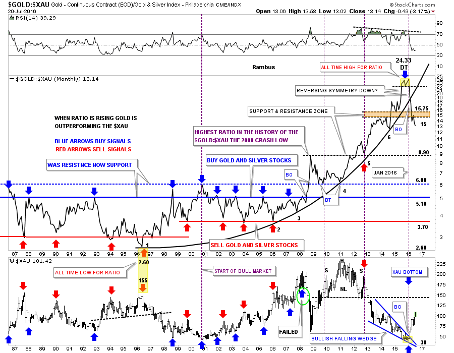
Lets start with one of the more important ratio combo charts the GOLD:$XAU, which is a 30 year monthly look at the ratio with the $XAU below it. The first thing to notice is all the red and blue arrows which showed a big trading range that worked very will in showing where to look for a top or bottom on the $XAU. Whenever the ratio would get up to the 5.00 area, blue arrows, it was time to start buying your favorite gold and silver stocks, and when the ratio fell to 3.70, red arrows, it was time to sell those stocks.
That went on for most of the bull market until the infamous 2008 crash which did something to blow this ratio out of the water, starting with the blue arrow with the green circle around it in 2008. Normally a move back up to the 5.00 area, blue arrows, would have been a good place to go long the PM stocks, but something happened during that crash which totally changed the landscape for years to come. I noted at the time the ratio was the highest it has ever been when it broke above the blue dashed horizontal line, which marked the all time highs up until that time for the ratio, purple annotation. As you can see the price action backtested the blue dashed S&R line twice from above, but what had been resistance turned into support for the ratio. From that point things just got worse for the PM stocks, as the ratio kept climbing to new all time highs.
It was actually in 1996 that the precious metals stock began to under perform gold. From that low in 1996 this ratio began its parabolic rise which lasted for 20 years, and finally ended at the top of the chart, which shows the small double top, yellow shaded area. The parabolic arc had six clean touches on it which strongly suggested it was hot. When the price action finally broke below the double top hump, that marked the end of the out performance of gold to the $XAU that had been going on for 20 years. From a Chartology perspective this was a really big deal. The ratio broke below the double top hump in January of this year, which coincided with the low on the $XAU chart at the bottom.
After the double top was confirmed the next area I focused in on was the 20 year parabolic arc. When a parabolic arc gives way, you can expect a move equal to or greater than the original parabolic arc. I labeled the initial decline as reverse symmetry because the move up was vertical in nature. After the parabolic arc gave way the next area to look for some support was the brown shaded S&R zone between 15 and 15.75. After a small backtest from below, the move down has started again for this ratio. Keep in mind this ratio is reversing symmetry back down giving the precious metals stocks their first taste of freedom in over 20 years. Note, the $XAU chart at the bottom, which shows it bottomed at the same time the ratio topped, and is rising in a near vertical move up.
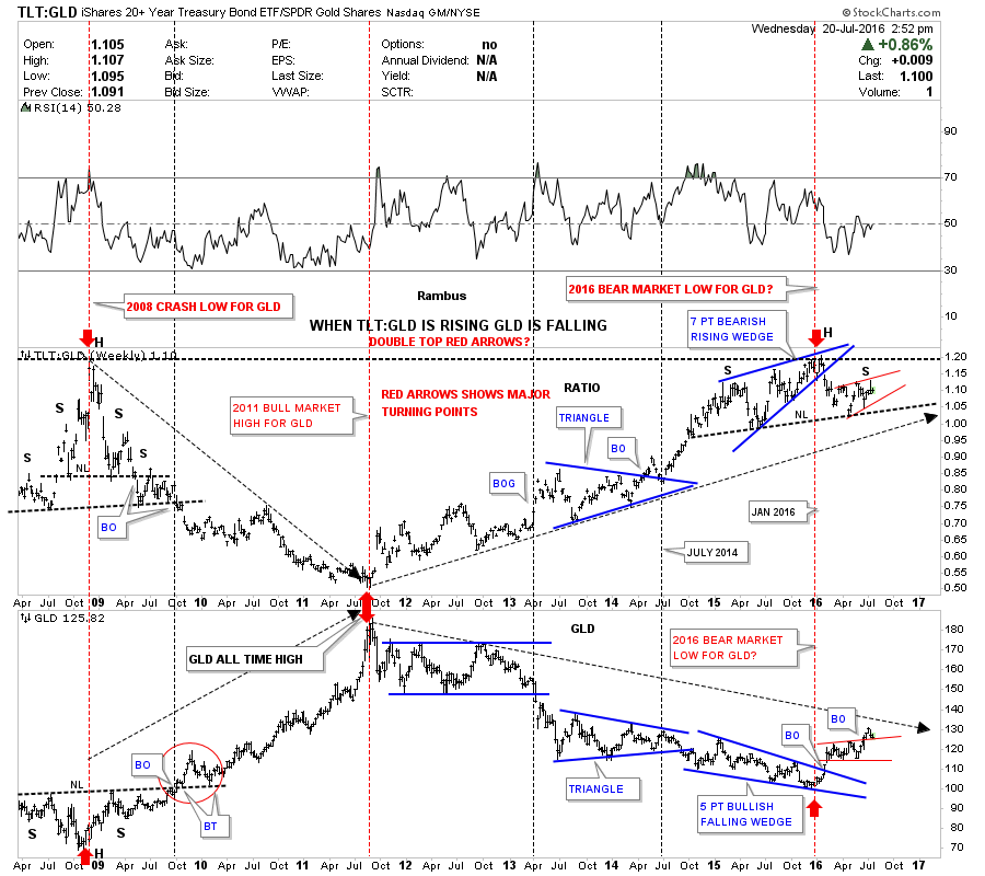
This next ratio combo chart has the TLT:GLD on top and GLD on the bottom. When the TLT is out performing GLD the ratio is rising. Note how the ratio on top and GLD on the bottom both built out H&S reversal patterns at the 2008 crash low. That was the point when GLD went on its last big move up to new all time highs, which ended in September of 2011. From that low on the ratio and high on GLD, it marked the beginning of the bear market, which was going to be one of the worst on record for the precious metals complex.
The ratio rose for the next five years peaking out in January of this year after it broke down from the seven point bearish rising wedge. That point also marked the breakout GLD had out of its own five point bullish falling wedge reversal pattern, as shown on the GLD chart. As you can see both have been basically consolidating their first move as shown by the small red patterns.
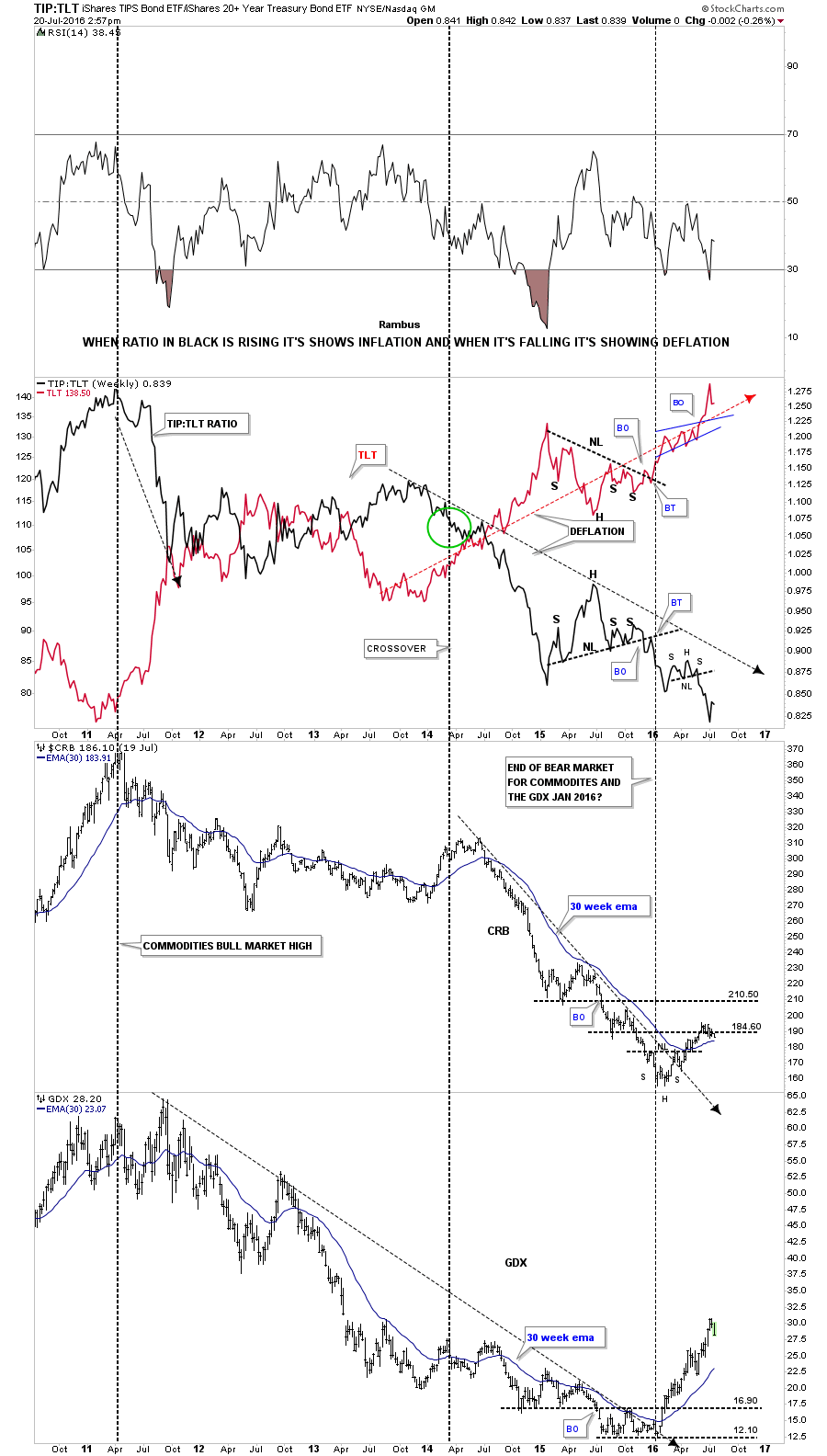
This next ratio combo chart I have overlaid the TIP on top of the TLT which is a way to gauge whether we are in an inflationary or deflationary environment. When the ratio in black is falling, it shows deflationary pressures in the economy. The ratio chart on top clearly shows deflation is still in place and hasn’t gotten any better.
The bottom two charts shows the dichotomy taking place with the $CRB and the GDX vs the ratio in black. As you can see normally the CRB and the GDX generally move in a similar fashion to the ratio. For whatever fundamental reasons, the CRB and in particular the GDX, have been going in the opposite direction of the ratio from you guessed it, January of this year.
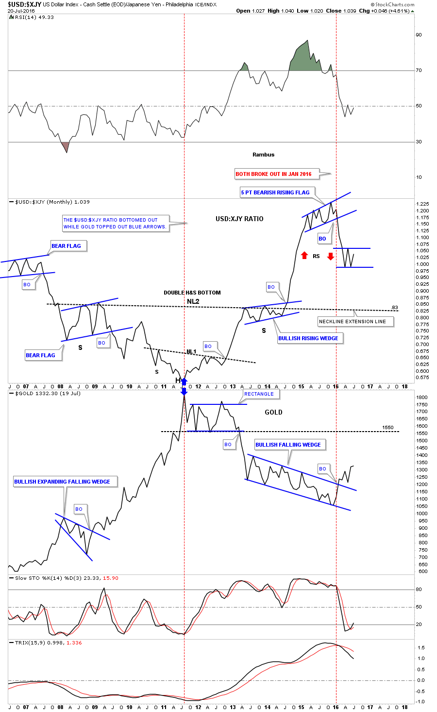
This next ratio combo chart has the $USD:$XJY on top and GLD on the bottom. When the ratio chart on top is rising, meaning the $USD is outperforming the Japanese yen, gold goes down. You can see the obvious inverse relationship these two generally have. Back in 2011 gold topped out and the ratio bottomed out. The ratio then went on to build out a massive 6 1/2 year double H&S bottom which led to gold’s bear market. Then in late 2015 the ratio chart topped, building out a bearish rising flag while gold on the bottom chart built out a bullish falling wedge. Note how the ratio chart topped out at the exact same time as gold bottomed.
When the ratio broke out above neckline #2 notice how vertical the rally was. This strongly suggests the ratio will most likely fall just as strongly as the rally leading into the high as shown by the red arrows. It has been consolidating this first leg down chopping out a small trading range. This is giving gold and the precious metals stocks a chance to rest for the first time since the January low.
This is also the chart which shows when we might see the first real correction in this new bull market. On the ratio chart I extended neckline #2 all the way to the right hand side of the chart where .83 will come into play. On the gold chart I’ve extended the bottom rail of the six point blue rectangle to the right hand side of the chart as well, which suggest the 1550 area should offer initial resistance. If they both reach those price objectives at the same time then there is a good chance we could very well see the first real consolidation pattern begin to form in gold’s brand new bull market.
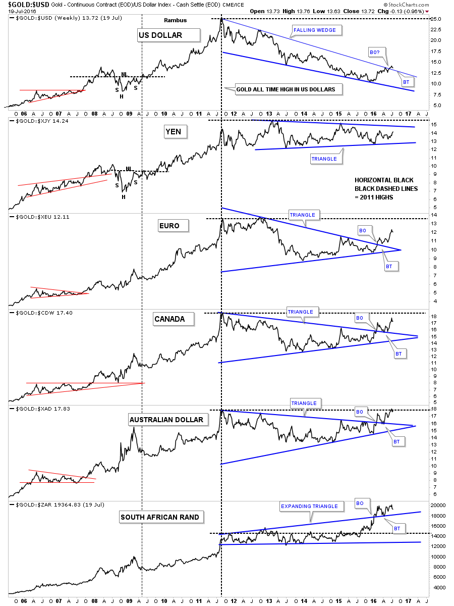
If gold is truly in a new bull market then we should see it rise in all the important currencies of the world. Below is a combo chart which shows how gold is trading in six different currencies including the US dollar. The last time I posted this chart the GOLD:USD ratio chart on top had just hit the top rail of its falling wedge. At the time I said that was very positive, but to look for a small decline which would tell us the top rail was hot. As you can see we got the small decline and now gold has broken above the top rail signalling the breakout has begun. Now we look for a backtest to the top rail from the topside.
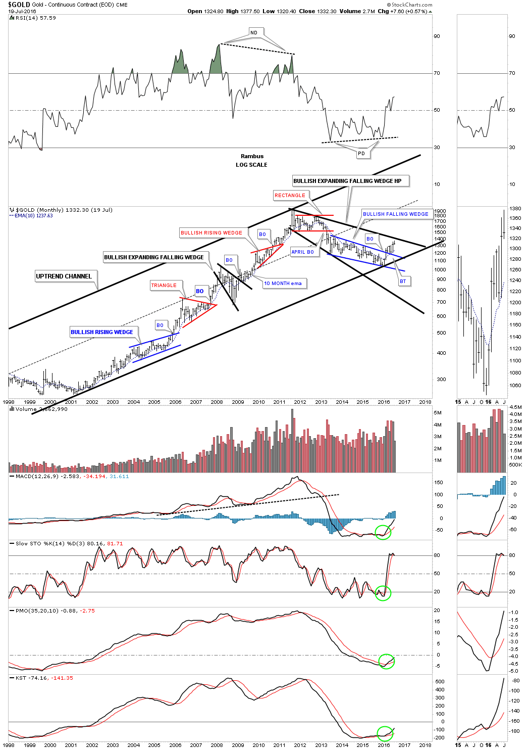
These last set of chart shows what I consider to be the major secular bull market uptrend channel for Gold, Silver and the HUI. The rally out of the 2000 low to the top in 2011 was the fist leg up. The five year bear market is the first real correction in the secular bull market. Both Gold and Silver bottomed out in December of 2015 while the HUI bottomed out a month later in January of 2016. Until something changes this scenario the secular bull market lives on.
Gold still has some upside resistance it will need to overcome at the top rail of the five year expanding falling wedge consolidation pattern around the 1450 area.
Next is the long term monthly chart for Silver which shows its secular bull market uptrend channel and the five year correction which built out the downtrend channel. You can see there was a nice clean breakout above the top rail of the downtrend channel with a backtest which confirmed the breakout was authentic.

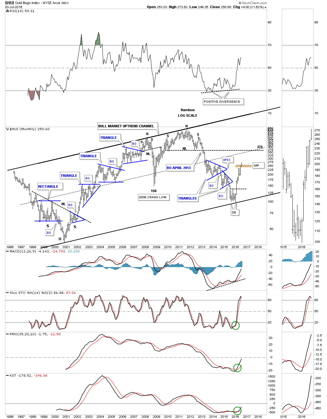
The last chart I would like to show you is the HUI’s bull market uptrend channel. This chart also shows you how markets work from a Chartology perspective. If you follow the price action starting the bear market low in 2000 you can see the first impulse move up lasted about seven months or so followed by a small blue triangle consolidation pattern. Once the small triangle finished consolidating that first impulse move up the second impulse move took off and lasted six more months when the next blue triangle was need to consolidate that move. As you can see when each impulse move was exhausted a blue triangle consolidation pattern formed to relieve the overbought condition. At some point the HUI is going to start building out its first consolidation pattern since the new bull market began which started at the double bottom reversal pattern low in January of this year.
The correction when it begins shouldn’t be feared because this is the way markets work, an impulse move followed by a consolidation pattern followed by another impulse move higher until a reversal pattern is finally made. As you can see from the bull market that began in 2000 this process can last for years before a bull market exhausts itself which usually comes in a parabolic spike as everyone and their brother wants to get a piece of the action.
That part of the bull market lasted until the top in 2008 when the HUI formed a H&S reversal pattern which led to the 2008 crash low at 150. Three years later the HUI built its massive H&S top which ended the first leg up in the secular bull market. What followed was one of the worst bear markets in history for the precious metals stocks. In January of this year the HUI built out a double bottom reversal pattern which ended the five year bear market. Keep in mind the first ratio combo chart we looked at, that compares Gold to the $XAU which shows how Gold has been outperforming the $XAU for twenty years. That ended in January of this year and now it’s time for the precious metals stocks to have their day in the sun and outperform Gold. This is a very interesting setup we have in the precious metals stocks right now that few understand the magnitude of what may lie ahead. Sitting in the saddle will be the hardest thing to do especially when the inevitable corrections take place.
So there you have it looking at the PM complex bottom from many different angles. It’s hard to imagine how all these markets could be manipulated to force the price of gold either down or up. The PM complex is behaving the way it is based on many different factors as shown by the charts above. One either believes we are in a new bull market in the PM complex or they don’t. There are never any guarantees when it comes to the markets but one has to trade on what they see based on their charts or whatever trading discipline you use to make a judgement call. I firmly believe that the bear market in the PM complex ended on January 19th of 2016 and a new bull market, within the secular bull market, has begun that could last for years into the future. All the best…Rambus
Catherine Austin Fitts:
Rambus, I can't thank you enough. This is Blockbuster Chartology! We have a lot to study and digest. Let me remind our subscribers that they can access your ongoing efforts at: http://rambus1.com.
Related Reading:
- Blockbuster Chartology with Rambus - April 21, 2016
- Rambus: Are We in a Deflationary Spiral? - January 28, 2016
- The Dollar, Gold & the S&P 500 with Rambus - October 15, 2015
- 2nd Quarter Wrap Up: Financial Markets Round Up
Top of Page
© Solari 2016