
October 20, 2016
Rambus: Blockbuster Chartology - 3rd Quarter 2016
By Catherine Austin Fitts
My "go to" website for technical analysis of precious metals, the US dollar & the US stock market is Rambus Chartology, where Rambus (that's his handle - he's the founding technical analyst) leads a discussion with extensive charts of what the markets are saying.
Last October, the Solari Report did a written interview with Rambus including an introduction here and a discussion of Rambus, his background, technical analysis as well as the word "Chartology." You can find all this information at our first interview:
- Why "Rambus?"
- How Rambus Chartology Got Started
- What Rambus Chartology Does
- About Technical Analysis
- Tracking the Markets
- What does the word "Chartology" mean?
- Rambus: Blockbuster Chartology
In January 2016, Rambus launched his quarterly Solari Report with a Blockbuster Chartology across the four market sectors: Currencies, Commodities, Precious Metals and Stock Markets. You can find it here: Rambus: Are We in a Deflationary Spiral? Then, Rambus returned with his Blockbuster Chartology across the market sectors in April and July. Now with the 3rd Quarter behind us, Rambus returns with a Blockbuster Chartology that takes an in depth look at currencies, commodities, equities and precious metals.
One of the reasons that Rambus is so good at his craft is that he focuses on "staying on the right side of the major trend." The challenge of doing so at this time is that it is tempting to look for bottoms or to assume that the trend upwards in the US dollar or stock market may be over. However, Rambus consistently brings us back to the discipline of the Chartology. What does price tell us? As he describes so aptly, we are dealing with psychological warfare.
Sitting back once each quarter to get this perspective offers invaluable insight. So, here we go for the 3rd Quarter Blockbuster Chartology!
Blockbuster Chartology
By Rambus
Currencies
This first part of the Quarterly Report I would like to do is an indepth look at several of the major currencies of the world, along with the most important currency on the planet, the US Dollar. It’s been quite awhile since we last looked at some of these longer term charts which really gives us some perspective on the big picture, which is most important to know. Once you understand what is taking place in the big picture it can make the shorter term charts come alive with important details to round out the long term look.
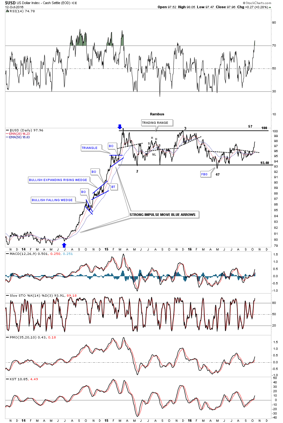
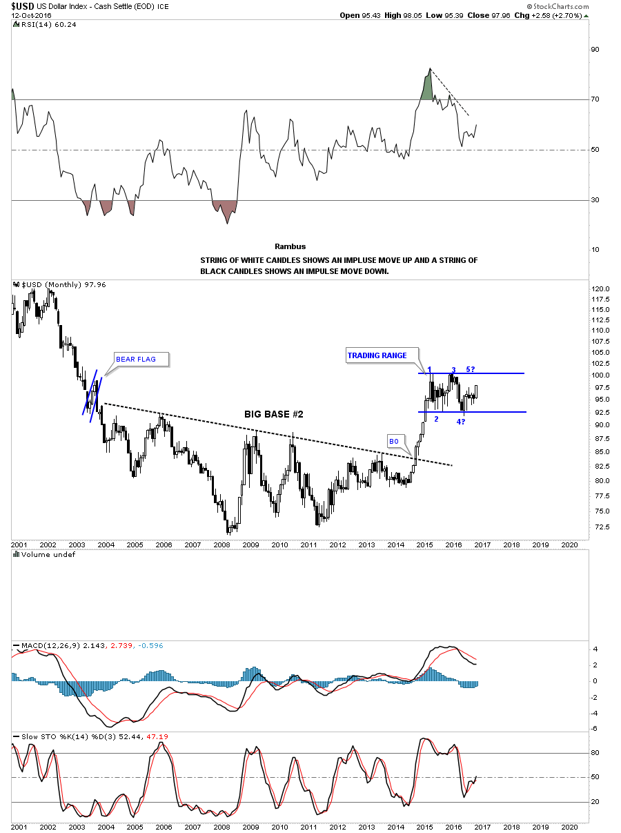
Lets start with just a basic three year daily bar chart for the $USD which shows the massive impulse move up that began in the middle of 2014 and ended in the first quarter of 2015. That was one massive impulse move up. After almost one year of impulsing higher, the USD finally ran out of gas in March of 2015 and has been consolidating that move ever since.
After a big move like that a stock needs to catch its breath by chopping out some type of consolidation pattern. The USD has been building out a sideways trading range which I’m labeling as a rectangle for now. The rectangle pattern is still under construction and won’t be complete until the top rail is hit at the 100.50 area, which will complete the all important fourth reversal point. At that point the USD can do one of two things. First, it can breakout above the top of the trading range and begin the next impulse move higher which would most likely resemble the first leg up. The second thing the US Dollar can do is reverse back down to the bottom of the trading range, keeping the consolidation pattern going. For the time being the USD is still in consolidation mode.
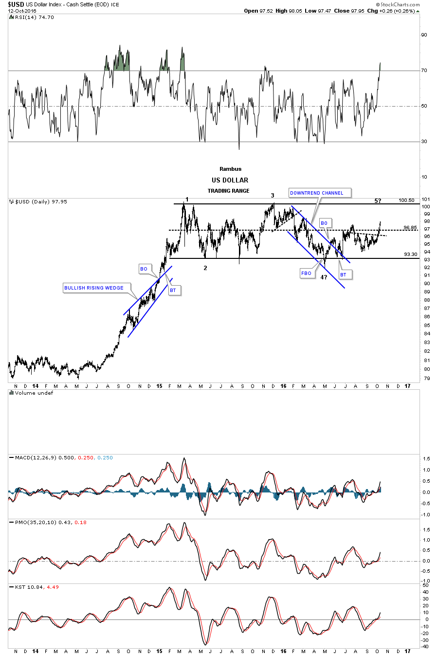
I always like to look at the line charts as they can takeout a lot of the noise a bar chart can make.This daily line chart is similar to the daily bar chart above which shows its impulse move up and the sideways trading range building out. You can see the small black dashed lines which lets you know when one of the reversal points may be finishing building out, and a reversal may take place in the opposite direction.
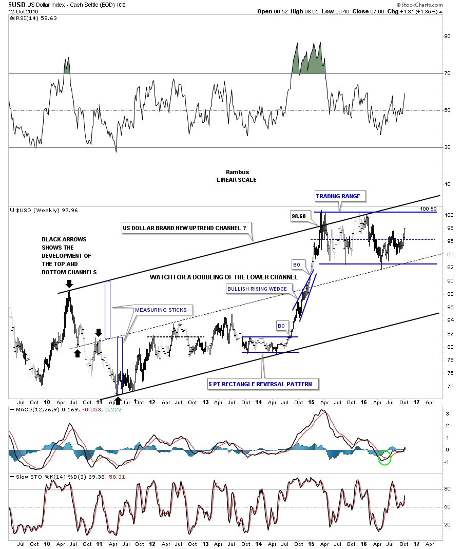
Next lets look at a seven year weekly chart for the USD which is building out a possible long term uptrend channel. During the formation of the blue bullish rising wedge in 2014, I recognized that the bottom channel that began at the 2011 low could be just half of a much larger uptrend channel. I knew at the time if the blue bullish rising wedge was going to play out as a halfway pattern to the upside, the lower channel would most likely double in size. I used the blue rectangles which I call measuring sticks, and drew in the top rail with the only touch being the black arrow pointing down in April of 2010.
What I find interesting now is how the USD is trading in the upper half of the uptrend channel. You can see that the spike down to the dashed mid line in May of this year reversed its role to what had been resistance to now support.
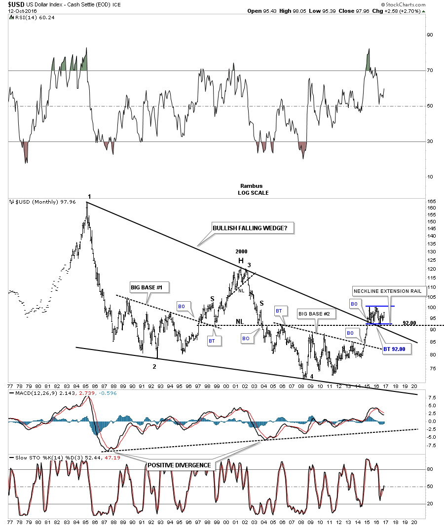
Lets work our way back further in time by looking at a 35 year monthly chart for the USD which has a lot of information on it. The first thing you will notice are the two massive fractals labeled BIG BASE #1 and BIG BASE #2, which launched their respective bull markets. When the US dollar built out that strongly slanted H&S top in 2001 that marked the bottom in gold. Point #4 in big base #2 marked the all time high for gold.
Note the blue bullish rising wedge which formed as a halfway pattern in the USD rise to its 2001 top. I put a rectangle around the rising wedge to measure it for time and price. I then took that same rectangle and moved it over to our current rectangle consolation pattern to see how it would fit, as the fractal bases are so close to each other. As you can see price wise the bullish rising wedge consolidation pattern which formed in the late 1990’s is a little taller than our current trading range. Time wise if our present trading range takes as long to build out as the late 1990’s bullish rising wedge we could see the USD chopping around for another year or so before the possible rectangle is completed.

This next monthly chart for the USD is the same chart as the one above but this chart has two uptrend channels on it. Note how much steeper the uptrend channel was from big base #1 vs our current uptrend channel. Our current uptrend channel is the same one we looked at earlier, on the weekly chart, which shows the price action trading close to the top rail.
When you find a stock trading in a parallel uptrend channel there are two ways the price action can bounce between the upper and lower rails. First, the price action can decline very quickly to the bottom rail or the price action can take its sweet ole time and just trade sideways until it comes into contact with the upper rail. The way this new uptrend channel is building out, shows how the potential sideways trading range could take quite awhile to construct.

This next monthly chart for the USD is a 40 year look which I first built right after the breakout from big base #2. I wanted to see how the price action would interact with the top rail of that 30 year black falling wedge. As you can see the price action broke cleanly above the 30 year rail and backtested it from the topside three times. There is also the horizontal neckline which is taken from the 2000 H&S top, where I extended to the right side of the chart labeled, neckline extension rail, which also held support at the 92 area.
This last chart for the US dollar is a monthly candlestick chart which does a good job of letting you know if you are in an impulse leg or consolidating. If you see a string of black candlesticks all in a row, you know you are in an impulse move down. If you see a string of white candlesticks all in a row, you know you are in an impulse leg up. If you see a mix of black and white candlesticks, you know you’re most likely in consolidation mode as shown by our current trading range.
Lets now look at several other important currencies of the world starting with the $XEU which makes up the biggest part of the US dollar. If the US dollar is building out a sideways trading range then there is a good chance that the euro is also building out a sideways trading range. As you can see, that is the case on this weekly chart for the euro.
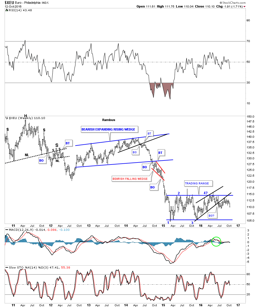
This next chart for the $XEU is a monthly look which shows its massive downtrend channel and the sideways trading range forming on top of the possible blue dashed center line. I used the same technique we looked at on the weekly chart for the US dollar where I doubled the bottom channel to create the top rail of the bigger uptrend channel, using the measuring sticks. Will the bottom rail of the huge downtrend channel ever get hit?
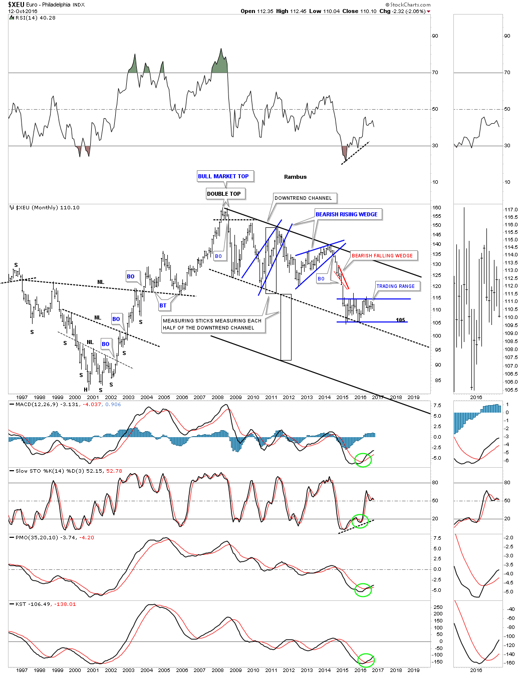
This next long term monthly chart is a different look vs the chart above. This monthly chart shows a massive double H&S top. You can see the ping pong trading range that is building out between the two necklines.

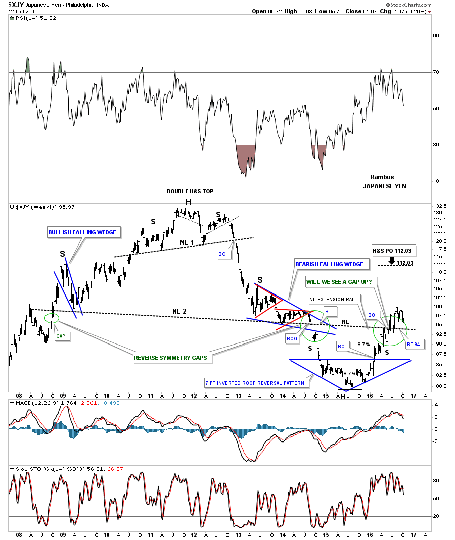
Next lets look at the $XJY, Japanese Yen, which seems to be playing a key role in the precious metals complex. We’ve been following this potential triple inverse H&S bottom since the first of the year. Note how the symmetry is playing out on the right shoulder vs the left shoulder at neckline #3. The possible right shoulder is ping ponging between neckline #2 and neckline #3.
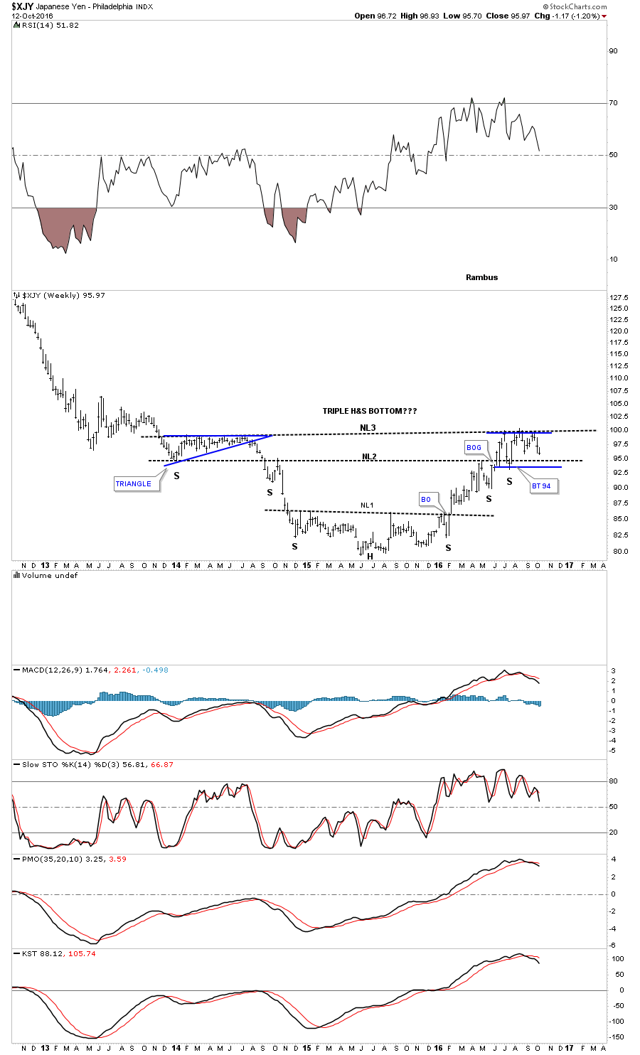
We’ve been following this next long term weekly chart ever since it broke out above the top rail of the inverted roof reversal pattern, which is the head portion of a pretty large inverse H&S bottom. Note how big neckline #2 has reversed its role, from support to resistance and back to support again, several months ago on the backtest to the smaller H&S bottom neckline. This is an important chart to watch as the PM complex tends to follow the $XJY.
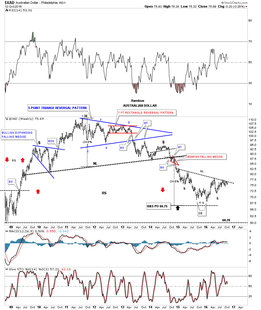
The $XAD, Australian Dollar, is showing a potential inverse H&S bottom which has been testing the neckline from below but still hasn’t had the energy to breakout above it yet.
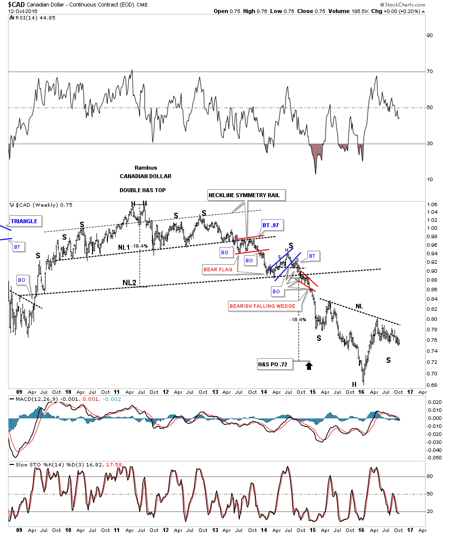
The $CAD, Canadian Dollar, which is another resource based currency is showing a similar inverse H&S bottom to the $XAD after reaching the price objective from that massive H&S top. Keep in mind the potential inverse H&S bottom won’t be complete until the neckline is broken to the upside.
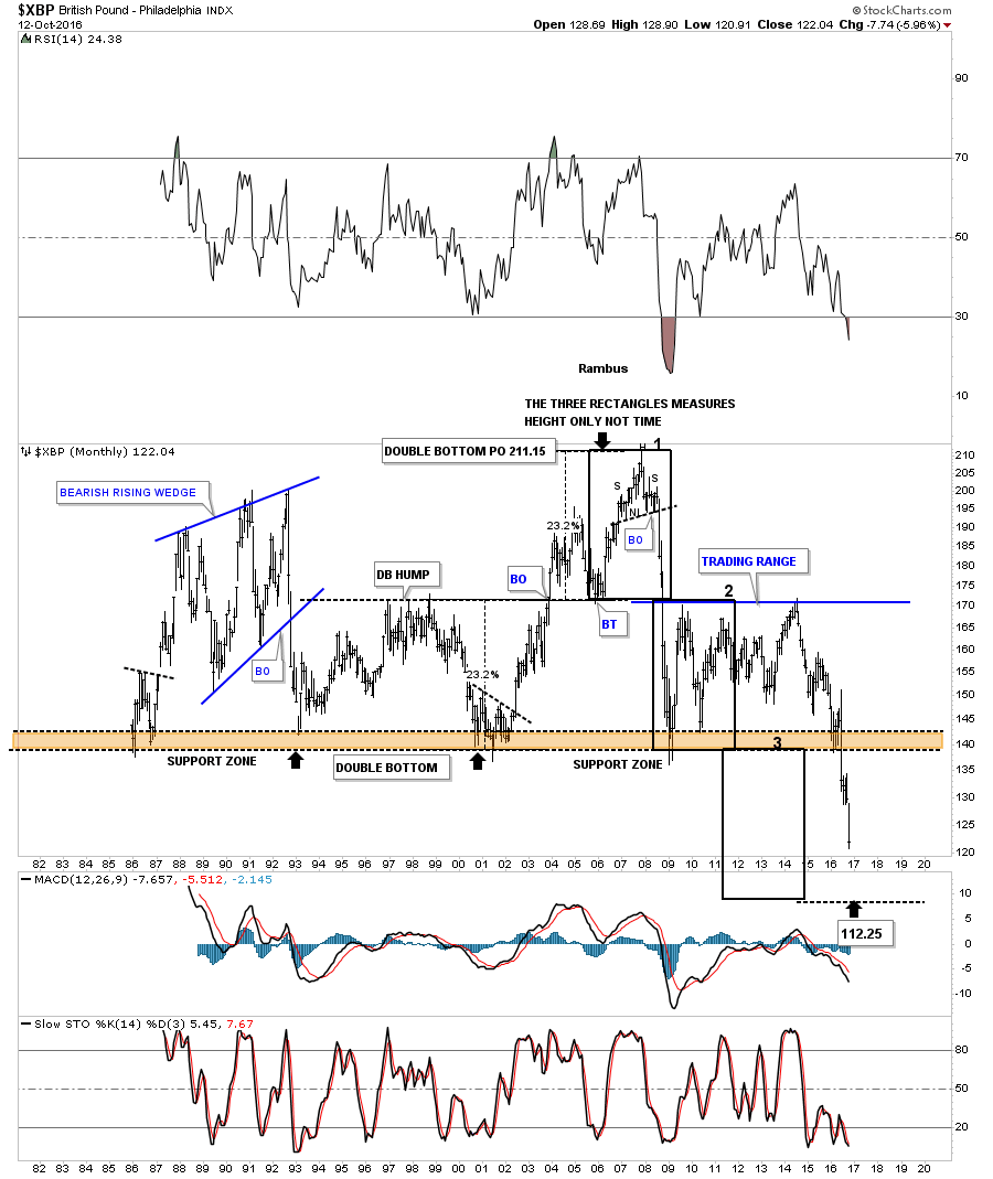
This last currency will be a 30 year look at the $XBP, British Pound, which shows the price action crashing below the major support and resistance zone at the bottom of the chart. These types of patterns that are horizontal in nature can be measured in equal increments. I’ve added three rectangles which are exactly the same height that measure price but not time. You can see rectangles #1 and #2 measures the two equal portions above the brown shaded support and resistance zone. The third rectangle is the same height as the other two, and measures down to 112.25 which could mark the measured move price objective. This may be one reason the $FTSE, which we’ll look at later, is trying to breakout to new all time highs.
In the next part to follow we’ll look at commodities to see how they have been trading. The US dollar will most likely give us some important clues to follow depending how it trades within its sideways trading range.
Commodities
In part two of this Quarterly Report we’ll look at the commodities complex that had a severe bear market that began in 2011 along with the precious metals complex. When you look at that monthly candlestick chart for the US dollar in part one of this report, you will see that string of nine white candlesticks all in a row when the price action broke out from big base #2. That strong impulse move up in the US dollar led to the crash in the commodities complex.
Big trends don’t reverse on a dime. It takes a lot of time of chopping around to build out some type of reversal pattern. The bigger the pattern, the bigger the move to follow. The most common reversal pattern is the H&S, followed by a double bottom or double top. Not so common is a five point triangle, rectangle or falling wedge, that will reverse a trend. When a trend becomes mature these are the reversal patterns that will generally show up.
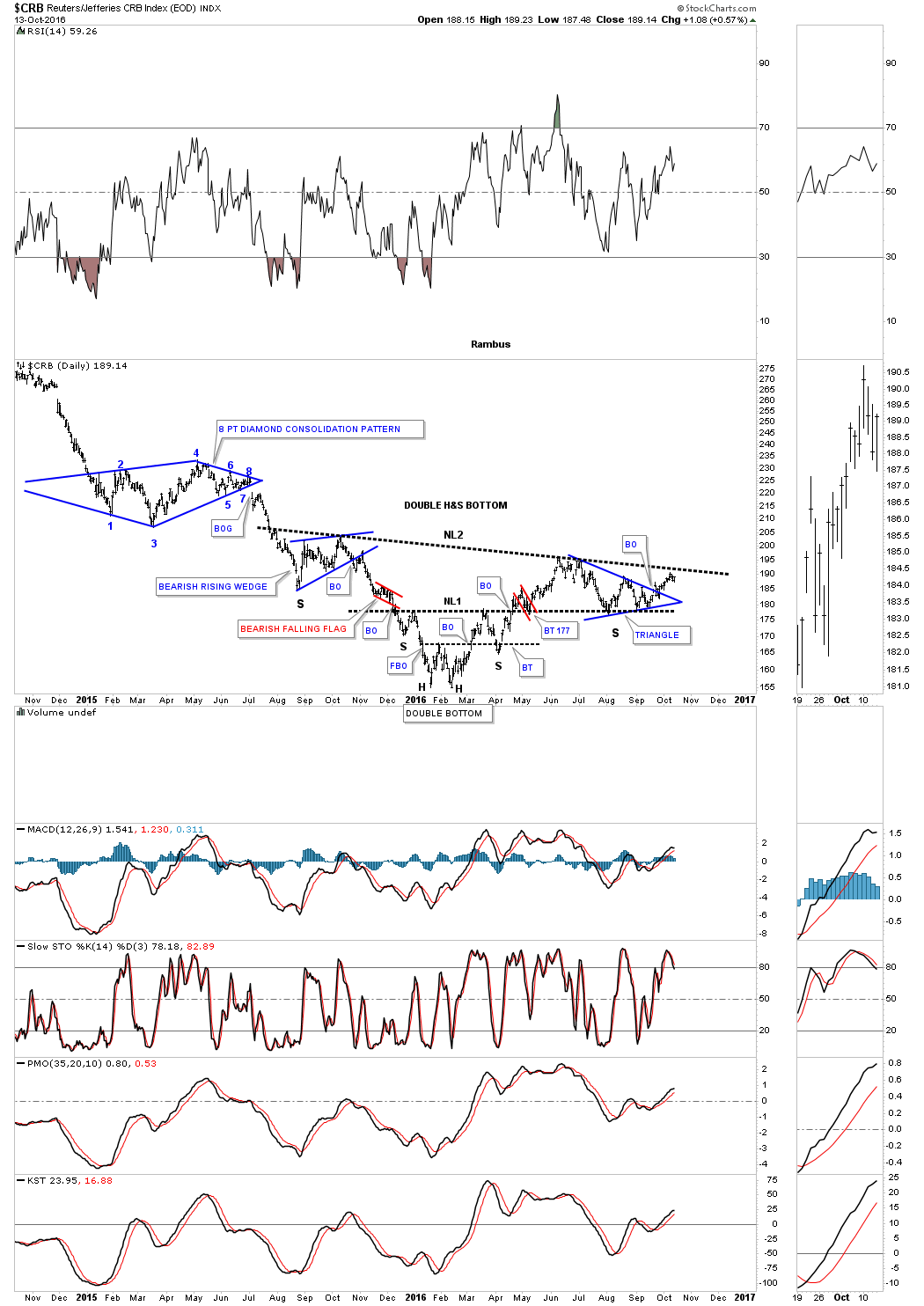
Lets start by looking at a daily two year chart for the CRB index which has been around a long time. On the left side of the chart you can see the last two consolidation patterns that formed during the hard down phase into the bear market low in January of this year. There was no way to know last fall that the blue bearish rising wedge would end up being the left shoulder of a still uncompleted inverse H&S bottom. The H&S bottom won’t be complete until the price action breaks out above the neckline.
Note the small double bottom that formed in January and February, which is a reversal pattern itself which has created the head portion of this inverse H&S bottom. Once the CRB index broke above the double bottom hump it reversed its role to support on the backtest, which created the right shoulder of the much smaller inverse H&S bottom labeled neckline #1. After finding support on top of the double bottom hump, the CRB rallied for the second time taking out neckline #1. The price action then backtested neckline #1 before moving to a new high on the right side of the H&S bottom.
Since June of this year, the CRB index has been consolidating that initial move up. Notice the double bottom low that formed the head, and the blue triangle which may very well be the right shoulder for this inverse H&S bottom. Again, the H&S bottom won’t be complete until the price action breaks out above the neckline.
What this daily chart also shows, is how the CRB index is reversing symmetry back up. Just follow the price action up from the January low on the left side of the head, and then follow the price action up from the second low on the right side of the head. It’s never a perfect correlation but you can see how the CRB index is reversing back up over the same area on the way down into the bear market low.
This next daily four and a half year chart puts our potential inverse H&S bottom in perspective. The decline into the bear market low was so strong that the price action created a parabolic downtrend arc. Normally when you see a steep decline like that the move in the opposite direction can be just as strong, in this case back up. First things first though. First we need to see the neckline broken to the upside to complete the H&S reversal pattern.
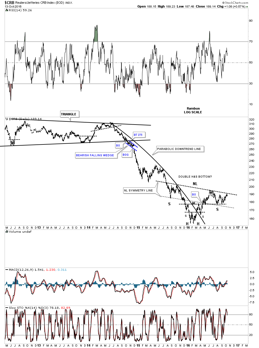
This next chart is a weekly look which shows the massive H&S top which ushered in the bear market decline. As you can see it took roughly five years to build out that huge H&S top but it only took one year when all that energy was released, to reach the bottom of the bear market when the neckline gave way.
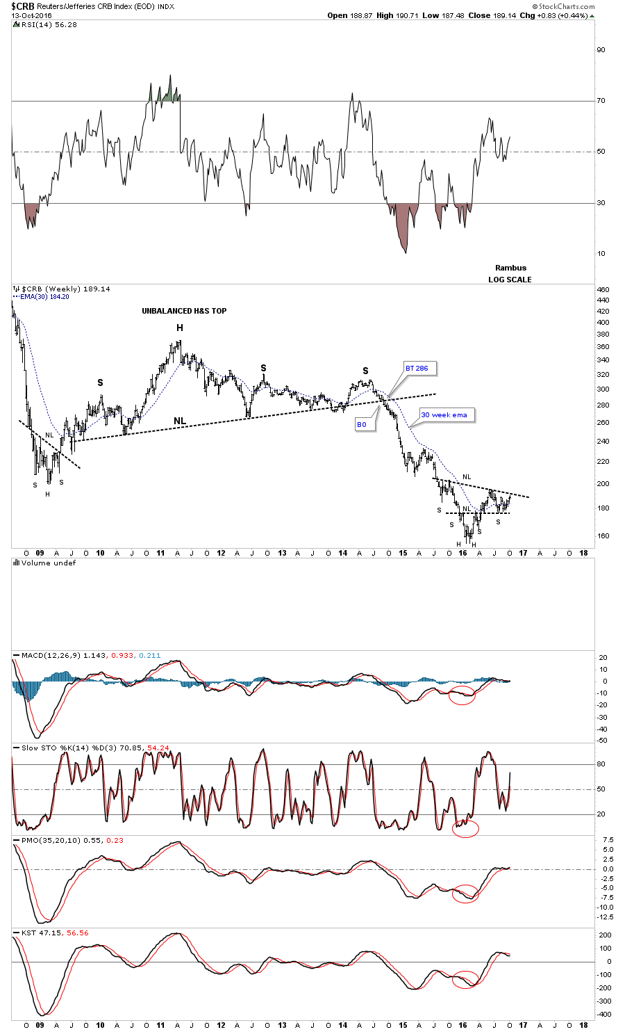
Below is an old weekly chart which shows many of the different chart patterns and measured moves the CRB index made over the last ten years or so. The same colored arrows measures each half of the measured move with a consolidation pattern in the middle. For instance, the blue arrows measures each impulse leg up, with the red bull flag as the halfway pattern.

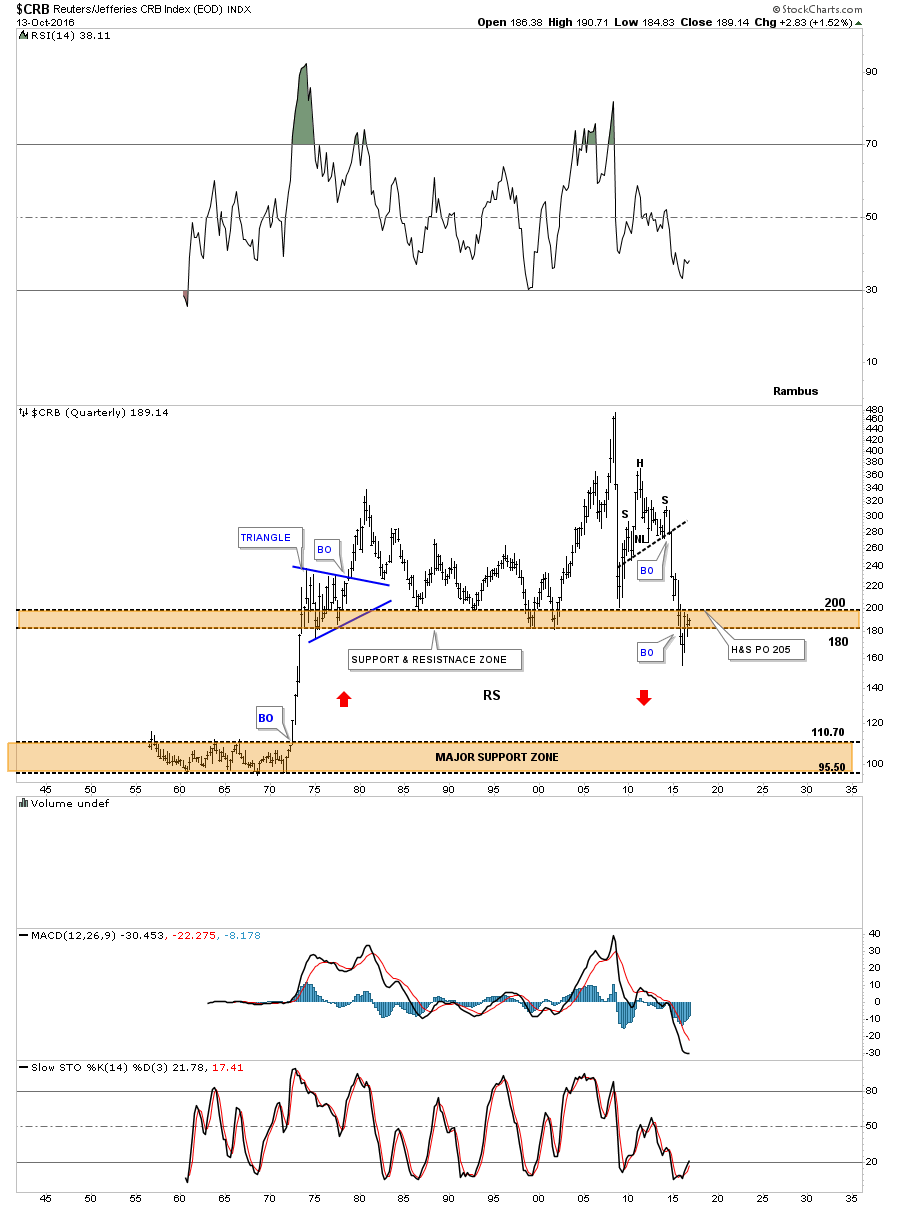
This last chart for the CRB index is one we were following during the deflationary spiral in 2014 and 2015. This 75 year chart shows two brown shaded support and resistance zones. The upper one was reached when the H&S top gave way, which had a price objective down to the 205 area. When the price action broke below the upper S&R zone it looked like the deflationary collapse might take the CRB index down to the lower brown shaded S&R zone.
This is where our current H&S bottom comes into play. If the inverse H&S bottom works out it will show the price action, below the upper brown shaded S&R zone, as a bear trap. As it stands right now the brown shaded support and resistance zone is still holding resistance until the CRB index can trade back above it which the H&S bottom is suggesting if it comes to pass.
This next commodities index we’ll look at is the DBC which is the most actively traded commodities index. This index built out a five point triangle as its reversal pattern. The blue expanding triangle, in the middle of the bear market decline, is a halfway pattern which measures each equal leg of the impulse move down that had a price objective to 11.70.
The last bit of Chartology on this chart is the neckline symmetry line. Through the years I have found that when you begin to suspect that a H&S pattern is building out I get the best results if the neckline is extended down to the bottom of the left shoulder, which often times can show you the bottom for the right shoulder. It’s just a symmetry thing. It’s by no means necessary but when you see a nice symmetrical H&S with both shoulders in line with the neckline, the odds favor the H&S will playout as expected.
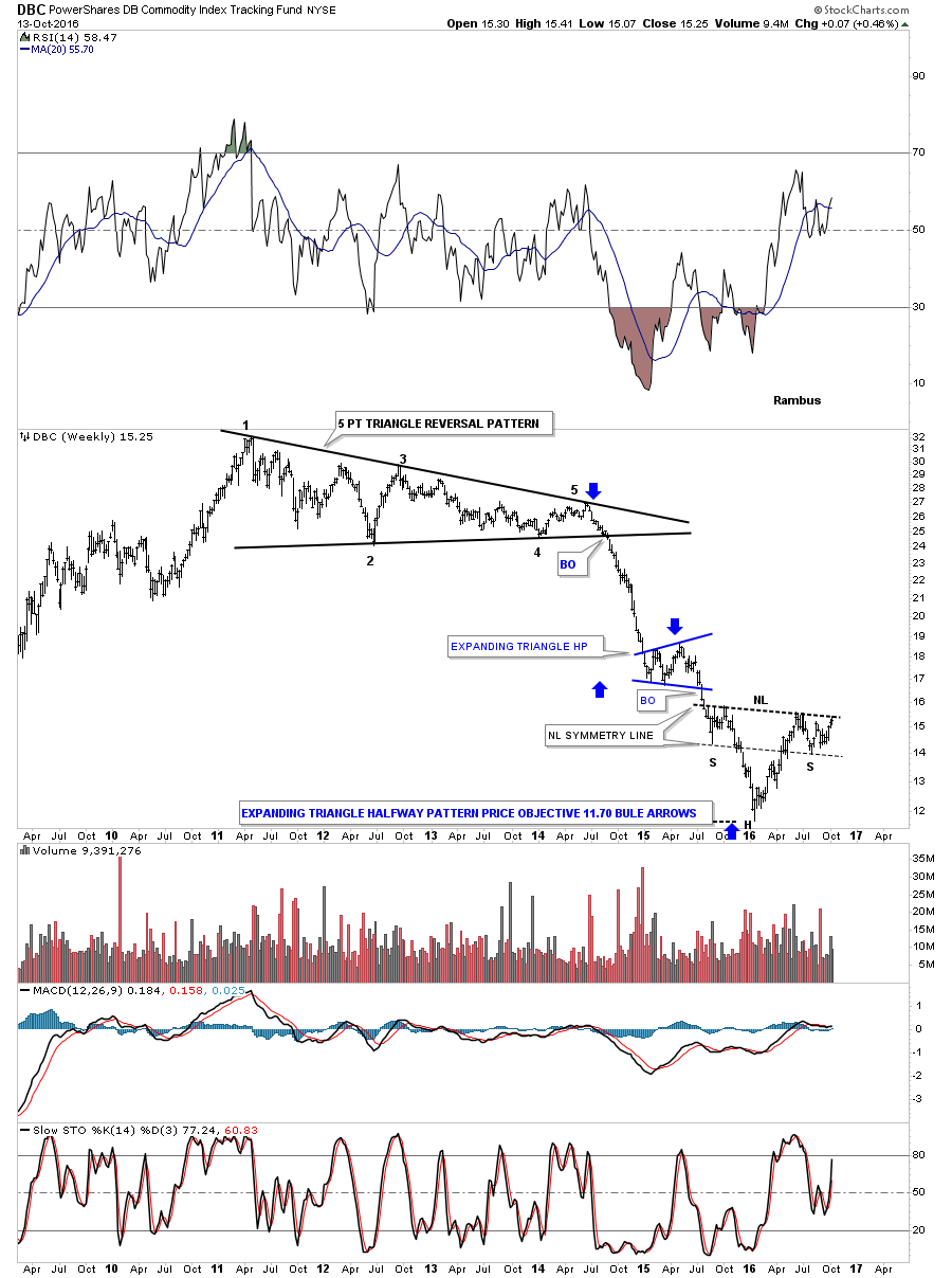
This monthly candlestick chart for the DBC shows you when you see a string of black candlesticks all in a row you have an impulse move down, and when you see a string of white candlesticks all in a row, you have an impulse move up. When you see a mix of white and black candlesticks that generally suggests you are in a trading range of some kind.

Next lets look at oil which is the most important commodity on the planet. How oil goes, so does the economy in most cases. Like the commodities indexes we looked at above, the $WTIC crude index is also building out a possible inverse H&S bottom. This week the price action finally hit the neckline, telling us it’s hot by the way it backed off, which is what you want to see. It also tells you the neckline is properly placed.
Just like the commodities indexes we looked at previously, oil’s head is also a double bottom. Back in September I showed how the triangle, which formed the right shoulder, may morph into a slightly bigger triangle, as shown by the red circles. The thin dashed trendlines shows the original triangle. Keep in mind everything you see below the neckline is the base, and the actual impulse move up won’t begin until the neckline is broken.
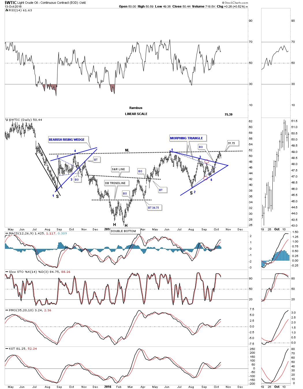
Again, like the commodities indexes we looked at, the $WTIC is also showing some beautiful symmetry, as shown by the neckline symmetry line, which is showing us the bottom for the left and right shoulders.
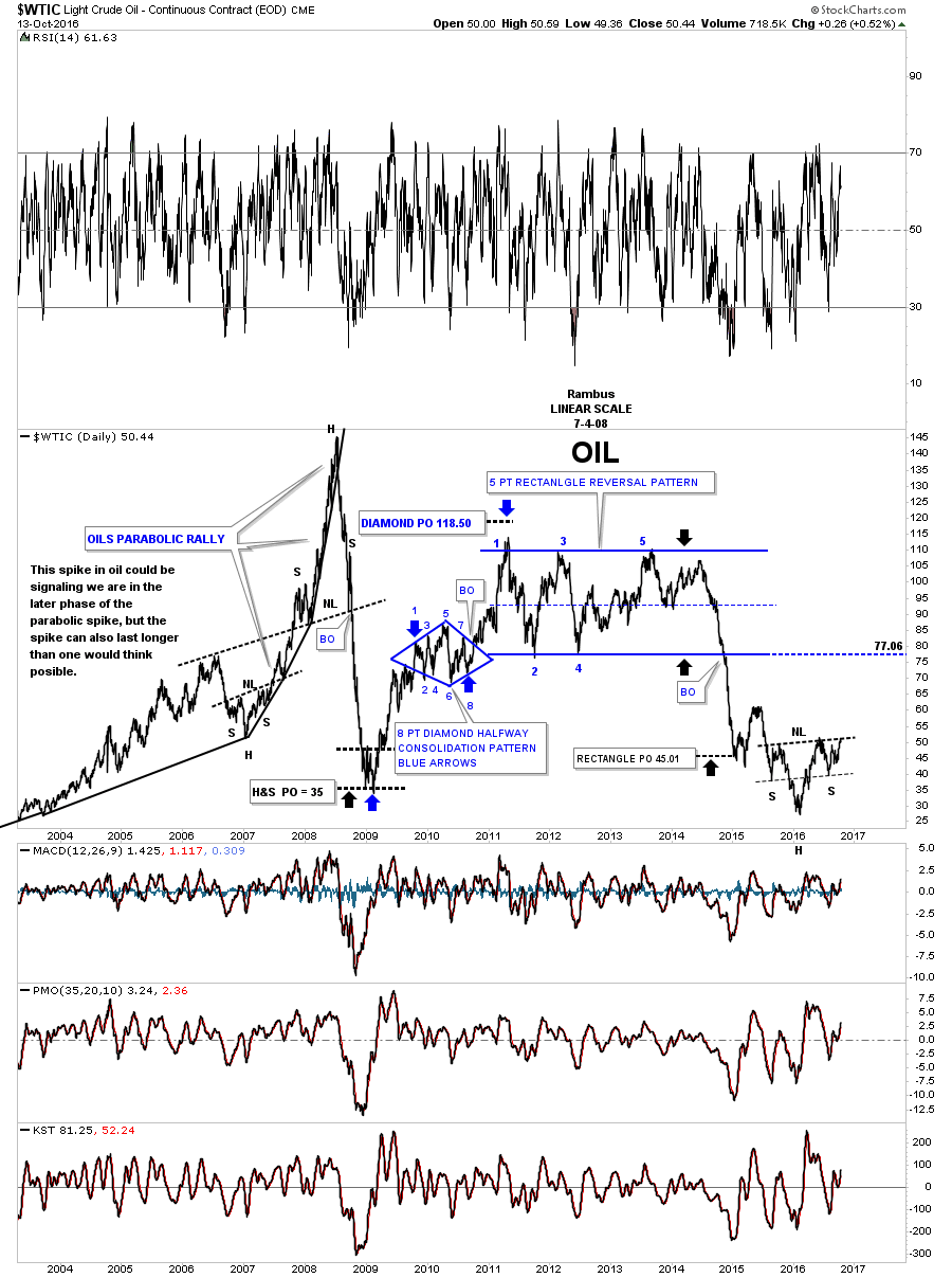
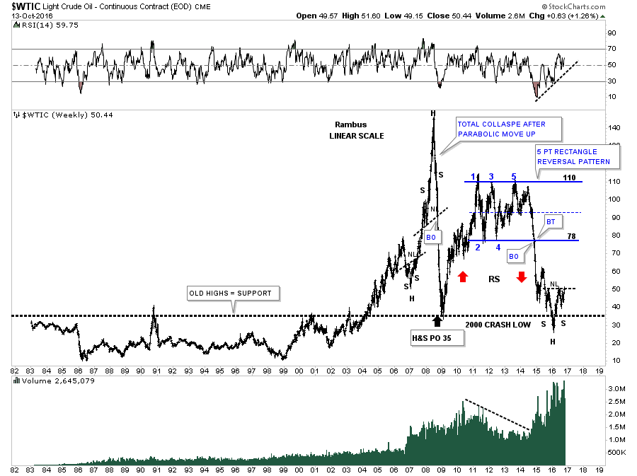
This next chart for oil is a 15 year daily line chart going back in time to just before the parabolic rise to 147. It’s hard to see on this linear scale chart, but oil built out a large H&S top when the high at 147 was reached and the parabolic decline began. The price objective for that H&S top measured out to 35, which was hit dead on the money.
There are several different reversal patterns I could draw in, but this chart shows a five point rectangle reversal pattern which took almost five years to complete. Notice how the measured move equaled the height of the rectangle once the bottom rail of the rectangle gave way. You can now see how our inverse H&S bottom fits into the big picture, as it’s forming just where you would like to see some type of reversal pattern build out, at the end of a big decline. Also the bottom rail of the blue rectangle at 77.06 would be the first area I would look at for resistance when the impulse move up begins.
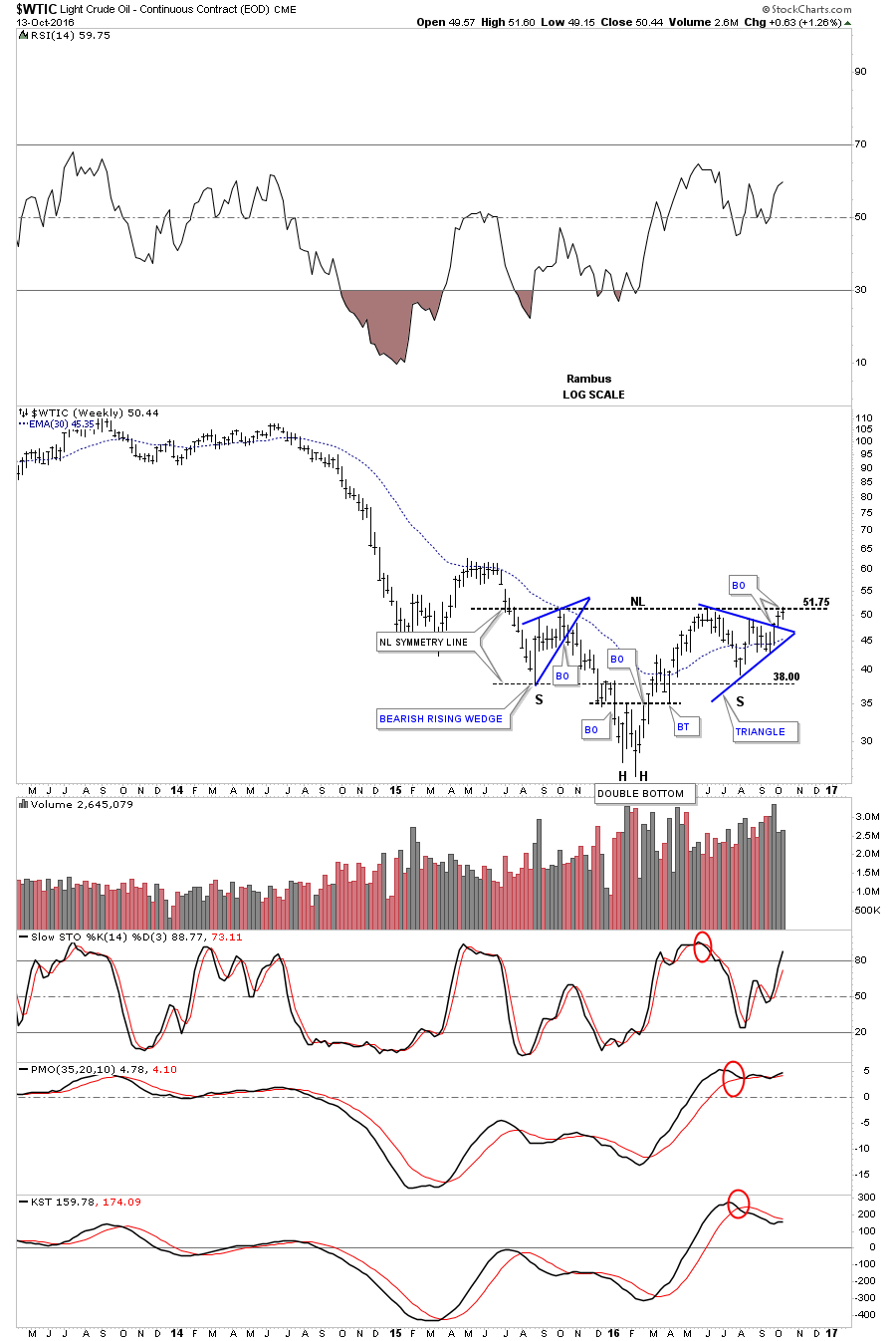
This last chart for $WTIC is a 35 year look which puts everything in perspective and why our inverse H&S bottom is forming where it is. First, notice the top of the old trading range, that goes all the way back to 1982. Oil traded below the top of that trading range until it finally broke out above it on its way to its parabolic run to 147. Also notice where the parabolic decline finally found support. It was right on top of the old trading range at 35, which reversed its role to what had been resistance to now support, during the 2008 crash.
Now fast forward to our current price action on the right side of the chart. You can see our five point rectangle which led to the 2014 – 2015 crash. After reversing symmetry down over the same area as the rally out of the 2008 crash low, as shown by the red arrows, oil cracked below the old highs, but finally found support where the head is located for our current inverse H&S bottom. The top of the old twenty year trading range came into play, once again offering support at the last minute.
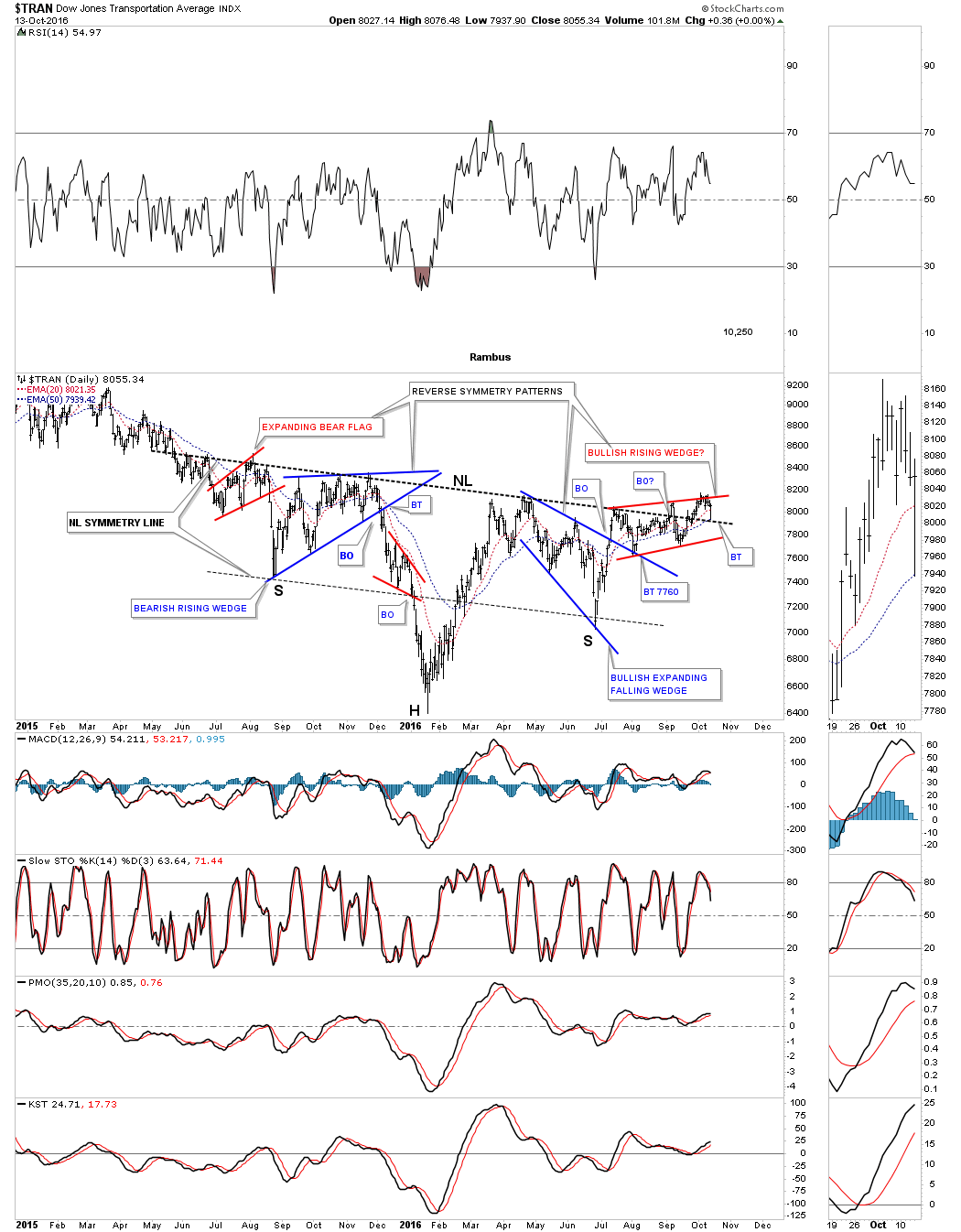
Before we leave oil there is another very beautiful and symmetrical H&S bottom that matches the oil chart almost perfectly. Below is a daily chart for the Transportation Average that is in the breaking out and backtesting phase, which is slightly ahead of oil. Today it made a perfect backtest to the neckline before bouncing higher. The neckline symmetry line shows us the bottom for the left and right shoulders. They say beauty is in the eye of the beholder. To me this chart represents beautiful Chartology.
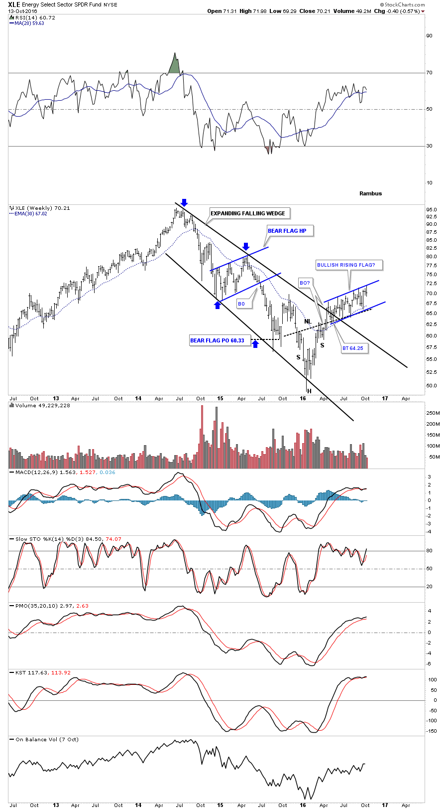
Next lets look at a few energy related etfs to see if they are offering us any clues to the direction of oil. This first chart is a daily look at the XLE which is an energy fund. We’ve been following this potential rising flag since the fifth reversal point thinking the pattern was getting close to completion. Little did we know at the time, but the XLE would go on to form reversal points 6, 7 and just completed reversal point 8 on Monday of this week. With 8 completed reversal points this rising flag is technically a consolidation pattern to the upside, but until it can breakout above the top rail it’s still in consolidation mode.

The weekly chart for the XLE shows the rising flag forming above the top rail of the expanding downtrend channel with the 30 week ema offering support. This rising flag is over six months in the making and it still hasn’t shown us its hand, so we wait.
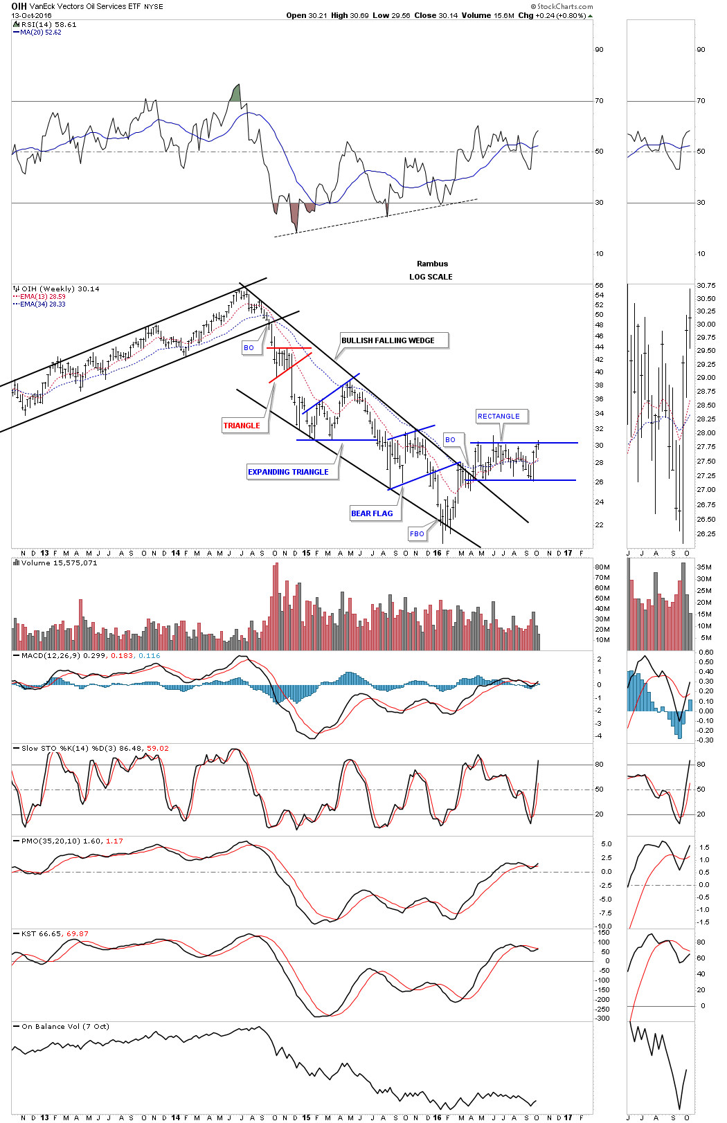
The OIH, oil service etf, shows a horizontal trading range that has been building out after breaking out from the black bullish falling wedge. It’s testing the top rail, but no break through yet.
Next is the XES, oil and gas and equipment and service etf, which is showing a possible inverse H&S bottom and is currently testing the neckline. You can see the volume picking up as it’s trying to breakout above the neckline, which is what we would like to see happen.

This next sector we’ll look at is $NATGAS which is giving us a heads up on what we may expect from the oil sector. This daily chart below shows a rather complex H&S/double bottom base, which launched its new bull market. It recently broke out of the blue triangle consolidation pattern complete with a backtest.
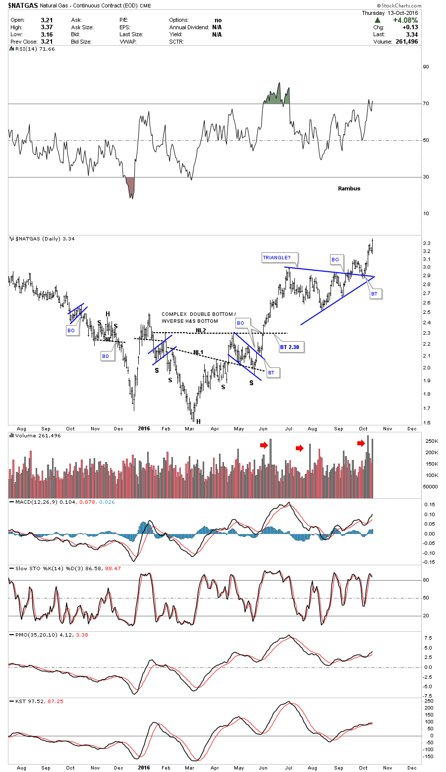
Lets step back further in time and look at a five year weekly chart which shows us a pretty symmetrical inverse H&S bottom, as shown by the neckline symmetry line. The right shoulder is a little smaller than the left shoulder, but that can happen in fast moving market. Like oil, $NATGAS too has a double bottom head with the two lows being further apart. You can see how it has already broken out above its neckline which is leading oil. Note how the neckline symmetry lines played a key role in the height of the left and right shoulders of that big H&S top. The breakout from that big H&S top was accompanied by a breakout gap.

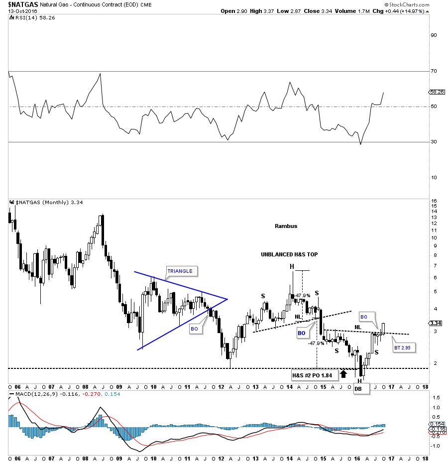
This last chart for $NATGAS is a twelve year monthly candlestick chart, which once again shows you that when you see a string of black candlesticks all in a row, you know you’re in an impulse move down. When you see a string of white candlesticks all in a row, you know you’re in an impulse move up. We still have two more weeks to trade for this month, but if $NATGAS can hold on to its gains it will create a white candlestick above the neckline. The bottom line is $NATGAS is showing us the way higher in the energy complex.
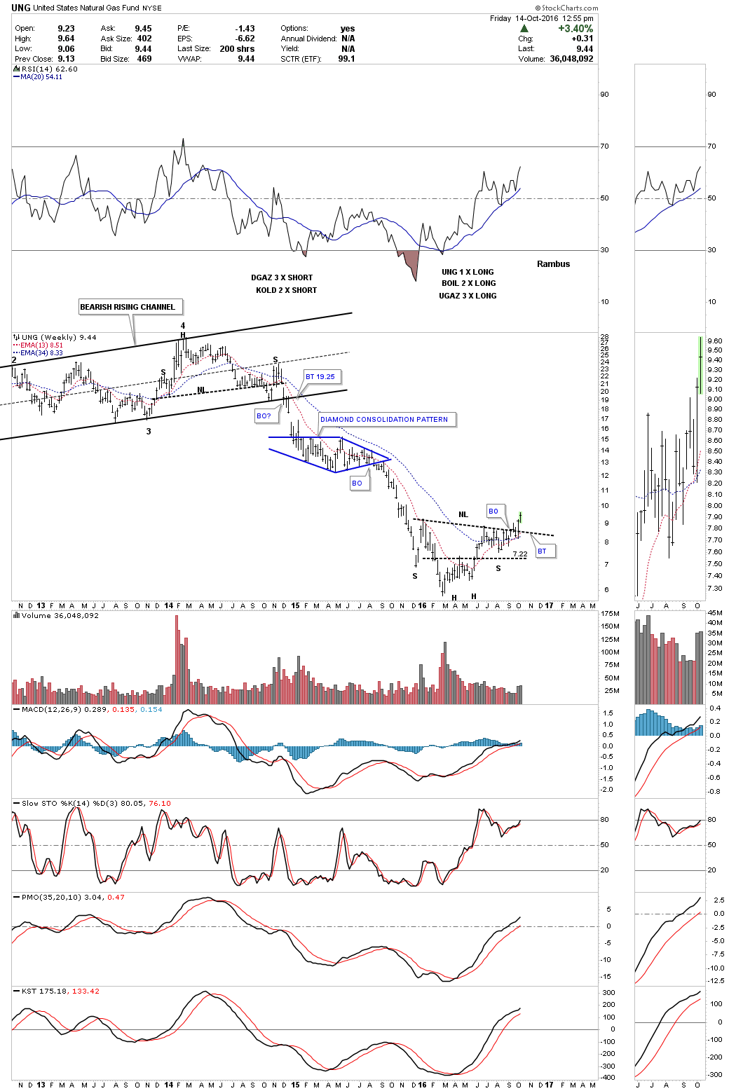
This weekly is another natural gas fund, UNG which is showing a breakout above its neckline. I still can’t rule out a backtest to the neckline which is still possible, but would represent a good low risk entry point if it happened.
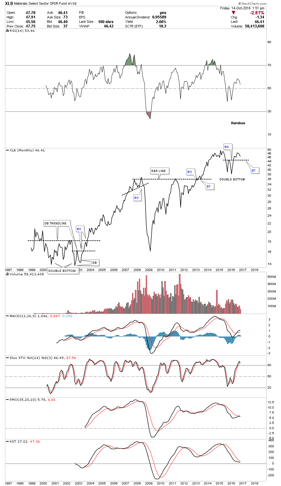
Another area I would like to see some strength in is the basic materials sector. The XLB does a good job of tracking many big cap INDU stocks that make up this sector. There are several big INDU stocks such as DuPont, Dow Chemical and International Paper to name a few, which will help lead the INDU higher if the XLB turns in a strong performance.
The XLB built out a seven point bearish rising wedge reversal pattern which broke down in 2015. An unbalanced double bottom formed at the low, which reversed the downtrend channel. The double bottom trendline has been holding support at the 45.25 area on several backtest attempts. The two red arrows show a little symmetry just below the double bottom trendline.
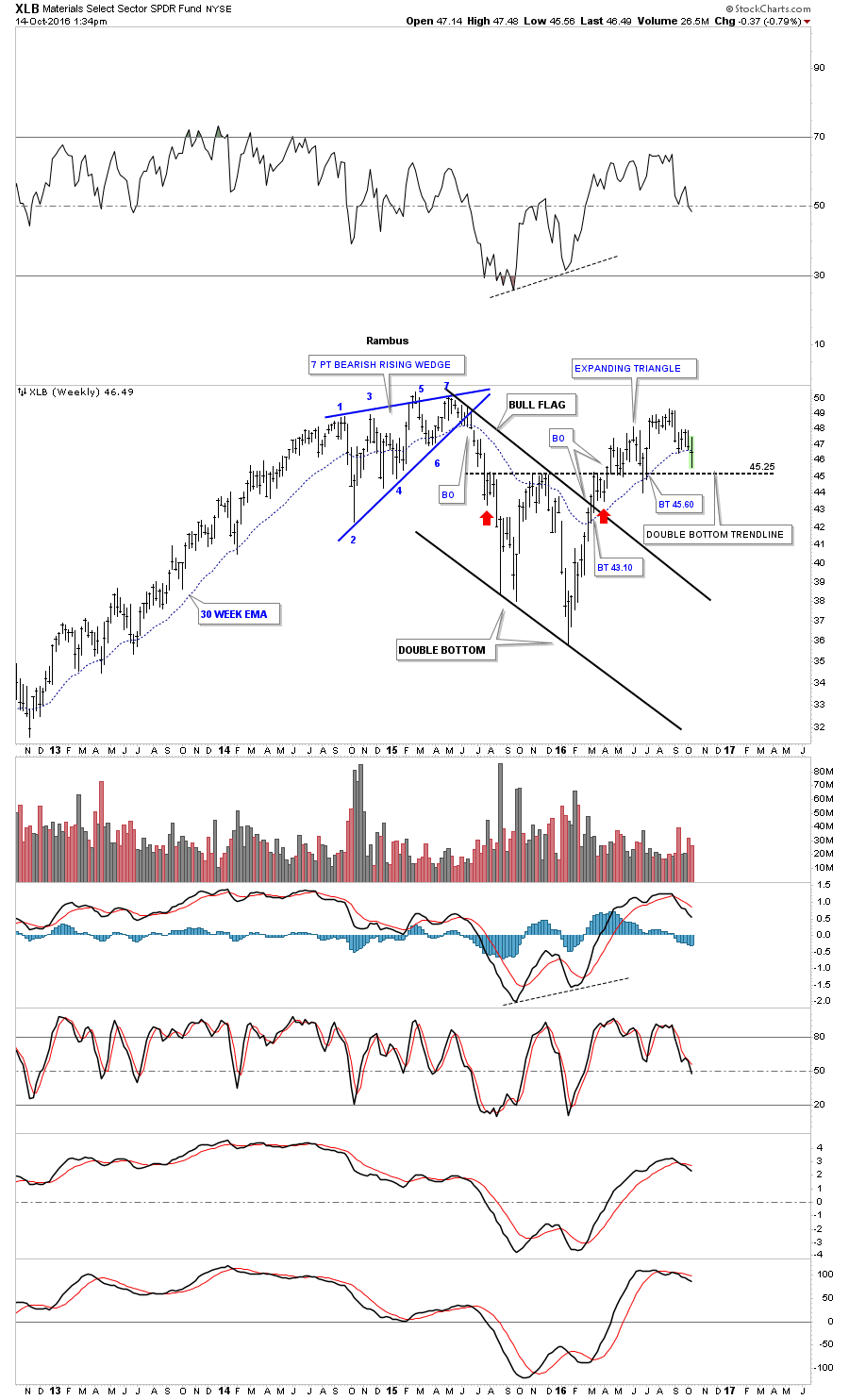
It’s always nice to look at a line chart, which sometimes can give you a clearer picture, that can take out some of the noise a bar chart can make. Below is a monthly line chart which shows the entire history for the XLB. You can see how the double bottom stands out now. Actually the XLB isn’t that far from making a new all time high, which would be very bullish for the commodities and stock markets.
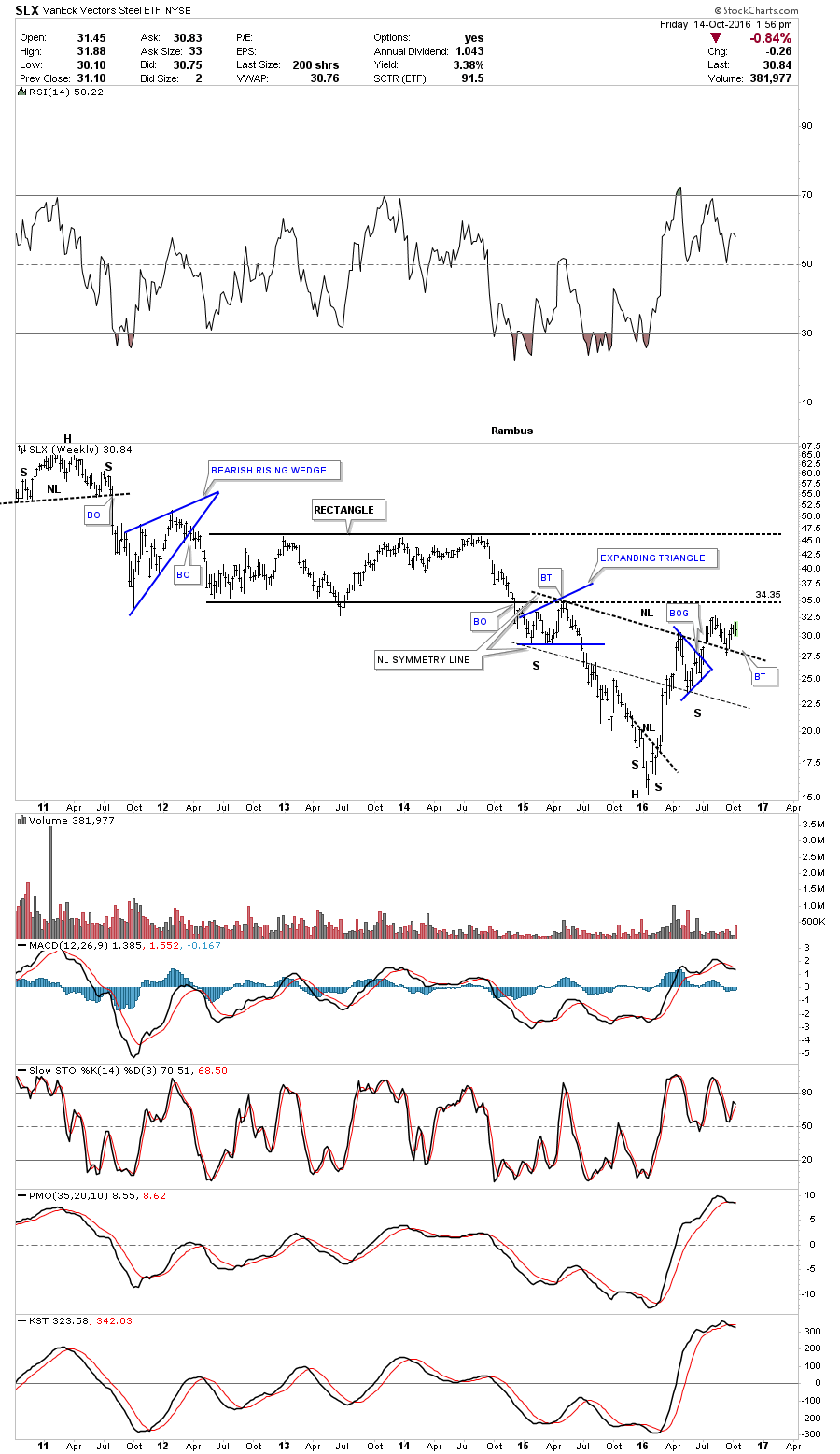
The SLX is a steel etf which has been building out an inverse H&S bottom. It has broken out above the neckline and has had a backtest. There is some overhead resistance at the bottom rail of the black rectangle consolidation pattern that it will have to overcome. The H&S bottom suggests that it’s building up the energy to take out that bottom rail at 34.35.
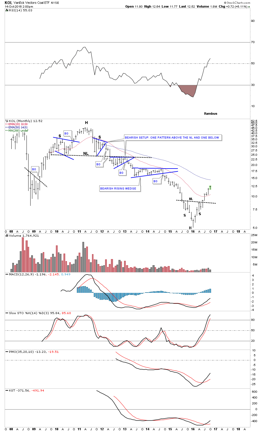
For all the bad publicity that coal has gotten the KOL, coal etf, has been one of the stronger areas in the commodities complex. It was one of the first to breakout of its inverse H&S bottom and hasn’t looked back.
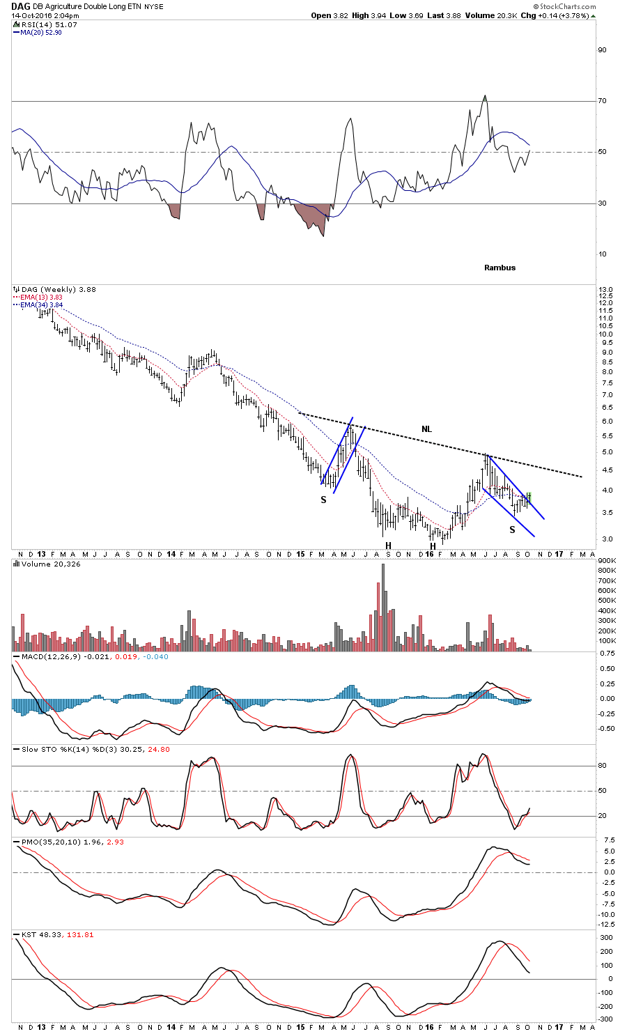
This last sector I would like to show you is the Agricultural etf, DBA. This area has been one of the weakest sectors within the commodities complex but it looks like it’s attempting to build out an inverse H&S bottom. This week it’s trying to breakout above the top rail of a falling wedge, which may very well be the right shoulder of a possible two year inverse H&S base.
As we have seen, the commodities complex had a massive bear market that started for the most part in 2011. After that very strong decline in most of the different areas inside the commodities complex, they have been building inverse H&S bottoms. As with any major trend reversal it takes a big pattern to reveres that trend, and the bigger the move the bigger the reversal pattern tends to be.
Stock Markets
In part three of this Quarterly Report I would like to show you many stock markets from around the world including our own here in the USA. I’m going to focus in on the longer term weekly and monthly charts because that’s where the truth really lies. The shorter the time frame one looks at the better the chance a pattern can change or morph into something else. In big chart patterns there can be millions or even billions of shares traded, which makes it harder for a good pattern to morph into something else. As with any trading discipline in the markets there are never 100% guarantees, only probabilities. The more clues we can find to help us make a decision, as to what to do, the higher our odds become that we may be on the right side of the markets.
The last two years for the US stock markets have been difficult for the intermediate to longer term investors, as there has been no significant trend change either up or down to trade. Big trading ranges can be one of two things. First, they can produce a reversal pattern that will reverse whatever trend is in motion. On the other hand, if a trading range breaks out to the upside then we’ll see a consolidation pattern, which in many cases will end up being a halfway pattern between the previous consolidation pattern and that impulse leg up. The rally out of the consolidation pattern can look similar in price and time to the previous impulse leg up.
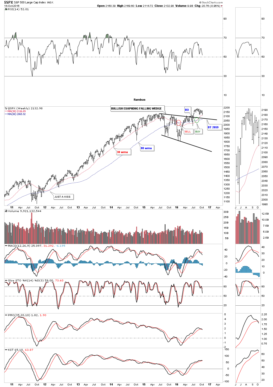
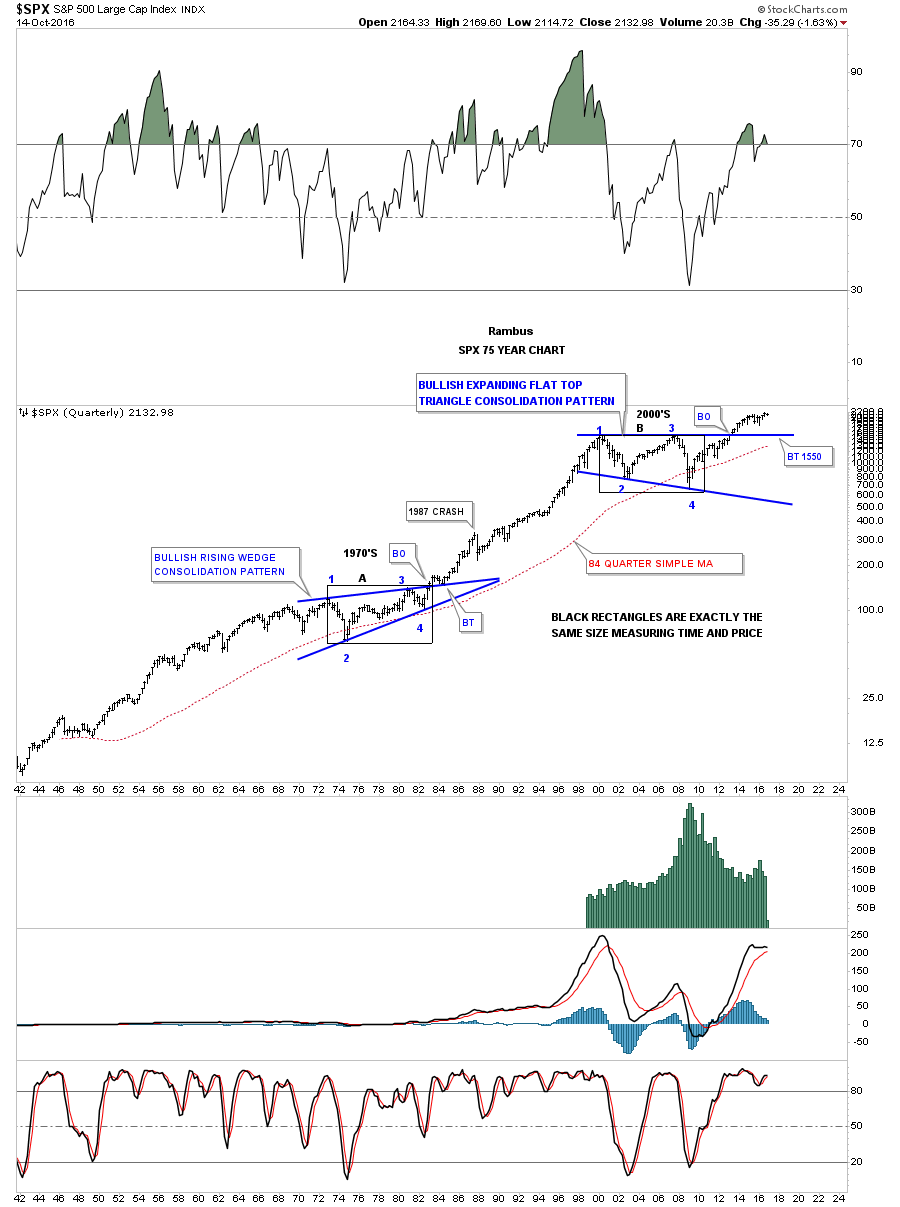
Lets get started by looking at a weekly chart for the SPX which shows it topped out about two years ago, and has been chopping sideways going basically nowhere. During this two years sideways trading range we can see a possible bullish expanding falling wedge that built out with an upside breakout, suggesting the bull market that began in March of 2009 is still alive.
What is critically important for the possible bullish expanding falling wedge to be successful, is for the backtest to the top rail at the 2060 area to hold support. This is all part of the breaking out and backtesting process, which will either confirm or deny the expanding falling wedge is the real deal. If the top rail fails to hold support then we know something is wrong and we will need to rethink things, but until that happens we have to respect the fact that the expanding falling wedge is a consolidation pattern.
There is a simple trend following technique I like to use on the weekly charts, when looking at the bigger picture for confirmation, that an impulse move is strong. I like to use the simple 30 and 88 week moving averages for buy and sell points, but mostly to follow the major trend. This simple technique would have kept you on the long side of the SPX for most of its bull market. Normally when you see the 30 week ma crossover the 88 week ma it can signal a trend change, or a consolidation pattern may be starting to build out.
This weekly chart for the SPX shows the negative cross for these two moving averages in January of this year as shown by the red circle. Then in August of this year we got a positive crossover signalling the expanding falling wedge may very well be a consolidation pattern and not a reversal pattern. Again, the backtest to the top rail is key going forward.
Below is a long term monthly chart for the SPX which puts our possible expanding falling wedge in perspective. Since the 2009 crash low the SPX has been trading in a well defined uptrend channel. What is obvious on this chart is our current trading range, the expanding falling wedge, that has formed between the top and bottom rails of the uptrend channel, which shows the biggest correction since the bull market began. This monthly chart also shows the 21 month simple moving average as another trend following moving average I like to use, which works best on the S&P 500 vs some of the other US stock market indexes. As you can see there are two important areas of support, the top rail of the expanding falling wedge and the 21 month moving average, which are going to tell us if we’re on the right track if they can hold support.
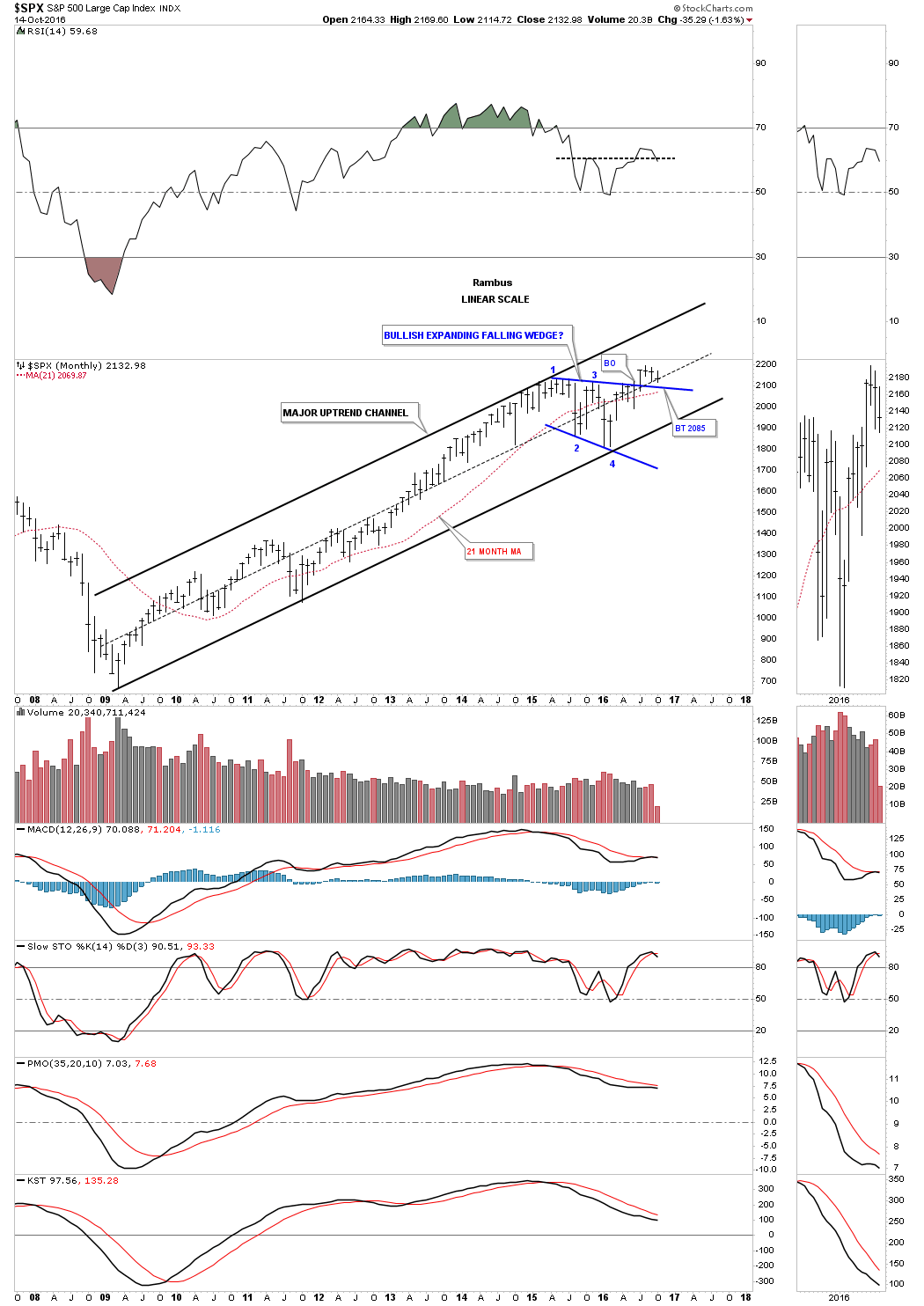
Over the last 20 years the 21 month moving average has done a very good job of keeping you on the right side of the major trends in the SPX. Just think of it as a moving trendline which holds support until it’s broken to the downside, and then it reverses its role to resistance when backtested from below. Over the last twenty years this moving average has only given a handful of buy and sell signals with a couple of whipsaws. Just follow the price action and the 21 month moving average, starting back in 1997 to see how it held support until it was broken to the downside and then it held resistance when it was backtested from below.
The blue circle in 2011 shows the first whipsaw when the 21 month moving average failed to hold support for one month, which was quickly negated the next month when the price action closed back above the 21 month moving average. That buy signal held until August of 2015 when the 21 month ma was broken to the downside, suggesting that a trend change or consolidation period was at hand. This chart also shows you why this two year trading range has been so difficult for the intermediate to longer term investors to get a position to stick, before getting stopped out. The blue arrow at the top of the chart shows the first time in twenty years there were two false breakouts below the 21 month moving average. Again, what this suggest is that the SPX is in a trading range.
As you can see the current buy signal was generated back in March of this year when the price action closed back above the 21 month ma. Back in July the SPX spiked below the 21 month ma during the BREXIT vote, which ended up being a shakeout move. By the end of the month though the SPX closed back above the 21 month ma keeping the buy signal alive. The bottom line is if the SPX closes any month below the 21 month ma I will have to concede the bull market is over, or the correction over the last two years is still enforce. Right now the 21 month ma comes in at 2070, which will need to hold by the end of October, to keep the bull market intact on a monthly closing basis.
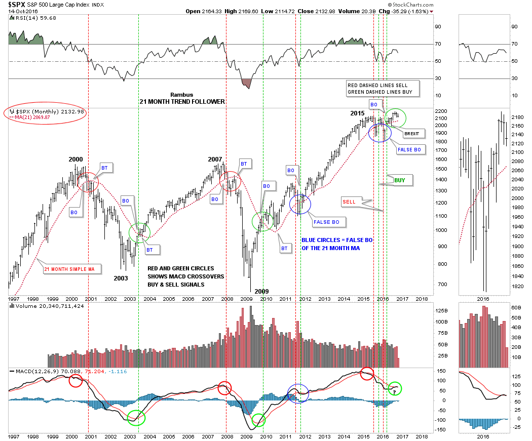
Next I would like to put some Chartology on the twenty year chart for the SPX, along with the 21 month moving average so you can see how I’m viewing the big picture based on price action. I’ve been showing this chart for years. It has a massive twelve year flat top expanding triangle consolidation pattern, which was broken to the upside back in April of 2013. Here you can see how important that expanding falling wedge, that we looked at on the weekly chart, and the 21 month moving average on the monthly chart above, are to the very big picture.
You can see the blue bullish rising wedge that formed as a halfway pattern in the 2007 bull market. The SPX also built out a second bullish rising wedge in our current bull market just below the top rail of the flat top expanding triangle. The million dollar question is, will the top rail of our current expanding falling wedge and the 21 month month moving average, hold support and be the launching point for the next important impulse leg up, which we haven’t seen in two years now?
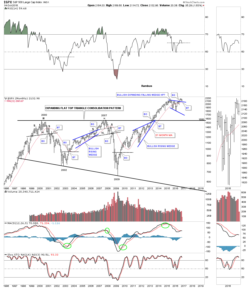
This last chart for the SPX is the 75 year quarterly chart which really puts the big picture in perspective. Regardless of all the fundamental reasons why the stock markets can’t keep going up, the pure price action is telling us a different story. As I stated earlier in this report, the bigger the trading range the more likely it will play out as expected vs a smaller trading range that shows up on the minute charts. Note the 1987 crash that seemed like the end of the world at the time, but on this 75 year quarterly chart, it was only a small blip that didn’t change the big trend that had been in place.
Next lets look at a weekly chart for the INDU which shows it has broken out of a possible triangle consolidation pattern. There was a strong backtest to the top rail of the triangle during the BREXIT vote which held support. There is a smaller blue expanding falling wedge that has formed on the top rail of the black triangle. A backtest would come in around the 17,625 area. Also back in August of this year the 30 week ma crossed above the 88 week ma to give a buy signal. If we get a backtest to the 17,625 area, it would be important to see the price action start to rally strongly, to show us the energy is there for the next important leg up in its seven year bull market.
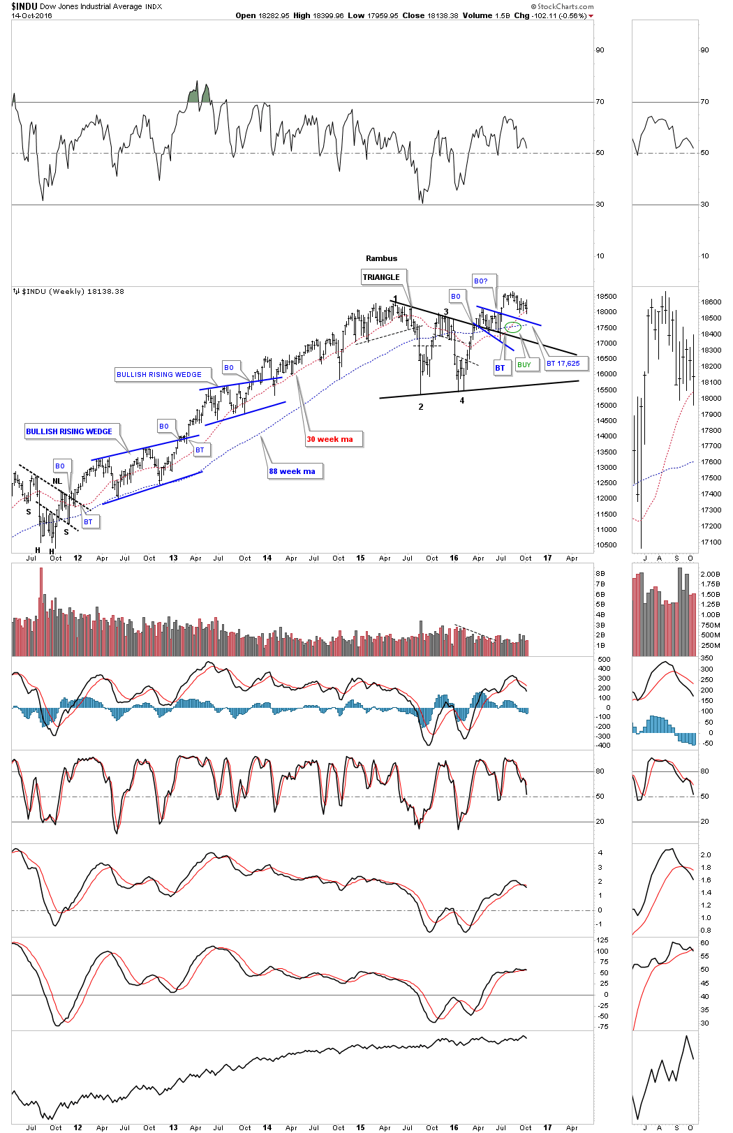
This next weekly chart for the INDU is a longer term look, which shows its bull market that began at the 2009 crash low. Using the 30 and 88 week simple moving averages, you can see there has only been one sell signal which occurred inside the blue triangle, which reversed to a buy signal in August.

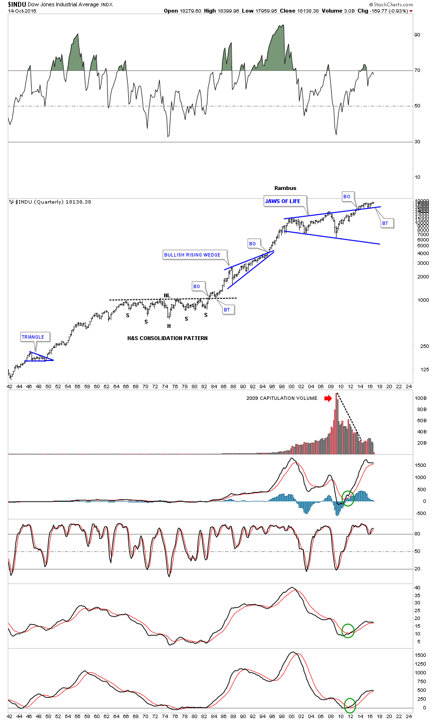
This last chart for the INDU is a 75 year quarterly look which shows the Jaws of Life consolidation pattern we’ve been following for longer than I care to admit. As you can see, the break out through the top rail and the backtesting process has been excruciatingly slow. This is all part of the two year trading range we discussed earlier. I wish I had a magic wand I could wave over the stock markets and magically end this sideways trading range and launch this next impulse leg up. Unfortunately I don’t have one, so we have to wait until the markets are good and ready to move higher. In the meantime all we can do is follow the price action for more clues.
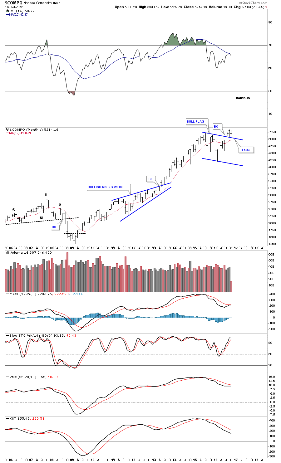
Next up is the weekly chart for the $COMPQ which is showing a possible bull flag and a positive crossover of the 30 and 88 weekly moving averages. A backtest to the top rail would come in around the 4940 area.
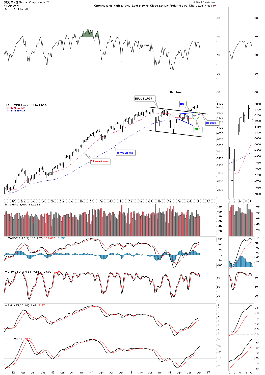
This next chart for the $COMPQ is a monthly look showing the 2007 top which led to the crash, and the bull market that ensued. Again, will the bull flag show up as a halfway pattern when we look back at this chart several years from now?
The weekly chart for the $RUT is showing us a possible H&S consolidation pattern with the 30 week ma just now crossing above the 88 week ma. An important backtest to the neckline would come in around the 1185 area.

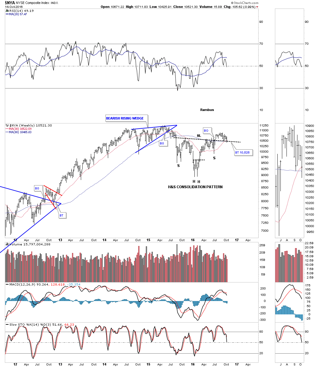
The weekly chart for the $NYA, which is a broadly based index, shows it’s forming a potential H&S consolidation pattern with the 30 week ma just now crossing above the 88 week moving average.
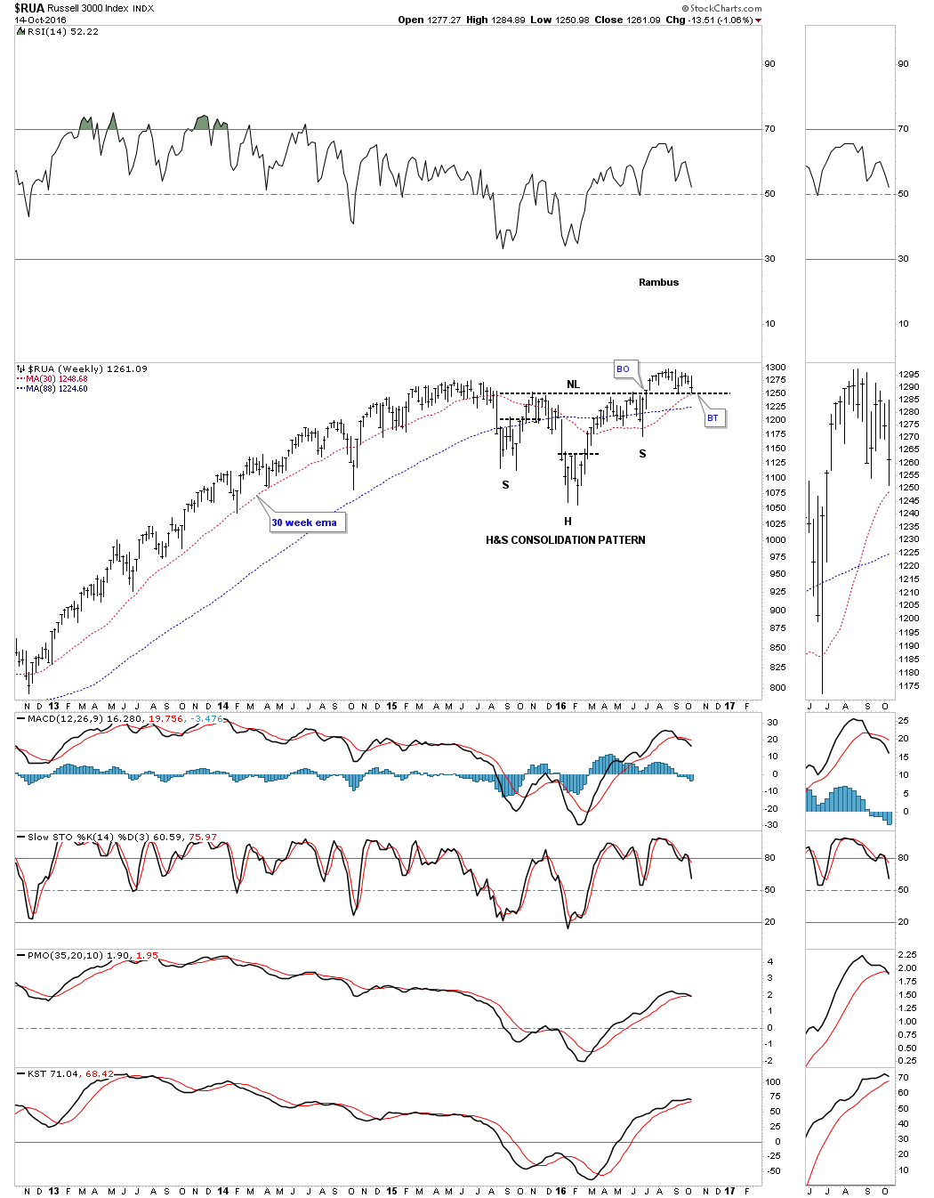
The $RUA is in the process of a critical backtest to its neckline.
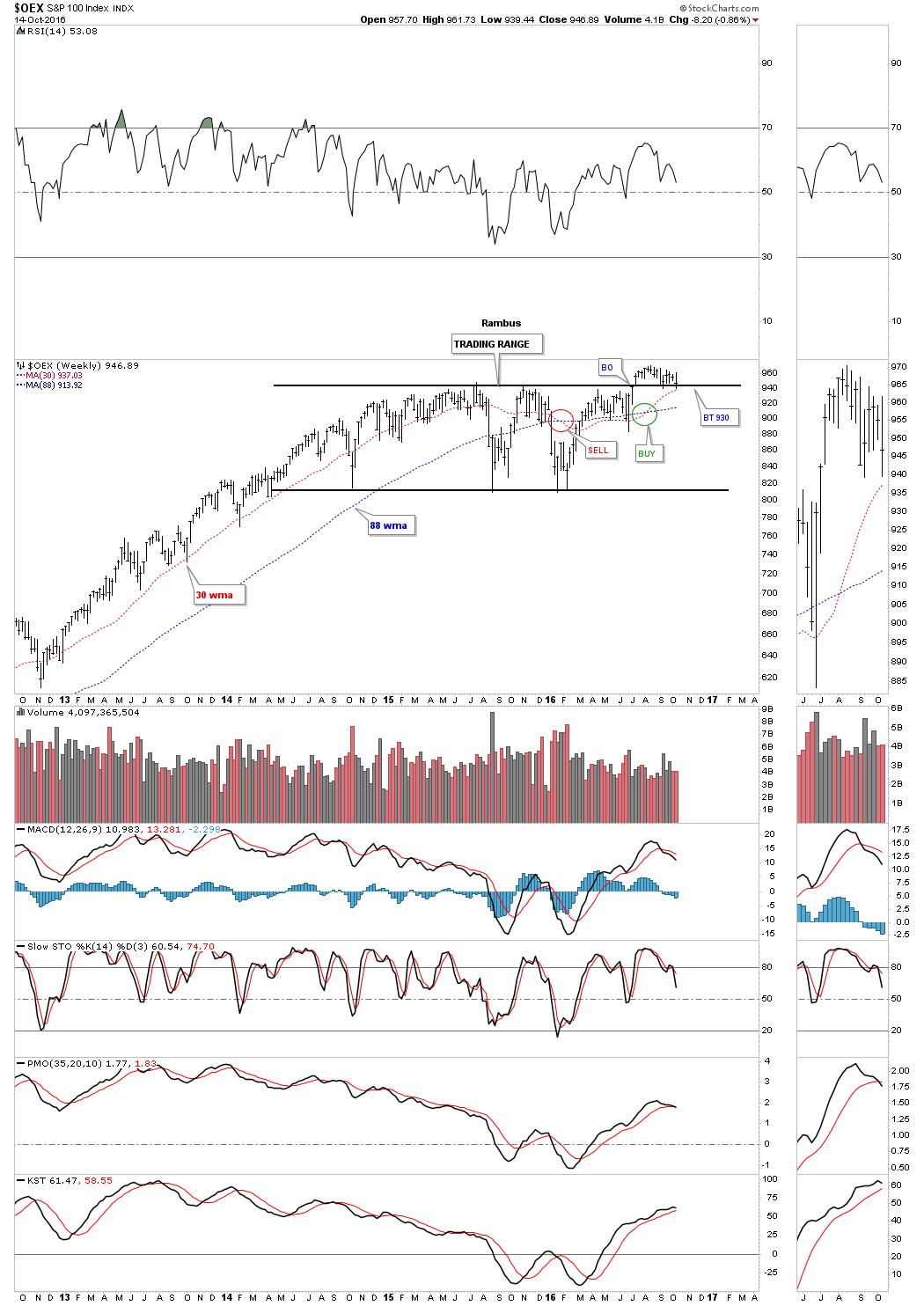
The OEX 100 has been building out as a sideways trading range and is in backtest mode currently.
Lets now look at several stock markets from around the world and see what they look like. Lets start with the $FTSE which gained a lot of attention just before the BREXIT vote. You may recall how this index, along with most of the other stock markets from around the world, were very negative. All that negativity created the right shoulder for a pretty large H&S bottom on the $FTSE. It’s now testing its all time highs.
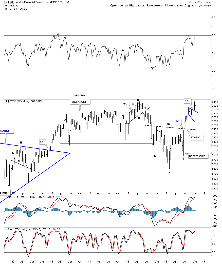
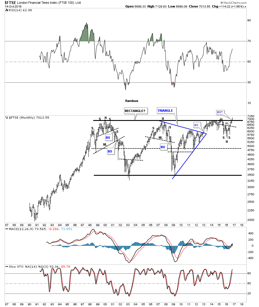
Below is a long term monthly chart for the $FTSE which shows its entire history and the massive 16 year horizontal trading range. The H&S bottom that is forming just below the top rail is suggesting that the $FTSE is building up the energy to finally take out that very big resistance line .If this is a half way pattern, imagine what this big trading range will look like five years down the road?
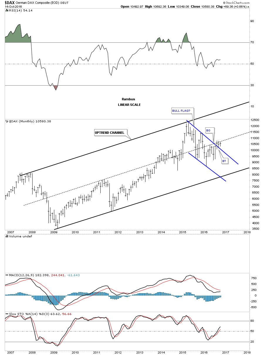
The German $DAX is a very important stock market to keep a close eye on, as it has the biggest economy in Europe. This monthly chart shows its bull market uptrend channel that began in 2009 and is still alive and well. It’s currently in the breaking out and backtesting process of the potential bull flag.
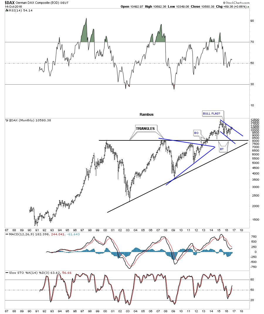
The 30 year monthly chart for the $DAX shows it also has formed a massive triangle consolidation pattern over a twelve year period, and is trading above the top rail. You can see where the blue flag that we looked at on the monthly chart above is located.
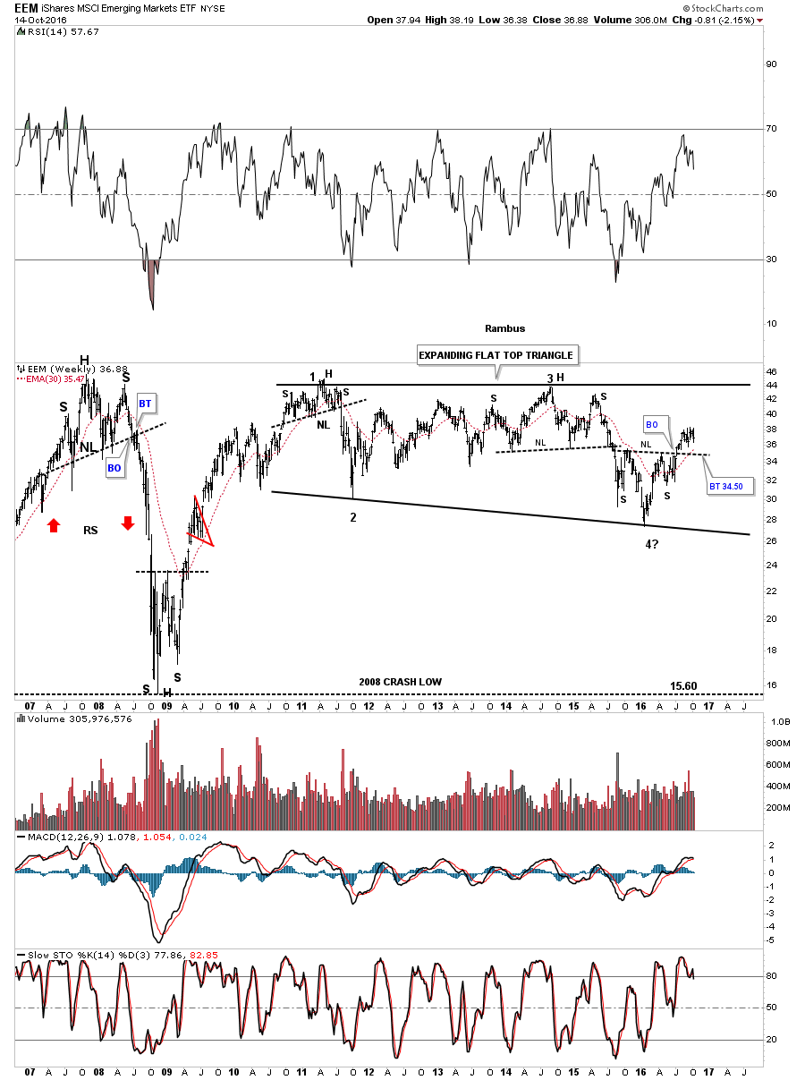
If we’re going to see the world participate in a global recovery, with the seeds possibly being sown today, the emerging markets should enjoy a lift as well. Below is the EEM, emerging markets etf, which is showing a seven year trading range building out. In big trading ranges like this it’s not uncommon to see a reversal patterns forming at the reversal points. You can see the H&S bottom that formed at reversal point #4, which should give this index the energy it needs to make it up to the top of the big trading range, at a minimum.
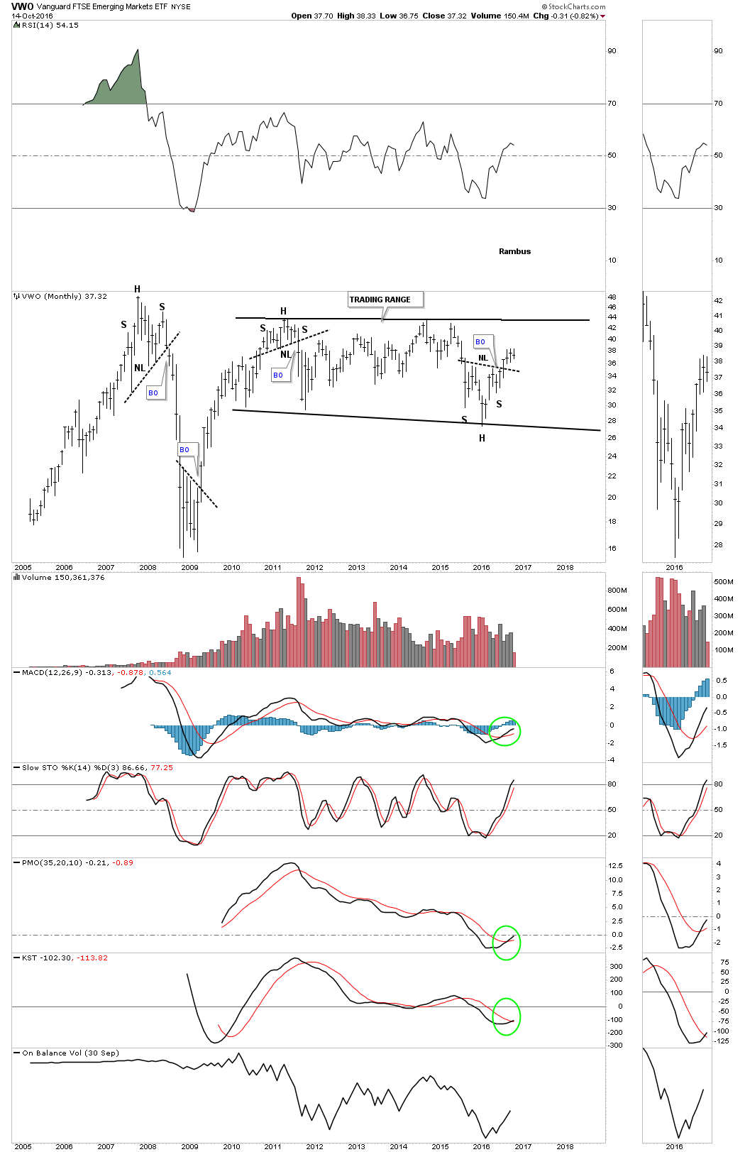
VWO is another emerging market etf which is more actively traded and shows a very similar looking chart pattern to the EEM.
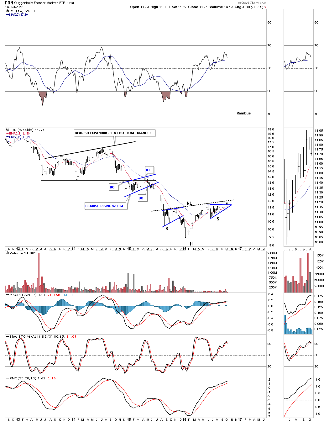
Below is the weekly chart for the FRN etf, Frontier markets, which is a step below the emerging markets. These economies are very small, but this index is building out a possible inverse H&S bottom after a long bear market decline.
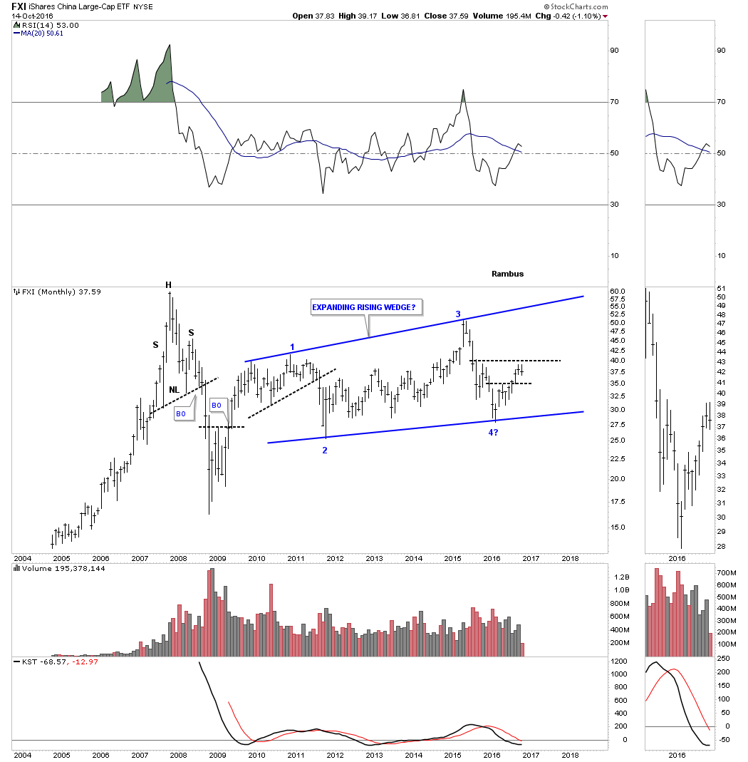
The FXI is a China big cap etf which has been building out a seven year trading range with no end in sight yet. It’s currently working on its fourth reversal point similar to the emerging markets charts we looked at.
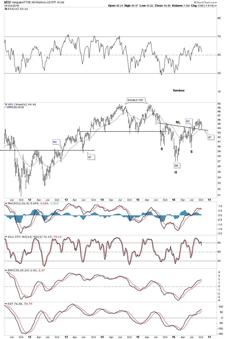
The last chart we’ll look at is the VEU, which is an all world stock market etf, minus the US stock markets. As you can see it’s doing a critical backtest to its neckline. A positive test to the neckline should bode well for a global recovery that may be about to get underway.
Keep in mind when you look at all these charts, they’re long term in nature and changes don’t come quickly. They’re painting a positive picture if all the H&S bases can hold support. I would consider this time in the markets to be an inflection point, where we’re going to find out if the world is coming to an end, or if there is going to be a global recovery instead. As always, time will tell.
Precious Metals
If you’ve been following the precious metals complex then you know this volatile sector had a very strong rally out of the bear market lows. This rally came on the heels of one of the greatest bear markets in history for the precious metals stocks, which would suggest that this bull market is just getting started. As always, there are never any guarantees when it comes to the markets only probabilities.
One of the very first signs that a new bull market has taken hold is when you see a series of higher highs and higher lows, after a bear market has run its course. It’s a simple concept, but very powerful when one sees it in action, just the opposite happens in a bear market.
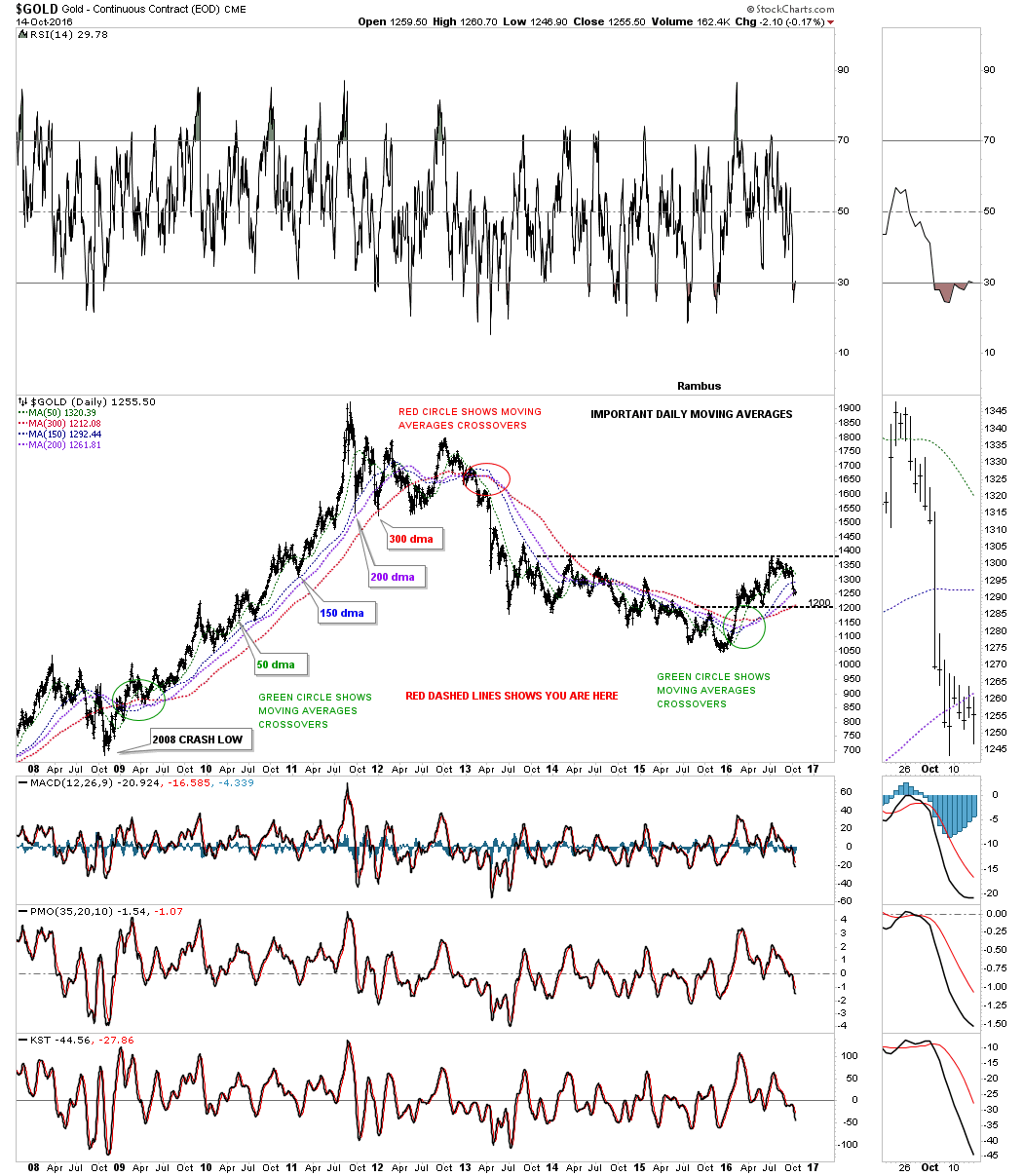
Below is a daily chart for gold which shows the bull market rally out of the 2008 crash low and the four most important daily moving averages. For the most part you can see gold formed a higher high and a higher low all the way up to the top in 2011. During that three year rally gold never closed below the 150 day simple moving average until the first reaction below the all time high.
You can see the same principal in reverse where gold made a series of lower highs and lower lows during the bear market years that began in 2011, until the bottom in December of 2015. The red circle shows how all four moving averages came into alignment to the downside in the spring of 2013, which confirmed the bear market.
Even though gold bottomed in late 2015 the moving averages didn’t come into proper alignment until four months later in April of 2016. As I stated a month or so ago, as long as gold trades above the previous low at 1200 I have to give the bulls the edge. The 1200 area is also where the most important moving average for gold comes into play, at the 300 day moving average. During the initial impulse move up out of the December 2015 low, gold took out a total of four previous highs, that were made during the bear market years, something it wasn’t able to do in five years. At this point the 1200 area becomes critical support for the health of the long term bull market.
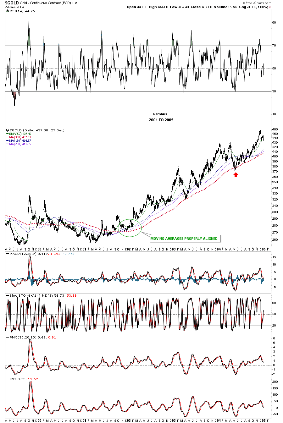
This next daily chart for gold shows how the four moving averages performed during the initial impulse move up between 2001 and 2005. There was one failure where gold made a lower low, which was in 2004, but the 300 day moving average came to the rescue and held support. I can assure you that lower low felt like the end of the world for gold investors.
Many times a new uptrend can take its sweet ole time walking up the bottom rail before the bull market really takes hold. You can see this happening back in 2001 and 2002 during the beginning stages of this bull market. This long term monthly chart also shows the 10 month ema, which did a good job of holding support during the bull market years, and resistance during the bear market. There are still two weeks to trade for the month of October, so we won’t know how this moving average is going to look until the end of the month. As it stands right now, we are the top rail of the blue falling wedge and the bottom rail of the major uptrend channel cross at 1142, this would represent the final line in the sand for support. This would call into question the validity of the new bull market if it’s broken to the downside.
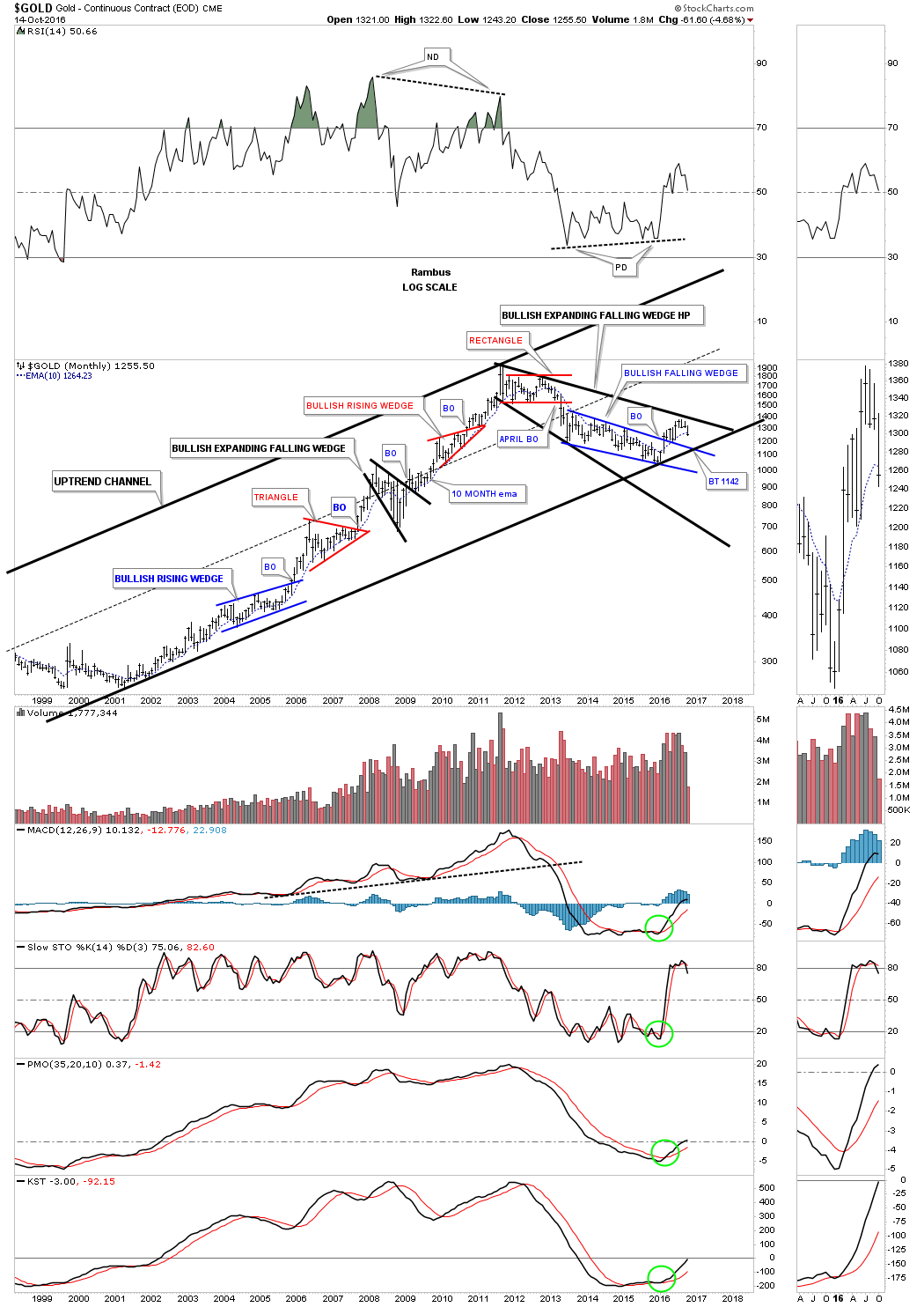
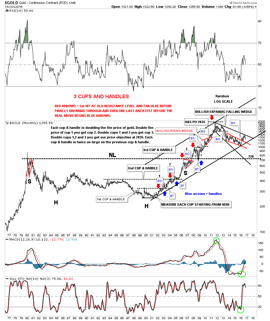
This last chart for gold we’ll look at tonight is a forty year monthly look which shows the top in 1980 and the bear market that followed. During that 27 year bear market, gold built out a massive inverse H&S bottom. The neckline showed us it was hot by the way it held support during the 2008 crash. You can see the small H&S consolidation pattern that formed on top of that massive neckline in 2009. Gold has formed one of the biggest bases in history, which is the 27 year inverse H&S bottom. If big bases lead to big moves then gold should have a big move ahead. This chart also shows you a good example of how support and resistance works by the way the previous highs reversed their role to support, once broken to the upside, as shown by the red and blue arrows.
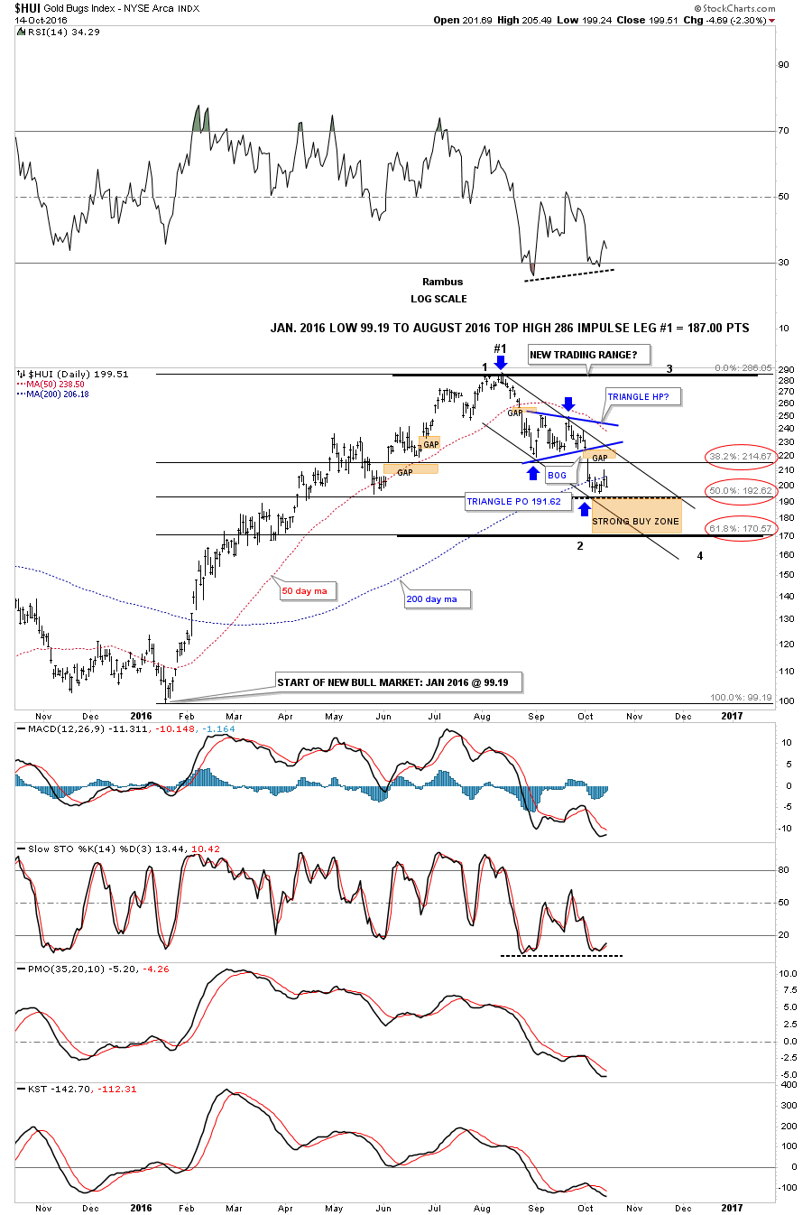
Next lets look at the Precious Metal Miners using the HUI Index .Zeroing in on HUI’s first impulse leg up and the first correction (that has been underway since August). That first impulse leg up was one of the strongest rallies the HUI has ever experienced in such a short period of time. This daily chart shows the potential new trading range we’ve been following with the fib retracements. I’ve been waiting patiently for the first reversal point down to find a low, but so far there is no confirmation the low is in place yet. The price action has been bouncing around the 50% retrace and the price objective of the blue triangle at the 195 area.
It’s possible the HUI could trade sideways for a bit longer and then drop down into the brown shaded strong buy zone, which could complete the first reversal point down and start the second reversal point back up, toward the top of the trading range around the 286 area. I’ve suggested that we could just be in the early stages of a big consolidation pattern where we could see a third and fourth reversal point completed before the consolidation pattern is finished building out.
What also suggests that we are in a trading range is the area gaps that formed during this first leg down. These types of gaps tend to get filled during the consolidation process.
Below is a daily chart for the HUI which shows the last two consolidation patterns that formed towards the end of the HUI’s bear market. I’m just using this chart to show you how a consolidation pattern can build out with at least four reversal points. As you can see there can be small channels or wedges along with the black dashed lines which shows the small reversal patterns at the reversal points. Our current trading range shows how it could build out if the 50% retrace holds support, which isn’t important for this example. It’s the internal structure that is most important to understand.
It’s the fight between the bulls and the bears for dominance which creates these consolidation pattern. As you can see, in a bear market the bears win the battles and the war. In a bull market the bulls will win the battles and the war, which sometimes can be pretty bloody. By the end of a consolidation phase both the bulls and the bears are worn out, but whatever the direction the major trend is moving that group generally wins the fight.

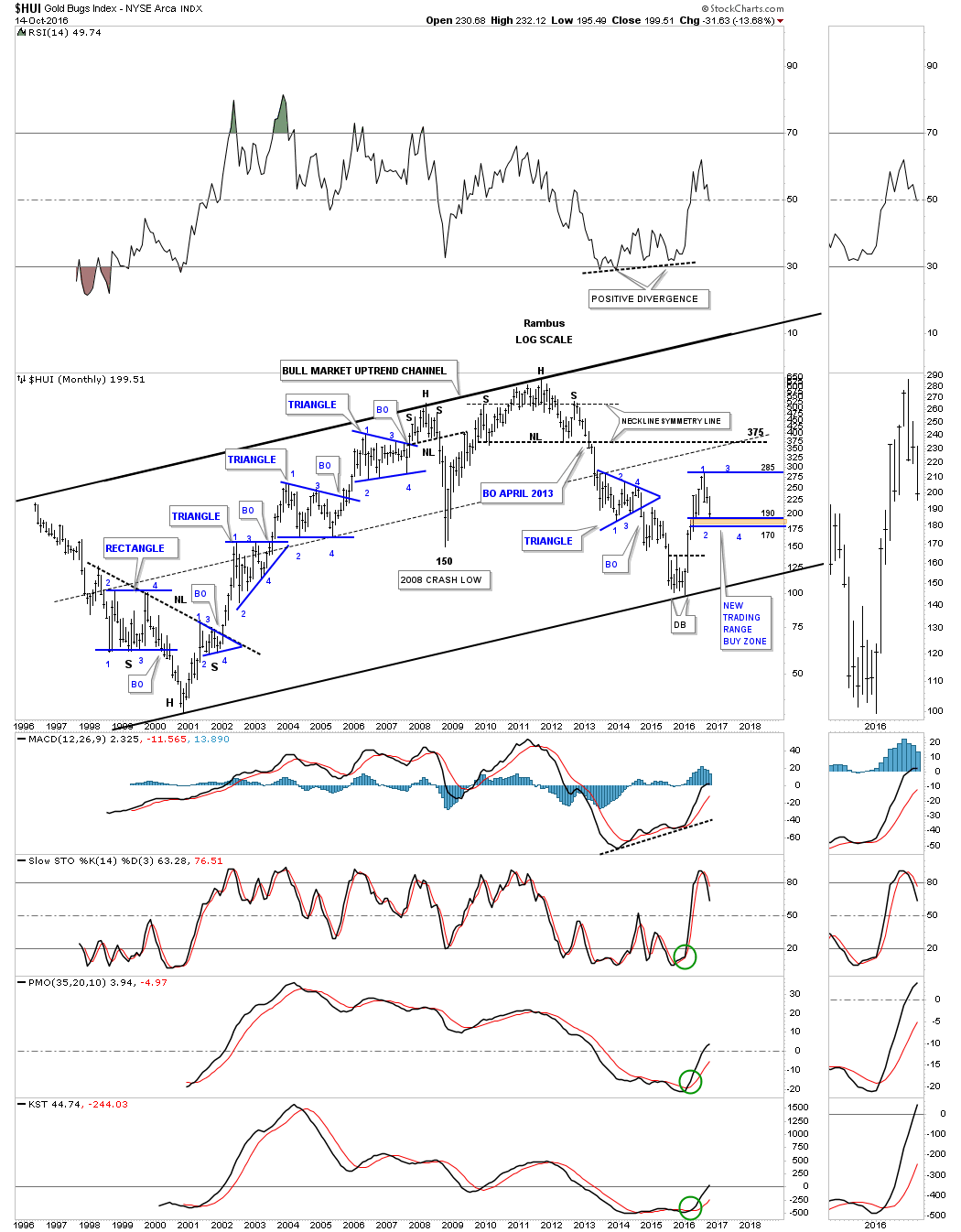
This next chart for the HUI is a monthly look and shows the entire history going all the way back to 1996. As you can see the price action is either building out a consolidation pattern, a reversal pattern, or is in an impulse move with all the blue consolidation patterns having at least four reversal points.
On the right side of the chart you can see how I have our current trading range building out. I’m expecting the first reversal point to the downside to complete somewhere between 170 and 190 and then the second reversal point to take the HUI up toward the top of the trading range. If a triangle builds out then the price action won’t make it all the way up to the top or the bottom in the next set of reversal points. Until something changes this is how I see our bull market uptrend channel building out for the HUI. So far our current trading range is mimicking several of the blue triangle consolidation patterns that formed during the first major leg of the bull market between 2001 to 2008. What we don’t want to miss is the fourth reversal point because that’s where the impulse move actually starts.
The bottom line is that this first impulse leg up was very exciting. Now comes the part that isn’t so exciting where the price action needs to consolidate that big leg up. It’s possible to start trading this new trading range once we have confirmation of the first reversal point low is in place. This will only be done with a small amount of capital as these types of trading ranges can deplete your hard earned capital in a heartbeat. Establishing the initial high and low of a trading range is the first step in trying to trade a trading range. It will always look easy in hindsight but living through one of these consolidation patterns is a different story. Knowing that it’s time for a consolidation phase to begin building out can take away a lot of anxiety when one is in total darkness. It’s all about following the price action and not telling the market what to do. All the best…Rambus
Catherine Austin Fitts:
Rambus, I can't thank you enough. This is Blockbuster Chartology! We have a lot to study and digest. Let me remind our subscribers that they can access your ongoing efforts at: http://rambus1.com.
Related Reading:
- Blockbuster Chartology with Rambus - July 21, 2016
- Blockbuster Chartology with Rambus - April 21, 2016
- Rambus: Are We in a Deflationary Spiral? - January 28, 2016
- The Dollar, Gold & the S&P 500 with Rambus - October 15, 2015
- 3rdd Quarter Wrap Up: Financial Markets Round Up
Top of Page
© Solari 2016