
Rambus: Blockbuster Chartology
By Catherine Austin Fitts
My "go to" website for technical analysis of precious metals, the US dollar & the US stock market is Rambus Chartology, where Rambus (that's his handle - he's the founding technical analyst) leads a discussion with extensive charts of what the markets are saying.
Last October, the Solari Report did a written interview with Rambus including an introduction here and a discussion of Rambus, his background, technical analysis as well as the word "Chartology." You can find all this information at our first interview:
- Why "Rambus?"
- How Rambus Chartology Got Started
- What Rambus Chartology Does
- About Technical Analysis
- Tracking the Markets
- What does the word "Chartology" mean?
In January 2016, Rambus launched his quarterly Solari Report with a blockbuster chartology across the four market sectors: Currencies, Commodities, Precious Metals and Stock Markets. You can find it here: Rambus: Are We in a Deflationary Spiral? Now with a challenging 1st Quarter behind us, Rambus returns with his Blockbuster Chartology across the four market sectors.
One of the reasons that Rambus is so good at his craft is that he focuses on "staying on the right side of the major trend." The challenge of doing so at this time is that it is tempting to look for bottoms - in commodities, in precious metals - or to assume that the trend upwards in the US dollar or stock market may be over. However, Rambus consistently brings us back to the discipline of the Chartology. What does price tell us? As he describes so aptly, we are dealing with psychological warfare.
Sitting back once each quarter to get this perspective offers invaluable insight. So, here we go for the 2nd Quarter Blockbuster Chartology!
Blockbuster Chartology
By Rambus
The Chartology of the Currencies
January of this year saw the stock markets taking it on the chin with one of its worst performances in history for the beginning of a new year. The precious metals stocks, using the HUI as a proxy, made a new bear market low on January 16th which looked like a continuation of the five year downtrend. Things couldn’t have looked more bleak as the world as we knew it was coming to an end. It seemed like the bears were in control of everything while the bulls were no where to be found. Then something unexpected happened.
Bottoms are made with pessimism you can cut with a knife. Just when you can’t take it anymore and sell all your positions to relieve your stress the strangest things can sometimes happen. Many times the markets will turn around on a dime which leaves you wondering how can the sentiment change so fast when last week the world was coming to an end and this week the bulls are back in full force driving prices higher. It’s called psychological warfare. Sentiment drives the markets which is investors psychology swinging from one end of the spectrum to the other usually overshooting in both directions before one side is exhausted and can’t fight anymore.
In a bear market investor psychology is bearish which drives prices to make lower lows and lower highs. The bears will defeat the bulls during the inevitable corrections that will take place as the bulls try as hard as they might, lacking the firepower behind them as they spent all their ammunition during the bull market years. Rinse and repeat. Just the opposite happens in a bull market. The main point is that we want to be on the right side of a major trend whether it’s a bull or bear market. Trying to short in a bull market is like a salmon swimming upstream fighting all the way to get to its spawning grounds. There are many obstacles along the way in which they’ll have to overcome with many falling by the wayside. It’s the strongest that can make the journey that will pass their genes on to the next generation. It’s called the cycle of life.
Investors are no different as many will fall by the wayside trying to figure out how to play the stock markets before their capital is exhausted. It looks so easy in hindsight that a child could play this game and win. A child may actually be a better investor as they’re not affected by all the trauma of losing ones hard earned capital which scares many investors for life. Those folks that can survive long enough in one of the toughest games on the planet to play, will eventually be successful but they’ll have the battle scares to show for their effort. There is nothing that can take the place of working hard to develop a trading discipline, whether it’s Elliot Wave, Cycles, Gann or Chartology, whichever matches your own personality. You will be rewarded in the long run by surviving and succeeding as an investor where so many have failed.
In this report we’re going to look at four important areas of the markets, currencies, commodities, the precious metals sector and some stock market indices to try and determine the major trend of each. It’s an arduous task but one we must perform in order to try and trade the right side of the major trend. With that said lets start by looking at some of the more important currencies of the world which have been under pressure since most topped out in 2011 or so.
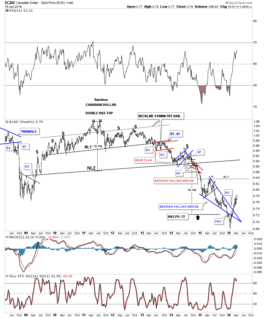
I would like to start by looking at the a daily chart for the Canadian Dollar as it has a big one year falling wedge, which seems to be a dominate pattern on some the other currencies and especially on some of the different commodities and commodity indexes. Also keep in mind when you look at some of these charts the low that was made in January of this year seems like it could be important at least for the intermediate term if not longer term.
As you can see we got the breakout below the bottom rail of the black falling wedge in December of last year with a backtest that came up a little short, and then the final decline into the January low. Note the small blue triangle that formed out in the apex of the falling wedge which did a little ping pong move before it broke out above the top rail which told us the top rail was hot. The $CAD has been trending higher and has now formed a second pattern, the rising flag, which is still building out. A breakout to the topside would be very bullish for the Canadian Dollar as this currency is in the natural resource sector and it would bode well for that area of the markets as well. A break below the bottom rail of the blue rising flag would create a 5th reversal point which is a reversal pattern to the downside which is not what we would want to see if an important low is in place. So we wait for the CAD dollar to show us which way it wants to go for confirmation one way or the other. On a positive note the three moving averages have all just gotten properly aligned with a bullish cross.

The weekly chart for the Canadian dollar shows the massive H&S top which formed back in 2011 along with many other currencies and commodities in general. The big massive double H&S top reached its measured move price objective down to the .72 area late last year. It’s currently in the biggest rally since its bear market began in 2011 closing last week at a new high for this move off of the January low. A pattern I’ll be looking for if the January low holds will be for this rally to continue higher up to the head of the small H&S top that formed at the high of the blue falling wedge.That area could produce a neckline which we would then need to see a small decline to form a right shoulder to complete a pretty large inverse H&S bottom reversal pattern. This is only a possibility as we follow the price action for more clues.
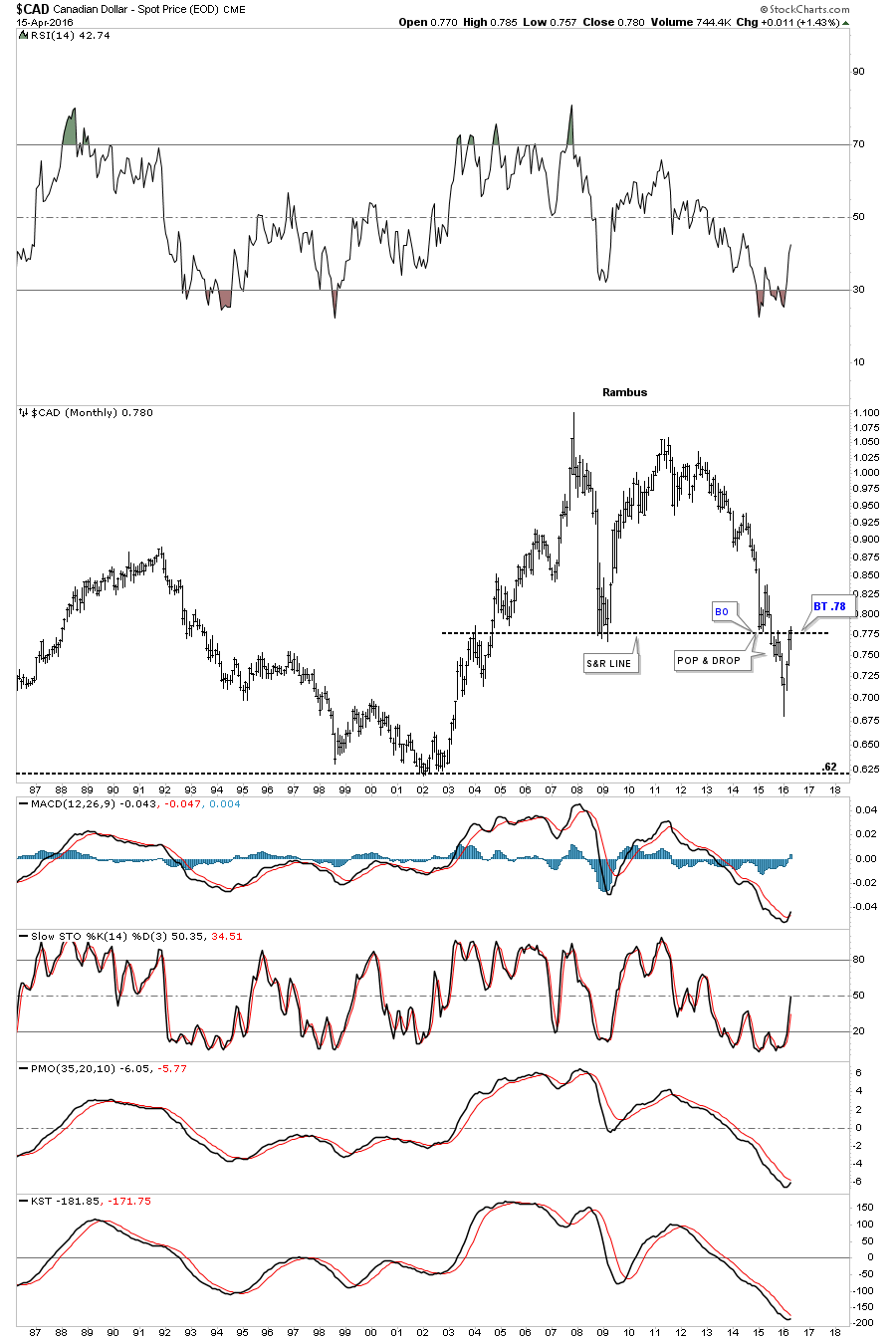
This monthly chart shows how important this general area is on the 30 year look. Early in 2015 the CAD dollar hit the support and resistance line and got a pop. The price action then broke below the S&R line and backtested it from below and then dropped, the pop and drop move. After hitting its low for the bear market in January of this year it’s now trading back up to the S&R line at .78 which should offer some resistance if the bear market is still alive. On the other hand if the January low was the bear market low, then the bulls need to step up to the plate and rally the Canadian dollar higher negating the support and resistance line at .78. This is a key area to keep a close eye on.
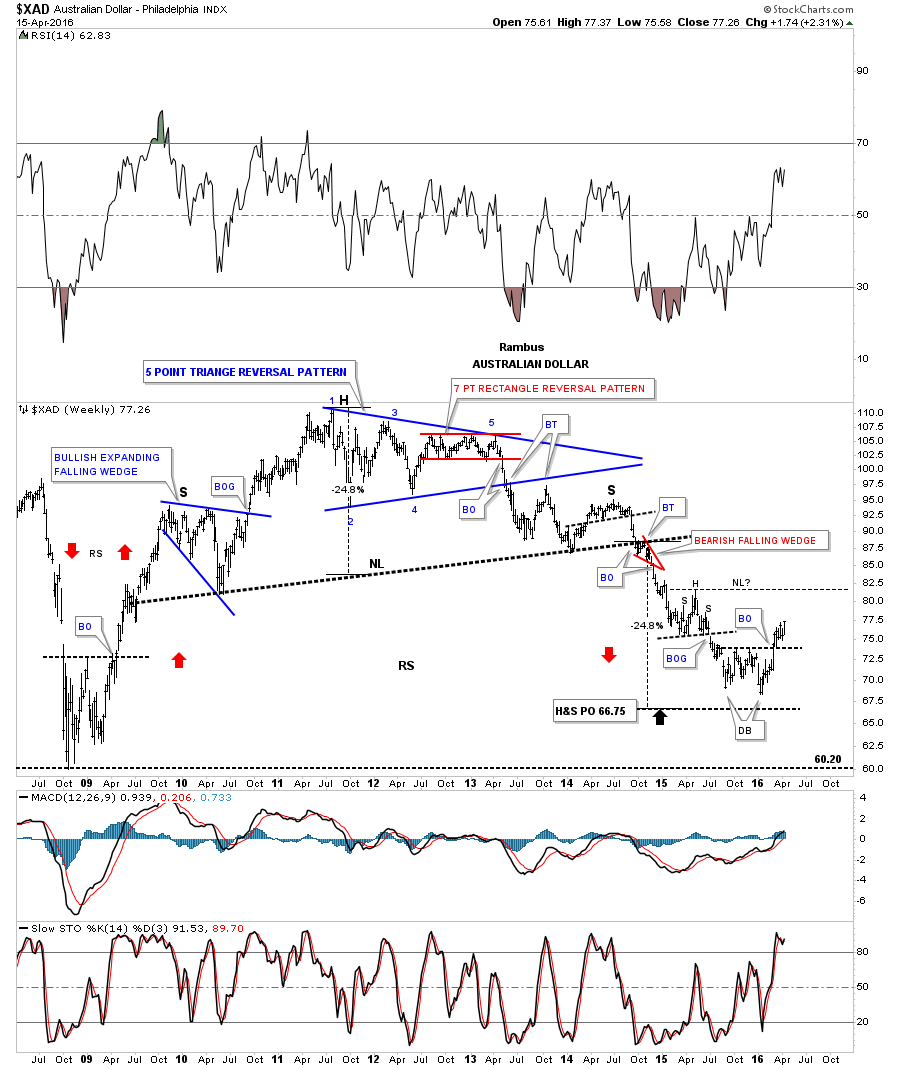
Lets look at a daily chart for another resource currency the XAD, Australian Dollar, which has broken above the brown shaded support and resistance zone. As you can see the price action is working on a trading range which is going on three weeks now. Again whichever way the blue trading range breaks a good move should follow.

The weekly look at the XAD shows it reached its massive H&S price objective down at the 66.75 area. Note the small double bottom that has been forming just above the H&S price objective which has broken out above the double bottom trendline which suggests there is more to come. Just like the Canadian dollar it would be a bullish sign if the Australian dollar could rally up to the head of the small H&S consolidation pattern and form a neckline with a modest decline thereafter to form a right shoulder which would give the XAD a bigger base which would be more beneficial in the longer term. Keep in mind that an inverse H&S bottom is a reversal pattern reversing the bear market if it builds out.
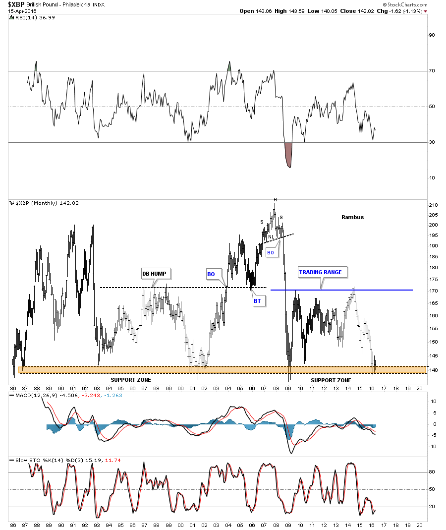
Looking at a daily chart for the XBP, British Pound, we can see it’s trying to build out a possible base below the black dashed support and resistance line in reverse fashion to the top it built out last year. The base won’t be completed until the bulls can rally the XBP above the S&R line which should then reverse its role back to support.
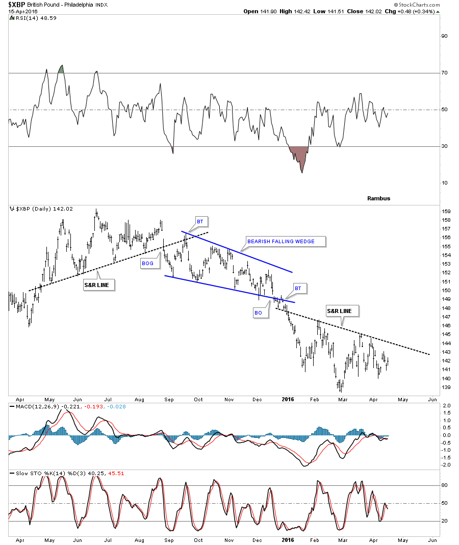
The long term monthly chart for the XBP shows you why the possible little base we looked at on the daily chart above is so important to the big picture. Below is a 30 year chart which shows this area right here as a very important support zone as it has been tested eight times over the years.
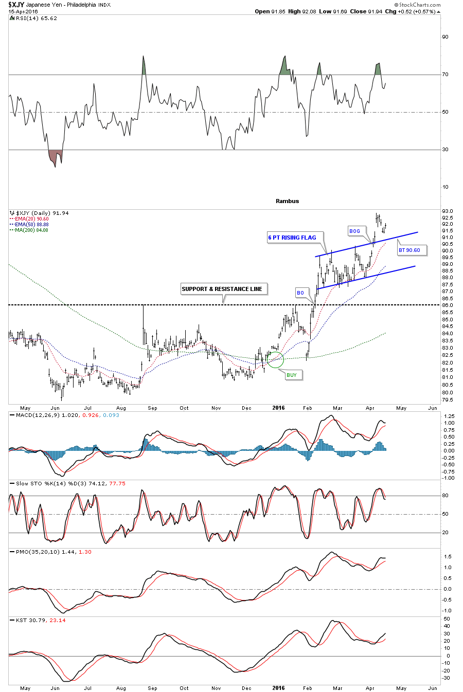
Next I would like to turn your attention to the XJY, Japanese Yen, which has been showing some strength recently. This daily chart shows part of a pretty nice base which has formed below the support and resistance line. The YEN broke above the base in February of this year and has been consolidating its move building out a blue rising flag. A backtest to the top rail of the rising flag would come in around the 90.60 area which will need to hold support to keep this rally going in the YEN.
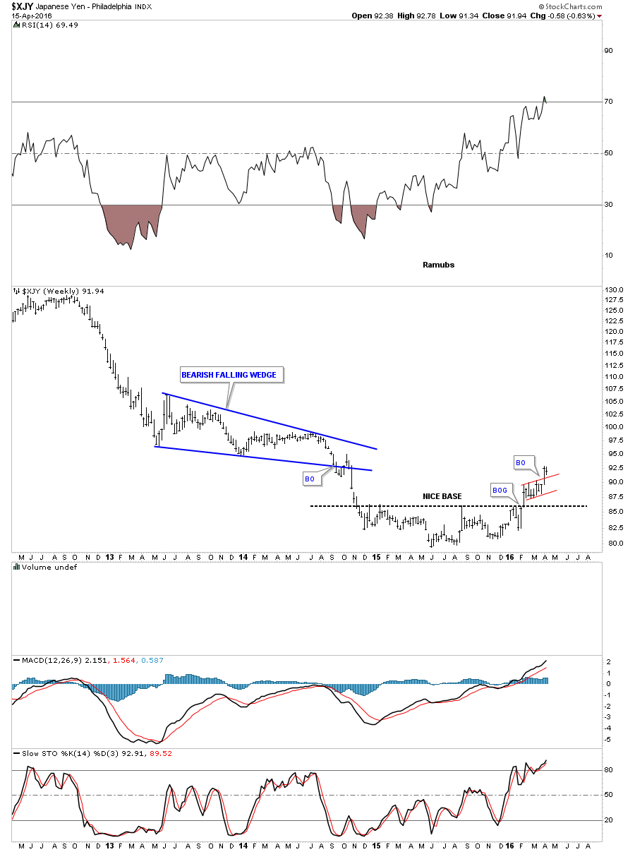
This next chart for the XJY is a four year weekly chart which shows the nice base it built out and the little rising flag we looked at on the daily chart above. The XJY is now showing a series of higher highs and higher lows which is the first step in building out an uptrend.
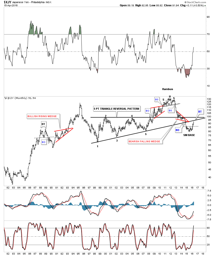
This long term 35 year monthly chart for the XJY puts everything into perspective. The XJY is approaching the underside of the massive five point triangle reversal pattern. How it interacts with the bottom rail is going to tell us a lot about the power of this current move up. Initially I would expect the price action to hit the bottom rail and then have a small decline and then another run at it if the rally has any legs to it. If it just runs up to the bottom rail and starts declining sharply then we’ll know it’s just a backtest and nothing more and the bear market will continue.
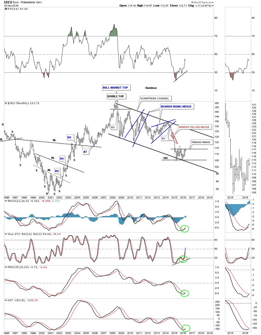
Next lets look at the XEU, EURO, which makes up the biggest part of the US dollar index. These two are pretty much inversely correlated. When the XEU goes up the US dollar goes down and vica versa. For just over a year now the XEU has been building out a pretty tight sideways trading range testing the top rail recently. It has completed its third reversal point at the recent high. If this sideways trading range is a consolidation pattern to the downside the price action will have to break below the bottom rail which will then complete the fourth reversal point making this a rectangle consolidation pattern. With these types of sideways trading ranges the center dashed line can offer up some support or resistance which can reverse the trend for awhile. If this trading range turns out to be a reversal pattern many times the center dashed line will hold support on the last decline before the breakout occurs. For now the trading range continues to mature.
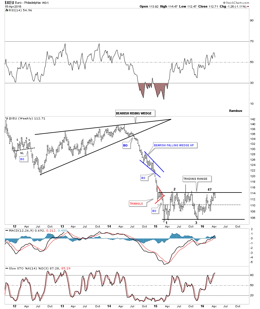
Below is a 20 year monthly chart for the XEU which shows its almost nine year downtrend channel with the sideways trading range we looked at on the weekly chart above forming right on the bottom trendline. I’ve seen trading ranges like this go on for a lot longer than one would have thought possible. Looking at all the indicators on the sidebar we can see a couple of positive divergences with some of the indicators getting ready for a possible positive cross. The price action trumps everything else so we wait and see what happens next at this most critical juncture.
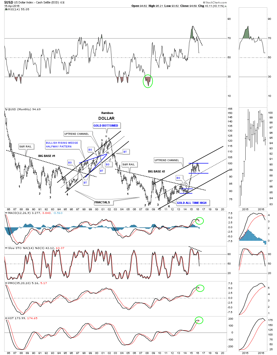
Now that we’ve looked at some of the more important currencies of the world lets see how the US dollar looks. This first chart is a three year daily look which shows the massive impulse move higher starting back in 2014 and running to March of 2015 which was pretty impressive. You can see all the small consolidation patterns that formed during that rally which shows a perfect example of what a really strong impulse move looks like. The only problem with a move like that is when they have finished you will generally see a significant consolidation pattern form. These consolidation patterns can last for a year or two and still not break the bull market keeping the uptrend intact.
As you can see the US dollar has been chopping sideways for over a year now with no breakout in either direction apparent yet. These big consolidation patterns can also do a lot of morphing before the final pattern is completed. Note the original falling wedge with the black dashed trendline being the top rail at the time. There was a nice clean breakout and backtest and a rally back up to the previous high at reversal point #1 but it couldn’t go any further which strongly suggested a bigger trading range was developing.
There are three important bottom trendlines to watch on this daily chart. The first one is the black dashed top rail of the falling wedge which has held support on at least four separate occasions. The next one is the thin dashed horizontal line at the low of the trading range. The other possible trendline is the solid black down sloping line that connects two lows made earlier in this formation.

Below is a 30 year monthly chart which shows the two big fractals that have built out over that time frame. You can see the blue bullish rising wedge which formed at the halfway point in the uptrend channel that developed when big base #1 broke out topside. Here we are 20 years later and another big base was built complete with a breakout. There are two ways the price action can get from one trendline to the next. First the price action can decline sharply to reach the bottom rail in this case or secondly the price action can just trade sideways until the bottom rail of the channel is reached. Either way the bull market in the US dollar will remain intact as long as the bottom rail of the uptrend holds support. Looking at the sidebar for more detail one can see the opposite looking indicators vs the XEU monthly chart we looked at earlier. These long term indicators are beginning to turn down but again the price itself is what is most important to keep an eye on.
This wraps up part one on the currencies. I started with currencies because we may be at a critical inflection point in many different markets in which the US dollar will play a big role on what happens next. Part two will be on commodities which are generally affected by the US dollar. All the best…Rambus
The Surprising Chartology of Commodities
In part two I would like to show you several different commodities indexes along with some individual commodities and stocks to see what they look like after a nearly five year bear market. There is one pattern that keeps showing up on some of the commodities indexes which is a falling wedge we followed on the way down. Most of them broke to the downside early this year when the bears were in full force.They were able to push prices modestly lower but it looks like they may have run out of gas at least from the short to intermediate term perspective.
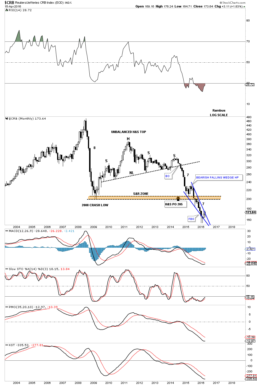
Lets start by looking at one of the oldest commodities index around the CRB. This one and a half year daily chart shows the big one year falling wedge and the breakout through the bottom rail but the bears were unable to push this index down much before the price action rallied back up to the underside of the falling wedge as a backtest and then decline once more. The second decline stopped in the area of the first low which created a double bottom when the CRB index traded above the double bottom hump. That move up also created a higher high which is the first thing we need to see to start an uptrend.
The price action around the top rail of the black falling wedge has been a little sloppy. Note how the CRB gapped above the top rail only to form a small gap on the break below the top rail which was followed by a modest decline back toward the double bottom hump. From there it found support and last week this index gapped back above the top rail of the falling wedge which shows a potential inverse H&S bottom building out. The potential inverse H&S bottom won’t be compete until the neckline is broken to the upside which would also make another higher high. It’s trying to build a base but still needs a little more work to compete the potential reversal pattern.
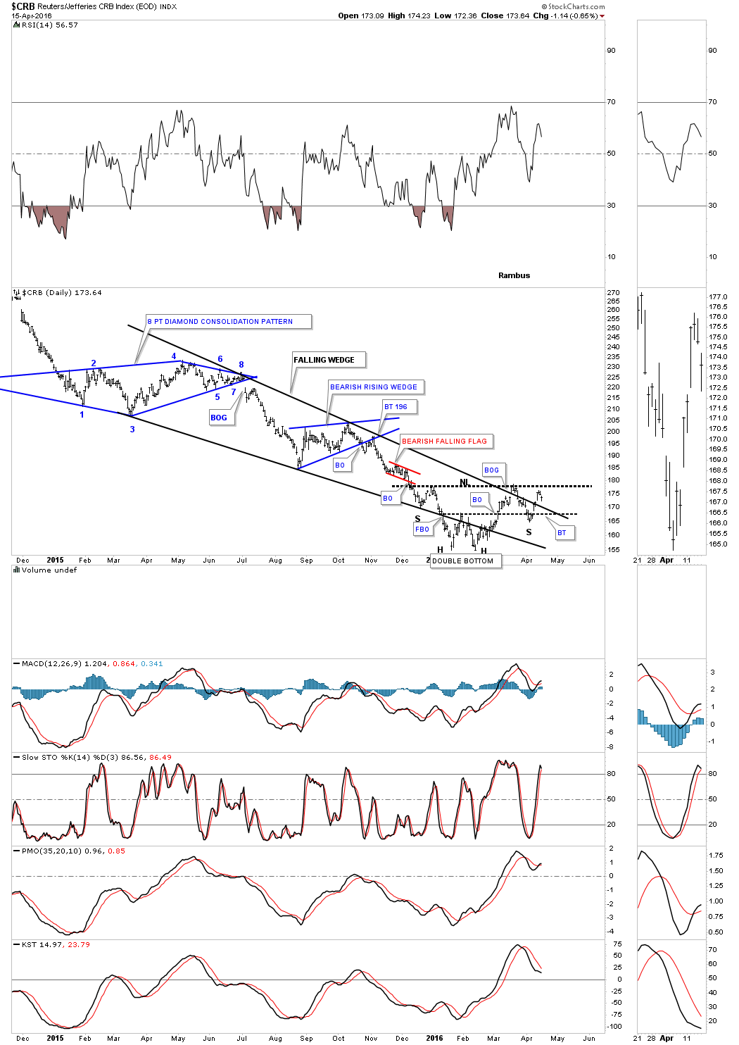
The weekly chart below shows its massive unbalanced H&S top which led to the bear market in this index. The 30 week ema is still holding resistance which will have to be broken to the upside along with the neckline to setup a possible move higher. One step at a time to clear out all the overhead resistance.

The 14 year monthly chart for the CRB index does a good job of showing you the massive H&S top which actually formed below the all time high made back in the middle of 2008 just befroe the big crash. If the bear market is going to continue for a long time to come yet a counter trend rally back up to the underside of the brown shaded support and resistance zone would help in relieving much of the oversold readings and give the bears a chance to rest up before for the next assault. Note the string of black candlesticks that formed during each impulse move down starting with the breakout from the neckline and then the decline that began after the initial bounce off of the brown shaded S&R zone. Each impulse move down had seven monthly black candlesticks before a white candlestick was formed. The crash in 2008 had eight black candlesticks all in a row before a white candle was formed.
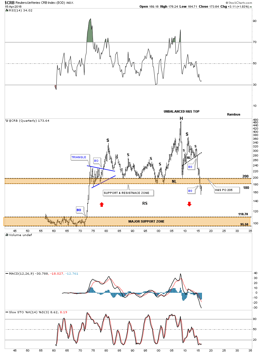
This last chart for the CRB index is a 75 year quarterly chart which shows the CRB index trading at lows not seen since the 1970’s. Will the brown shaded S&R zone between 180 and 200 hold resistance on a backtest move?
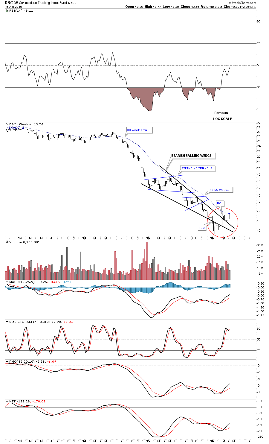
The next commodities index we’ll look at is the actively traded DBC which shows the the last year of trading. If you ever wondered what a bear market looks like this chart shows you a good example starting at the H&S top made about this time last year. Each consolidation pattern formed below the next for the entire year until January of this year where you can see a change in trend taking place with just the opposite happening now. After forming a higher low and a higher high the DBC is now in a trading range looking for direction. The 20 day ema has crossed over the 50 day ema inversely to the way it did when the price action broke below the smaller H&S neckline last year. The long term 200 day ma which shows us the big trend is just above and still dropping.

The weekly chart for the DBC shows another one of those black falling wedges we looked at previously. The price action around the apex of this falling wedge is more clearly defined by the top and bottom trendlines. Note how the price action broke below the bottom rail and then for four weeks the bottom rail held resistance. Then on the fifth week the DBC gapped above the bottom rail and spent just one week inside the apex before breaking out topside. The top rail then held support for the next four weeks with last weeks bar trying to make a new high for this new move off the January low, red circle. It’s not setting the world on fire to the upside but it’s not declining either. You can see the two smaller blue consolidation patterns that made up this falling wedge which is pretty typical and the 30 week ema which was also touched last week from below.
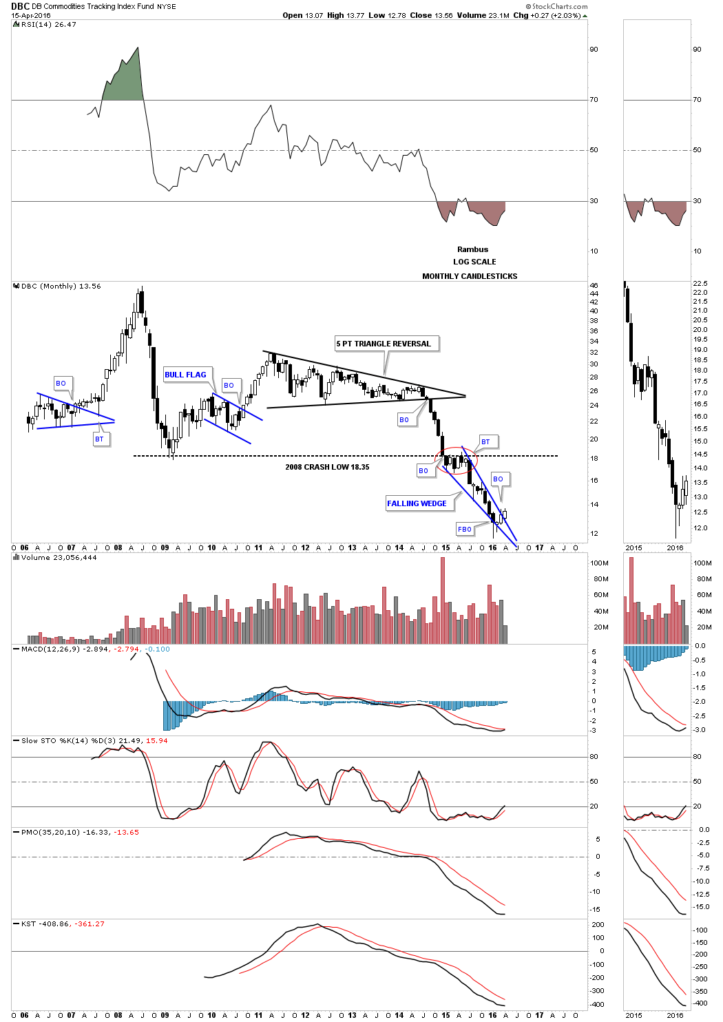
The monthly chart for the DBC shows its top was a five point triangle reversal pattern which led to its bear market. Note the price action when it broke below the 2008 crash low trendline at 18.35. That 2008 crash low trendline held resistance for six months before the bear market began in earnest again, red circle. There are still two weeks left to trade this month but you can see a possible third white candlestick is forming, something this index hasn’t been able to do for a very long time.
There is an index we haven’t looked at in quite awhile which is the Baltic Dry Index. This index has been beaten to a bloody pulp during the bear market in commodities. It’s kind of busy but there is a lot of good Chartology on it. The move off of the most recent low has been one of the strongest in quite sometime. It will be interesting to see if it can make a higher high and a higher low to reverse its bear market.
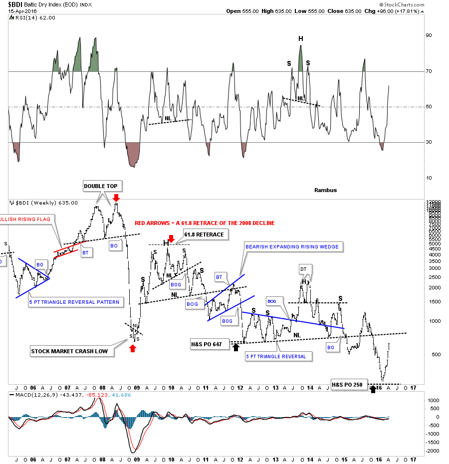
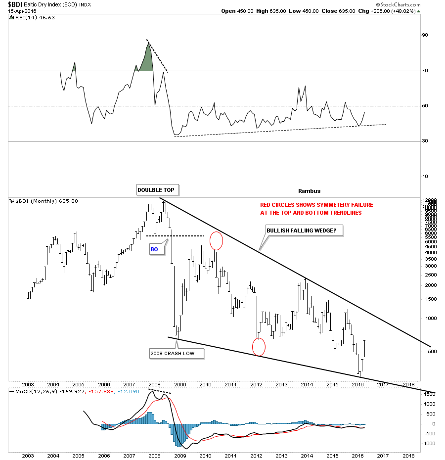
The long term monthly chart shows one big gigantic falling wedge which started to form way back at the 2008 double top.
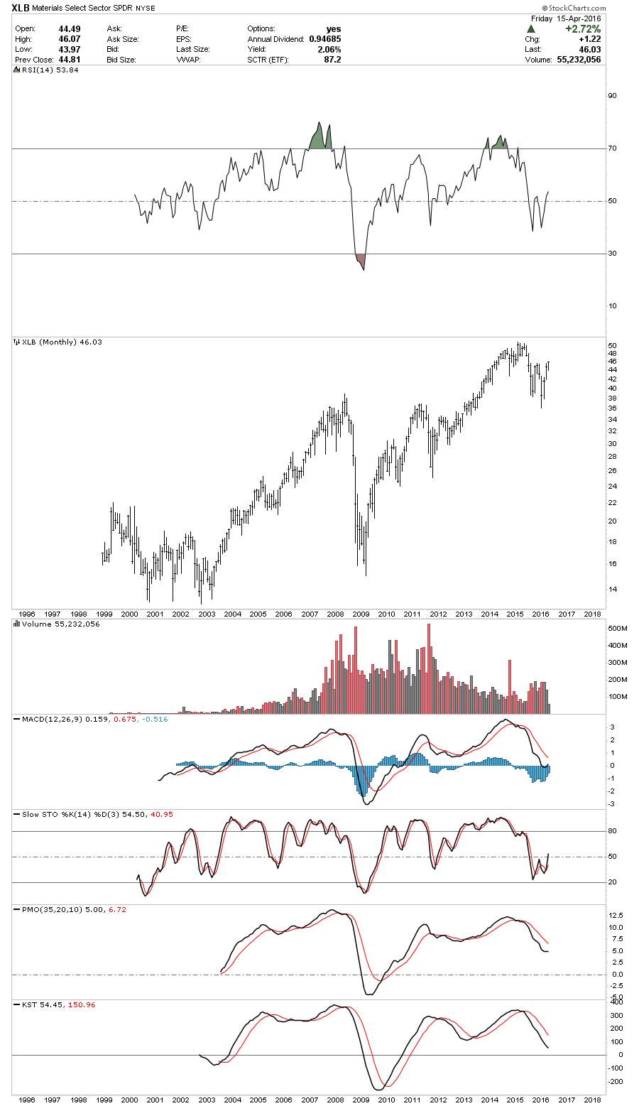
This next index is a daily chart for the XLB, basic materials index, which gapped above the possible double bottom trendline last week right after breaking out from the blue triangle consolidation pattern. This is one of those, WHAT IF charts. What if that big double bottom plays out to the upside?
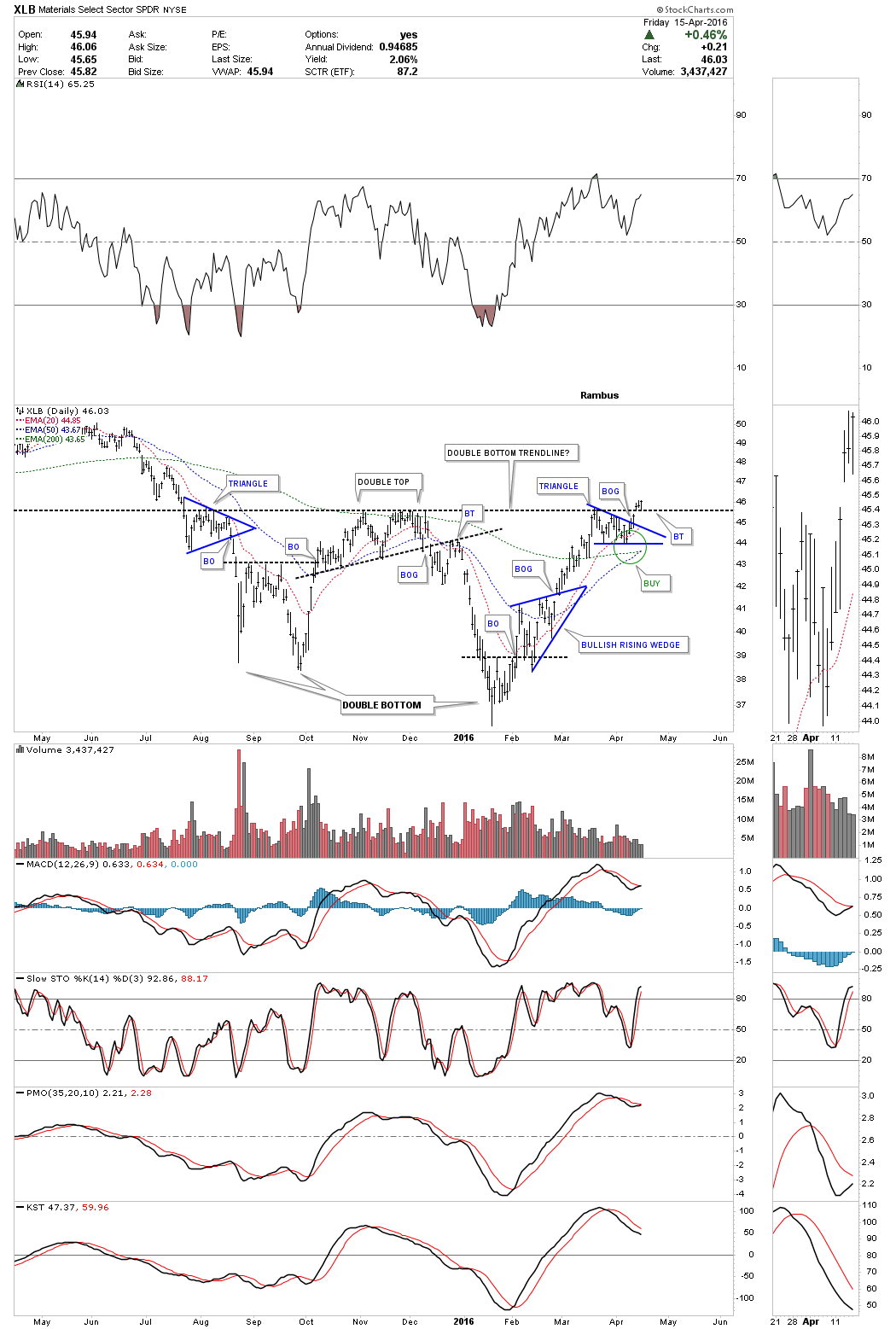
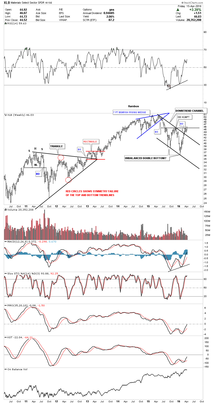
The weekly chart for the XLB puts the possible double bottom in perspective which I labeled as an unbalanced double bottom. Note the much bigger black bull flag that the XLB had broken out of about six weeks ago already. This sector has held up very well and really isn’t that far away from new all time highs which seems impossible for most to believe today. The basic materials sector has a lot of big name INDU companies in it which is one reason why it hasn’t crashed and burned. They’re probably making money hand over fist using cheap raw materials based on today’s prices.
Below is a monthly chart for the XLB without any annotations on it for perspective.
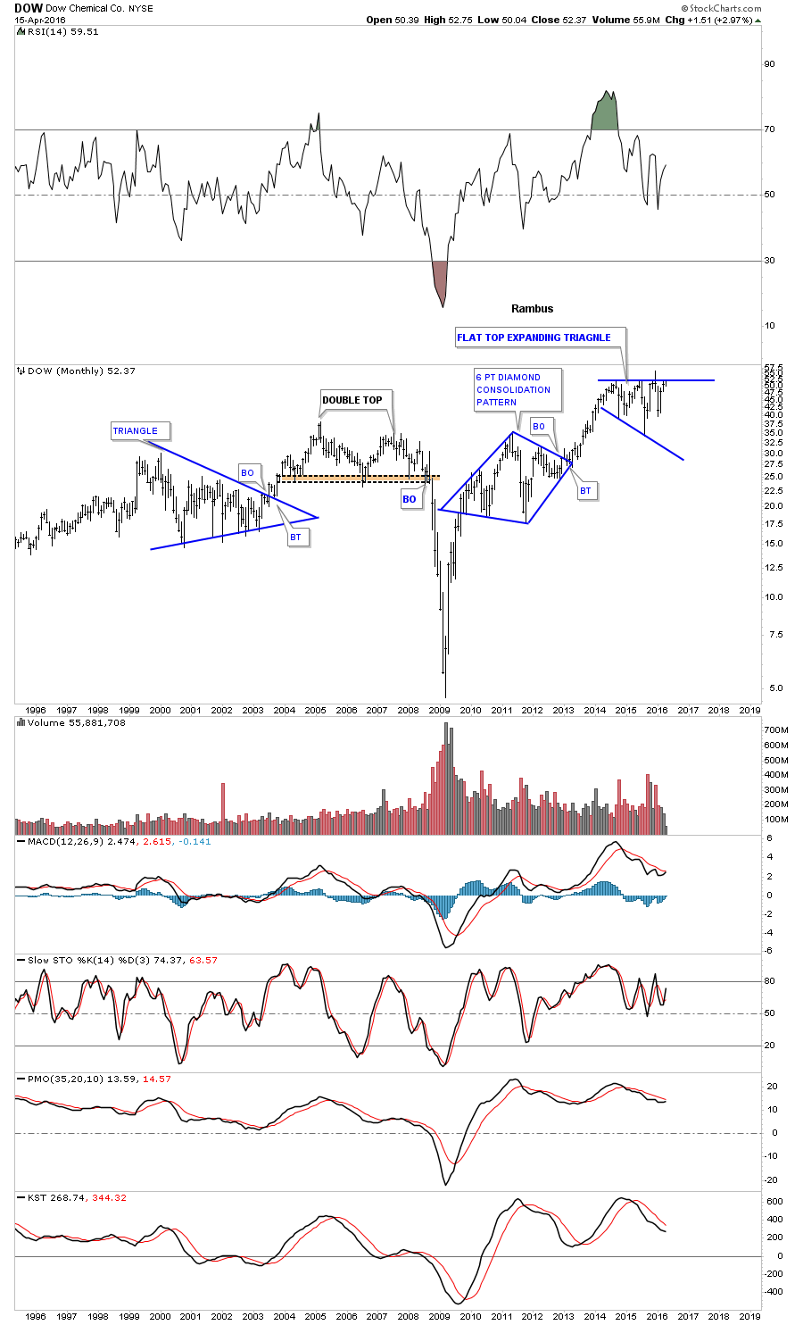
DOW is a basic materials stock.
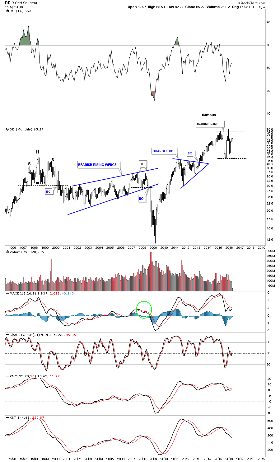
DD is a basic materials stock.
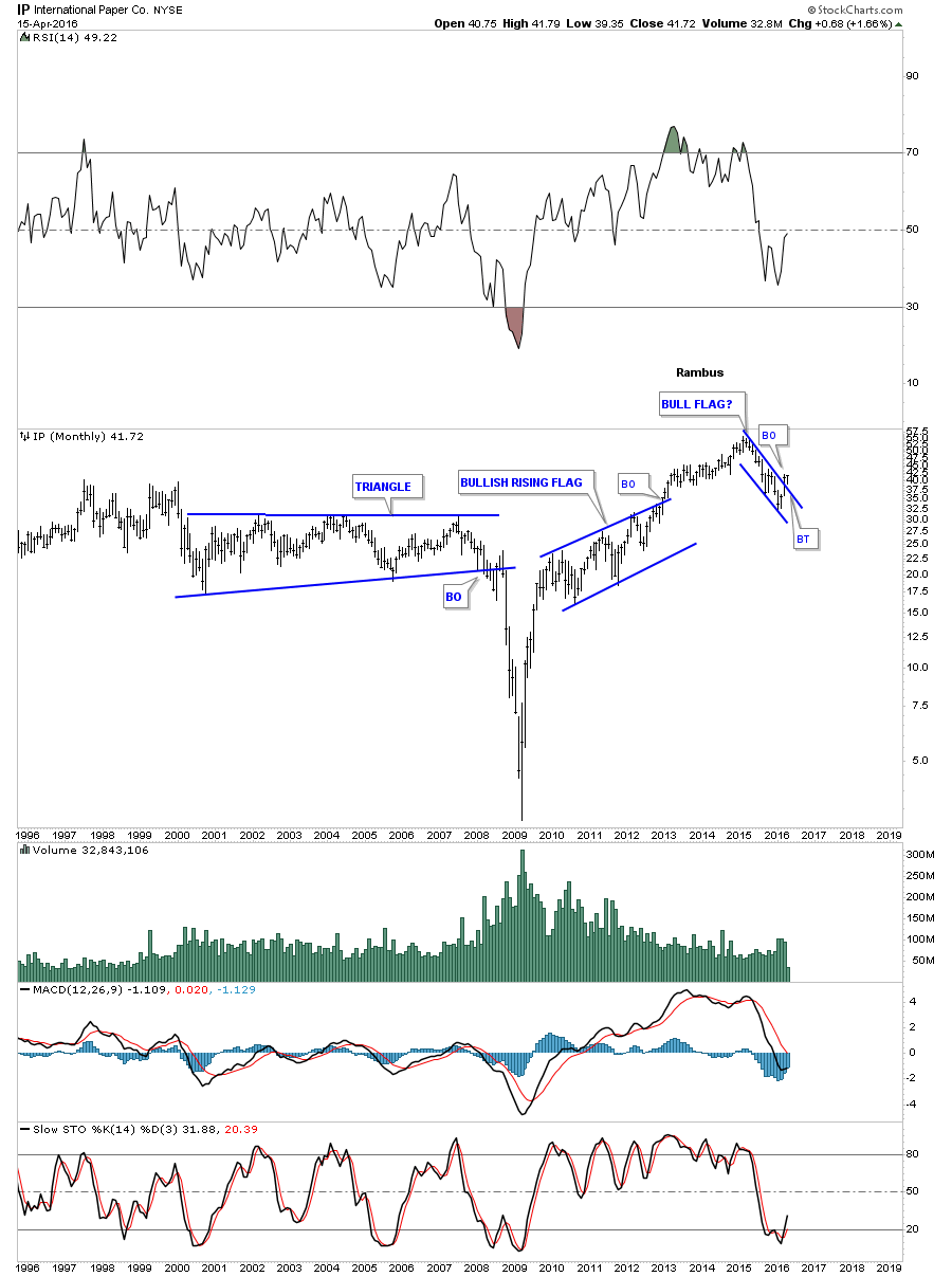
IP is a basic materials stock.
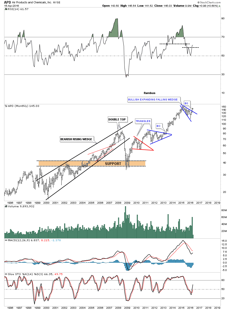
APD is a basic materials stock.
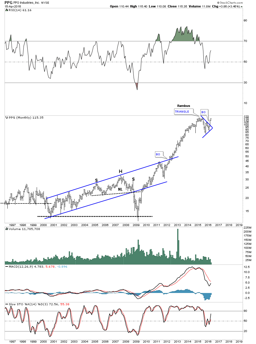
PPG is a basic materials stock.
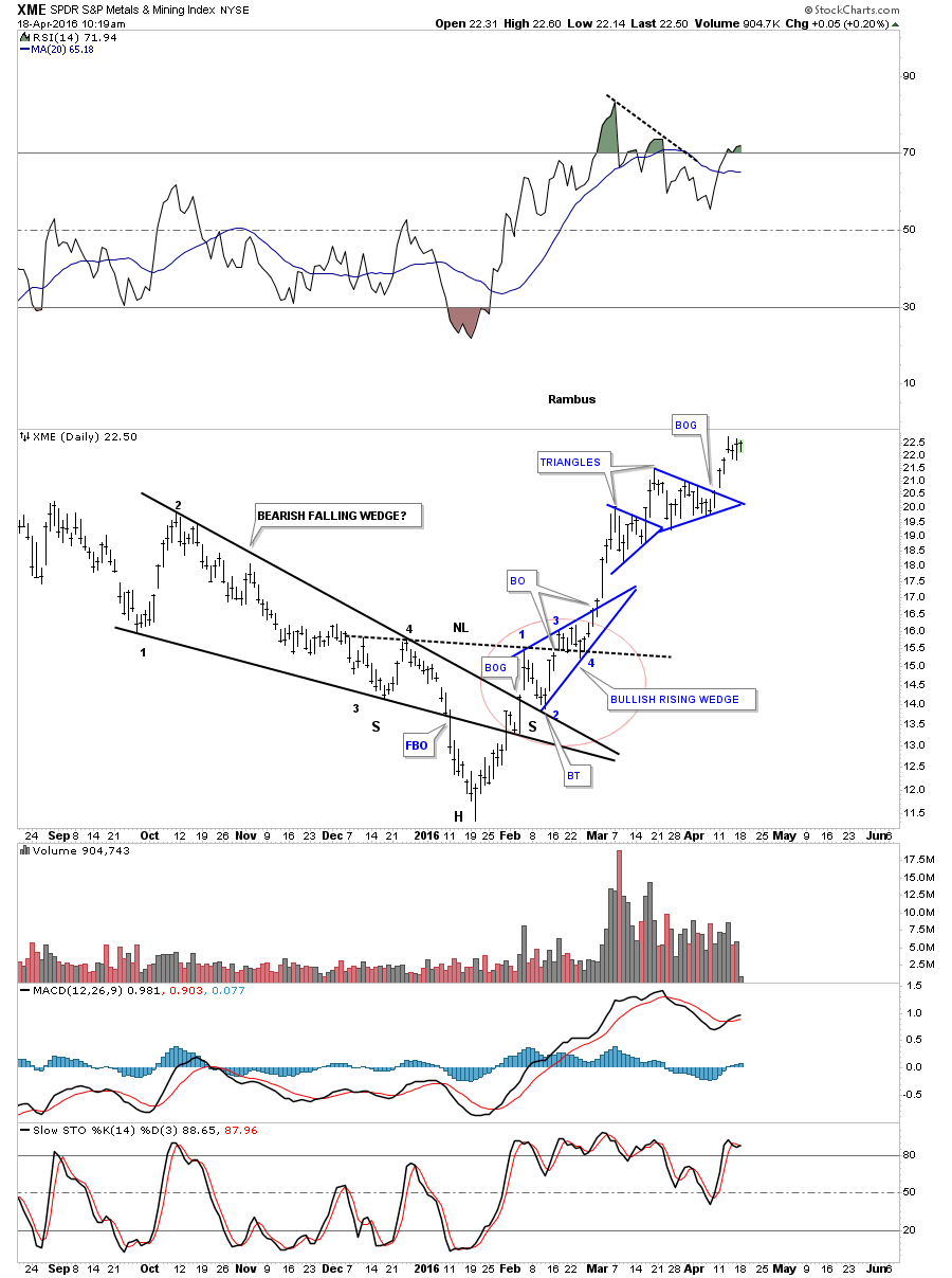
The XME is a metals and mining index which bottomed in January of this year and has created some very nice Chartology. The daily chart shows the black falling wedge with the breakout to the downside. As you can see the left shoulder formed inside the black falling wedge with the head forming after the breakout at the January low. In some cases the left shoulder and head will form inside the falling and other times like this chart shows, the head formed below the falling wedge. Many time with these types of patterns the right shoulder will form shortly after the top rail of the falling wedge is broken to the upside and then you get the backtest to the top rail. After the backtest to the top rail of the falling wedge took place, forming the right shoulder, the XME then rallied building the blue bullish rising wedge and broke above the neckline at reversal point #3. Reversal point #4 was created when the price action backtested the neckline. Four days later the XME broke out of the blue bullish rising wedge on its way to its next price objective. To get a feel for the beauty of the Chartology on this chart just follow the price action up starting at the January low which was the head. Note how the price movement interacted with the apex of the black falling wedge as shown by the red circle. Each line on that chart has offered support or resistance at some point.
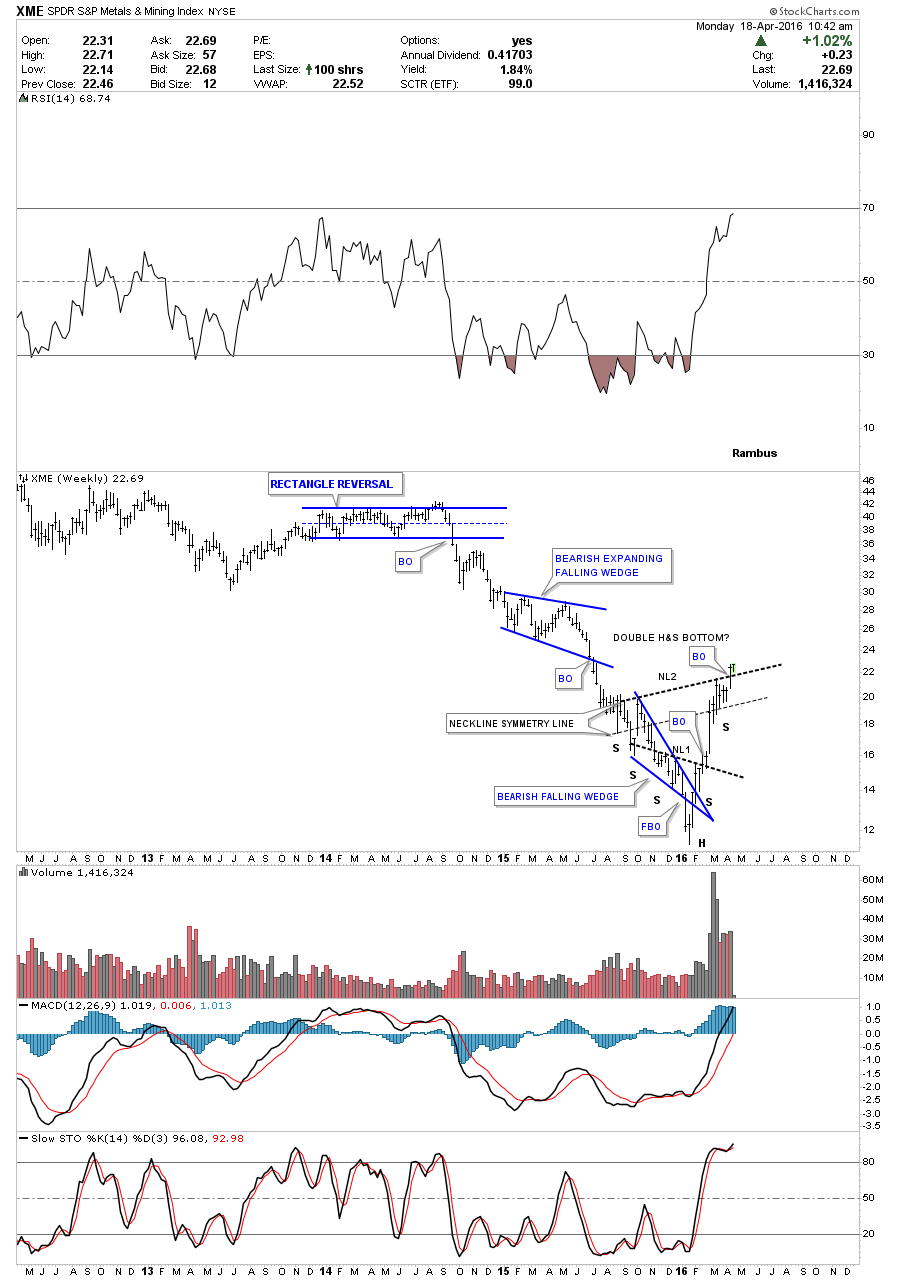
The weekly chart puts the H&S bottom in perspective. It also looks like the XME is breaking out from a second and bigger H&S base labeled neckline #2. Note the nice volume on the impulse move up.
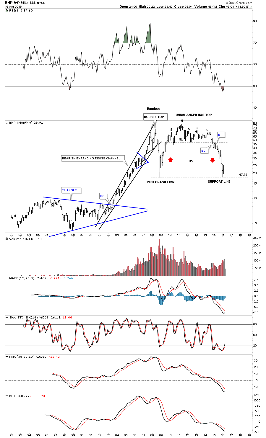
BHP is bouncing off the 2008 crash low.
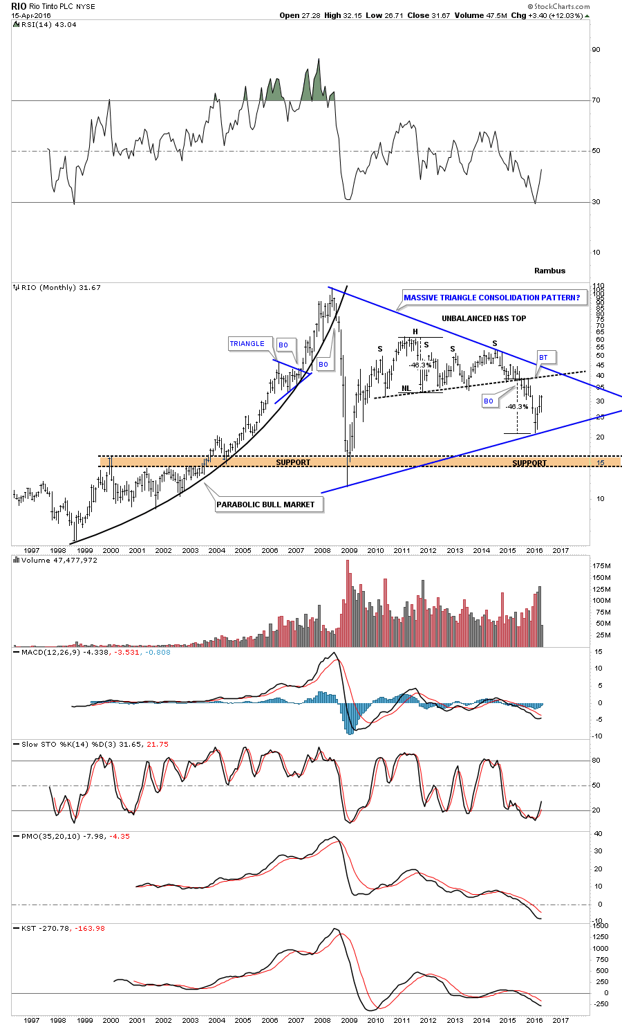
After reaching the price objective for its H&S consolidation pattern RIO is building out a potentially massive triangle consolidation pattern.
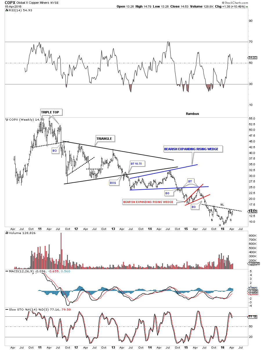
COPX copper miners inverse H&S bottom forming at the bottom of its five year bear market?
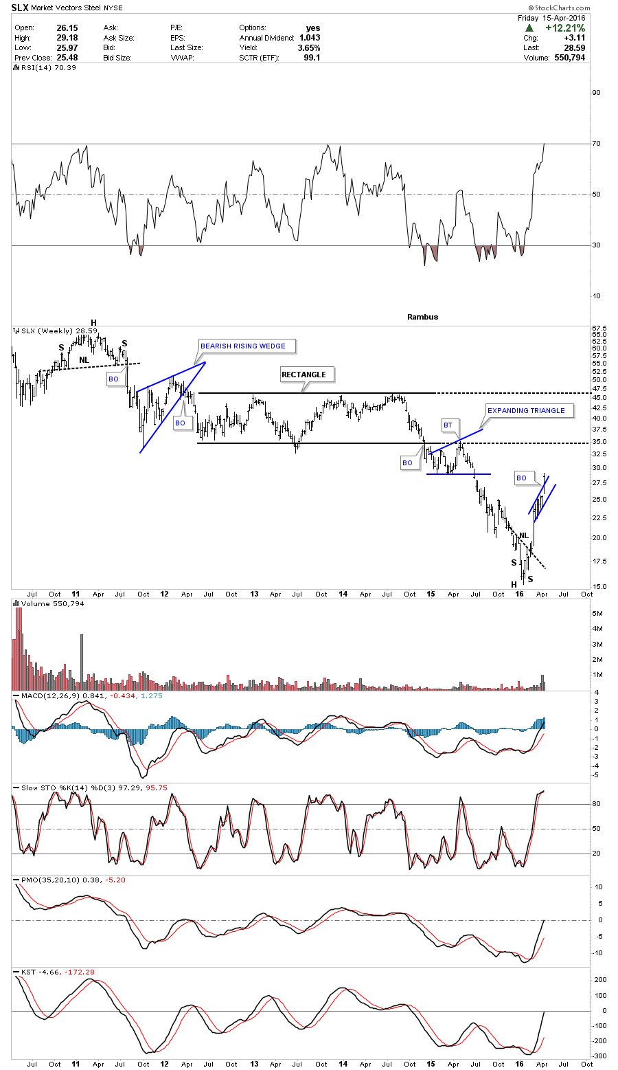
One of the hottest areas in the basic materials sector right now are steel stocks if you can believe that. The SLX, steel etf, has just about doubled since that very important January 16th low across the commodities complex. It broke out of a small bullish rising flag last week.
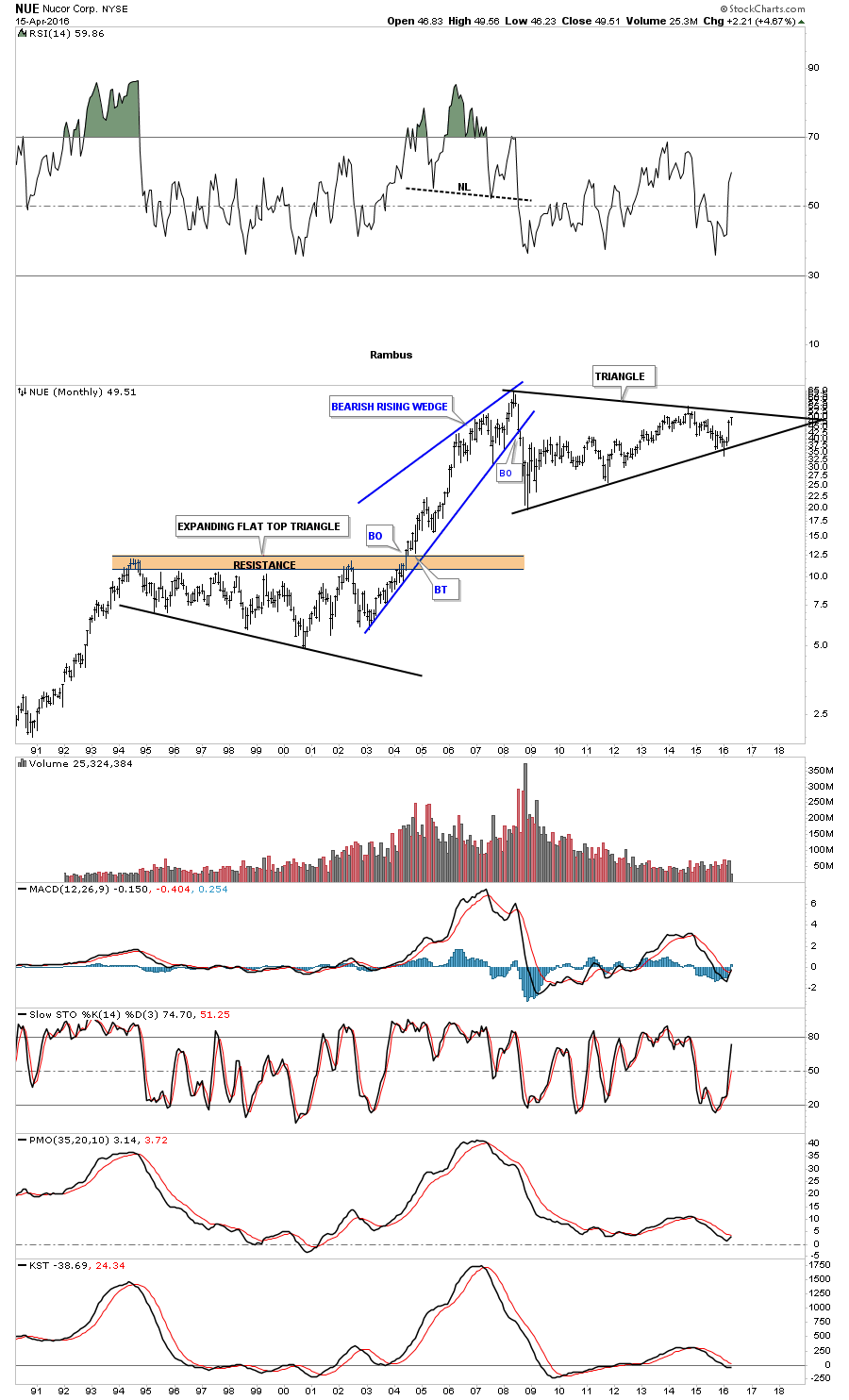
NUE is a steel stock that is fast approaching the top rail of a massive triangle. The bears will look at this triangle as a reversal pattern the bulls a consolidation pattern. The price action will tell us the truth when it’s ready.
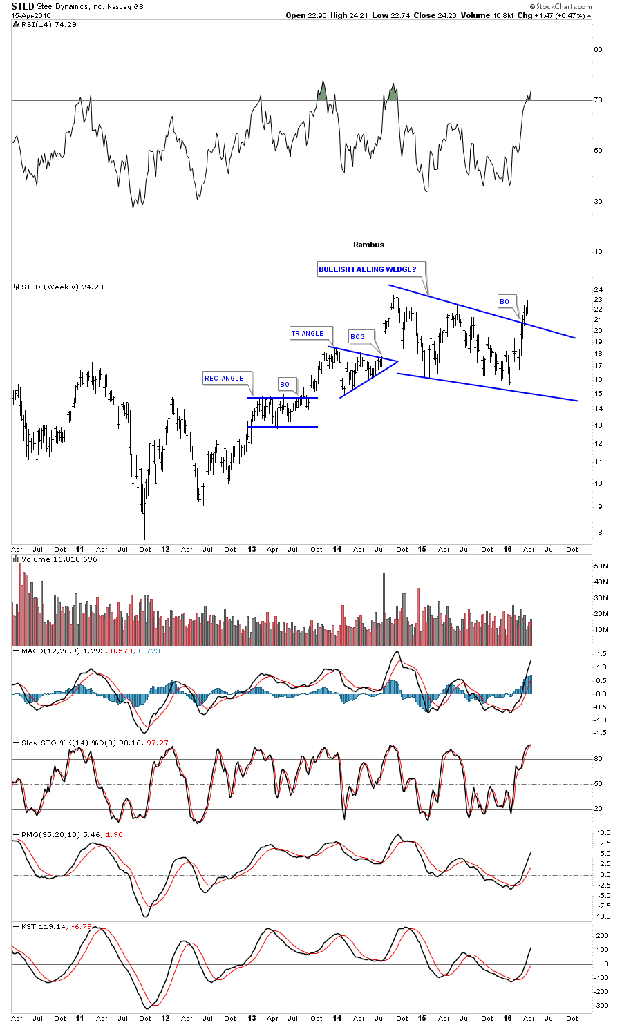
The weekly chart for STLD shows this stock is not waiting around after breaking out from a two year bullish falling wedge consolidation pattern.
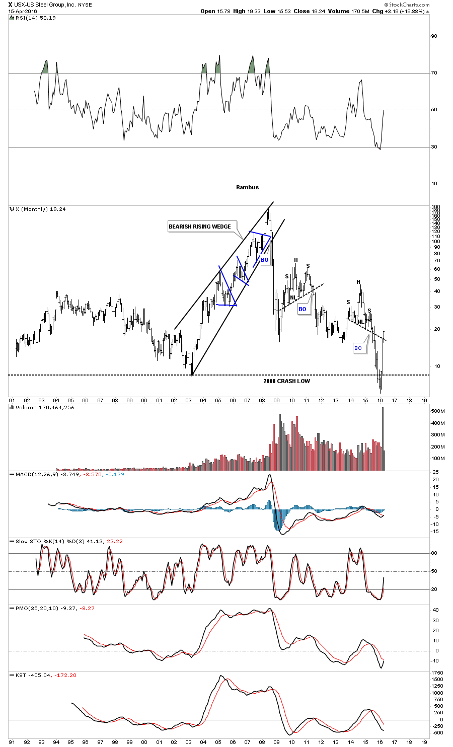
Below is a 25 year chart for X, US Steel, which shows its price almost tripling since January of this year after catching all the sell/stops below the 2008 crash low. Note the bull market rising wedge which started in 2003 and ran to the high in 2008 which was made up of three individual blue triangle consolidation patterns. The precious metals stocks also had a good move back then as well. Will history repeat?
Copper is still a dog but it’s trying to find a bottom.

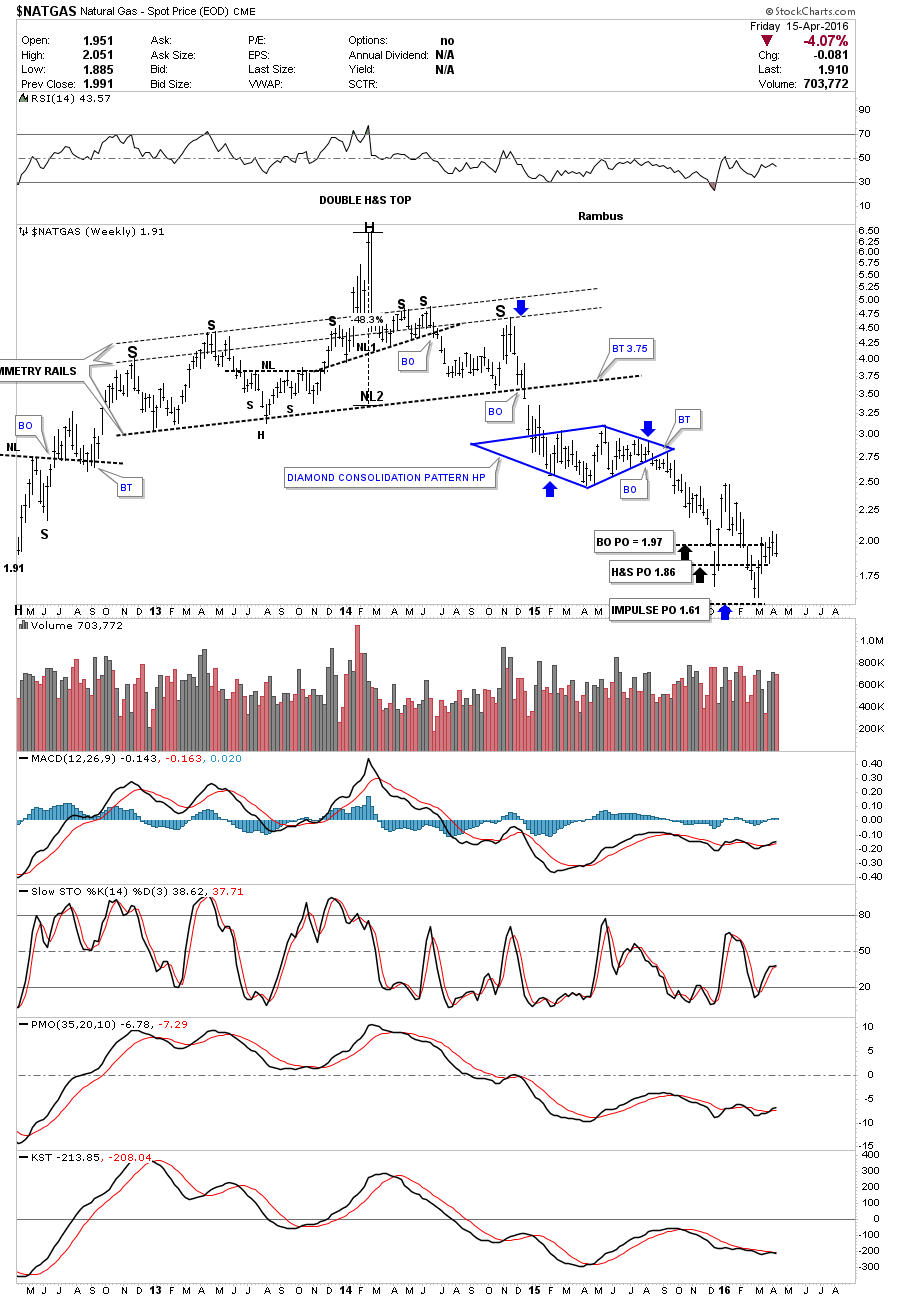
NATGAS is still trying to pick its self up off the floor after hitting three of its measured moves. For the time being I think there are better places to play.
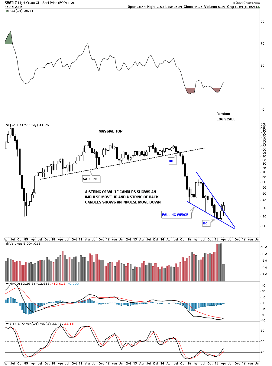
WTIC has one of those big one year falling wedges we looked at previously on some of currencies and commodities indexes. It too has broken back above the bottom rail and rallied up to the top rail and broke out with a backtest. The 200 day simple moving average has done a good job of holding resistance through this decline. It looks like it will have its work cut out holding support tomorrow but it also has the 20 and 50 day ema’s rising to offer some support.
I guess we’ll find out in time what the basic materials stocks are barking about. Right now they’re going against the grain of the deflationary five year spiral the commodities complex has been in. Five years is a pretty long time without even a corrective rally which this sector deserves IMHO. All we can do is watch the price action for more clues on what is really going on which will be very obvious in hindsight. All the best…Rambus

Below is the monthly candlestick chart for oil which shows a potential second white candle trying to form with two weeks left to trade this month yet.
Precious Metals Complex Reverse Symmetry
In mid January of this year it looked as if another leg down was in store for the precious metals complex. Most of the precious metals stock indexes broke down to a new bear market low which I was expecting, as I was looking for that one last capitulation move to shake out the last of the bulls. There was a pretty symmetrical H&S consolidation pattern that had developed at the lows going back to August of last year. The setup looked perfect for one last move down to end the bear market but that didn’t happen. Instead we got a two day shakeout below the previous low which ended exactly three months ago today.
I have been one of the biggest bears since the HUI put in its right shoulder high in 2012 which was the beginning of the bear market.The actual high was made in 2011 but the first real strong impulse move down started from the right shoulder high. Three and a half years or so was a long time to be bearish on this once thriving sector but when I seen the failed breakout to the downside in January of this year that caught my attention. There is an old expression in the markets that says if you see a false breakout from a well defined pattern, the chances are very good that it was a failed breakout and the price action will move rapidly in the opposite direction, leaving everyone who was on the wrong side of the trade in the DUST.
This is exactly what happened in the precious metals sector. After just two days below the neckline on the HUI for instance, the move back up has been breathtaking to say the least. Both the bulls and the bears were confused as to what just happened. How could sentiment change so quickly from the bottom falling out, to a rip roaring bull market just like that. That’s how many moves end. The bear market was so long and brutal that everyone who wanted to sell finally had their chance. With no sellers left the bulls took charge and a brand new impulse move up began.
We’re now at a critical point where both the bulls and the bears don’t know what to do. The bears keep hoping that they were right and the bear market isn’t really over yet and new lows will be on the horizon. The bulls on the other hand are waiting for a good correction in which to buy their favorite PM stocks in this new bull market but the precious metals stocks just keep going higher without any significant declines. Damned if you do and damned if you don’t.
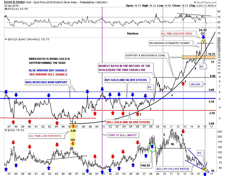
Lets look at some charts so I can show you what I was looking at in regards to such a major shift in sentiment. These first charts will be what I call a ratio combo chart. The top chart will have a ratio which compares one item to the other, which shows how it’s doing compared to the item on the bottom chart. It’s a little bit like inner market analysis, but is easy to see and understand. How a ratio chart develops can have huge consequences for the underling stock or market.
This first ratio combo chart compares gold to the XAU on top with the XAU on the bottom. The ratio chart on top tells the story of how undervalued the XAU index is to the price of gold. It’s mind blowing when you understand how beaten up the precious metals stocks have been vs gold. For many years the blue horizontal line at 5.10 or so was a good place to buy your favorite precious metals stocks, and when the ratio dipped down to the red horizontal line around the 3.70 area it was time to exit those favorite PM stocks.
Looking back to the 1996 time frame you can see the ratio chart on top put in its all time low at 2.60 while the XAU was putting in another important high up to that point in history. From that important low in 1996 the ratio chart on top embarked on a twenty year parabolic rise in which gold would outperform the XAU, even with the bull market the XAU had in the 2000’s.
The first real sign that the XAU or the precious metals stocks were in trouble with gold was during the famous 2008 crash which spiked the ratio up to new all time highs. At the time it looked like it might just be an aberration and the ratio would fall back into its normal trading range between 3.70 and 5.10. If you look at point #4 on the parabolic arc the old ceiling now became support for the ratio meaning gold was outperforming the XAU. There is no way anyone could have predicted how far out of wack this ratio would become. The parabolic arc just kept getting steeper and steeper until it finally put in a double top reversal pattern in January of this year. That was my cue to reverse from a staunch bear to now a staunch bull on the precious metals stocks.
Many times when a parabolic trend ends either up or down the move in the opposite direction can be quicker than the actual parabolic move itself. So far the move down from that double top on the ratio chart has been vertical in nature. Now take a look at the XAU monthly chart on the bottom. As the ratio has been moving down the XAU has been in a strong rally since the middle of January of this year. The XAU broke out from the five point blue bullish falling wedge reversal pattern while the ratio chart on top has broken below the parabolic arc. What this combo chart strongly suggests to me is that it’s now time for the precious metals stocks to outperform gold and in a big way, a revision back to the means.
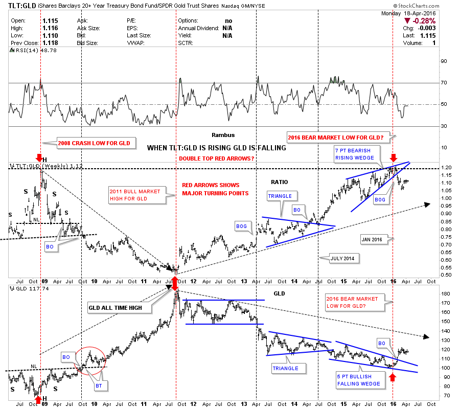
Below is another ratio combo chart which did an excellent job of calling the low for the bear market in the PM complex. This chart has the TLT:GLD ratio chart on top and GLD on the bottom. On the left hand side of the charts you can see how the ratio chart topped out during the crash in 2008 while GLD bottomed out with each forming a H&S pattern. Then when GLD topped out in 2011 the ratio chart bottomed out calling for a bear market in GLD. Now fast forward to January of this year 2016. Up until January of this year, the blue rising wedge could have broken out in either direction which I was leaning toward an upside breakout as that would have signaled the capitulation move for the PM sector. After the seventh reversal point in the blue rising wedge the ratio broke to the downside signaling the bear market was over. Instead of being a consolidation pattern the blue seven point rising wedge ended up being a reversal pattern. Mid January of 2016 comes into play again as an important low for the PM complex.
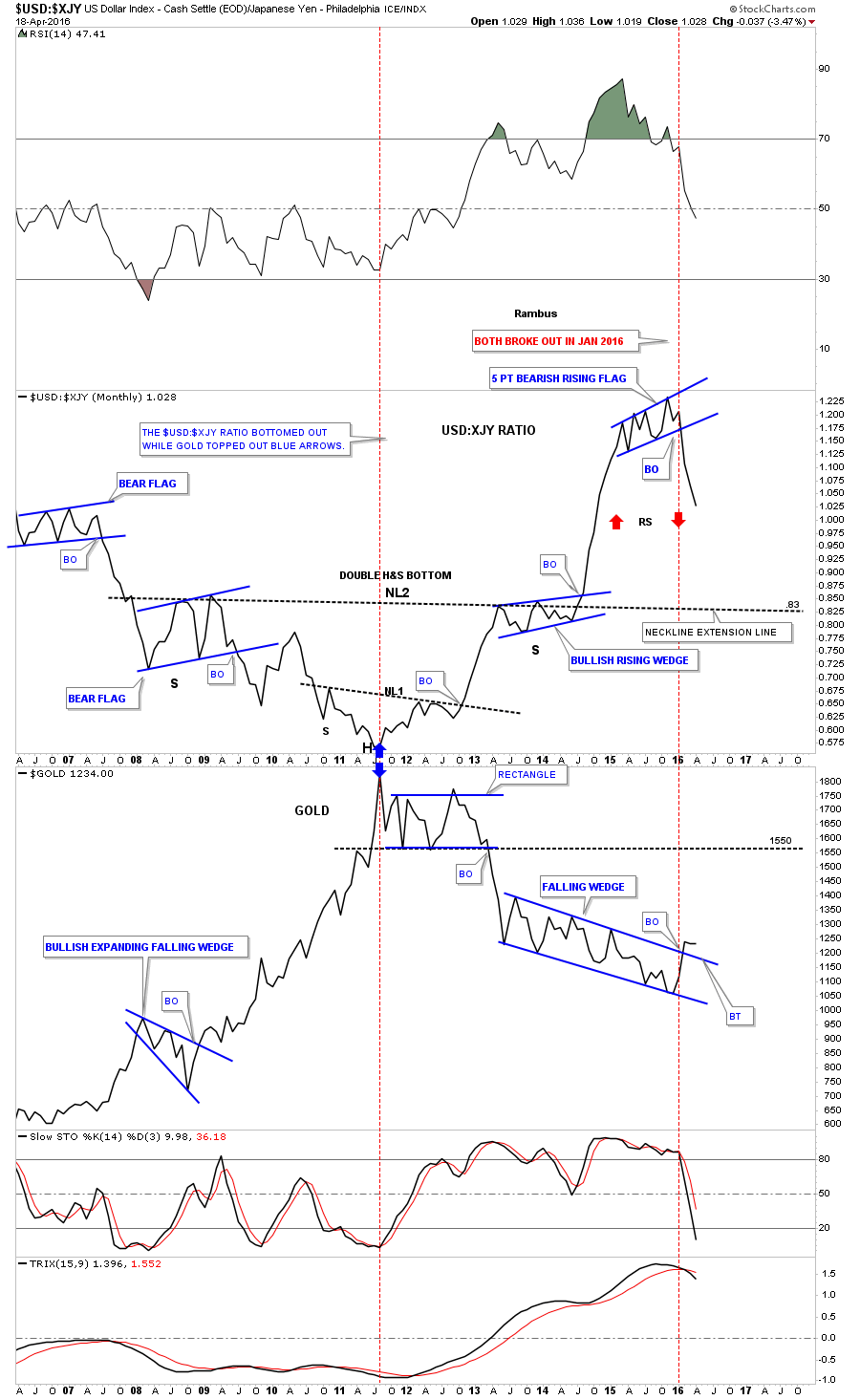
This next ratio combo chart compares the US dollar to the Japaneses Yen on top and Gold on the bottom. Normally when the US dollar is outperforming the Yen gold declines in general. Note where the two blue arrows meet in 2011. They meet at gold’s 2011 bull market peak and the ratios bottom. The ratio chart built out a double inverse H&S bottom while gold built out a rectangle consolidation pattern. From the 2011 high for gold, and the bottom for the ratio they both moved in the opposite direction. The ratio chart on top and gold on the bottom actually made their reversal high in November of last year but they both broke out of their reversal patterns in January of this year. Again January 2016 comes into play You can see the ratio built out a blue five point bearish rising flag reversal pattern while gold built out a very large seven point falling wedge.
There is one more important point to make on the ratio chart which will most likely affect gold as well. Note the near vertical move up the ratio made when it broke out of above neckline #2. It was a vertical move which didn’t have time to form any consolidation patterns along the way. Many times when you see a near vertical move like this the decline will be just as strong because there were no consolidation patterns built on the way up to offer any support on the way down. I call this Reverse Symmetry as shown by the red arrows. As you can see the decline out of the blue 5 point bearish rising flag has been just as steep as the rally leading up into the bearish rising flag, reverse symmetry. The first area of real support for the ratio chart will be .83 which is the neckline extension rail taken from neckline #2 which many times will hold initial support.
What is interesting about these three ratio combo charts is that they are all suggesting a strong move up for the precious metals complex that maybe larger and quicker than move folks can believe. We won’t know 100% until we can look back in hindsight and see what actually took place, but so far the beginning of the rally, especially the precious metals stocks, has been very strong since the mid January low. If you’re a bull where do you get on and if you’re a bear where do you get off? Questions I’m sure are being asked right now from many of the precious metals complex investors.
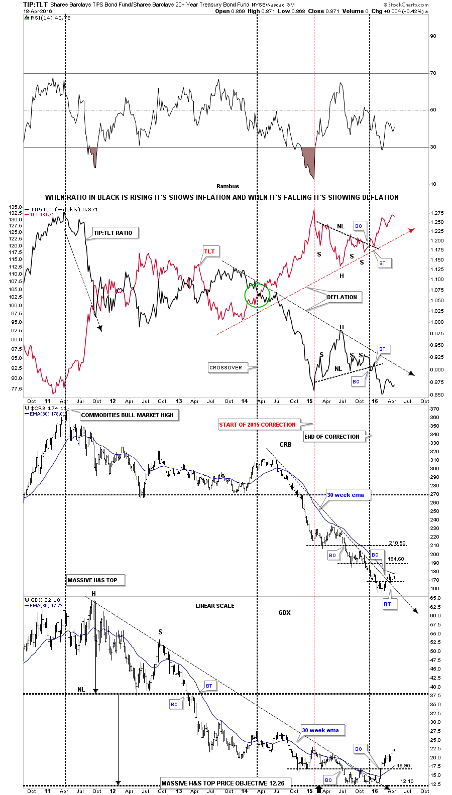
Lets look at one last ratio combo chart which has the TIP:TLT ratio chart on top with the CRB and the GDX indexes on the bottom. When the ratio chart in black is rising there is some general inflation and when it’s falling we generally see deflation. It’s not a perfect tool but it shows us a general picture of what is actually taking place. As you can see the ratio chart in black topped out in 2011 along with most commodities and the precious metals complex. We’ve been in a general state of deflation since the 2011 ratio high and still are to this day. What would get my attention that maybe some inflation may be coming into the markets would be if I seen the ratio in black starting to rise above the downtrend arrow with the TLT itself declining below its uptrend arrow. At this point there is nothing to get excited about on the inflation front unless the ratio chart builds out a possible double bottom in this area, and the TLT builds out a possible double top.
Now lets look at the CRB index and the GDX precious metals stock index at the bottom of the chart. The CRB index has barely budged off of its bottom but it has formed a higher high and has broken above its two year downtrend arrow with the 30 week ema just above the current price.
The GDX is showing a much stronger bottom in place as it has broken above its double bottom trendline at 16.90, the top rail of its five year downtrend line, and is trading well above its 30 week ema. This tells us the precious metals stocks are leading the rest of the commodities complex higher at least to this point in time. There is one more bit of interesting chart action on the GDX at the very bottom. If you look to the left hand side of the chart you can see that massive H&S top that formed back in 2011 on this linear scale chart. You only get one guess on the price objective for that massive H&S top. The measured move for that H&S top is down to 12.26 which is almost dead on the money of the actual low. Just take your fib tool and measure down from the top of the head to the neckline and then move your fib tool down to the neckline and see what you get.
This next combo chart shows how gold is performing in some of the more important currencies of the world. The two resource based currencies the Canadian Dollar and the Australian Dollar show a big triangle consolidation pattern that has broken out and and is being backtested presently. Note how the Australian Dollar is the closest to making new all time highs vs the other currencies vs gold while the US dollar is the furthest away from making a new all time high.

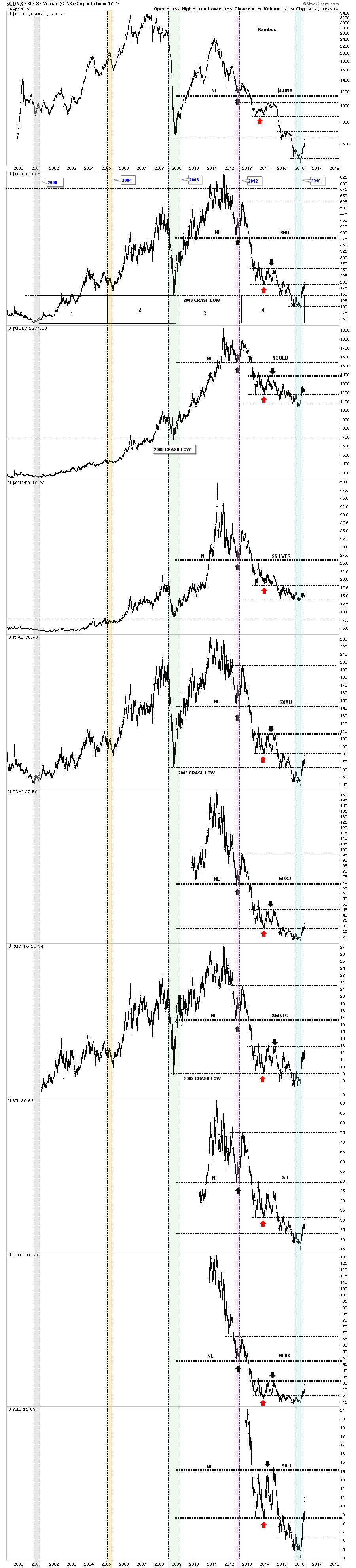
This last chart for tonight I call the Precious Metals Combo 10 chart. This combo chart has all of the most important precious metals stock indexes along with gold and silver. I use this chart to see what PM indexes are performing the best so far in this new bull market. The red arrows shows the 2014 consolidation patterns lows and the black arrows shows the 2014 consolidation patterns highs.The blue shaded vertical area shows the January 2016 lows. When you scroll down through all these charts you can see which ones are leading the pack using the red arrows for a reference point. Up until today the XGD.TO, big cap PM miners, was the first PM index to reach the top of the 2014 consolidation pattern as shown by the black arrow. Today though shows the GLDX, junior gold explores, making up ground fast as it too closed at the top of the 2014 consolidation pattern. Note the move of the small cap junior silver miners which is the last chart on the bottom. The SILJ still has a ways to go yet to reach the black arrow, but they’re putting on a show for all those folks that care to take a look. Silver is still the weakest but it’s trying to make a move up. Even the old $CDNX small cap Canadian index has finally joined the party and is getting a decent move to the upside.
The other different shaded vertical areas shows what I consider to be important lows. It just so happens that the lows are roughly four years apart, as shown by the black rectangles on the HUI chart. They’re not exact by any measure, but they do show up at interesting junctures on these indexes.
Back in 2008 when the PM sector finally bottomed it was an important low as that’s where the buyers stepped up to the plate. In 2015 most of the PM stock indexes broke below that very important bottom which made one stand up and take notice. And then in January of 2016 a rally started, which would take those PM indexes back above that important 2008 crash low. That was a very big deal for me, which suggests we seen a bear trap which few got out alive. Now just three months later many of the PM stock indexes are trading back up to their 2014 consolidation pattern highs, which is a multi year high in some cases. There are no guarantees when it comes to trading the market, only probabilities which we need to get on our side in order to be successful. All the best…Rambus
Equities: The 100 Year Bull Market
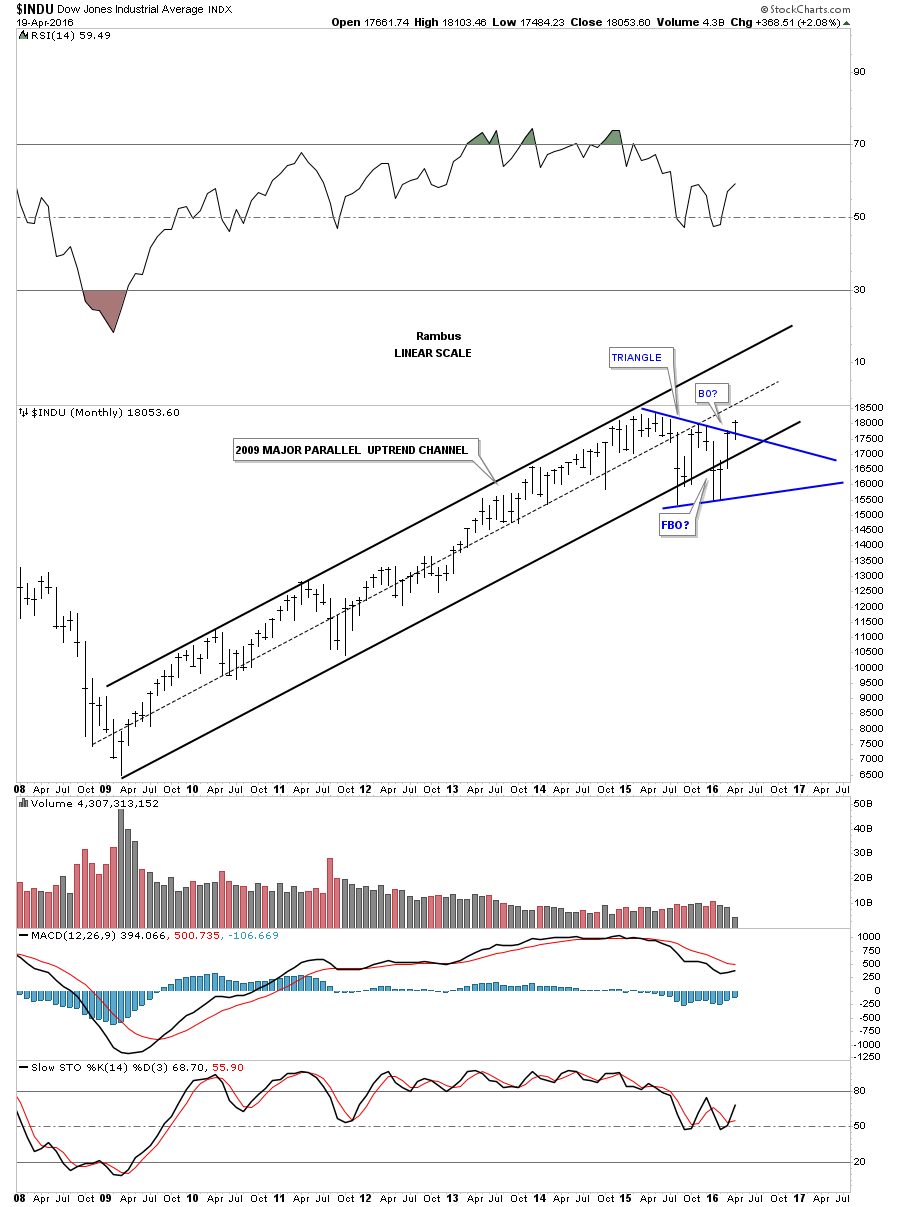
I would like to finish off this four part report by looking at some long term charts for many of the US and world stock markets. In regards to the US stock markets the bull market that began in March of 2009 has to be one of the most despised, hated and unforgiving bull markets of all time. To say it has climbed the proverbial wall of worry is an understatement. The bears have thrown everything they have at this bull market including the kitchen sink and still the bull market lives on.
What’s frustrating both the bulls and the bears alike is the long term trading range that really began about a year and a half ago when the INDU had that big spike down in October of 2014. The INDU proceeded to make slightly higher highs but there was no new impulse move up which created our current trading range. The job of trading ranges is to frustrate everyone. If you’re a short term trader then you can take advantage of a trading range which looks much easier to do in hindsight. If you’re a bull you’re frustrated because the markets don’t go up and if you’re a bear you’re frustrated because the market won’t go down. The only one happy is the traders that scalp short term positions, but they will eventually be on the wrong side of the market when the new trend reasserts itself again.
From a Chartology perspective the bull market that began in March of 2009 is still firmly in place as shown by the long term monthly charts. There were some scary times, especially in August of 2015, and then again in January of this year 2016. January of this year had one of the worst starts for a new year in history. How could one not be bearish. The markets have an uncanny ability to shift sentiment from one side of the spectrum to the other leaving everyone frozen like a deer in the headlights. It’s a tough game we choose to play and to the victor goes the spoils.
Lets look at some long term monthly charts which shows the bull market that began in 2009 and is still enforce to this day. The beauty of Chartolgoy is that it clears our minds from all of the fundamental reasons why a stock or a market has to preform a certain way. There are more reasons the stock markets have to go down right now than numbers to count them. Below is the monthly chart which shows the bull market uptrend channel that began in 2009. You can see the sharp shake out that occurred below the bottom trendline which were negated when the price action rallied back inside of the blue triangle. What else is evident on this chart is the blue triangle consolidation pattern that is the biggest consolidation pattern we’ve seen since the bull market began. To really confirm the breakout it would be nice to see a new high made.
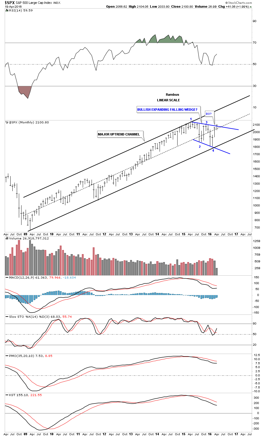
The monthly chart for the SPX shows a very nice parallel uptrend channel with the price action knocking on the door of the top rail of its potential bullish expanding falling wedge. Keep in mind one doesn’t have to be a rocket scientist to see the bull market uptrend channel, just having an open mind can help.
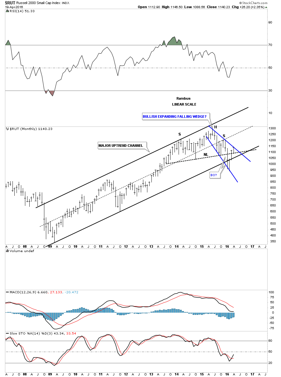
The RUT shows a nice parallel bull market uptrend channel that had just a slight breach of the bottom trendline in January of this year, but that was quickly nullified when the price action traded back inside the uptrend channel. There is another important point I would like to show you on this chart and that is the failed H&S top. Late last year and of course January of this year, which had one of the worst starts in history, alot of potential H&S tops broke out to the downside only to quickly fail. We discussed previously that when we see a failed breakout of a well defined pattern it usually means that we’ll see a big move in the opposite direction, the shakeout before the breakout. As you can see the RUT is now trading back above its neckline which looked so bearish just three months ago. I know how impossible it seems but that blue expanding falling wedge looks like its the real pattern not the failed H&S top.
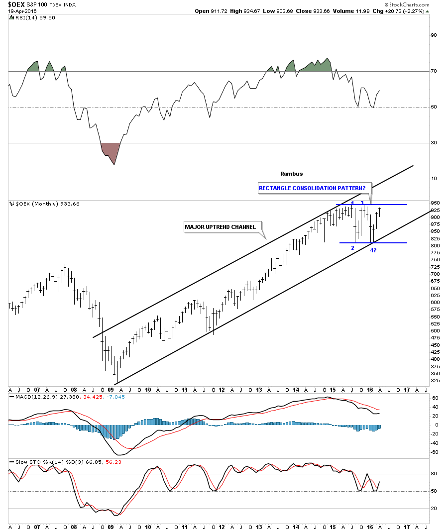
The OEX 100 shows a beautiful bull market uptrend channel with the rectangle getting close to completing the all important fourth reversal point.
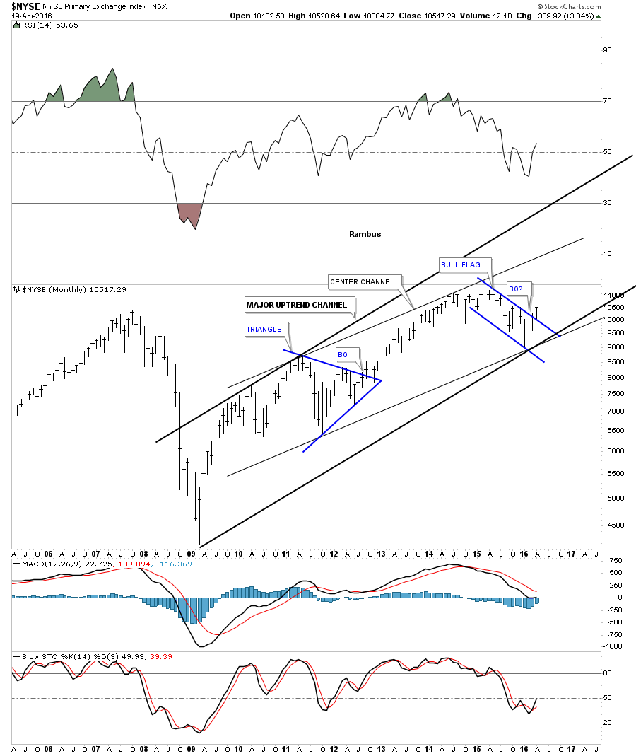
The NYSE is a broadly based index which has a slightly different look to it compared to the other indexes we’ve looked at. Here you can see it has a parallel center channel, which shows the top rail of the blue bull flag with a breakout.
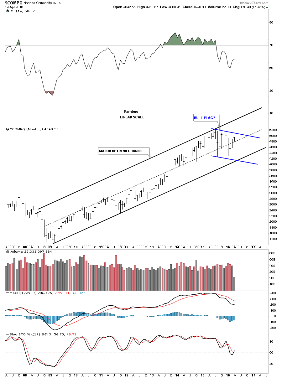
The COMPQ shows a very nice bull market uptrend channel and is working on its fourth reversal point for the potential blue bull flag.
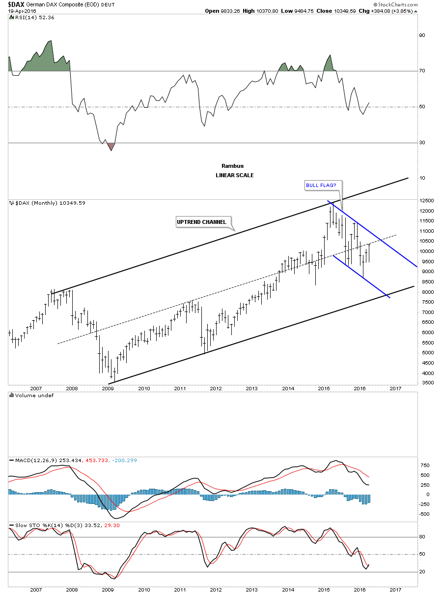
Lets now look at several of the big European stock markets and see how they compare to the US stock markets we looked at on the charts above. The DAX has been in a bull market since the low in 2009 and is currently building out a possible blue flag. As you can see it’s not quite as strong as the US stock markets but it does have a nice lookng bull market uptrend channel.
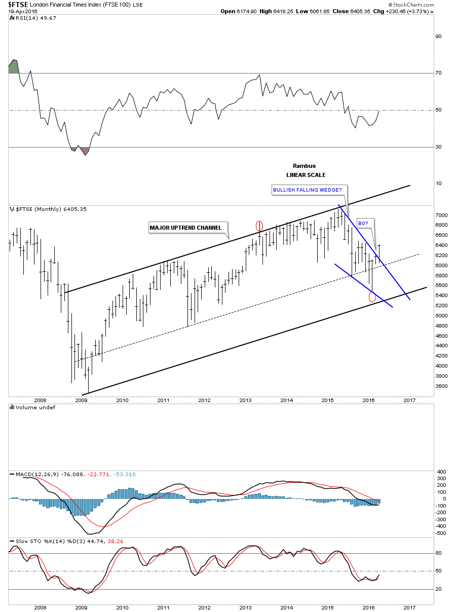
The FTSE is showing a nice bull market uptrend channel and it may have just broken out from the blue falling wedge.
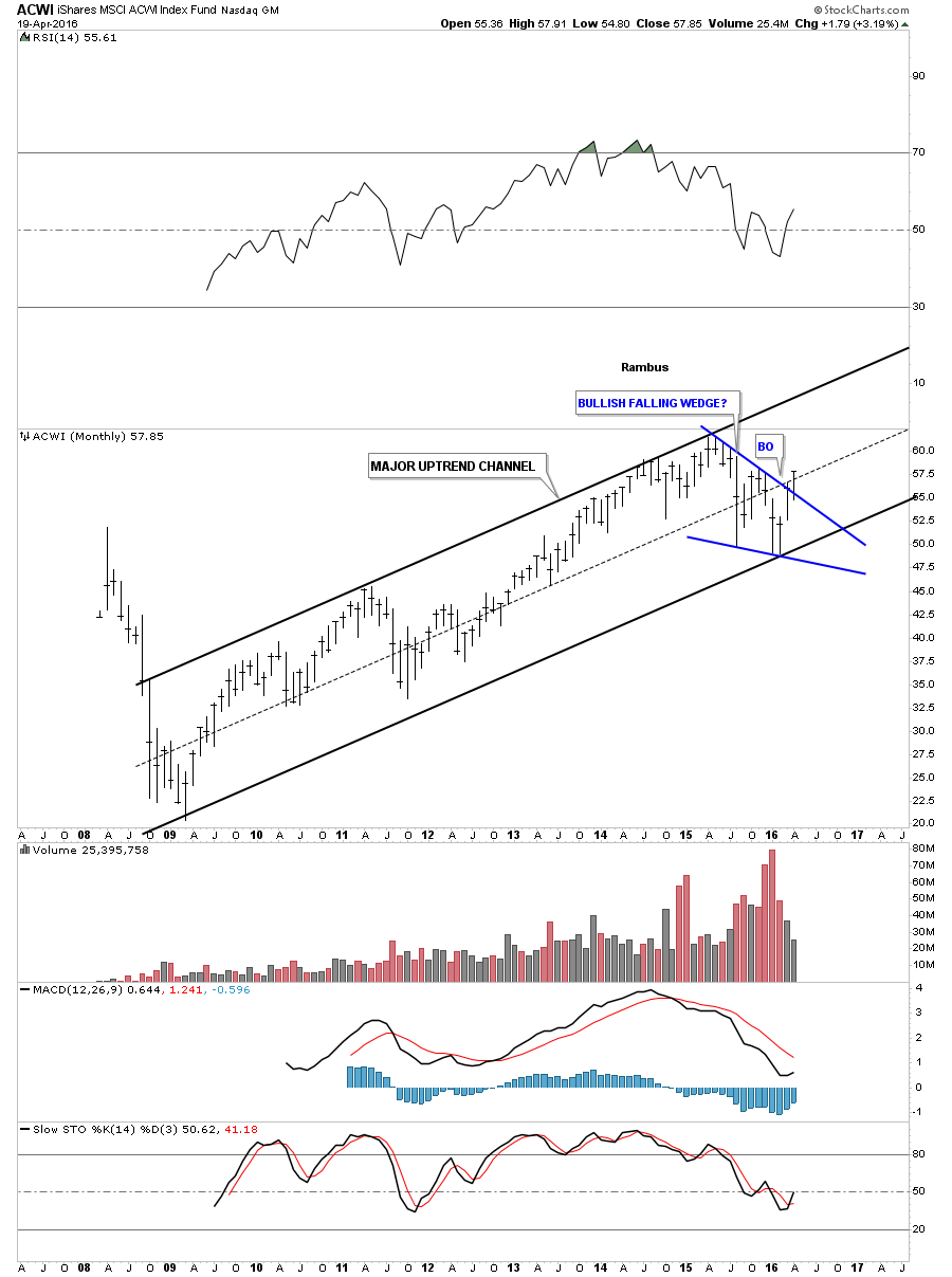
We are constantly preached to on how the world as we know it is coming to an end from an economical point of view. That maybe true but the AWCI, which is an all world index, looks like it’s getting ready to move higher. It has a beautiful major uptrend channel and is just now starting to breakout from the one year blue bullish falling wedge.
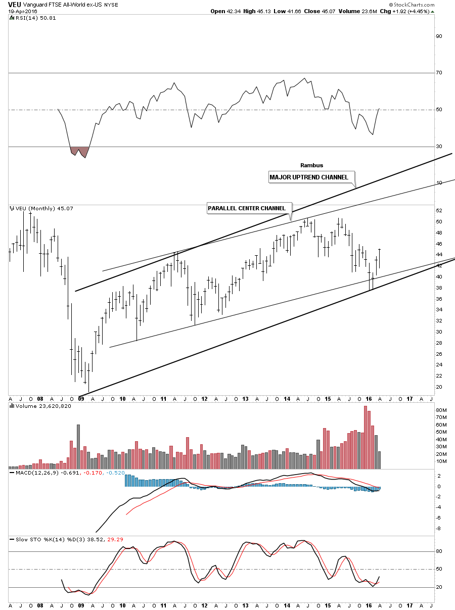
The EVU is an all world stock market index minus the US market.
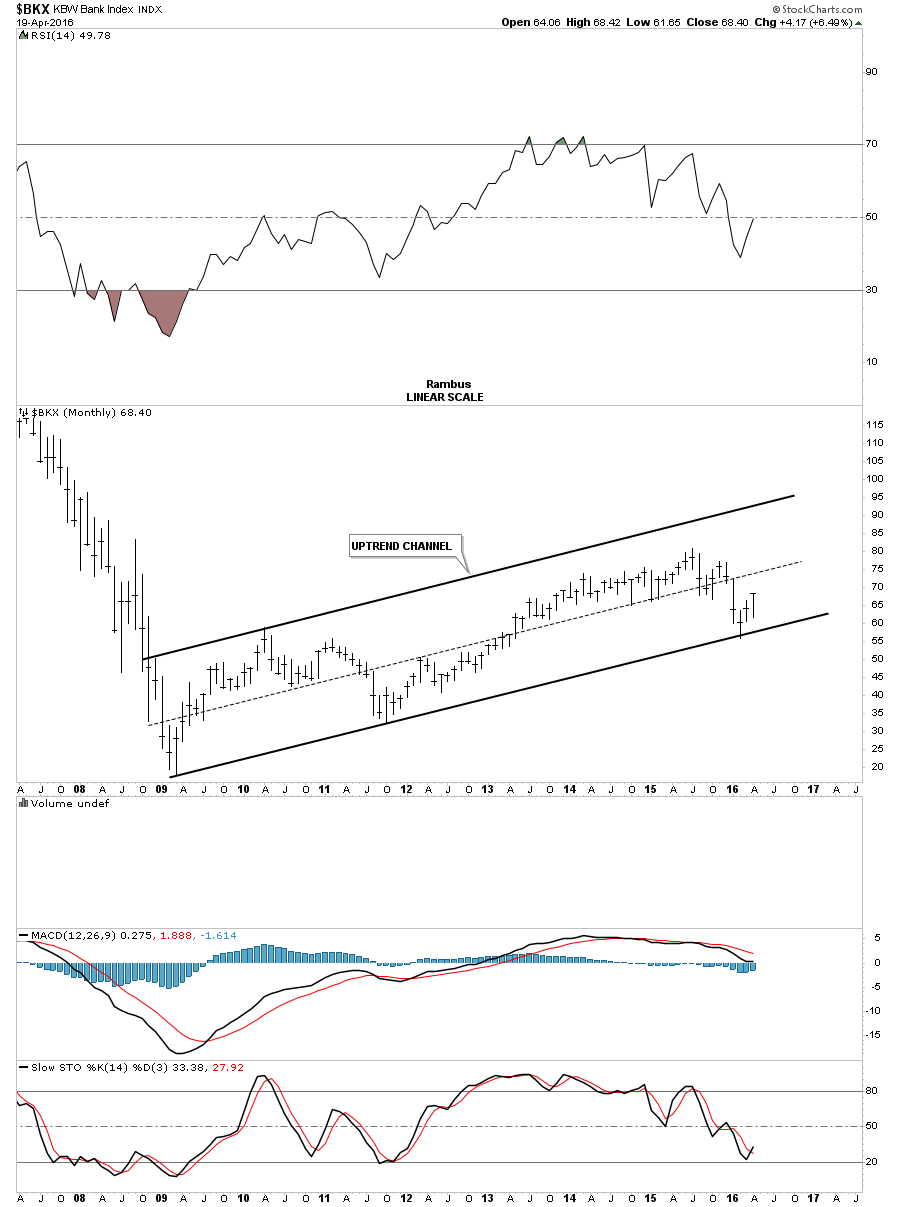
Lets now look at several of the different stock market indices to see if they represent the bull market that began seven years ago. The BKX, bank index, shows a nice bull market uptrend channel with the price action testing the bottom rail in February of this year. It’s not as steep as some of the other indexes we looked at but it’s in a bull market uptrend channel until proven otherwise.
The DRG, Pharmaceutical index, is showing a failing H&S top within its 2009 bull market uptrend channel. The bears need to step up to the plate to get the price action back below the neckline.

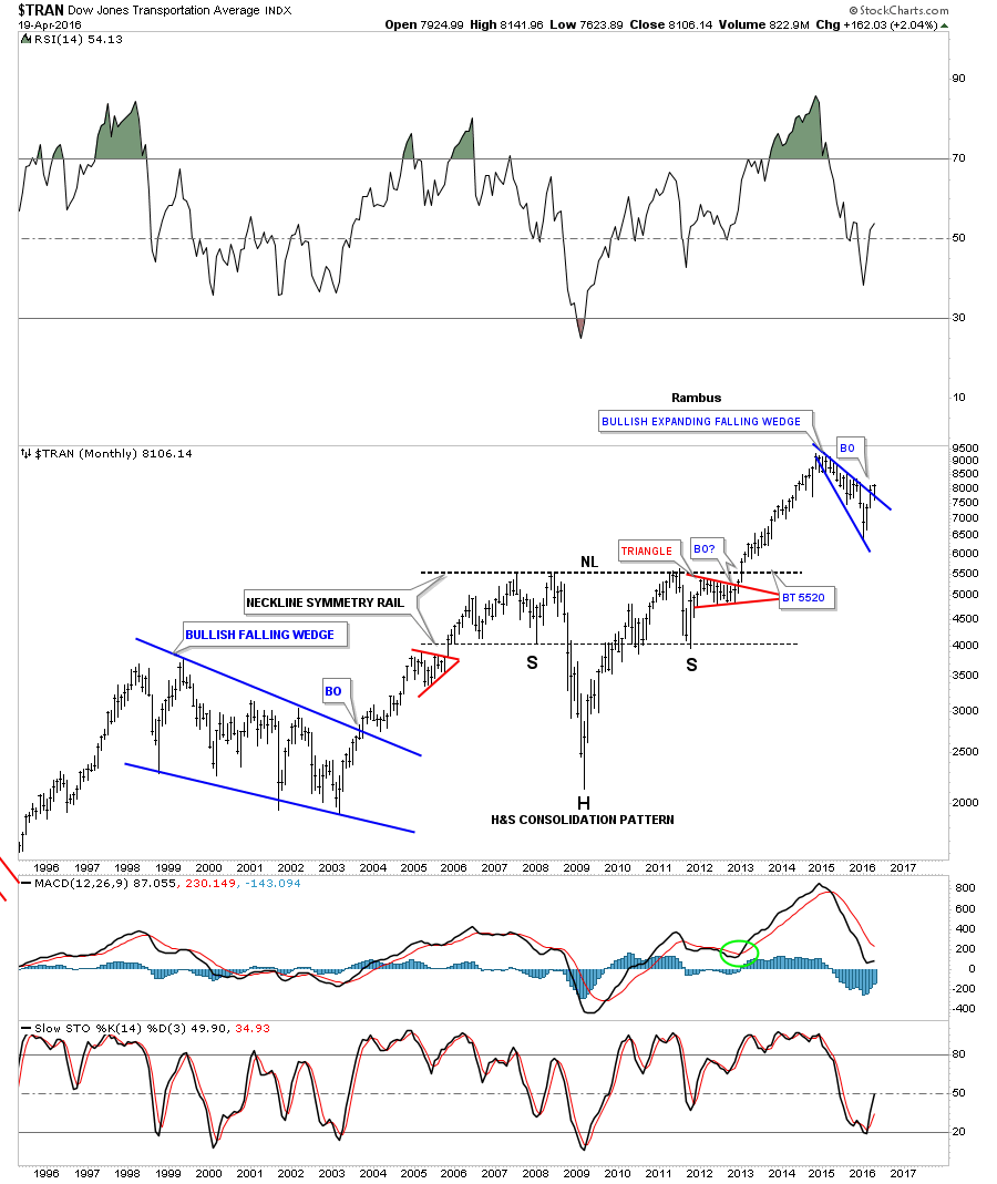
I would like to end this report by looking at a 20 year monthly chart for the Transportation Average. Normally the Transportation Average will lead the stock markets higher or lower. Note how ugly this chart looked back in 2009 when it wrecked. From that very ugly low one of the most beautiful inverse H&S bottoms I’ve ever had the pleasure to build occurred. Note how the price action reversed symmetry back up over the same area where the crash happened. That reverse symmetry rally finally came to an end in 2011 which was at the all time highs made back in 2008. Note how the neckline symmetry rail showed the low for the right shoulder. After building out the one year red triangle consolidation pattern just below the neckline, the breakout move was about to get underway. Over the next couple of years the Transportation Average gained around 4000 points before topping out. Over the last 18 months or so this index has consolidated that massive move up by building out a bullish expanding falling wedge. It’s in the process of breaking out this month. This index will be a key driver going forward if the bull market is ready to enter into its next impulse move higher.
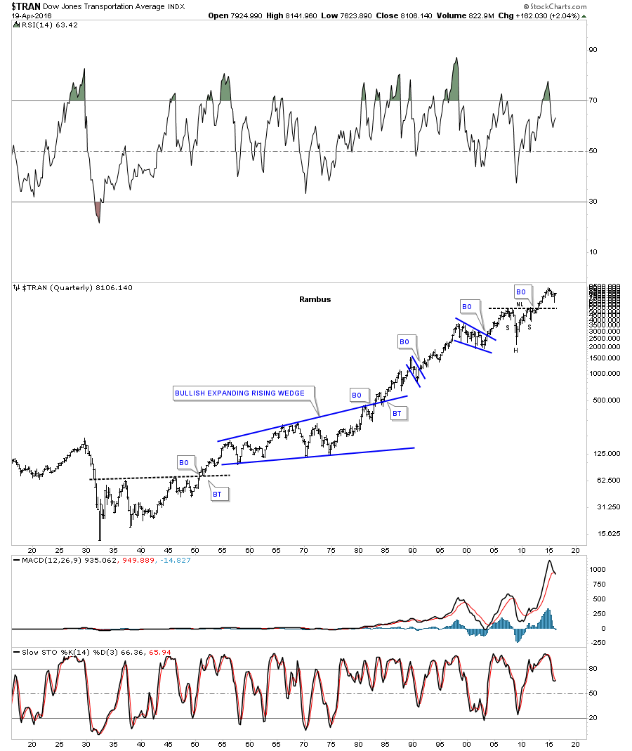
The 100 year chart for the Transportation Average puts that beautiful H&S consolidation pattern in perspective. The beauty of Chartology is that it’s just as relevant today as it was 100 years ago. Human psychology still remains the same when it comes to the stock markets. All the best…Rambus
Catherine Austin Fitts:
Rambus, I can't thank you enough. This is Blockbuster Chartology! We have a lot to study and digest. Let me remind our subscribers that they can access your ongoing efforts at: http://rambus1.com.
Related Reading:
- The Dollar, Gold & the S&P 500 with Rambus
- Thanks, Rambus!
- Precious Metals: It's ALL about the Big Picture After All
- GoldMoney Stock Down on Continued Losses
Top of Page
© Solari 2016