
January 19, 2017
Rambus: Blockbuster Chartology - 2016 Annual Review
By Catherine Austin Fitts
My "go to" website for technical analysis of precious metals, the US dollar & the US stock market is Rambus Chartology, where Rambus (that's his handle - he's the founding technical analyst) leads a discussion with extensive charts of what the markets are saying.
Last October, the Solari Report did a written interview with Rambus including an introduction here and a discussion of Rambus, his background, technical analysis as well as the word "Chartology." You can find all this information at our first interview:
- Why "Rambus?"
- How Rambus Chartology Got Started
- What Rambus Chartology Does
- About Technical Analysis
- Tracking the Markets
- What does the word "Chartology" mean?
- Rambus: Blockbuster Chartology
In January 2016, Rambus launched his quarterly Solari Report with a Blockbuster Chartology across the four market sectors: Currencies, Commodities, Precious Metals and Stock Markets. You can find it here: Rambus: Are We in a Deflationary Spiral? Then, Rambus returned with his Blockbuster Chartology across the market sectors in April, July and October. Now with 2016 behind us, Rambus returns with his first Blockbuster Chartology of 2017 that takes an in depth look at currencies, US and world stock markets and precious metals.
One of the reasons that Rambus is so good at his craft is that he focuses on "staying on the right side of the major trend." The challenge of doing so at this time is that it is tempting to look for bottoms or to assume that the trend upwards in the US dollar or stock market may be over. However, Rambus consistently brings us back to the discipline of the Chartology. What does price tell us? As he describes so aptly, we are dealing with psychological warfare.
Sitting back once each quarter to get this perspective offers invaluable insight. So, here we go for the first 2017 Blockbuster Chartology!
Blockbuster Chartology By Rambus
Currencies
The Dollar and the Euro
Prepared on January 07, 2017Below is a daily chart for the US dollar which shows it’s still in breakout and backtesting mode. The top rail of the black rectangle is major support at 100.
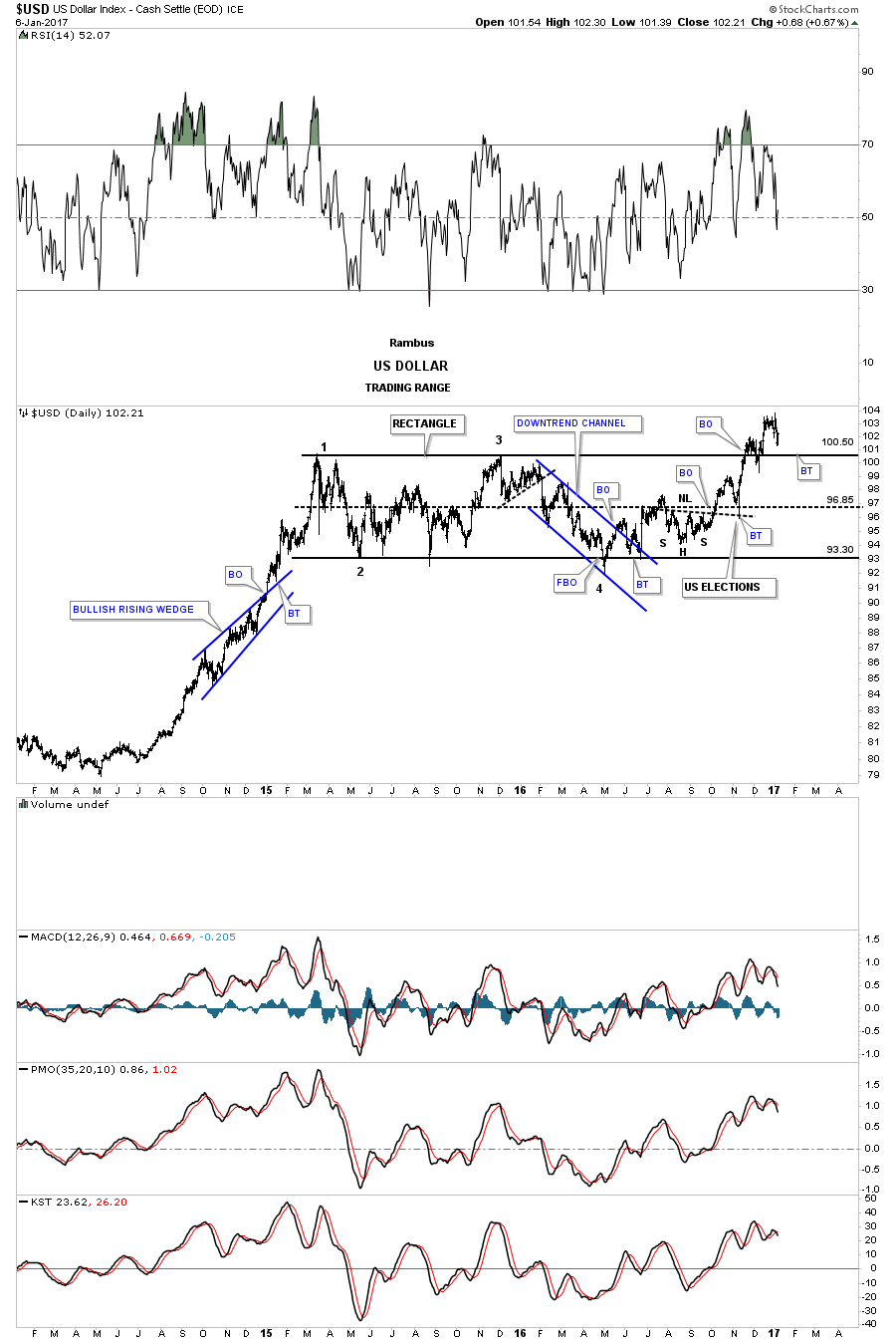
The month is still young yet but I would like to see the monthly candlestick chart form another white candle to go with the previous three. The more white candlesticks the US dollar makes in a row the stronger the impulse move. The breakout from big base #1 produced nine white candlesticks all in a row.
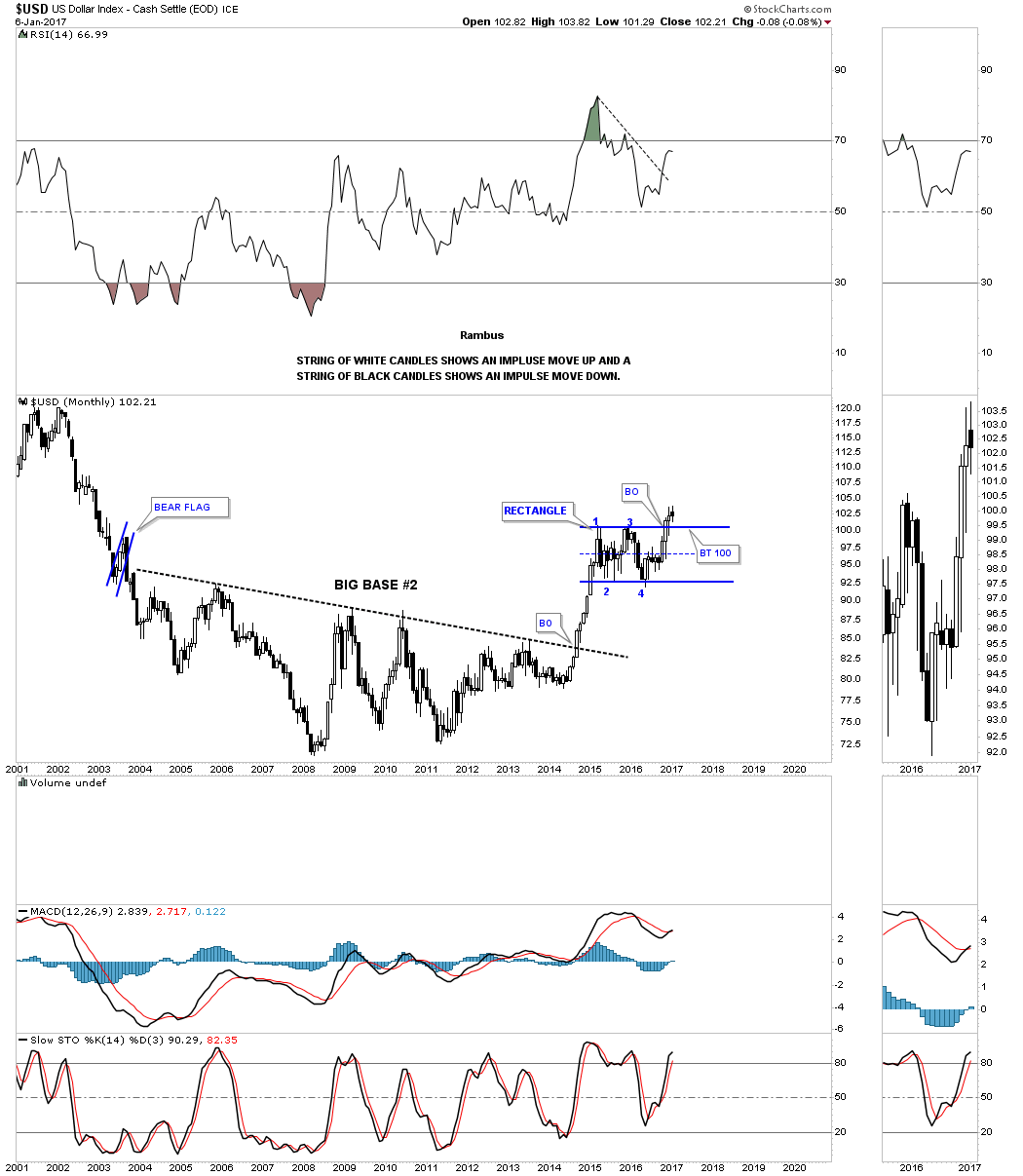
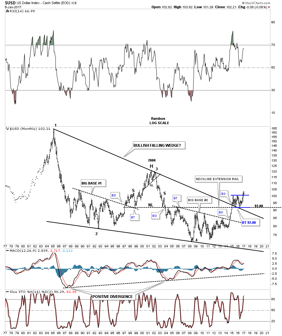
The 40 year monthly chart for the US dollar is one we’ve been following for a long time now. The breakout from the top rail of the major bullish falling wedge and the backtest is the rectangle we looked at on the charts above.
If the US dollar is trying to breakout topside from a horizontal trading range then there is a good chance that the $XEU is doing the same thing at the bottom of its chart. You can see how critical the backtest is which will have a huge impact on what the US dollar does which will have a big impact on other areas of the markets.
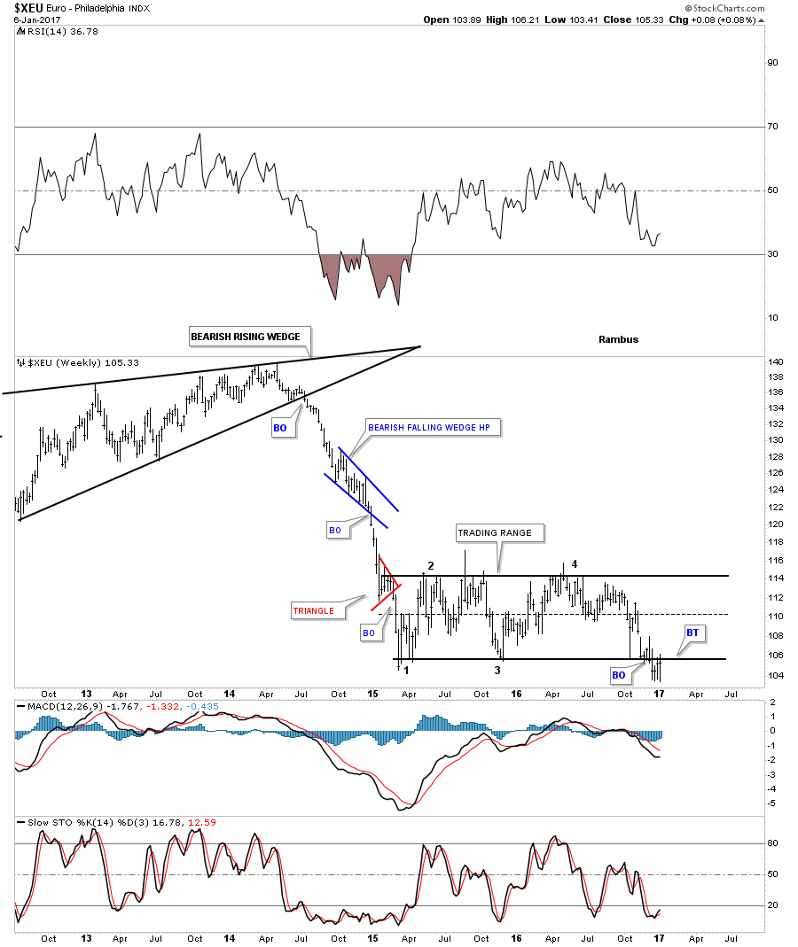
Below is a long term monthly chart for the euro which shows the red rectangle trading on top of a 14 year neckline which again shows how critical this area is.
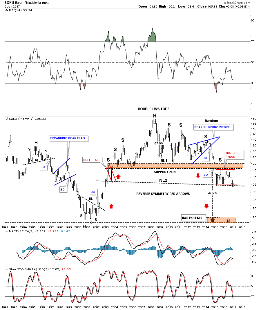
This next 20 year monthly chart for the euro shows where the rectangle fits into this big picture again. The rectangle has been building out on the bottom rail of the downtrend channel which I changed to the dashed mid line. This is only speculation at this time, but if the rectangle breaks down there is a good chance the downtrend channel can double in size as shown by the black rectangle measuring sticks. The first thing we need to see is a nice tight upper channel which the euro has.
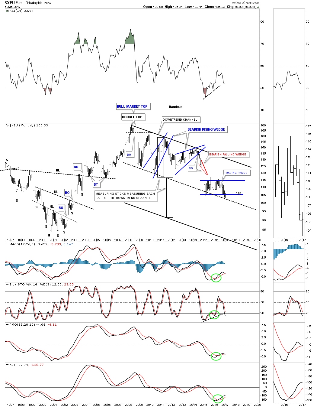
This last chart for tonight I overlaid gold on top of the euro so you can see the correlation, which is good, but not perfect. Whatever the euro does down here will most likely have a direct impact on the US dollar and the precious metals complex. Have a great weekend. All the best…Rambus

U.S. & World Stock Markets
The Psychology Behind the Stock Market Charts
Prepared on January 8, 2017Since the US elections many of the US stock markets and some world stock markets for that matter, have been rallying pretty strong. Most investors will think it’s the Trump victory that is propelling the markets higher but the bigger patterns started to build out before Trump even announced his candidacy. It’s more of a case of the news following the price action. Everyone wants to know why the markets are either going up or down so they can understand, from a purely fundamental view, how to invest.
Investing in the markets is more psychological warfare than anything else. How many times have you scratched your head when a good piece of economic news came out and the markets went down or just the opposite, up on bad news? A bull market climbs the proverbial wall of worry because without it everyone would be bullish and there would be no one to buy stocks. Nothing goes straight up and there will be the inevitable corrections along the way, but if you can get the big trend right you will have a much better chance to survive and even prosper in one of the toughest games on the planet to play.
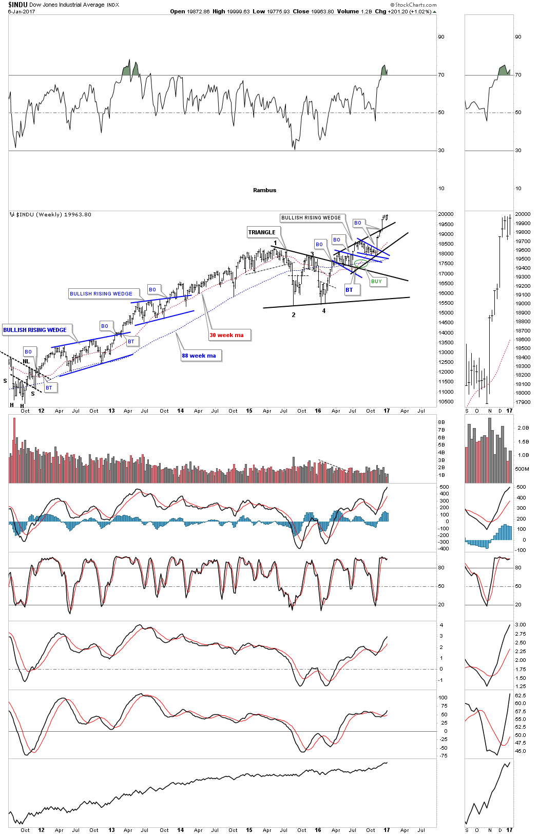
If you recall a year ago the INDU had one of the worst starts to a new year in history as it declined into its first low in what turned out to be a double bottom reversal pattern after the second low was established in mid February. That initial rally took the INDU up to the 18,100 area where it began to to correct that impulse leg up. There was no way to known back in April what type of consolidation pattern may build out but with the double bottom reversal pattern in place the odds were good to expect some type of consolidation pattern to start forming.
The initial consolidation pattern to start building out was the blue expanding falling wedge at reversal point #1 on both the small blue falling wedge and what turned out later the black bullish rising wedge. Normally the blue expanding falling wedge should have created a much bigger breakout move than it had. This suggested that a possible bigger consolidation pattern would develop. Note the low for the blue expanding falling wedge which was the fourth reversal point, that was marked by the BREXIT vote. Everyone was pretty bearish back then as no one knew what to expect going forward. The FTSE was crashing that day and it looked like the end of the world.
At reversal point #3 on the black bullish rising wedge began the second decline which formed the blue 8 point bullish falling wedge. If you recall that 8 point blue falling wedge had very little volatility and just slowly declined into the fourth reversal point in the black bullish rising wedge. The reason I’m explaining this in such detail is that when we look at a chart we don’t feel the emotions that were taking place during the formation of a chart pattern. It’s easy to see in hindsight, but when you’re living through and following the price action very closely it’s an entirely different ballgame altogether.
After the top rail of the 8 point blue falling wedge was broken to the upside is when I connected reversal points #1 and #3 on top and reversal points #2 and #4 on the bottom which showed a rising wedge formation that was still not completed. Note reversal point #4 on the black rising wedge was the US elections low. Again, if you recall the night of the US elections the US stock markets were down big time and it looked like the end of the world.
Generally when I see two small consolidation patterns building it with a failed first pattern that tells me to start looking for a bigger consolidation pattern to build out. Many times a big consolidation pattern will have several different small formations that build out the finished product. Also when I see an up slopping consolidation pattern forming in the direction of the trend instead of against it like a normal bull flag, it tells me the stock is in a strong move. The breakout came when the price action broke above the top rail of the black bullish rising wedge, I can call it a bullish rising wedge because the price action broke out above the top rail, with that long daily bar.
For the last thee weeks or so the INDU has been consolidating that breakout move as shown by the red pattern at the top of the chart. The odds favor an upside breakout, but since there wasn’t a backtest to the top rail there is still a possibility that we could see a backtested which would come in around the 19,350 area. This daily chart for the INDU shows you the chart patterns and the psychology behind the patterns which led to new all time highs. There are longer term charts we’ll look at for the INDU which strongly suggested the black bullish rising wedge would indeed breakout to the upside.

This next daily chart for the INDU shows all the chart patterns going back to November of 2014. The first thing to notice is the small double bottom on the chart above is actually part of a much bigger double bottom with the first bottom forming in August of 2014 so we have a very large double bottom reversal pattern in place. This chart puts the black bullish rising wedge in perspective. At some point we’re going to get a decent correction but at the moment the setup on the INDU still looks bullish and impulsive.

Putting another brush stroke on the longer term weekly chart for the INDU you can see the black bullish rising wedge formed as a backtest to the top rail of the black year and a half triangle consolidation pattern. I know many are calling for a top in the INDU, but when you look at this chart there is no reversal pattern to be seen just a continuation of the bull market that began in March of 2009. If one had shorted the INDU and is still holding on they’re underwater, but if one had been long at anytime since the March 2009 low they have a profit. The trend is your friend.
This next weekly chart for the INDU shows the H&S top that formed just before the 2008 crash when Real Estate and banks along with just about everything else including the precious metals complex crashed. That H&S top was a reversal pattern that reversed the uptrend at that point. The INDU built out an inverse H&S bottom which reversed the 2008 bear market. Looking at our current price action there is no reversal pattern in place to reverse the bull market that began in 2009. Maybe one will begin to build out but for now the INDU is in an impulse move higher.
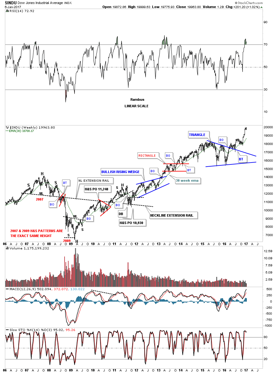
This next monthly chart I call the most hated bull market in history chart for the INDU.

This next 20 year monthly chart for the INDU shows the Jaws of Life, expanding triangle consolidation pattern which took nearly 13 years to complete. You can see how the blue triangle that we looked at above on the weekly and monthly charts, formed as a backtest to the Jaws of Life, expanding triangle. I have to admit it was a very hard backtest to live through as there was some serious volatility but I never gave up on this massive consolidation pattern because there was never a reversal pattern that formed just the blue triangle consolidation pattern.
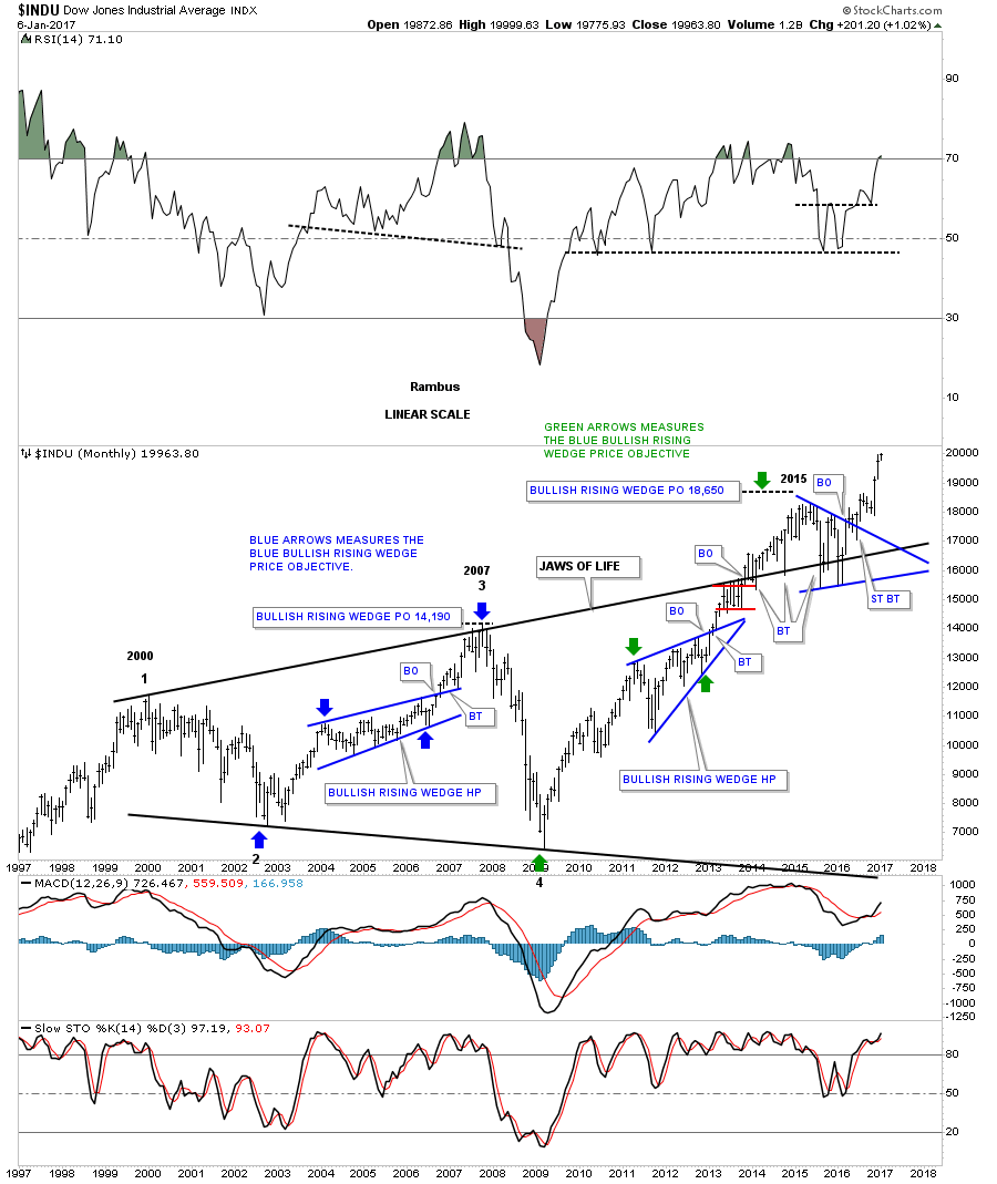
Below is a 75 year quarterly chart for the INDU which puts the Jaws of Life consolidations pattern in perspective. I know how hard it’s for most of you to even contemplate the meaning of this 75 year chart. What this chart is strongly suggesting is that the INDU started its secular bull market at the 2009 crash low. And what is even more exciting is that the backtest looks complete to the top rail of the Jaws of Life and the next strong impulse move up has begun.
Note the beautiful H&S consolidation pattern that formed the last low in the secular bull market in the late 1960’s and 1970’s with the neckline giving way in 1982. After the backtest was complete the INDU rallied for five years into the infamous 1987 high which led to the biggest crash in history. That 1987 high also marked the first reversal point in the next consolidation pattern, the bullish rising wedge. The blue arrow that marks the head of that massive H&S consolidation is actually the beginning of that secular bull market. The blue arrow at the 2009 crash low marks the beginning of our current secular bull market.
When you watch a multi year pattern build out in real time there are always some doubts along the way in which you question what you’re seeing is real. But when you see the pattern come to fruition, the 13 year Jaws of Life, for me personally, this is why I love charts. You’re seeing something that no one else on the planet is seeing. Most folks won’t understand what is taking place until well after the fact. The only thing that will change my mind is if we see the INDU trade below the top rail of the Jaws of Life. Above the top rail is bullish and below is bearish.
This last chart for the INDU is a quarterly line chart which shows the Jaws of Life expanding triangle in all its glory. Note the beautiful breakout and the backtest to the top rail that stopped exactly where it should have.
All these charts above shows you in detail how Chartology comes together in the short term daily charts all the way out to the 75 year quarterly chart to paint a picture of the price action. It’s the price action which tells the story, but interpreting the price action is another matter altogether. Just like Elliot waves or cycles guys everyone has their own way of looking at the charts. Chartology is just one way of many trading disciplines out there that can work if one can put enough time and effort into learning what works for them.

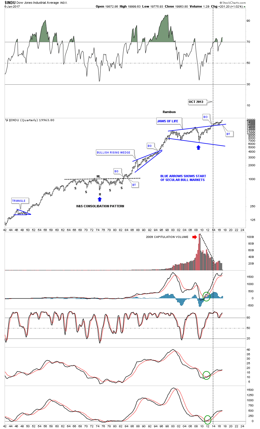
Lets see if we can find some other indexes that may support the long term charts for the INDU. It’s always nice to see the Transportation average move to new highs with the INDU which helps confirm the Dow Theory buy signal. A month or so ago the Transportation Average hit a new all time high confirming the the Dow Theory buy signal.
The weekly chart shows the beautiful H&S bottom which led to the new all time highs in the Transportation Average.
![]()
The 20 year monthly chart for the Transportation Average shows a massive 7 year H&S consolidation pattern with the head forming at the 2009 crash low. The H&S consolidation pattern at the top of the chart is the same H&S pattern on the chart above.
![]()
The 100 year quarterly chart for the Transportation Average shows the H&S consolidation pattern on the monthly chart above and how it fits into the very big picture.
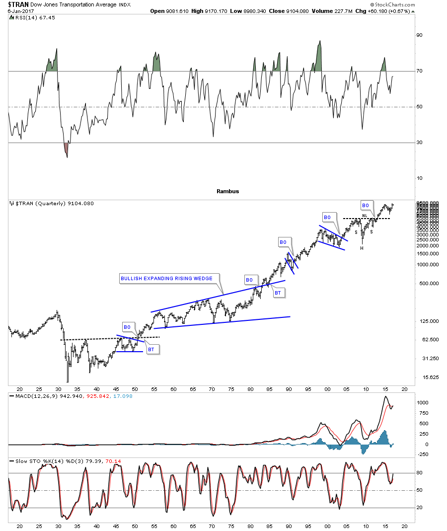
The INDU won’t be able to rally to new all time highs unless the SPX goes along for the ride. This weekly chart below shows its own year and a half bullish expanding falling wedge consolidation pattern. The backtest to the top rail built out the blue bull flag. As you can see it closed this past week at a new all time high.
The SPX actually has led the way higher for the INDU as it broke out from a 12 year expanding flat top expanding triangle back in 2013. Over the last year and a half the SPX built out the blue expanding falling wedge and broke out six months ago and backtested the top rail and the 21 month moving average. It looks like all the work is now finished. We should see an impulse leg that may look similar to the impulse move out of the big expanding flat top triangle. The blue bullish rising wedge which formed just below the top rail of that massive flat top expanding triangle, gave the SPX the energy it needed to finally takeout that multi year resistance line.
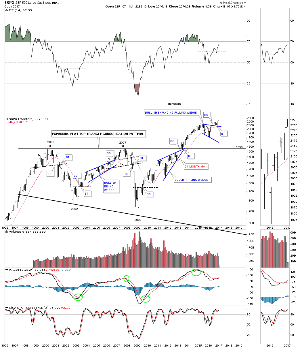
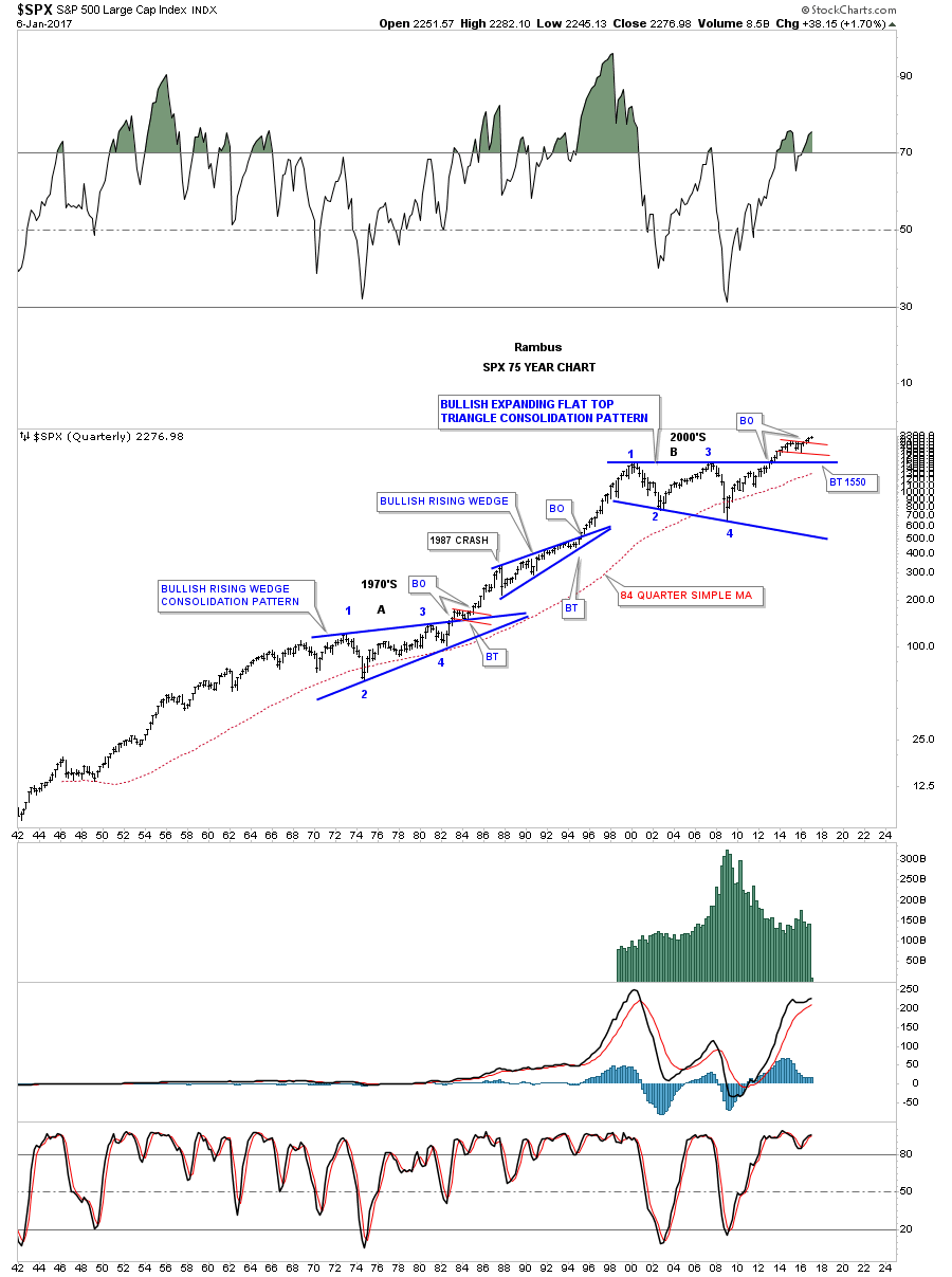
Again to put that 12 year expanding flat top triangle consolidation pattern in perspective the 75 year quarterly chart does a good job. If you didn’t know what time frame you were looking at you wouldn’t know if you were looking at a daily, weekly or monthly chart. A bull market shows one consolidation pattern forming on top of the next separated by an impulse leg. There have been some tough times in the US economy but over the long haul with inflation, deflation or whatever the problems were, the stock markets keep moving higher.
Is this bull market that has been building out since the 2009 crash low, only a US stock market phenomenon? Lets take a look at a weekly chart for the FTSE, London Times, which has an interesting setup. Before the BREXIT vote the FTSE was building out a potential inverse H&S bottom. The BREXIT vote completed the right shoulder of a one year H&S bottom which gave the FTSE the energy it needed to trade up to new all time highs.
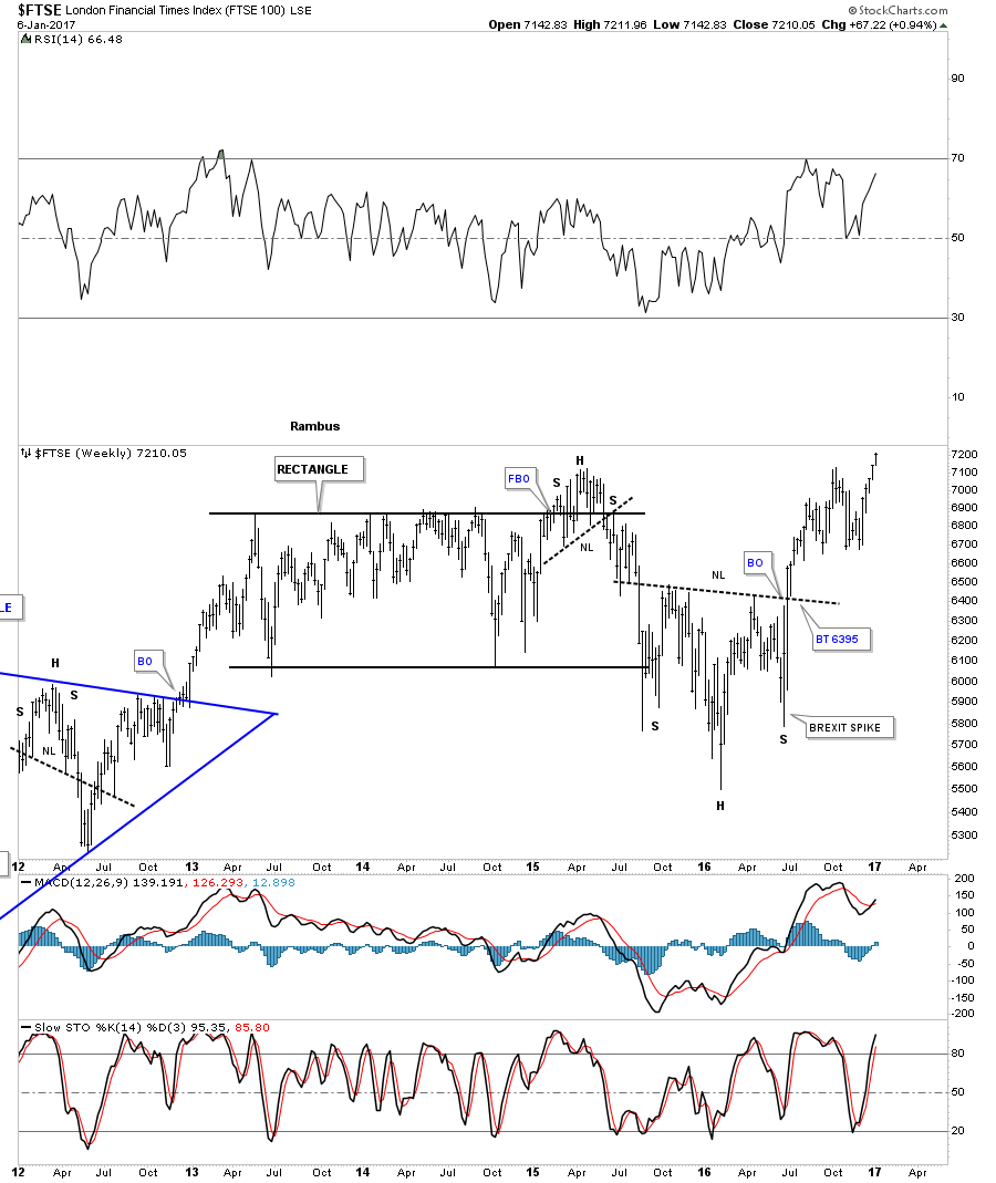
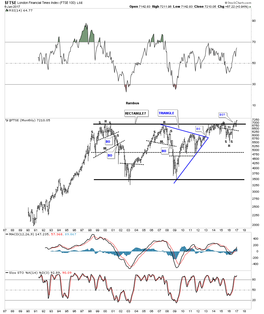
I know how impossible it may seem to see a European stock market breaking out to new all time highs but the FTSE is now in the process of doing just that. It has been building out a 16 year rectangle consolidation pattern. Note how the inverse H&S bottom on the weekly chart above fits into the big picture forming just below the top rail of the 16 year rectangle consolidation pattern.That H&S pattern is giving the FTSE the energy to finally breakout above 16 years of resistance.
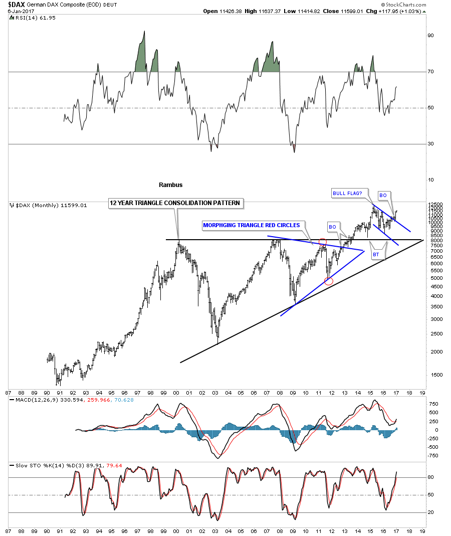
There is another European stock market that has been doing pretty good also which is the DAX, German stock market. It built out a one year blue bull flag and broke out back in the summer. There was a nice clean backtest to the top rail and the 30 week ema. As you can see the DAX made its all time high in 2015 which led to the bull flag consolidation pattern.

Like so many big stock markets the DAX has also built out a massive 12 year consolidation pattern which broke out in 2013 similar to when the SPX broke out of its massive expanding flat top triangle. Is it just a coincidence that so many of the world stock markets are breaking out to new all time highs? From what we read and hear about the fundamental perspective for the stock markets they should be crashing and burning in a bear market not making new all time highs. If we could live in an isolation booth we would all be better investors. It’s the psychological aspects of the markets that makes it difficult. I’ll have more charts on some of the different areas of the stock markets coming up later this week. All the best…Rambus
The Chartology of The World's Markets
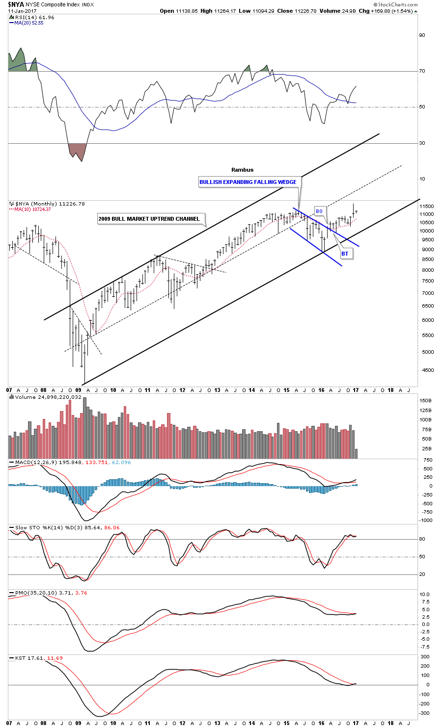
Prepared on January 11, 2017Lets start with the weekly chart for the $NYA which is a broad measure for how the stock markets are doing. This chart shows a big H&S consolidation pattern with the backtest to the neckline being pretty laborious, with the finally backtest low being on election night. The green circle shows where the 30 and 88 weekly moving averages crossed for a buy signal.

This monthly chart shows the bull market uptrend channel that began in March of 2009.
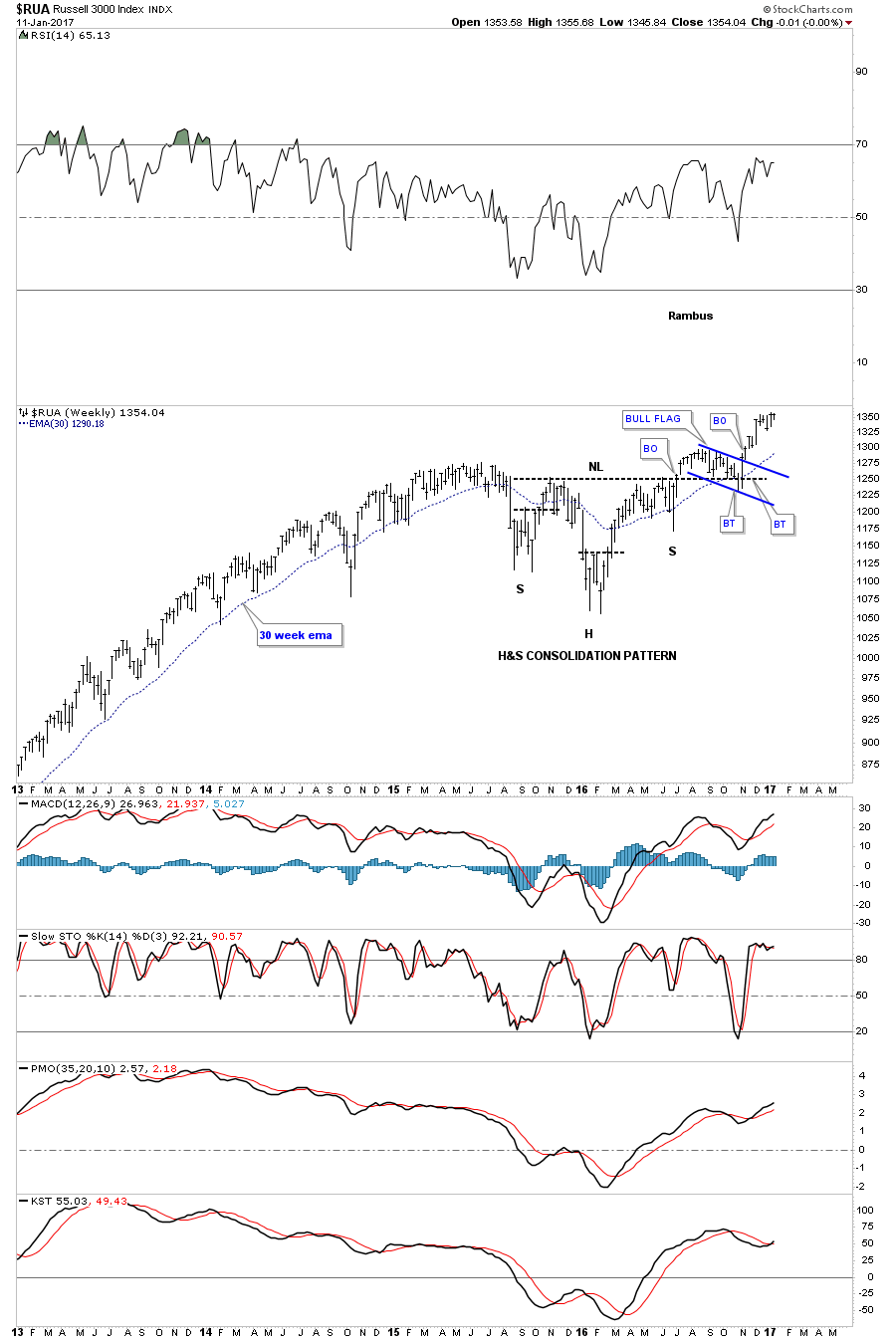
The weekly chart for the $RUA, Russel 3000, shows a H&S consolidation pattern with the blue bull flag forming as the backtest.
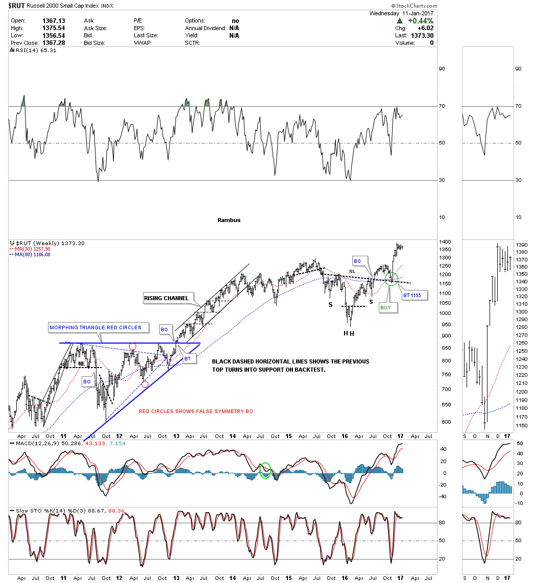
The weekly chart for the $RUT, Russel 2000, shows a H&S consolidation pattern with a nice clean backtest to the neckline.
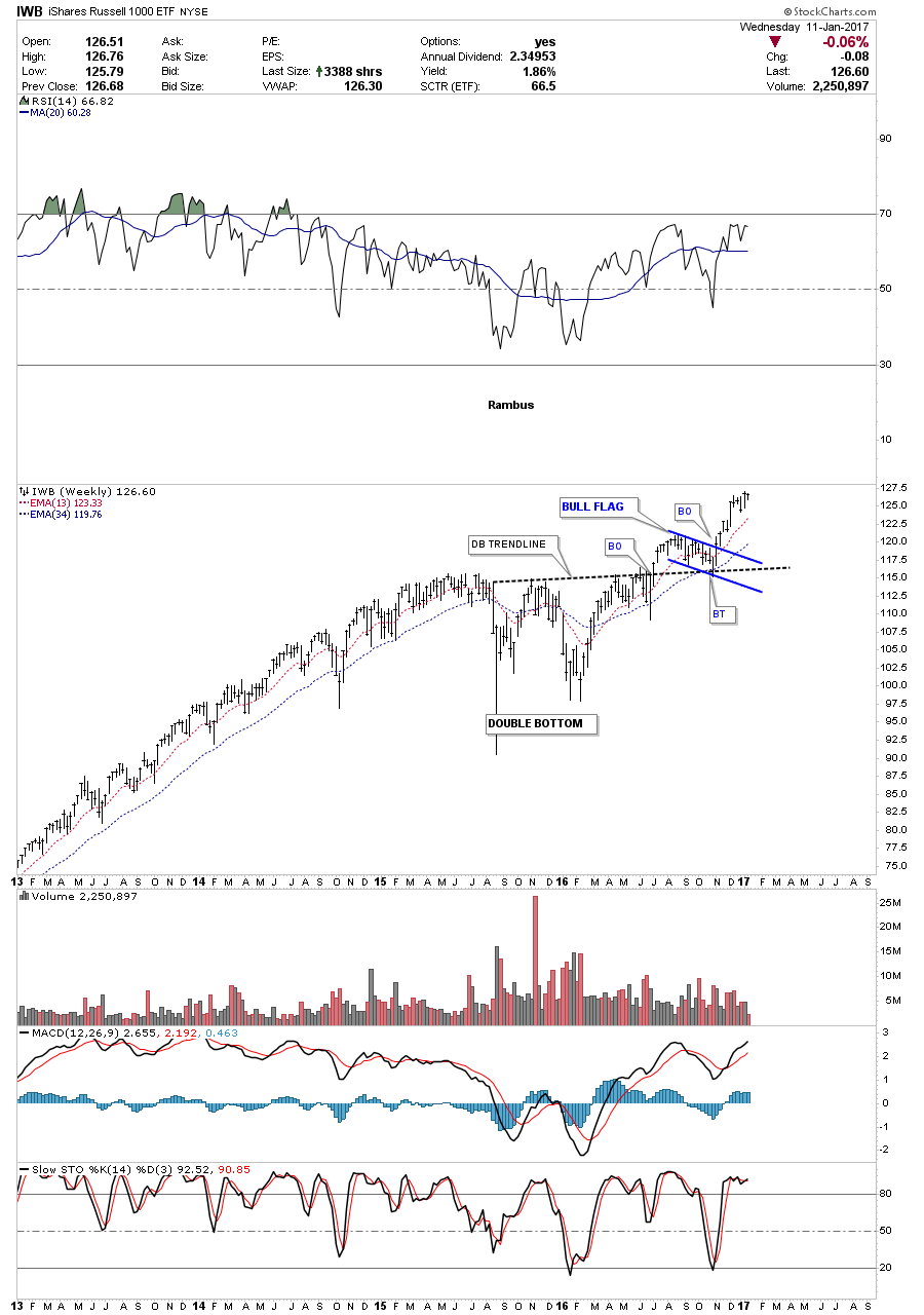
This weekly chart for the $IWB, Russel 1000, formed a double bottom with the backtest to the double bottom trendline being the blue bull flag. This index is also a good proxy for the overall stock markets.
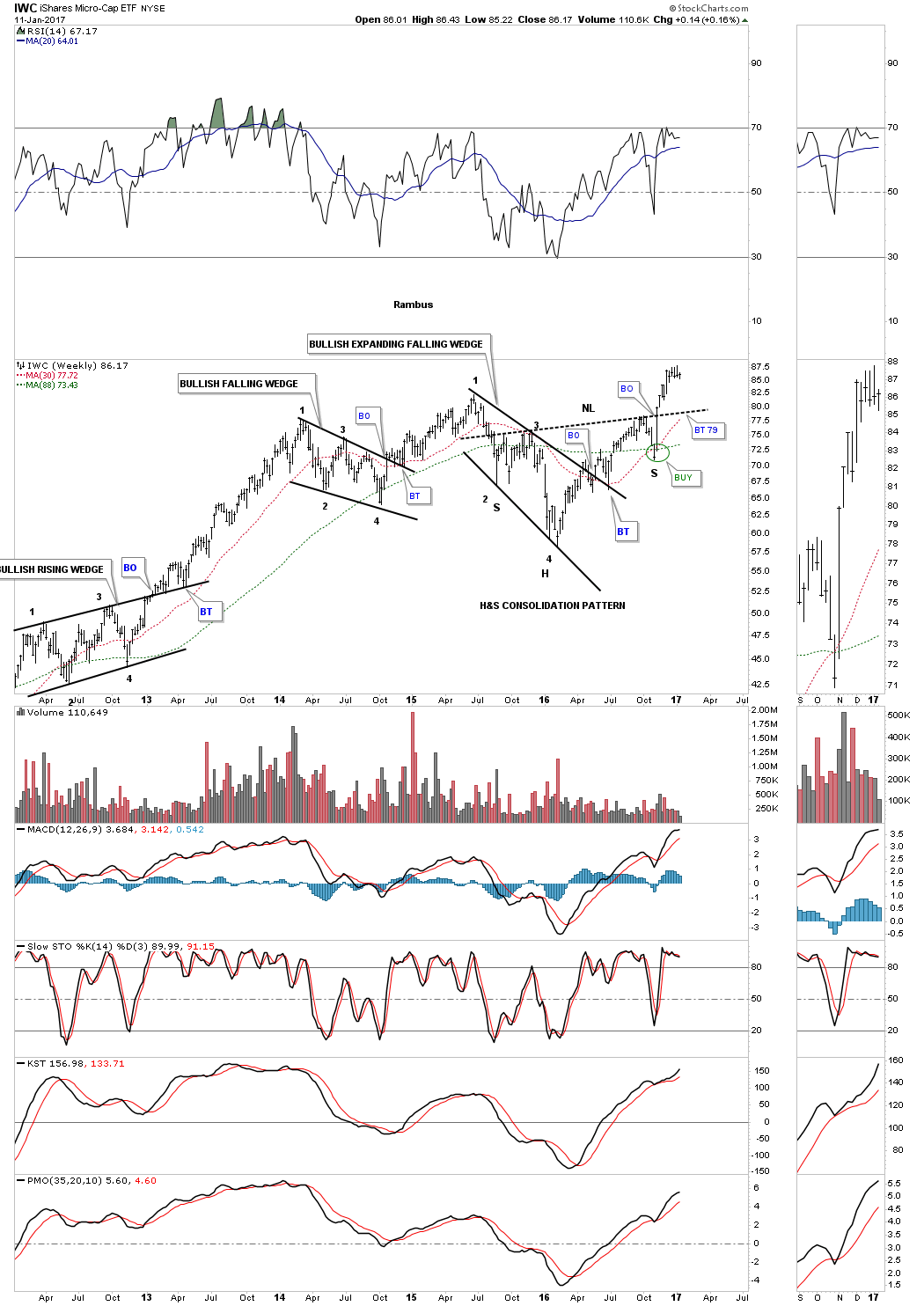
When the small caps and micro cap stocks are doing good that shows there is speculative money floating around looking for a place to go, and is usually bullish for the markets. Below is the IWC, micro caps, which formed two bullish patterns with the first one being the black bullish expanding falling wedge. The bullish expanding falling wedge encompasses the left shoulder, and the head of a bigger H&S consolidation pattern.
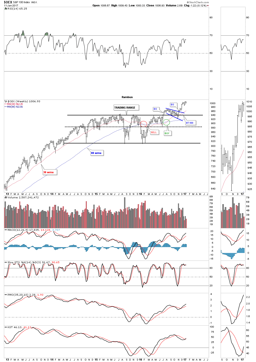
The weekly chart for the $OEX 100 formed an almost two year sideways trading range with the backtest forming an expanding falling wedge.
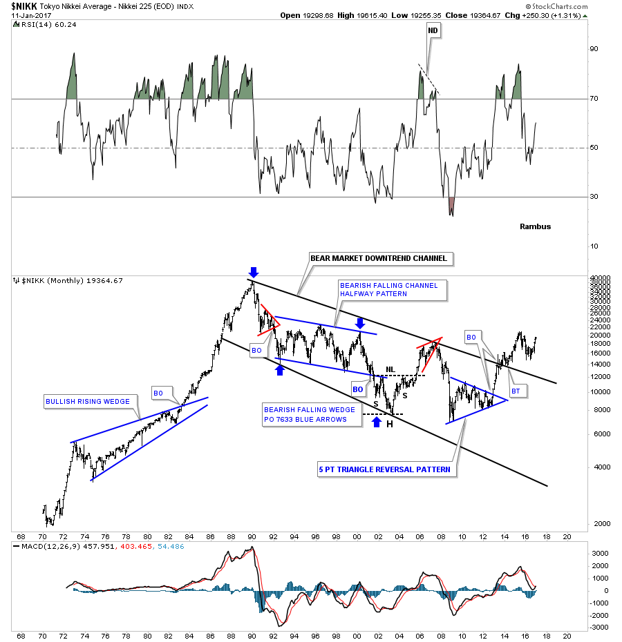
After being in a long term bear market since 1989 the $NIKK, Nikkei 225, is finally starting to show some life. Two months ago the weekly chart showed it broke out of the blue bullish expanding falling wedge.
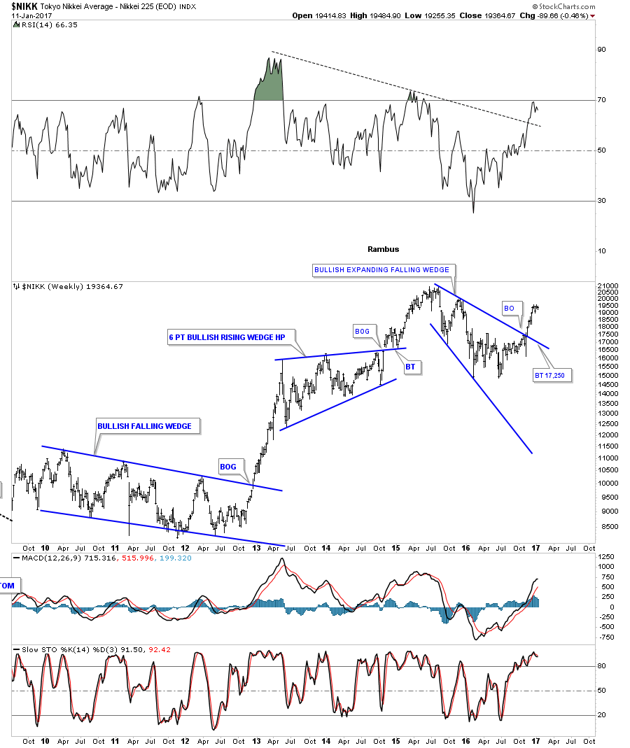
This long term monthly chart shows its nearly 25 year bear market downtrend channel. Its been a long time coming, but it look likes the $NIKK is finally going to enjoy a bull market, as it’s making a higher high and a higher low.
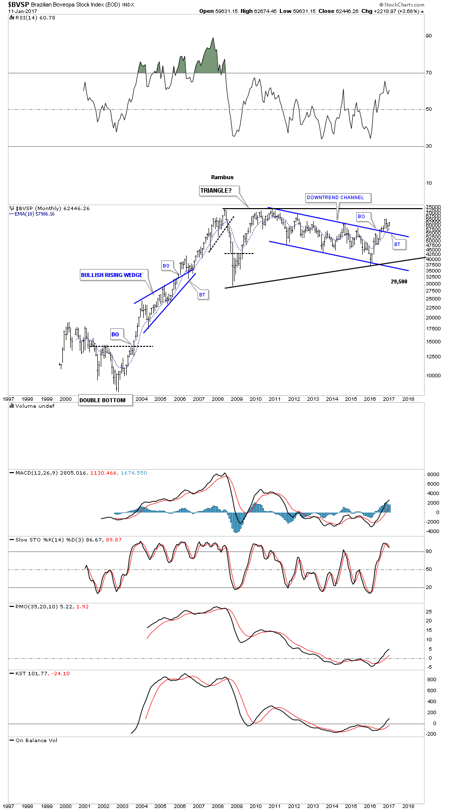
Another stock market index the $BVSP, Brazilian Bovespa, has been trading in a shallow downtrend channel and recently broke out and backtested the top rail last month. There is also a potentially very large 10 year triangle consolidation pattern building out.
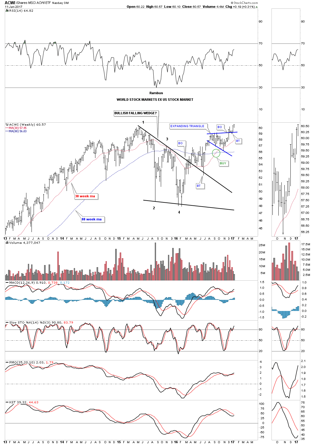
This next index is the ACWI (All World Stock Market etf ex the US stock market) which broke out of the blue expanding triangle 5 weeks ago and finished up the backtesting last month. As you can see it’s making a new all time high this week.
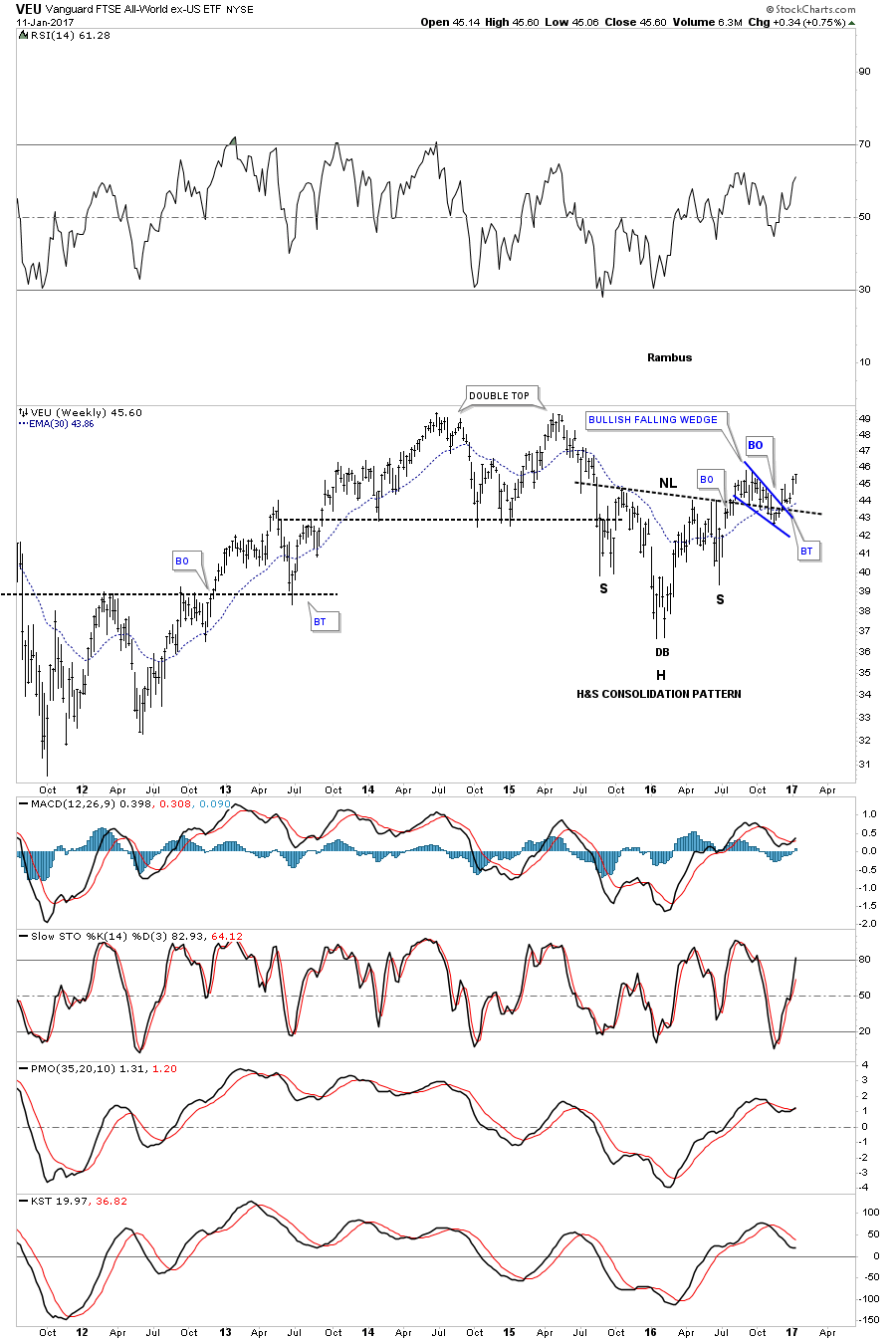
The VEU is another all world etf ex the US stock market, which built out a H&S consolidation pattern and formed the blue bullish falling wedge as the backtest to the neckline.
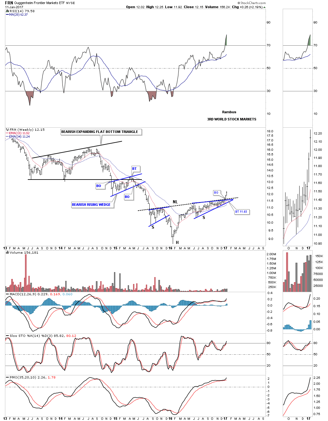
Even the FRN, Frontier Markets, which is basically a third world stock index has broken out from an inverse H&S bottom two weeks ago. It’s still a long ways away from its all time highs, but if money is flowing into this index, there must be alot of cash in the system looking for a home.
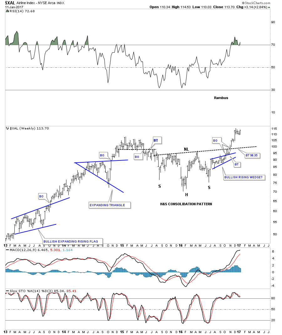
Lets look at some other areas which are showing some strength where capital is finding a home. Earlier we looked at the Transportation Average which had broken out from a big H&S consolidation pattern and was making a new all time high. The $XAL, Airline index, broke out from its year and a half H&S consolidation pattern about 2 months ago as shown on the weekly chart below.
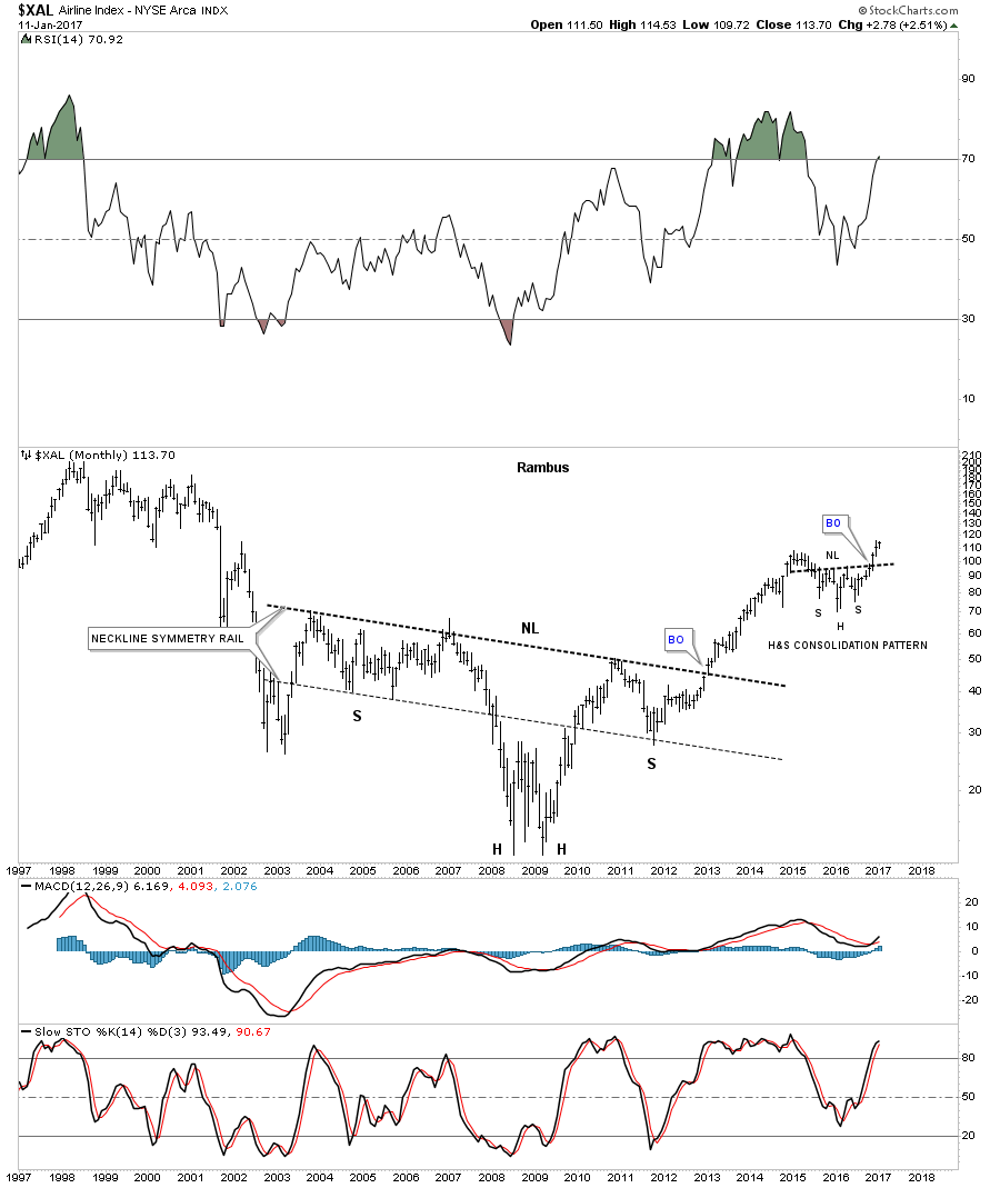
The long term 20 year monthly chart for the $XAL shows a massive inverse H&S bottom that took close to 10 years to build out. The little H&S consolidation pattern at the top of the chart is the same pattern on the weekly chart above.
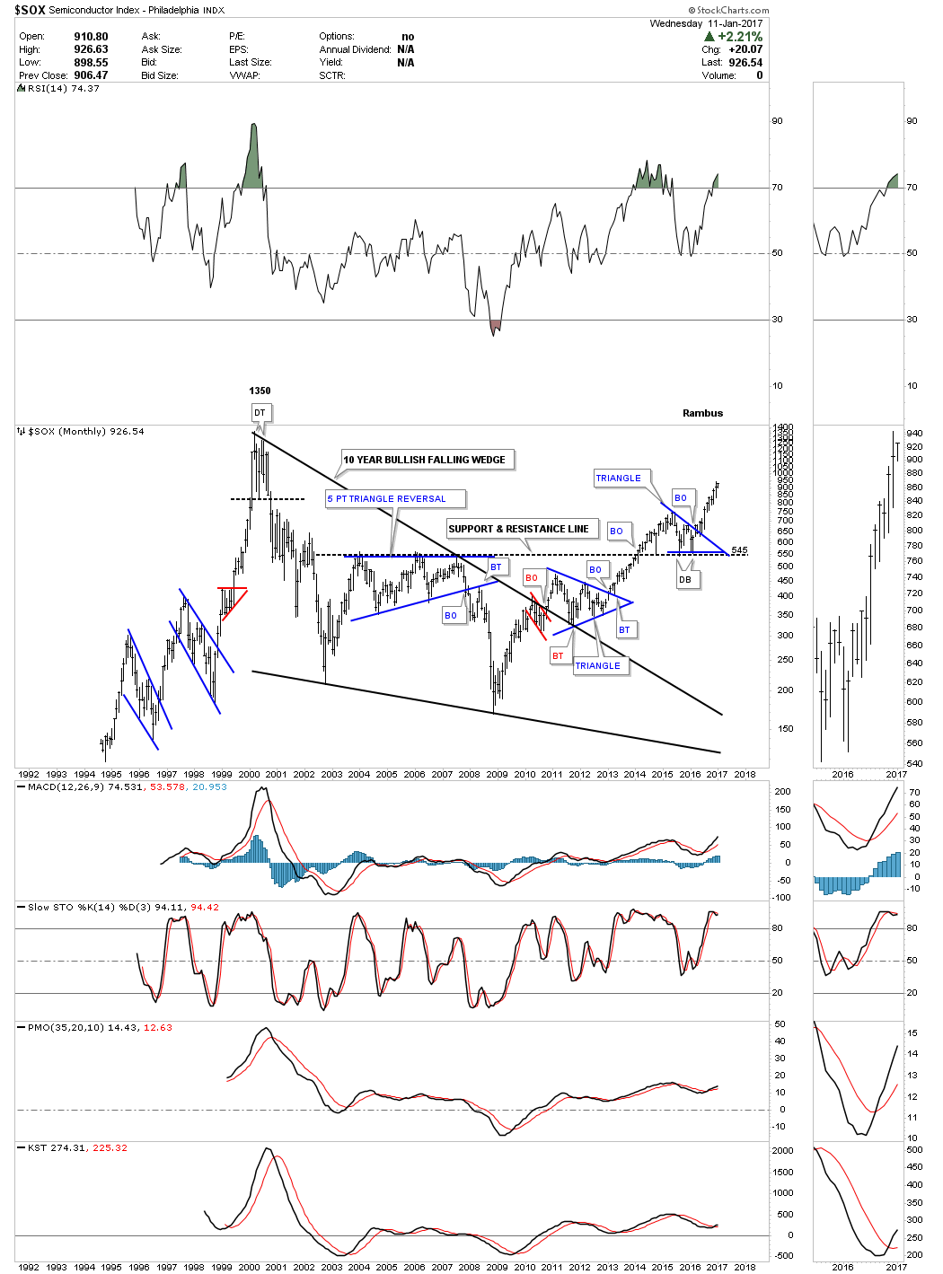
The $SOX, Semiconductor index, has been one of the stronger areas in the tech arena. The 25 year monthly chart below shows some really nice Chartology starting with the 10 year bullish falling wedge consolidation pattern. Before the top rail of the 10 year bullish falling wedge was broken to the upside, the price action formed the little red bull flag just below the top rail. The backtest formed the blue triangle consolidation pattern. Note how the top rail of the big blue 5 point triangle reversal pattern that formed in the mid 2000’s reversed its role to support once it was broken to the upside in 2014, at the 545 area. The $SOX has been playing catch up as it’s now trading just below the 2000 highs.
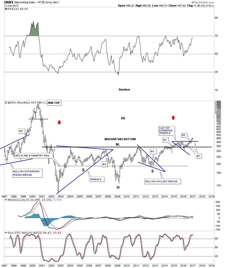
Another area in the tech sector is the $NWX, Networking Index, which may play catch up as its been in breakout and backtesting mode for the last couple of years above the neckline of a massive 12 year H&S bottom. Two months ago it broke out of the blue expanding flat top triangle and is now in backtest mode.
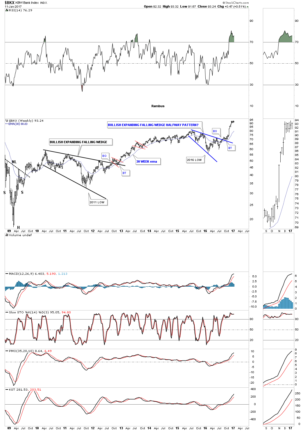
The $BKX, Bank Index, has probably been one of the stronger areas in the markets once it finally broke out above the top rail of the blue expanding falling wedge. Note the much bigger one that formed back in 2010 and 2011 which led to a three year bull move.
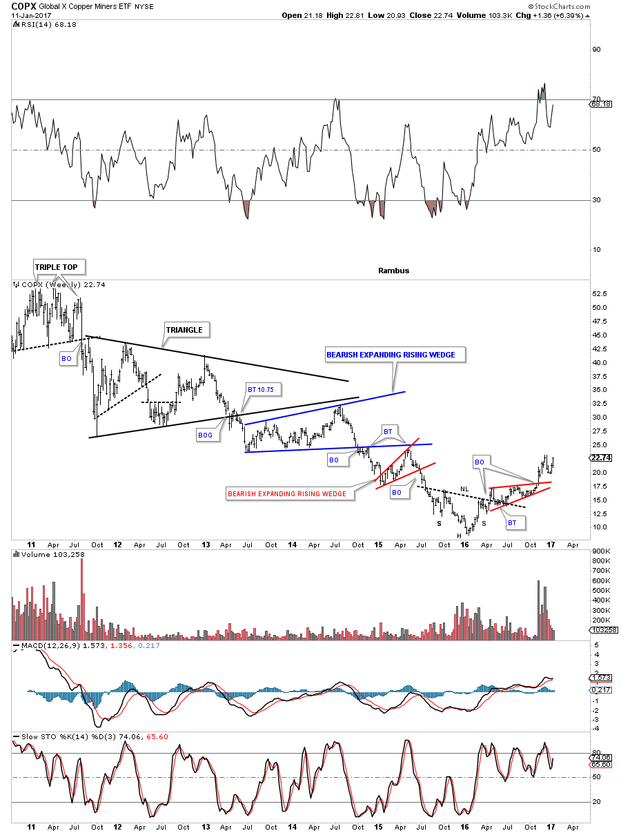
After building out an inverse H&S bottom the COPX, Copper Miners etf, is starting to gain some traction to the upside. It’s still a long ways away from making new all time highs, but the H&S bottom is forming right where you like to see a pattern like this form at the end of a long drawn out bear market.
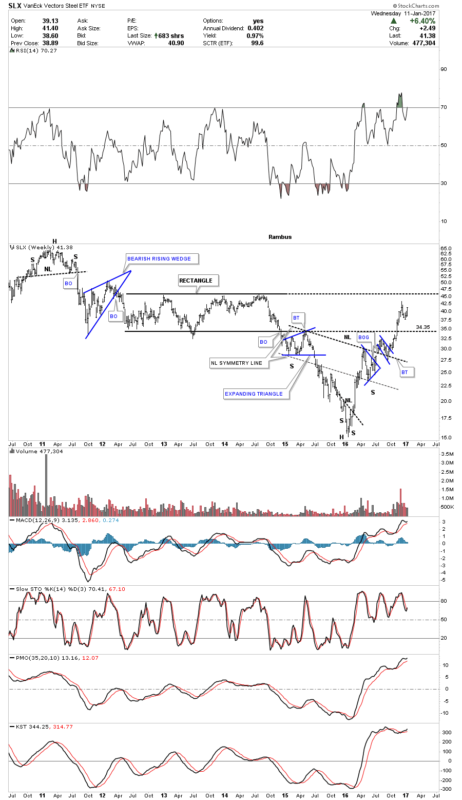
Another area which has been very strong for the last year is the SLX, Steel etf.
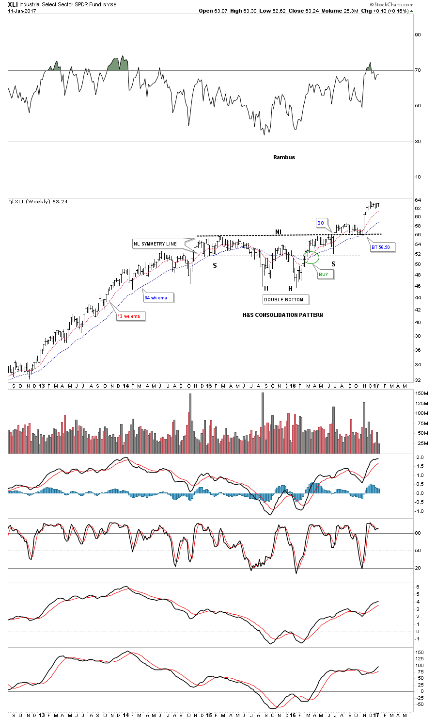
The XLI, Industrial Sector, built out a massive 2 year H&S consolidation pattern and had a prolonged backtest which formed the blue expanding triangle. Big patterns equals big moves.
The bull market continues to advance in many different areas of the markets including some foreign markets. It’s always nice confirmation to see so many different areas hitting new all time highs at the same time. Most of the bases are at least a year and a half in the making which suggests this next leg up will have a prolonged move. There is an old stock market adage which says to, sell in May and go away. Hopefully the first half of 2017 will be bullish with maybe the second half setting up for the inevitable correction.
The bullish stock market scenarios we looked at last quarter, Catherine, seem to have picked up some momentum. There are many H&S consolidation patterns with many smaller blue consolidation patterns that formed as the backtest which is a bullish setup. At some point there is going to be a decent correction as there always is, but the big trend is up which is most important to understand. It will be interesting to see how some of these charts look 3 months from now when we do the next Quarterly Report.
Precious Metals
What IF Gold has a Drop Dead Line ?
Prepared on January 02, 2017In part 2 of this Weekend Report we’ll take an indepth look at gold and especially the long term view. Again, this is just for entertainment purposes only until gold can close below a very important trendline. I’ve been following this potential scenario since shortly after the US elections. Up until the elections this pattern I’m about to show you didn’t show its self, but now it’s one of the most important chart patterns for gold that I’ve posted in several years. As we discussed in part 1 , please read forward with an open mind regardless of what other information you re processing and what your current expectations are. This is an exercise in my preferred method of Technical Analysis , Chartology.
Again, this is an exercise in a “Potential” big picture scenario which has a strong basis in Chartology . It is not a prognostication at this time , but is an important scenario to keep in mind. At the moment there is a rally in the Gold sector and we are short term bullish .
There are three daily charts we’ll look at first, which are reversal patterns that formed at a very critical spot on the long term charts.
I’m going to start with a few daily charts and then work our way back in time to see the big picture. This first chart for gold shows the H&S top which we’ve been following on the PM combo chart that I post several times a week. This H&S top is an unbalanced H&S top with two left shoulders and one right shoulder. Note how the moving averages are crossing to the downside with the 20 and 50 day moving average now having crossed below the all important 300 day moving average. In the not so distance future, if gold keeps dropping, the 150 day will cross below the 300 day ma which will be a long term sell signal.
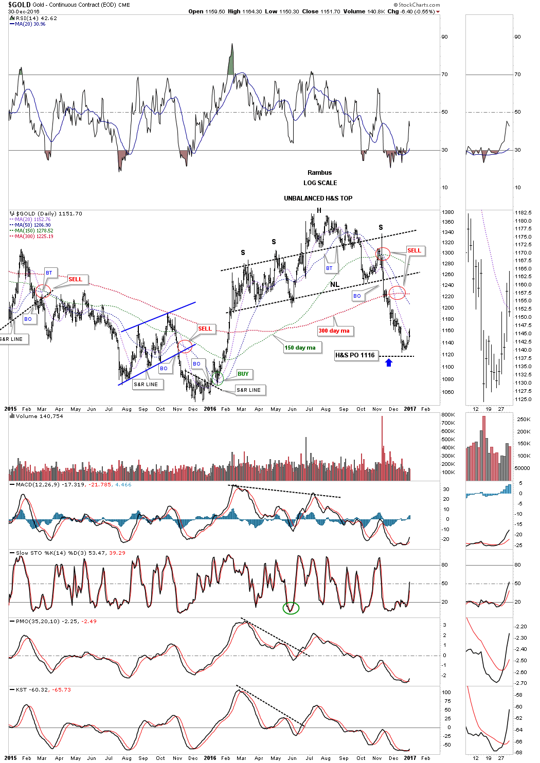
This second daily chart shows the seven point diamond reversal pattern we looked at shortly after the price action broke below the bottom rail. The seventh reversal point formed on the night of the US elections which put the diamond back into the reversal pattern category as it has an odd number of reversal points. It looks like gold is trying to rally as the decline out of the diamond reversal pattern has been pretty severe. It will be interesting to see how high a bounce may go and if gold starts building out some type of consolidation pattern.

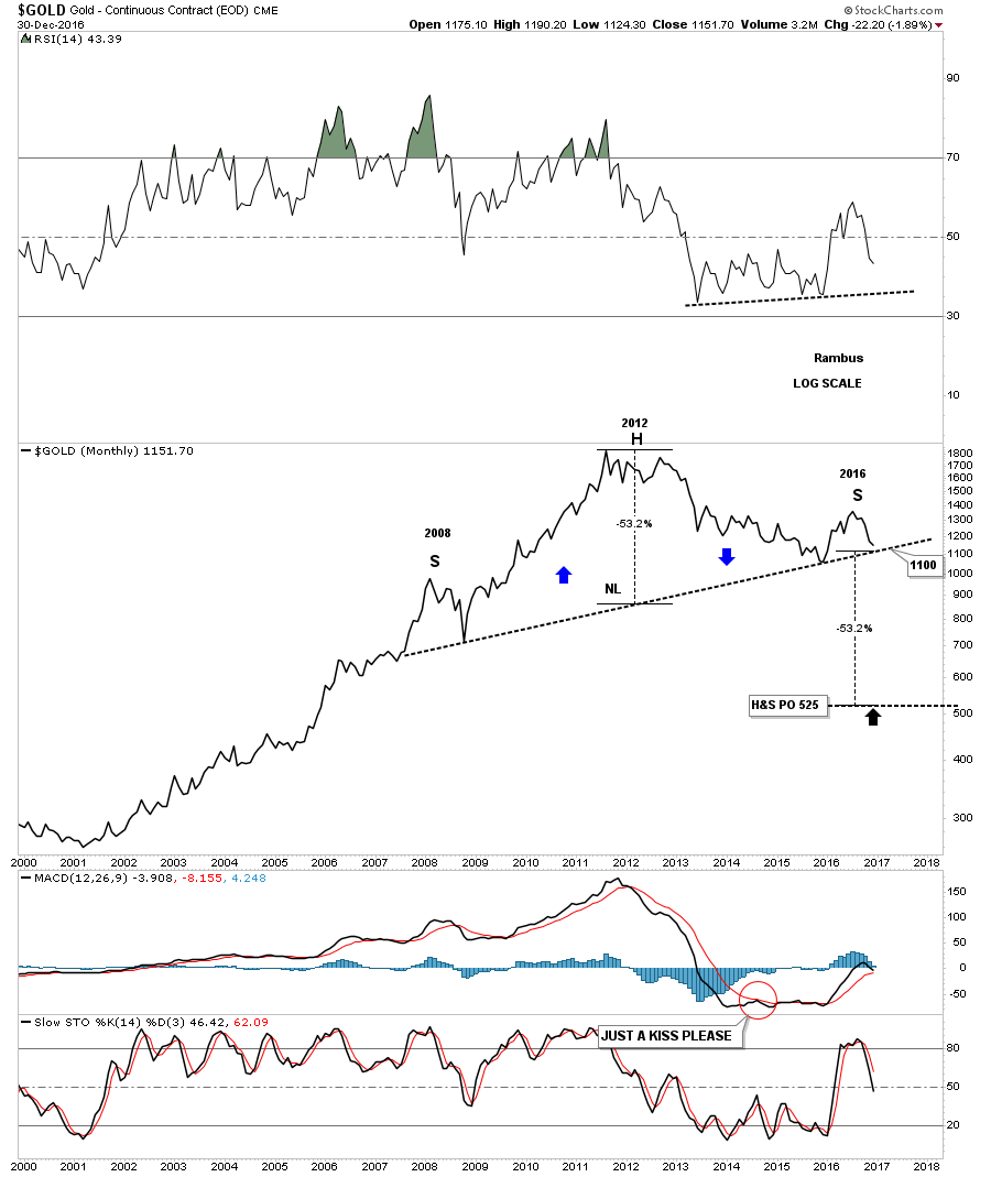
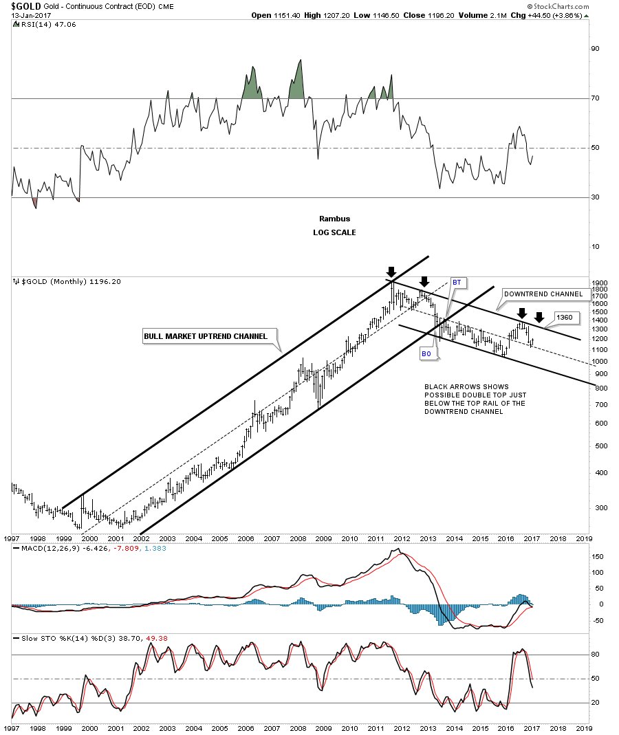
This next daily chart for gold is probably the most important chart for the big picture. This chart shows a bearish rising wedge which began to build out one year ago at the December low. Most folks think this was the beginning of a new bull market, but the bearish rising wedge has strong overtones of a bear market rally. The price objective of a rising or falling wedge is where the wedge begins to build out or the first reversal point. This would be a minimum price objective as prices can go much lower. The top half of the bearish rising wedge is the H&S and the diamond tops we looked at on the charts above. The important moving averages are looking very weak at this point in time.
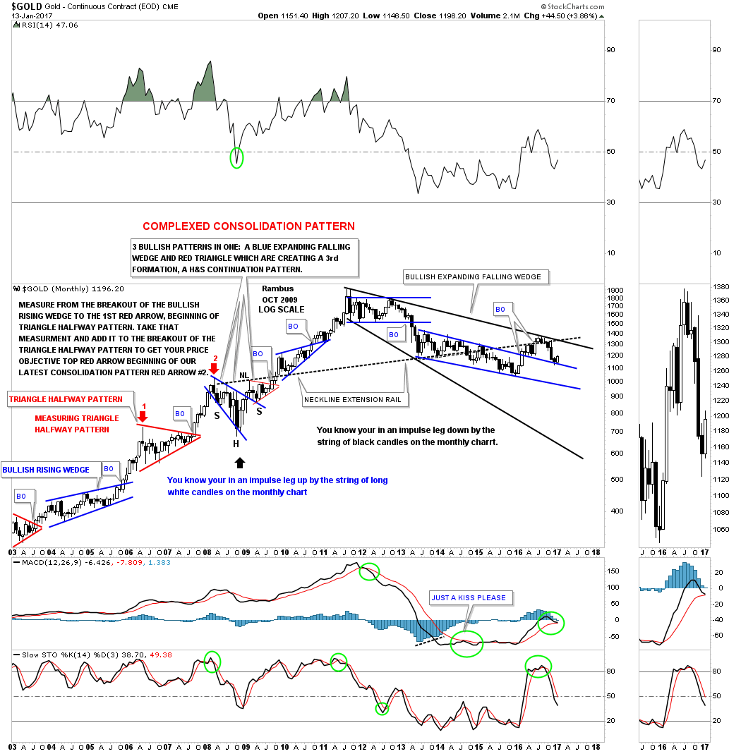
In part one of this Weekend Report we looked at the morphing process for two important H&S tops on the HUI. This next chart for gold is a long term monthly look which shows the original H&S top I showed you back in 2013 or so. The 2008 H&S consolidation pattern is what setup the neckline that stretches all the way to the left hand side of the chart, as shown by the neckline extension line.
Note the beautiful symmetry as shown by the neckline symmetry line which shows the high for the left and right shoulders. Back in 2014 the price action broke below the neckline and it looked like the H&S top was complete when the backtest took place. Gold dropped into last years December low and rallied backup to the neckline again in a second backtest which so far is holding resistance telling us the neckline is still hot.
As you can see the price objective for the H&S top is down to the 2008 crash low as shown by the brown shaded S&R zone. If gold takes out the December 2015 low it will be creating a lower low, which is not bull market action. So the 1040 area now becomes important support for the big picture.
This next weekly chart focuses in on the shorter term look which shows how gold may be morphing into its own double H&S top. Neckline #1 is shown by the weekly chart above. Neckline #2 is taken from the 2008 bullish expanding falling wedge bottom which is creating the left shoulder. The right shoulder is built from the bearish rising wedge we looked at on the daily chart earlier. Now you can see why the bearish rising wedge is playing such an important role in the big picture.
Note the beautiful symmetry just above neckline #1 which shows gold building out the bullish rising wedge on its way to the bull market high at 1920, and the blue six point triangle consolidation pattern that formed on top of neckline #2 just before gold broke down.
Since I became aware of the potential double H&S top, I always showed the bull market top as a small double top, with the six point rectangle formation building out just below the double top as a consolidation pattern. What I’ve been contemplating recently is how the 2011 top fits into the big picture as the head. A reversal pattern consists of an odd number of reversal points 3, 5, 7 or more. It’s apparent that the 2011 top is a reversal pattern. During gold’s last strong move up in its parabolic run to its all time high at 2011, the price action above the top rail of the six point rectangle consolidation pattern was most likely a throw over or a final capitulation move. We can label the bull market top as a seven point rectangle reversal pattern if we use the capitulation throw over as the seventh reversal point.
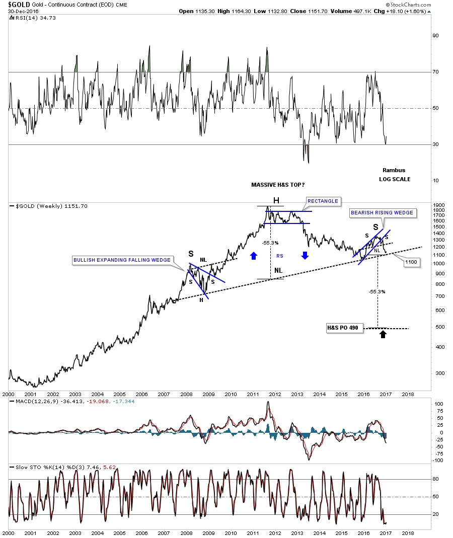
This chart also shows why neckline #2 is so critical to the very big picture. As you can see if big neckline #2 gives way, gold will have created a massive H&S top. It looks like 1100 is going to be the magic number that is going to tell us if gold is truly in a bear market that began at the 2011 high. As long as gold can trade above 1100 it will have a positive basis and the massive double H&S top will be negated. On the other hand if gold breaks below the 1100 area then the odds increase very dramatically that gold has been in a bear market since 2011 with a long way to go to the downside before the bear market exhausts itself.
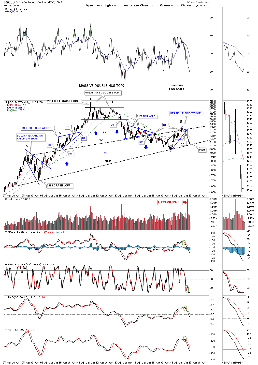
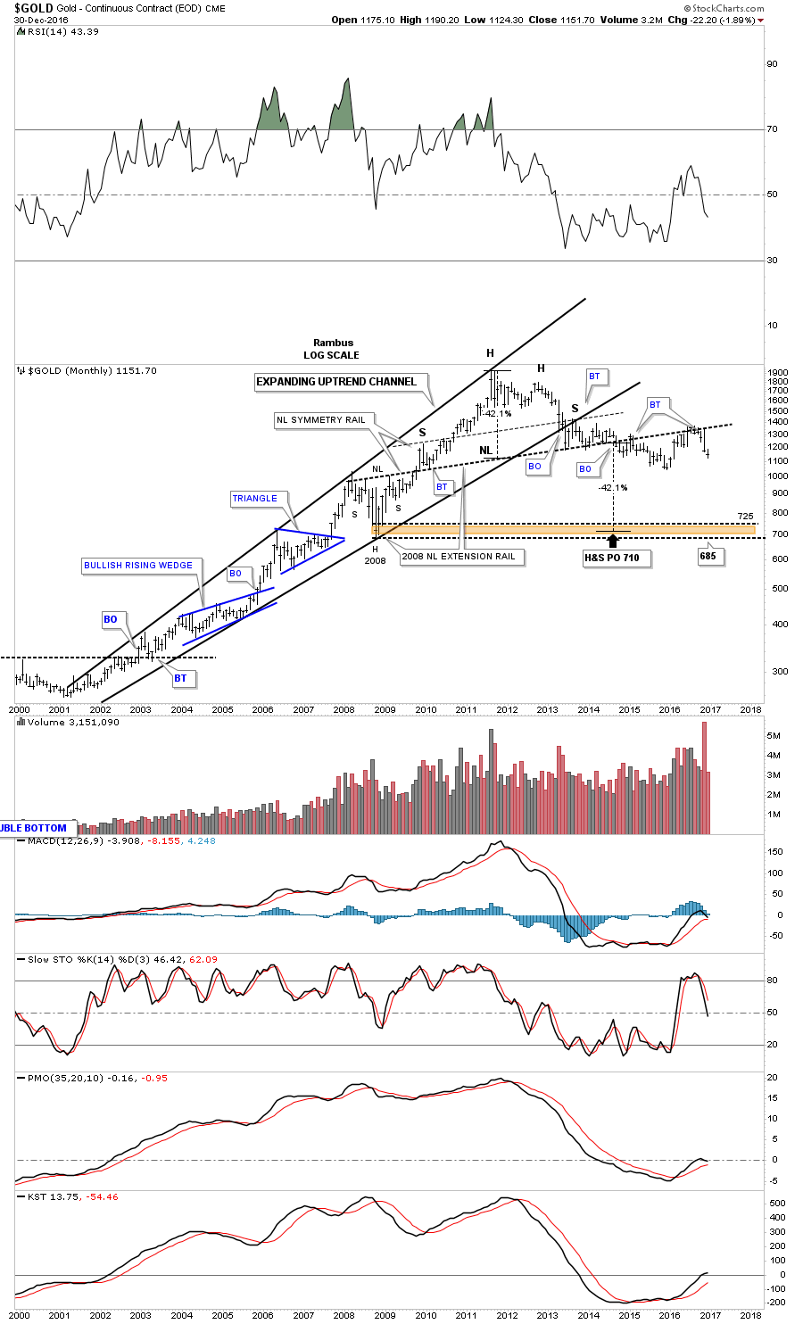
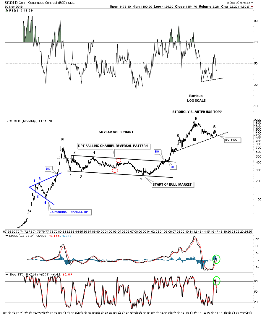
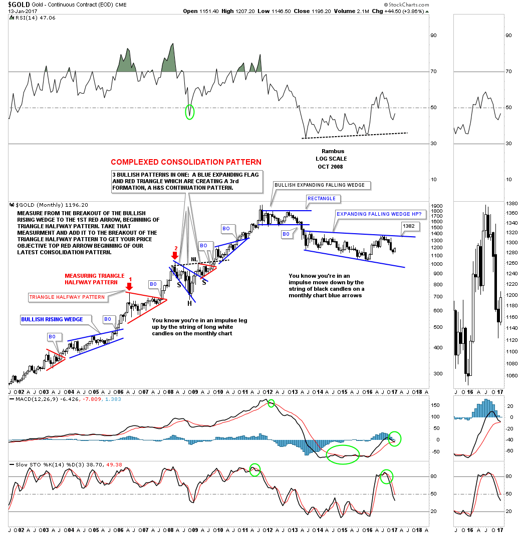
Now I would like to start showing you the very big picture which begins to bring all the pieces of the puzzle together. This first weekly bar chart for gold shows the potential massive double H&S top with the 1100 area being the most important price point for gold at neckline #2. If neckline #2 gives way the price objective will be down to the 500 area, which seems impossible at this time, but big patterns create big moves. Note the multi year base made back in the late 1990’s which launched gold’s bull market that took over five years to build out.
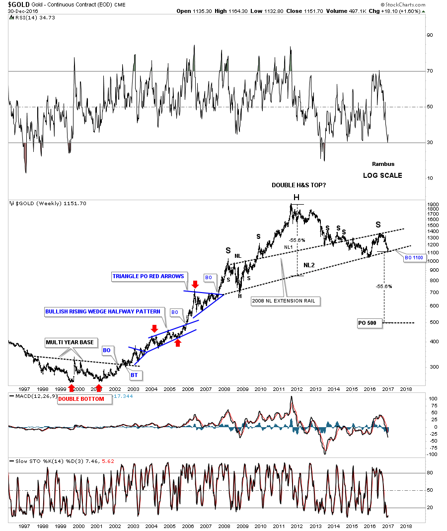
This next chart is a weekly line chart which shows the reverse symmetry patterns for the left and right shoulders. Note how the left shoulder formed a combo H&S consolidation pattern along with the bullish expanding falling wedge. Now look over to the right shoulder and you can see the H&S top with the blue bearish rising wedge. The blue arrows show how gold has been reversing symmetry back down vs how it went up. It’s not a perfect correlation but close enough.
Below is a shorter term weekly chart showing the double H&S top in more detail.
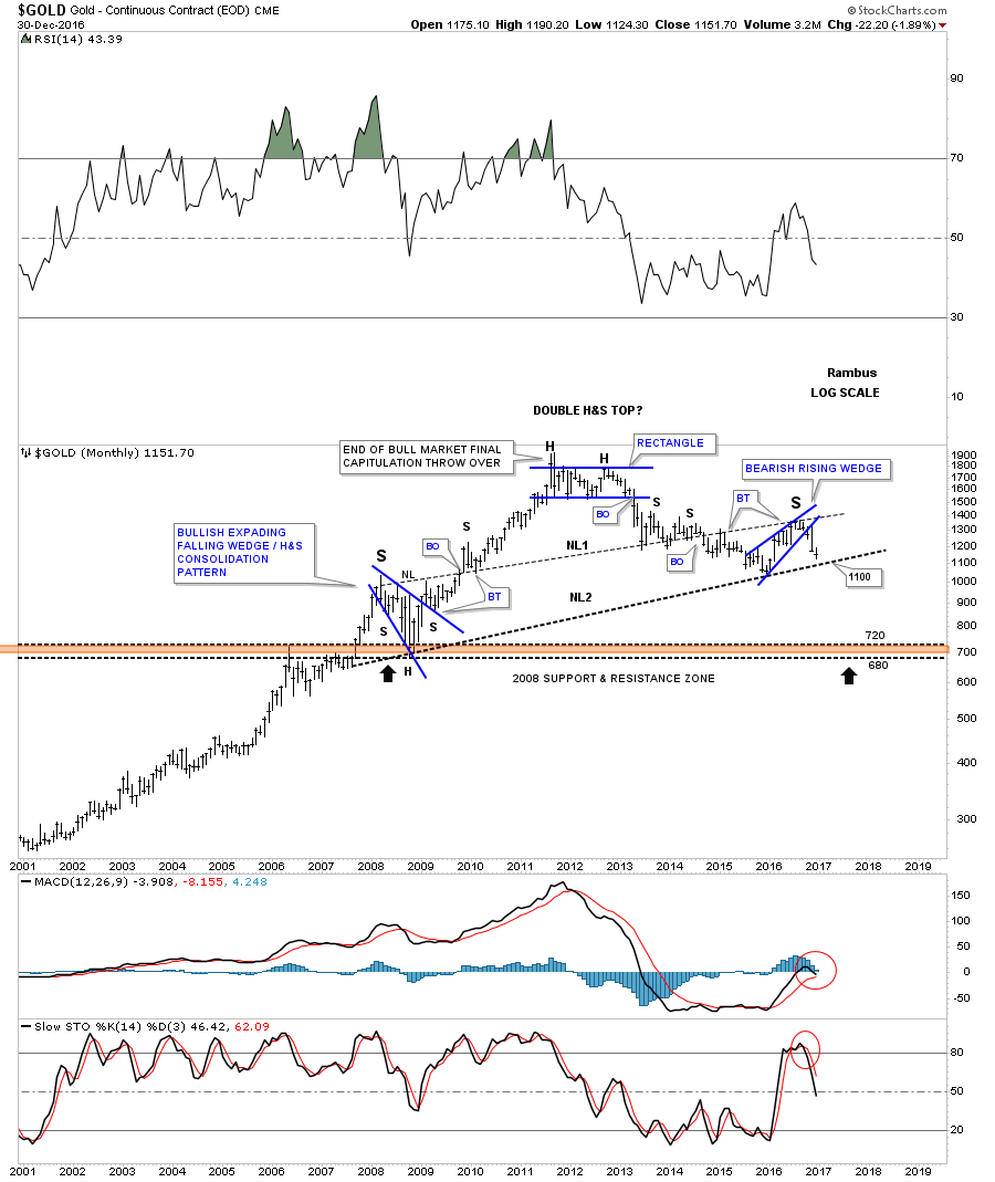
Now, on to the monthly bar chart which shows the parabolic bull market and the strongly slanted H&S top. Again, you can see how the 1100 area is going to be our line in the sand, which will have long term consequences if it the price action breaks below that now very important neckline.

This next monthly line chart for gold has just one trendline, which is the neckline.
This last chart for tonight is a long term monthly look that goes back 50 years and is pretty self explanatory.
We like to think of ourselves as not being part of the herd, but it’s very difficult not to be. With all the information we absorb everyday it’s bound to affect us in ways we don’t understand. If this massive H&S top plays out you’ll be some of the first PM investors that will understand what is really taking place in the precious metals complex. The bottom line is that if the 1100 area at neckline #2 gives way a major long term top will be in place, and big patterns equals big moves. All the best…Rambus
Bull vs Bear Chartology in the PM Markets
Prepared on January 15, 2017In this Weekend Report I would like to take an indepth look at the precious metals complex as it seems to be at a critical inflection point at least for the short to intermediate term perspective. The million dollar question remains, is this just a bear market rally or a continuation of the bull market that began in January of 2016? We’ll look at both the bullish and bearish scenarios, which will have long term consequences for this sometimes volatile sector.
I would like to start by looking at some of the ratio combo charts which have guided us pretty well in the past. Lets start with the Gold:XAU ratio chart on top and the XAU on the bottom. This chart may look pretty busy to some of the newer members but it really isn’t. The first thing to recognize is the 20 year parabolic arc in which gold outperformed the XAU for 20 years from 1996 to late 2015. The parabolic arc finally came to an end with the small double top at 24.33 at the top of the chart. When the double top broke down that was a very big clue to go long the precious metals stock in January, and February of 2016.
Normally when a parabolic trend ends there can be a move in the opposite direction that is equal to or greater than the parabolic move itself. Once the double top gave way I added some reverse symmetry which showed we should expect a strong move down in the ratio, and a strong move up in the XAU, which indeed happened. Again using some reverse symmetry I drew in a possible neckline at the 12.50 area where we could see a possible bounce to form a right shoulder in the brown shaded S&R zone. When the PM complex topped out in August of this year we got the bounce back up, in the ratio chart, which is now starting to show a right shoulder building out.
Keep in mind this potential H&S top won’t be complete until the neckline is broken to the downside at the 12.50 area. If the H&S completes it will have a price objective down to the 6.35 area, which is just slightly above the long term 30 year blue dashed support and resistance line, which comes in at 6.00. Also keep in mind this is a 30 year monthly chart so changes don’t come very fast. The bottom line on this ratio combo chart is that if the H&S top plays out it should be very bullish for the precious metals stocks as shown by the XAU and the 2016 rally.
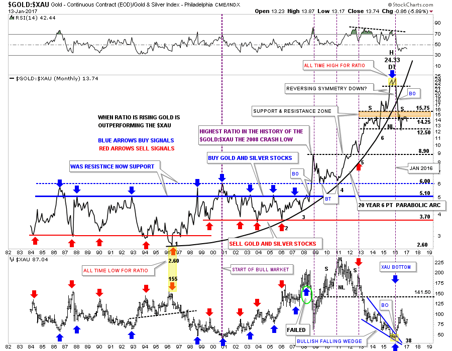
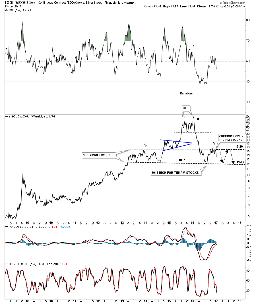
The weekly line chart for the GOLD:XAU ratio chart shows the potential H&S top in more detail. Reverse symmetry suggests that the right shoulder could still take some time to finish building out. If that is the case then it could be showing us a trading range for the precious metals stocks. The low last year on this ratio chart shows the high for the PM stocks last August. The current low in the PM stocks is the top of the right shoulder. If the right shoulder is going to build out some reverse symmetry to the left shoulder the ratio should show us a trading range for the precious metals stocks between 11.85 on the bottom and 15.20 on top. A move to the neckline should give the PM stocks another leg up before they run into serious resistance which would be at the neckline at 11.85 or so. Trading ranges are great to trade if you can find them soon enough.
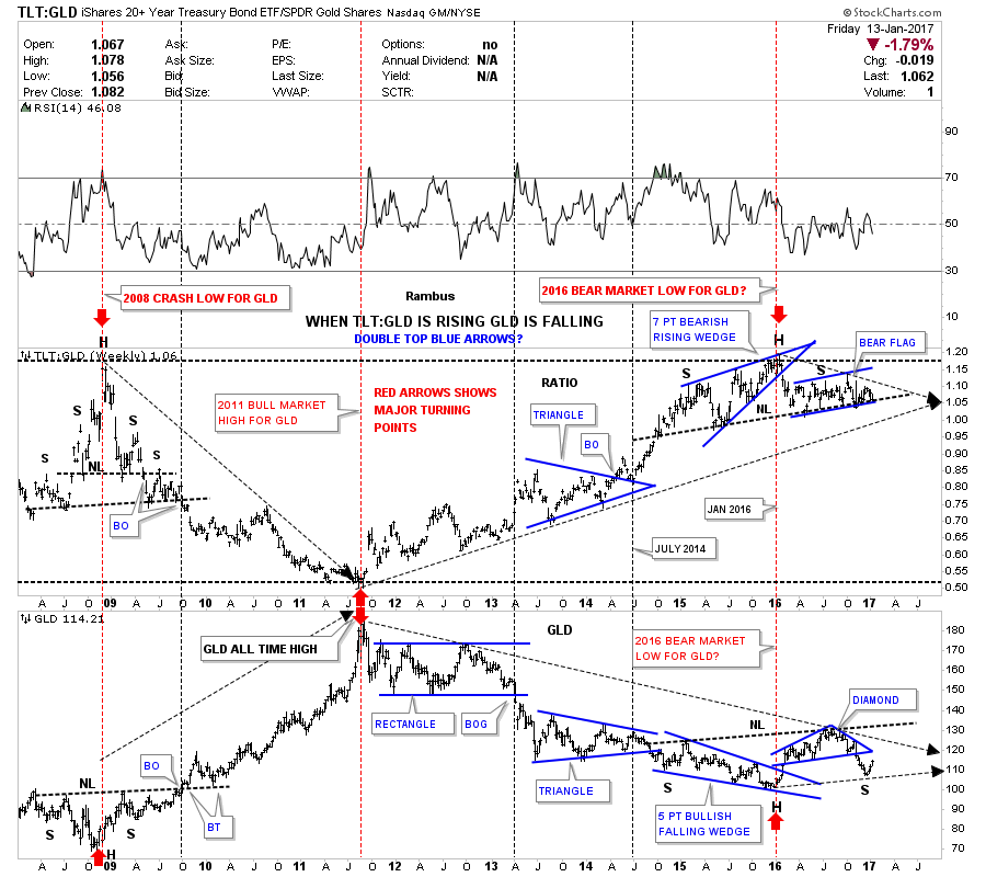
This next ratio combo chart which has the TLT:GLD ratio on top and GLD on the bottom has also done a good job in the past of showing us the highs and lows in gold. As you can see when the ratio chart on top is rising GLD is generally declining. Note the H&S top on the ratio chart and the H&S bottom on GLD which formed back during the crash in 2008. Then in 2011 the ratio chart on top bottomed out while GLD was topping out at its all time highs as shown by the two center red arrows. The two red arrows on the right hand side of the chart shows where the ratio topped out and GLD bottomed last year.
In 2016 the ratio broke down below the bottom rail of its 7 point bearish rising wedge, which showed a good time to go long the PM stocks while GLD broke above the top rail of its 5 point bullish falling wedge reversal pattern. That rally took GLD up to the August 2016 high.
For the last 2 1/2 years the ratio and GLD have been building out potential H&S patterns inversely to each other. As you can see the ratio chart on top is testing its neckline while GLD on the bottom is nowhere near its neckline, which is a negative divergence for GLD. Normally when one is breaking out the other is usually in lockstep or not too far behind. For whatever reason this negative divergence needs to be watched very closely.
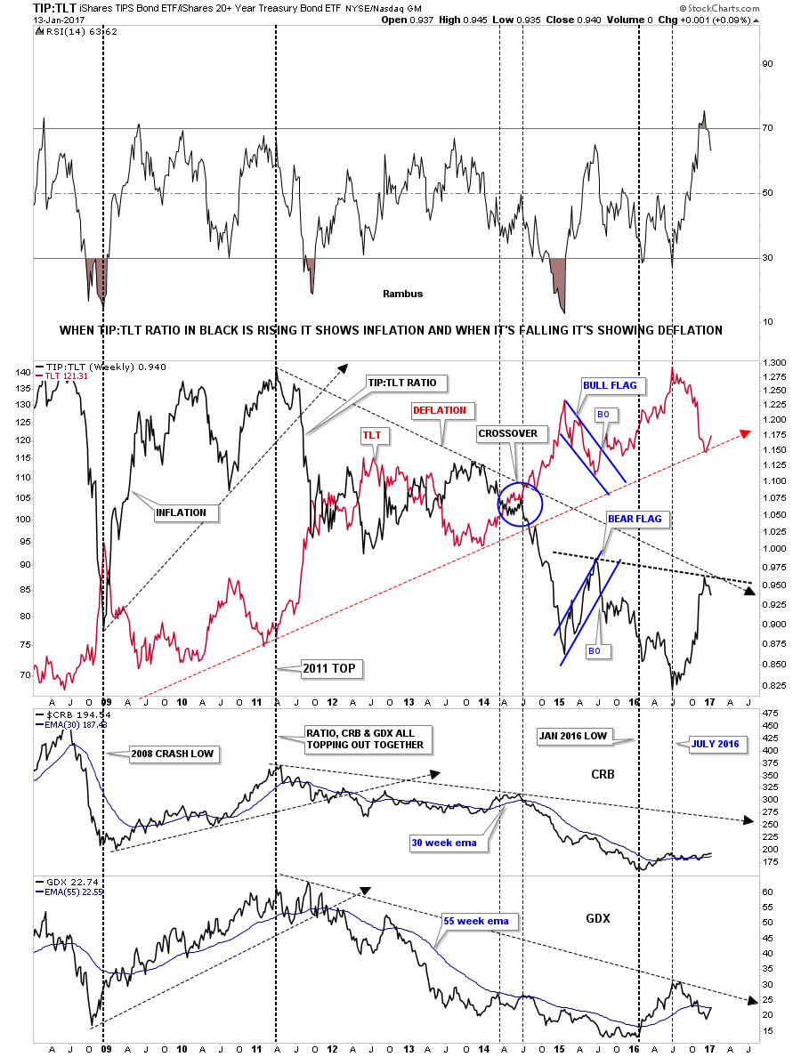
This next ratio combo chart has the TIP:TLT in black overlaid on top of the TLT in red, with the CRB and GDX charts below. When the ratio in black is rising, it generally means there is some inflation, and deflation when it’s falling. Going back to the 2008 crash low in the GDX and CRB indexes you can see how the ratio in black was rising into the 2011 top along with the CRB and the GDX which was showing some inflation. Then from that 2011 peak until July of 2016 the ratio in black was declining suggesting deflation. The CRB and the GDX indexes actually bottomed out 6 months before the ratio did in January of 2016 which produced the bear market low so far. If we’re to see any signs of inflation we’ll need to see the ratio chart in black break out above the down downtrend line around the 9.50 area. The last time the ratio bottomed out in 2008 the CRB and the GDX indexes enjoyed a substantial bull market rally.
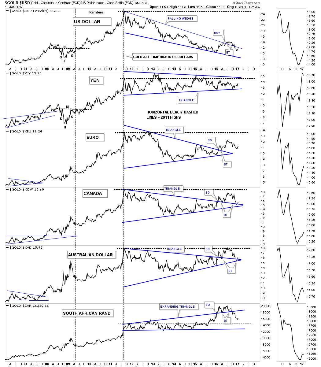
This next chart is a 20 year monthly look at how gold is doing in 6 important currencies of the world. As one would expect, the GOLD:USD ratio chart on top, shows the weakest looking chart of the six, as the US dollar made a big move up in 2014. Earlier in 2016 the GOLD:USD ratio chart looked like it was breaking out above the top rail of the blue falling wedge that began forming at the 2011 all time high. The price action broke above the top rail, found support twice on a backtest, but then closed below the top rail, negating the breakout at least for now. For reference the horizontal black dashed lines shows the 2011 highs which really puts in perspective how poorly gold has done in US dollar vs the other currencies of the world. Gold in South African Rand had the strongest showing.
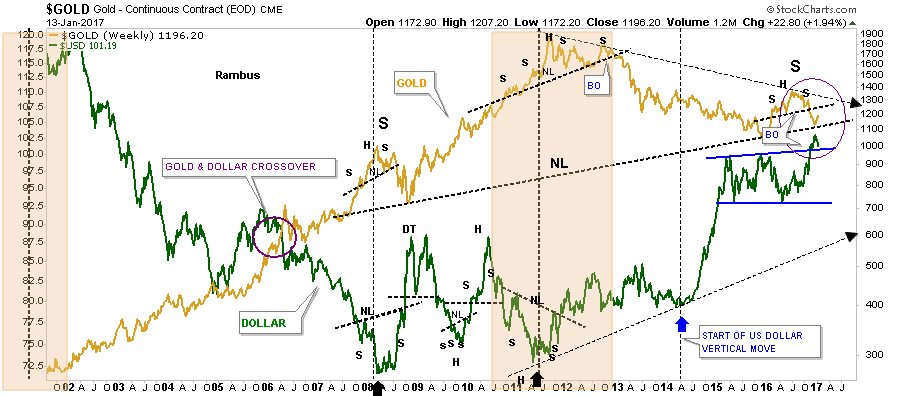
This next chart I overlaid gold on top of the US dollar which shows the inverse correlation these two have. It’s not a perfect correlation but they do tend to move opposite to each other for the most part. The last time we looked at his chart gold and the US dollar were almost kissing when gold broke below its neckline, and the US dollar broke above the top rail of its flat bottom expanding triangle. Since then they both have been in backtest mode. You can see how important the backtest is for the US Dollar. In order for gold to have a bullish outcome the US dollar will need to show a false breakout and start trading below the top green rail.
This next ratio chart is a long term weekly look at the gold:USD ratio chart going all the way back to the beginning of golds bull market in 2001. For 11 years the ratio rallied in a nice tight uptrend channel until the 2011 high. From that all time high the ratio has been declining in a nice tight downtrend channel. This ratio is currently in backtest mode to the H&S neckline at 12.50. That will be a critical area to watch. There was also a H&S consolidation pattern that formed back in 2008 which we could view as a possible reverse symmetry pattern which could setup a very large neckline. The first thing we’ll need to see happen is how this ratio handles this current backtest to the neckline. If the price action stalls out at the neckline or even the top rail of the downtrend channel, that would be bearish for gold, as it would suggest the US dollar is stronger than gold.

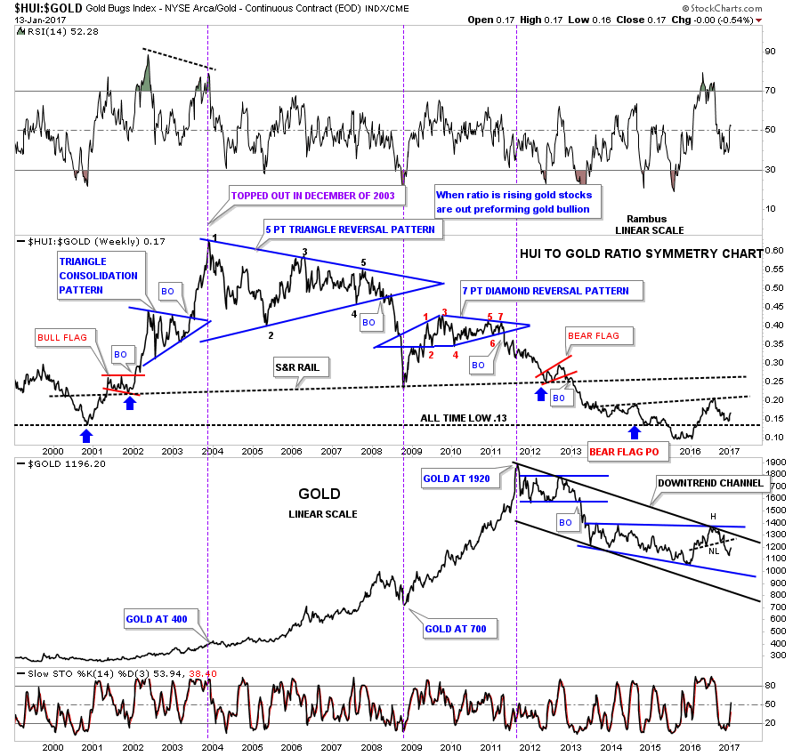
This next ratio combo chart has the HUI:GOLD ratio chart on top and gold on the bottom. The ratio chart on top shows just how weak the HUI has been vs gold. The ratio chart actually topped out in late 2003 and finally bottomed in late 2015 after breaking below the all time low at .13. Gold on the bottom chart shows there is some room to rally before it starts running into overhead resistance at the neckline, the top rail of the black downtrend channel, and the top rail of the blue expanding falling wedge. If gold can trade above all three of those resistance lines the bulls will be talking to us.
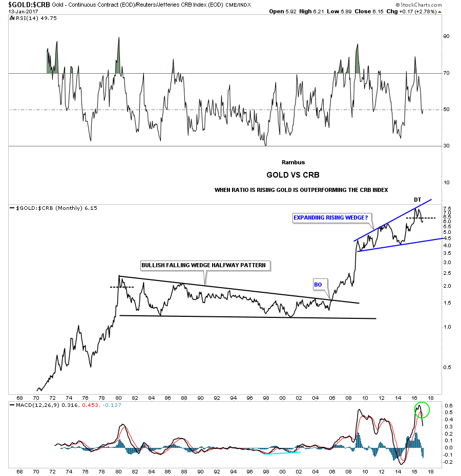
Below is a ratio chart which compares gold to the CRB index going back 50 years. This ratio recently topped out with a small double top that formed below the top rail of its 8 year expanding rising wedge. This chart is strongly suggesting that gold is going to under perform the CRB index for a long period of time.
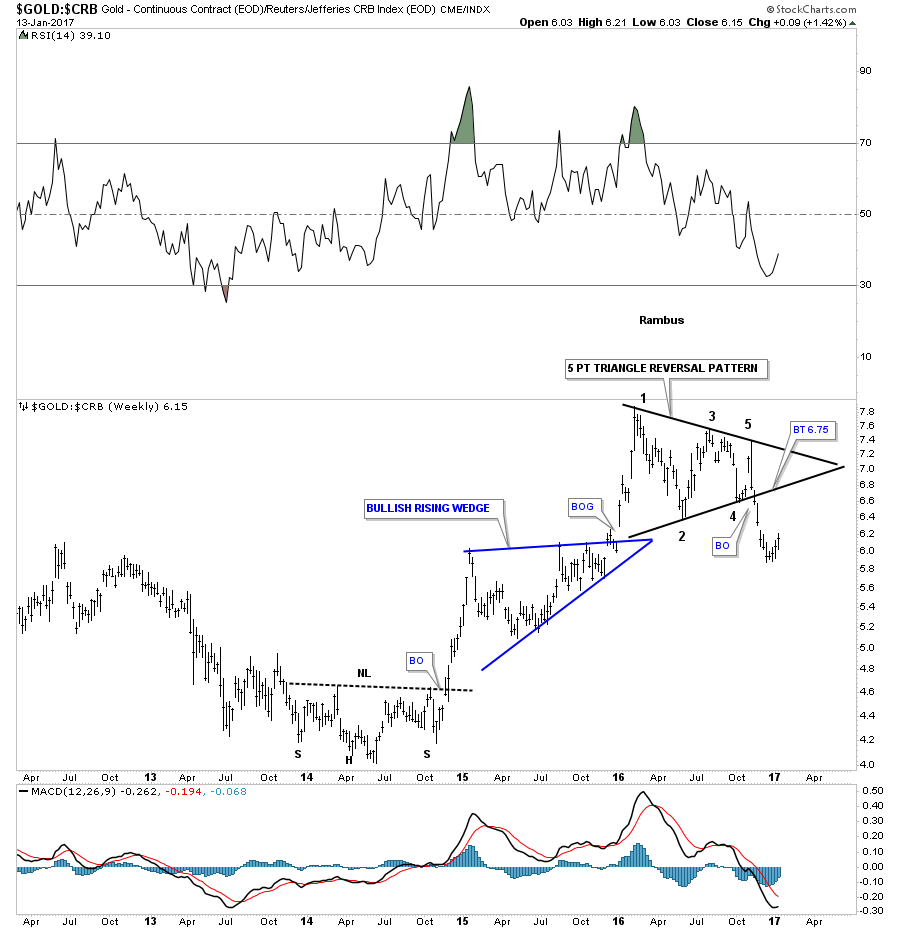
The weekly bar chart shows a 5 point triangle reversal pattern for the GOLD:CRB ratio. A backtest to the bottom rail would come in around the 6.75 area so there is still some room for gold to show its bullish side vs the CRB index.
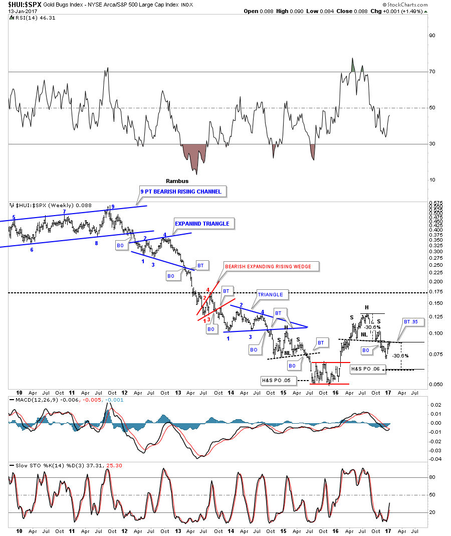
This last ratio chart we’ll look at compares the HUI to the SPX. The three week rally in the HUI is putting this ratio just below an important neckline. If this ratio breaks out above the neckline it will show the HUI is stronger than the SPX. This is another very important inflection point to keep a close eye on. Note the similar small H&S pattern that formed back in 2015 which had a measured move down to .05 which so far has been the low.
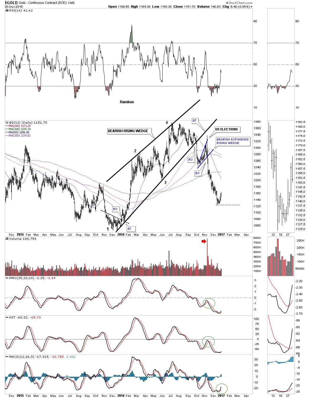
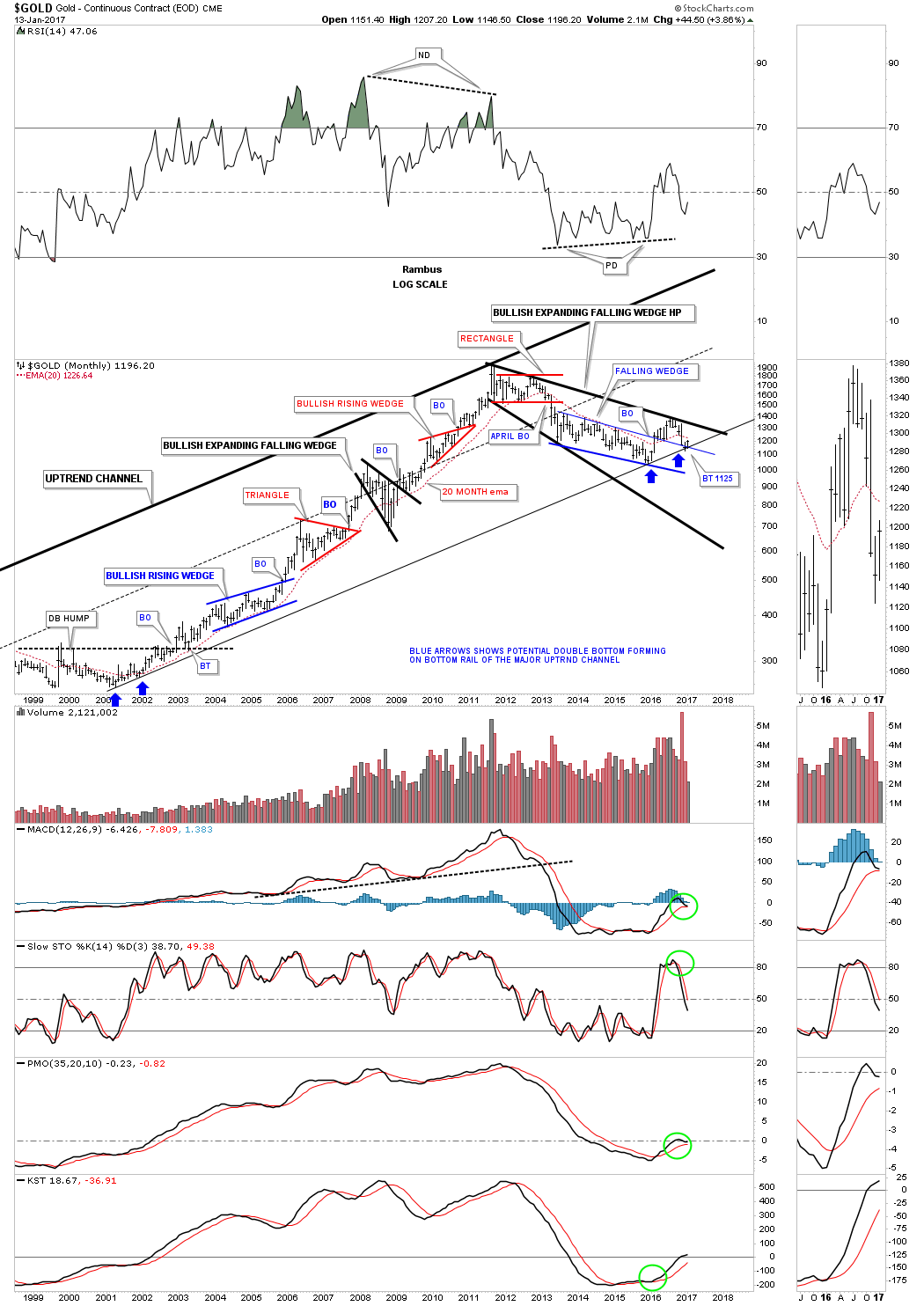
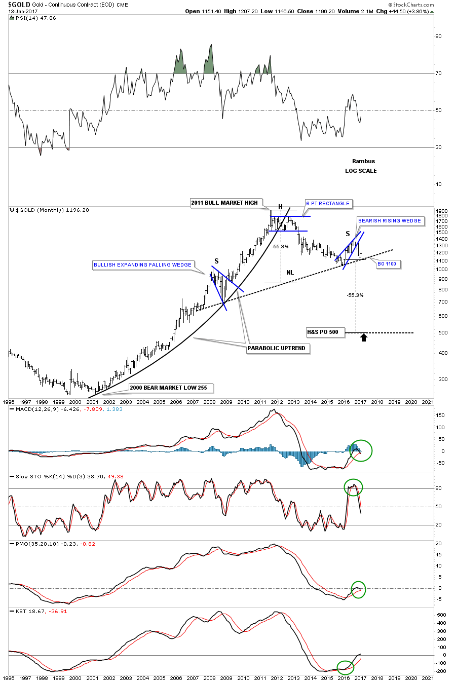
Next I would like to show you some potential bullish and bearish charts for gold. This first monthly chart for gold shows my original blue falling wedge that formed inside of the much bigger black expanding falling wedge. Back in February of last year gold broke out above the blue falling wedge, did a quick backtest, rallied up to the top rail of the black expanding falling wedge, and the 2008 neckline extension rail where it declined once more to the top rail of the blue falling wedge where it’s finding some initial support again. So far nothing is really broken on this chart from a bullish perspective as long as the top rail of the blue falling wedge holds support.
Below is the exact same chart as the one above but I’ve adjusted the top rail of the blue falling wedge to the August 2016 high. If this scenario plays out gold could rally all the way back up to the top rail at the 1382 area and then decline into a bear market. A breakout above the top rail will put the bulls firmly in charge.
This next long term chart for gold shows its bull market uptrend channel. Last month when we looked at this chart it was testing the bottom rail of the uptrend channel which was actually at 1125. If the bottom rail can hold support you can see a possible inverse H&S bottom forming. The first bit of resistance the bulls will need to overcome is the 10 month ema which is currently at 1225.88. If gold can trade above the 10 month ema, then the top of the trading range and the neckline will come into focus at the 1360 area.
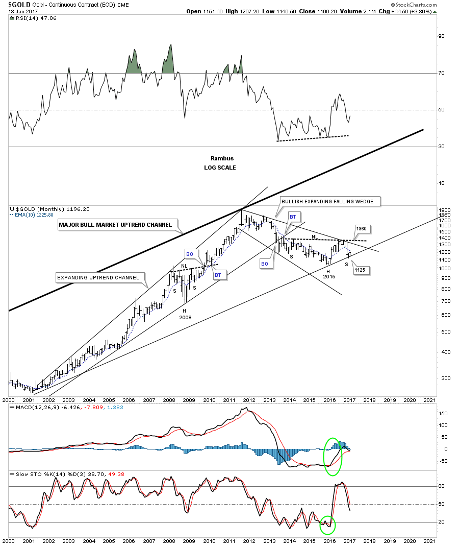
Below is a monthly chart for gold which shows its uptrend channel with all the bigger chart patterns that formed during its bull market.
When gold topped out in 2011 it began to form this downtrend channel which is still in place today. Gold found initial support at the December low on the center dashed mid line and is getting a nice bounce. There are two clear channels that make up the big downtrend channel separated by the center dashed mid line. It looks possible now that gold could trade inside the upper channel until it reaches the top rail of the major downtrend channel. The top of the downtrend channel would come in around the 1360 area. It’s also possible that gold could put in a double top similar to the one that formed at the beginning of the uptrend channel, as shown by the black arrows.
This next long term monthly chart for gold shows a potential bearish setup taking place. Gold formed a 10 year parabolic bull market which came to an end in 2011. From that multi year top, gold has been declining for 5 1/2 years. Gold built out the black bearish rising wedge and is getting a bounce off of the potential neckline. If gold takes out the high for the right shoulder it will negate the possible very large H&S top. So where this current rally stalls out will be critical to the very big picture. A close below the neckline at 1100 will be very bearish for gold, until then above the neckline is positive and below is negative.
I would like to finish up this Weekend Report by looking at a bullish and bearish chart for the HUI. This first chart shows the bull market uptrend channel still in place which began back in late 2000. This long term chart shows all the big chart patterns the HUI built out in both the bull and bear markets. The possible current trading range is the same size as the blue rectangle that formed the last consolidation pattern before the bull market began, labeled with a #2 above it. The blue triangle is also the same height as our possible current trading range which also has a #2 above. So our current trading range isn’t out of the ordinary as far as consolidation patterns for the HUI are concerned.
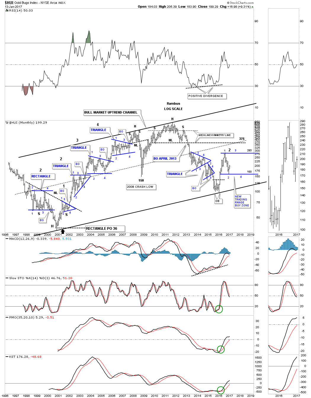
This last chart for tonight shows the potential bearish setup for the HUI. If the neckline fails to hold resistance then there is the top rail of bear market downtrend channel that will come into play at the 250 area.
What most of these charts are showing is that there is room for the precious metals complex to have a decent rally within the bear market that began in 2011. If the price action can take out all the overhead resistance lines then the bulls will be in charge. On the other hand if they fail, the bear market that began in 2011, will be alive and well. We have several stepping stones along the way that will let us know where the important inflection points are located, and how the price action interacts with them will give us some big clues on what to expect going forward. All the best…Rambus
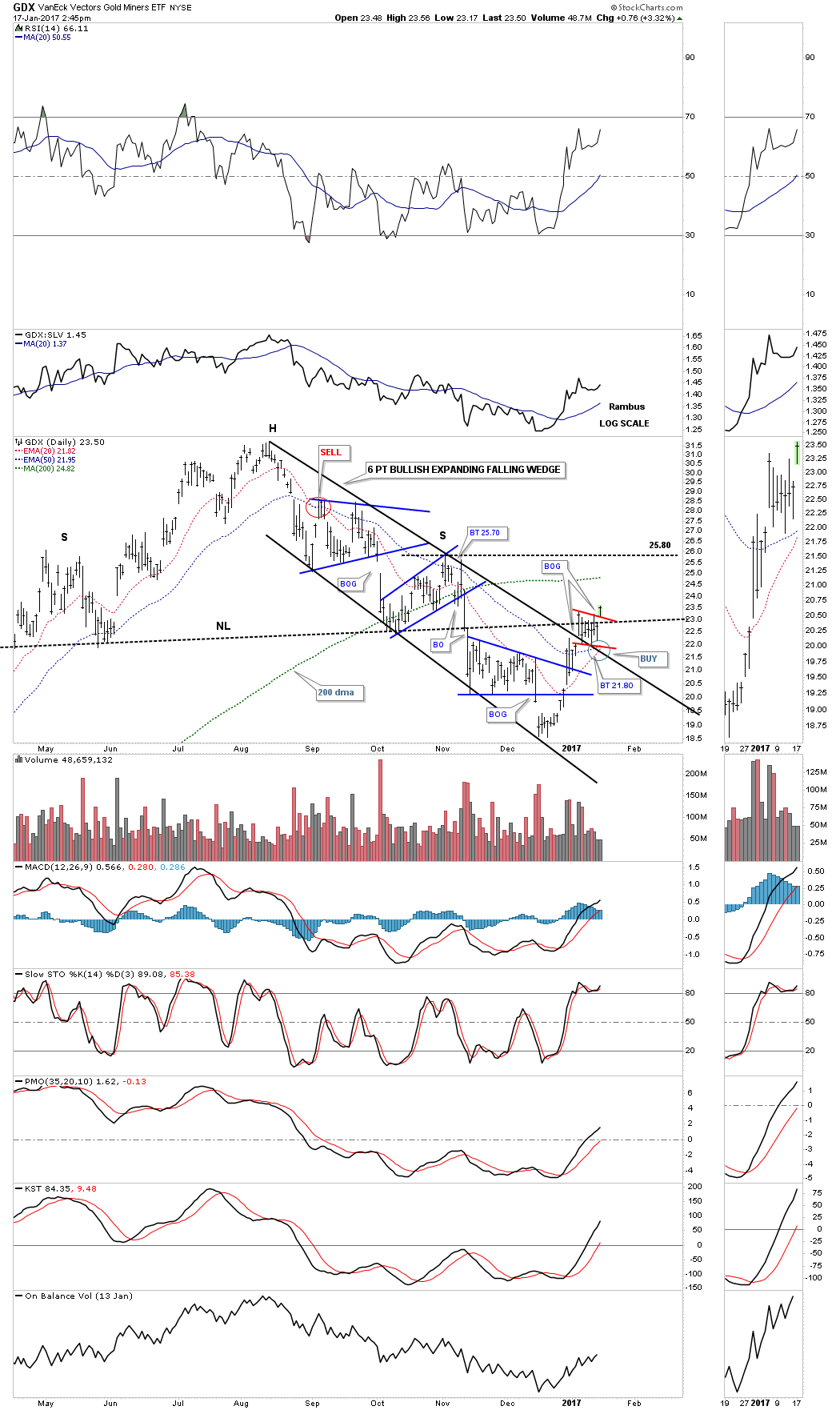
GDX Update...
Prepared on January 17, 2017We’ve been following the small red trading range that was building out just above the top rail of the 6 point expanding downtrend channel. Today the price action gapped above the top red rail and the old neckline which looks like the H&S top may now be negated. The 20 day ema is getting close to crossing above the 50 day ema which will offer another buy signal.
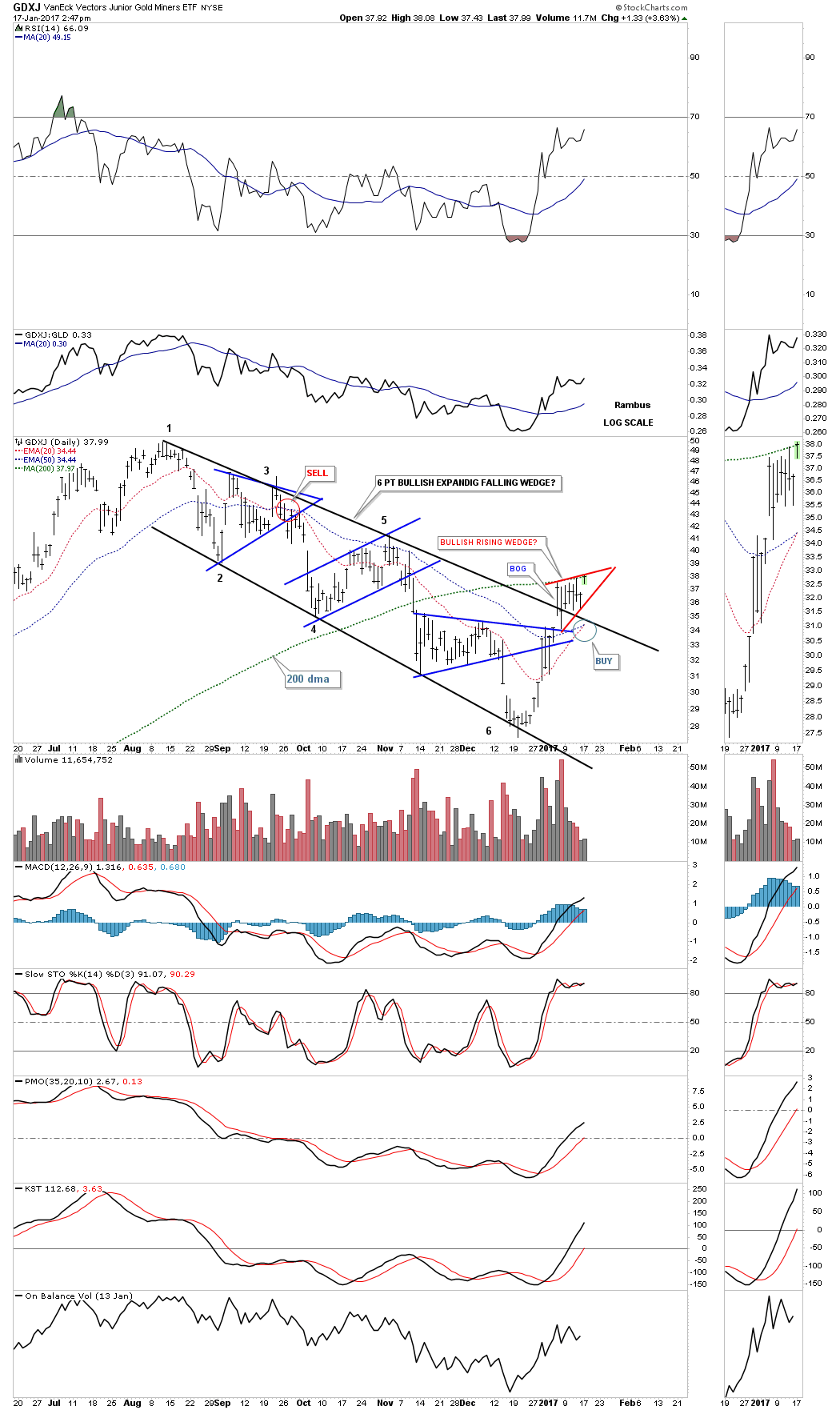
The GDXJ also shows a 6 point expanding falling wedge with a breakout gap above the top rail. The price action is currently testing the top rail of the small red rising wedge and the 200 dma. The 20 and 50 day ema’s are currently kissing at 34.44.
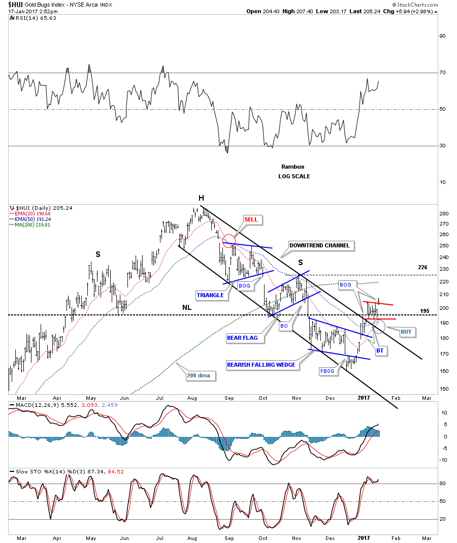
The daily chart for the HUI shows a similar setup as it broke out above the top rail of the small red triangle today which was also above the old neckline. It’s now important for the top red rail to hold on a backtest. The 20 and 50 day ema’s haven’t crossed yet but they’re getting close.
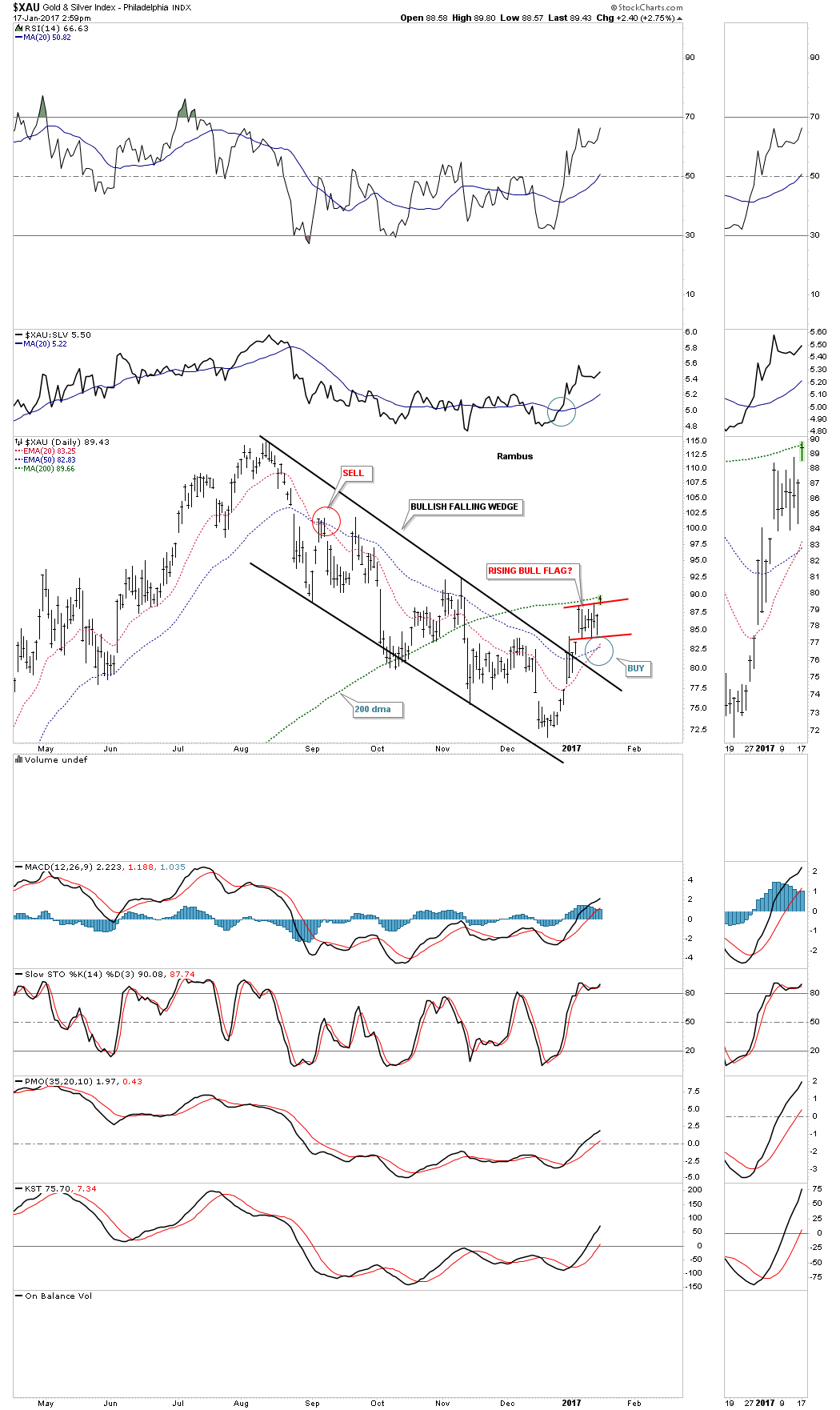
Below is a daily chart for the XAU which has a slightly different setup to the charts above as it has formed a falling wedge instead of an expanding falling wedge. Regardless of the difference it broke out above the top rail of a red rising flag today and is testing the all important 200 dma. The 20 and the 50 day ema’s have a positive crossover offering a buy signal.
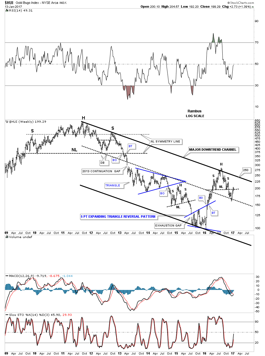
In the Weekend Report we looked at the gold:XAU ratio chart which showed it was building out a possible right shoulder of a H&S top. Below is a ratio combo chart which has the gold:XAU ratio on top and the XAU on the bottom. The ratio chart on top suggested that a the right shoulder would need more time to build out from a symmetry point of view. If that is the case then a nice trading range may be setting up on the XAU between 78 on the low end and 111 on the high end. If the neckline is broken that would complete a very large H&S pattern which is now four years in the making. It now becomes important for the price action to trade between the neckline and the neckline symmetry line to keep the possible right shoulder building out. This could go on for many more months before the right shoulder is complete which would be fine if we can trade the trading range before the necklines give way.

Catherine Austin Fitts:
Rambus, I can't thank you enough. This is Blockbuster Chartology! We have a lot to study and digest. Let me remind our subscribers that they can access your ongoing efforts at: http://rambus1.com.
Related Reading:
- Blockbuster Chartology with Rambus - October 20, 2016
- Blockbuster Chartology with Rambus - July 21, 2016
- Blockbuster Chartology with Rambus - April 21, 2016
- Rambus: Are We in a Deflationary Spiral? - January 28, 2016
- The Dollar, Gold & the S&P 500 with Rambus - October 15, 2015
- 3rd Quarter Wrap Up: Financial Markets Round Up - October 06, 2016
Top of Page
© Solari 2016