
Here is a map of US counties, again colored red and blue to indicate Republican and Democratic majorities respectively:
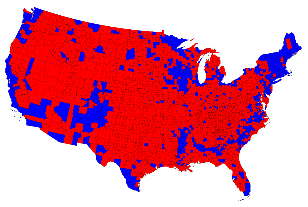
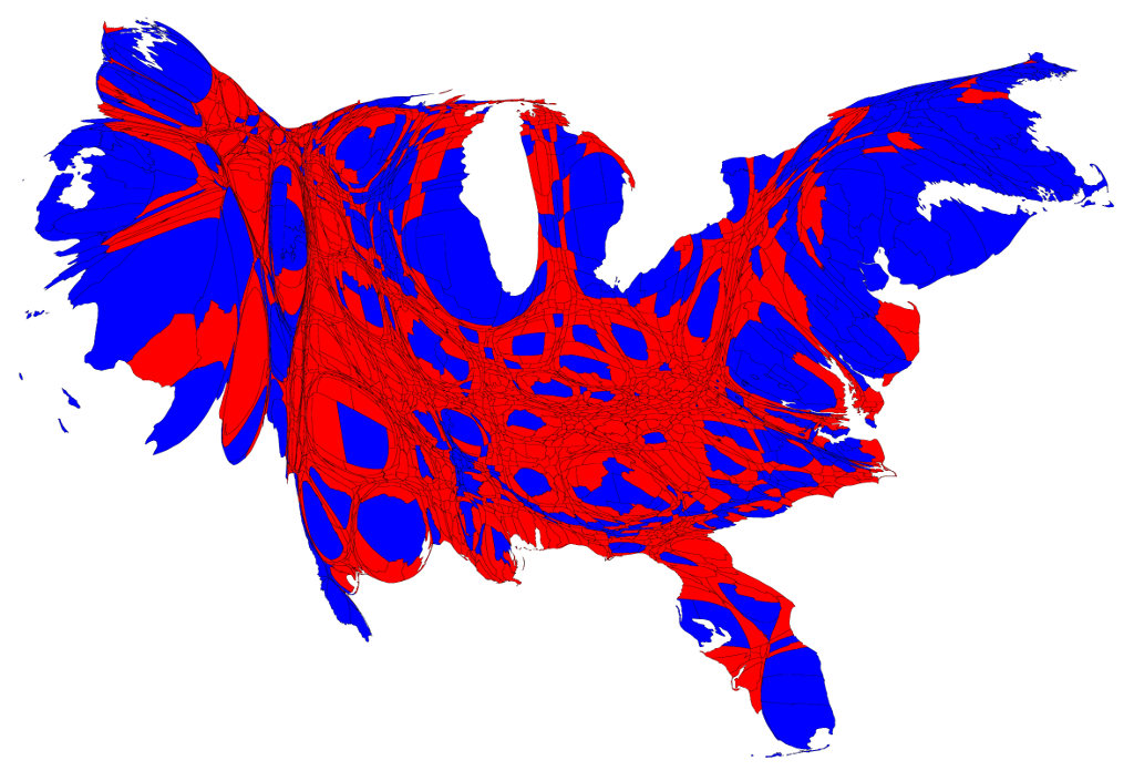
Now the effects we saw at the state level are even more pronounced: the red areas appear overwhelmingly in the majority, an appearance again at odds with the actual results of the election. Again, we can make a more helpful respresentation by using a cartogram. Here is what the cartogram looks like for the county-level election returns:
![]()